BTC - Bitcoin
 USDTERC20 - USDT ERC20
 ETH - Ethereum
 BNB - Binance
 BCH - Bitcoin Cash
 DOGE - Dogecoin
 TRX - TRON
 USDTTRC20 - USD TRC20
 LTC - LiteCoin
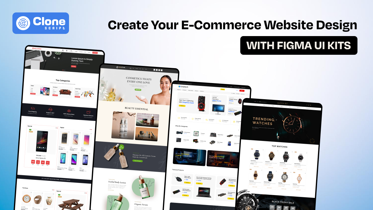
How to Create Your E-Commerce Website Design with Figma UI Kits
You don't get a second chance at a first impression, especially in e-commerce.
Before anyone clicks “Buy Now,” they make a silent judgment about your brand. Is this site professional? Is it trustworthy? Is it even worth my time? The reality is, most users make that decision within 10 seconds of landing on your website.
That means your design isn’t just important. It’s everything.
For designers, founders, and developers working on an e-commerce product, that pressure can feel overwhelming. You need to launch fast, stay on-brand, and make it look like a million-dollar storefront. Even if you're building it on a startup budget.
That’s exactly where Figma UI kits come in.
In this guide, we’re going beyond the basics to show you how to turn your raw idea into a full-blown, conversion-ready e-commerce design using Figma. Without wasting time or settling for “just okay” templates. If you're building a store people love to browse and buy from, this guide is your starting point.
What Is a Figma UI Kit for E-Commerce?
A Figma UI kit is like the blueprint of a well-designed storefront. It’s not just a pretty mockup. It’s a complete design ecosystem made up of reusable components, polished layouts, and scalable systems.
Here’s what a good e-commerce template in Figma gives you:
-
Product page designs that already follow UX best practices
-
Buttons, banners, icons, cards, and form fields are ready to use
-
Fully responsive layouts (desktop + mobile)
-
Navigation menus, filters, and checkout flows are pre-built
Instead of designing each screen, a UI kit hands you the building blocks. It’s like starting your store with shelves already built, displays already polished, and lighting already perfect. All you need to do is add your products and branding.
It saves time, reduces errors, and sets you up with a professional website UI design right from day one.
Why Figma Is the Perfect Tool for E-Commerce Website Design?
Let’s not sugarcoat it: online store design is hard. You have to balance beautiful aesthetics with practical e-commerce UX. You need your site to feel modern, but also fast. Most importantly, it has to convert.
Figma is built for that balance.
Here’s why smart teams choose Figma for e-commerce web design:
-
Real-Time Collaboration: Work alongside your team, clients, or developers in the same file. No exporting. No email chains. No nonsense.
-
Browser-Based: Figma works anywhere: Mac, Windows, or Linux. No license key. No bloated install files.
-
Built-In Dev Handoff: With one click, developers get the CSS, font sizes, spacing, and assets they need, straight from the design.
-
Component-Based Design: Make a change to one button, and it updates across every page, homepage, cart, checkout, you name it.
If you’re serious about website design, especially e-commerce, then it’s time to leave old tools behind and build inside the only design platform truly made for speed, collaboration, and scale.
Step-by-Step: How to Create Your E-Commerce Website Design Using a Figma UI Kit
Designing a professional e-commerce site doesn’t require weeks of wireframing or hours of trial-and-error. With a powerful Figma UI kit, you can launch your design faster, stay consistent across pages, and focus on what really matters: user experience and brand identity.
Here’s a complete breakdown of how to use a UI kit inside Figma to design your website UI from start to finish.
Step 1. Choose a Figma UI Kit That Matches Your Brand and Product Category
The first step isn’t to open Figma. It’s to choose the right Figma web design template for your specific business needs. UI kits come in different styles and focus areas: some are minimal, some bold and vibrant, and others are crafted for niche industries like fashion, electronics, or food delivery.
You have a question: How to choose the right kit?
Follow the tips.
-
Check for completeness: Ensure the kit includes the core pages: homepage, product listings, product detail, cart, checkout, login, and account.
-
Assess the visual tone: If the client is selling premium jewelry, they want a high-end, elegant layout. For tech gadgets, a clean, modern interface works better.
-
Look for a mobile-friendly design: The kit should offer both desktop and mobile frames to ensure responsiveness.
-
Ensure component flexibility: You’ll need editable buttons, forms, icons, and sections that can adapt to your brand identity.
-
UI standards compliance: Look for auto-layout, proper spacing, reusable symbols, and clean layer naming for a smoother workflow.
Once selected, download or duplicate the kit directly into your Figma account.
Step 2. Import and Organize Your UI Kit Inside Figma
After selecting your UI kit, import it into your workspace. Figma allows you to either duplicate a public Figma file or upload a .fig file if you’ve purchased a premium kit.
Once the file is open:
-
Rename the project clearly (e.g., “MyStore_UI_2025”)
-
Group key pages into folders like /Homepage, /ProductPages, /Auth, etc.
-
Add a reference page where you keep notes, screenshots, or feedback
Getting your files organized early will save hours later, especially if working with a team of developers or designers.
Step 3. Apply Your Brand Identity: Colors, Fonts, and Logo
This is the step where your design starts feeling uniquely yours.
-
Update the logo: Replace placeholder logos with your brand’s official logo in all headers, footers, and login pages.
-
Customize color palette: Swap out the default theme colors with your brand’s primary, secondary, and neutral colors. Most kits use Figma’s Color Styles, so changes apply globally.
-
Set typography: Change font styles to match your brand tone: bold and loud for streetwear, clean and minimal for lifestyle brands.
-
Adjust icons and illustrations: Replace or recolor them if they feel off-brand or outdated.
By customizing global styles (under the "Assets" panel), you make your brand consistent across every screen without manually updating each frame.
Step 4. Edit Core E-Commerce Pages: Homepage to Checkout
Now that the visual foundation is in place, it’s time to build out the functional flow, the shopping journey.
1. Homepage
This is the first impression. Focus on the following pages:
-
Hero banners with product highlights
-
Top categories with icons or thumbnails
-
Trust badges (e.g., secure checkout, fast shipping)
-
CTAs like “Shop Now” or “Browse Collections”
-
Testimonials or reviews, if available
2. Product Listing Page (PLP)
Key considerations for a listing page design:
-
Grid layout with product images, names, price, and quick action buttons (Add to Cart, Wishlist)
-
Filters (by price, brand, size, etc.)
-
Sort options (e.g., Newest, Popular, Price Low to High)
3. Product Detail Page (PDP)
This is where the user decides to buy or not. Your design should include:
-
High-res product images with zoom/carousel
-
Price and discount display
-
Variant selectors (color, size, etc.)
-
Add to Cart button (visible and prominent)
-
Social proof: star ratings, reviews, or user images
-
“Related Products” or “Customers Also Bought”
4. Cart Page
Keep it clean, intuitive, and editable:
-
Product preview with remove/edit options
-
Clear subtotal, shipping cost, and total
-
Proceed to Checkout CTA
-
Promo code input field (optional but common)
5. Checkout Page
Minimize steps for completing the checkout:
-
Single-page checkout (ideal)
-
Guest checkout option
-
Auto-filled address fields
-
Multiple payment methods with clear icons
-
Progress bar or breadcrumb (e.g., Address → Payment → Confirm)
6. Login/Register
Focus on usability:
-
Social logins (Google, Facebook)
-
Clear form design with input validation
-
Password visibility toggle
-
Easy account recovery option
These screens are the backbone of any e-commerce experience. Your UI kit likely includes them, so you’ll be editing rather than creating from scratch, a massive time-saver.
Step 5. Build for Mobile Responsiveness
In most industries, over half of your users will visit from a mobile device. Your site should work beautifully on screens as small as 360px wide.
If your UI kit includes mobile versions:
-
Open mobile frames and start customizing them alongside your desktop design
-
Use Auto Layout in Figma to ensure elements adapt well to resizing
-
Adjust button sizes for thumb reach (44x44px minimum touch target)
-
Ensure typography scales well (min 14px for body text)
If the kit doesn’t include mobile layouts, duplicate key pages, and rebuild them manually using a mobile grid (e.g., 375px wide, 8pt spacing system). The mobile experience should feel just as elegant and usable as the desktop.
6. Create a Design System (if your UI Kit doesn’t already have one)
Design systems aren’t just for large teams; even solo developers or startups benefit from a systemized design.
This includes the following elements:
-
Color styles: Primary, secondary, accent, error, background, text
-
Typography styles: Heading 1–6, subtitles, body text, captions
-
Buttons: Default, hover, pressed, disabled
-
Forms: Input fields, checkboxes, toggles, dropdowns
-
Spacing and layout guides: Grid system, margins, gutters
By converting these into Figma styles and components, you’ll maintain consistency across all pages. This is a must for professional-level web page UI design.
Step 7. Collaborate in Real-Time with Your Team or Clients
Figma’s collaboration features shine when working with others. You can have an option:
-
Invite team members to comment directly on designs
-
Share view-only links with stakeholders for feedback
-
Use Figma’s Version History to track changes or roll back if needed
-
Assign comment threads to specific people (great for client review rounds)
This real-time interaction helps avoid endless revision cycles and miscommunication. When your website is being developed alongside product strategy or marketing efforts, it can prove a golden chance.
Step 8. Hand Off to Developers Using Figma’s Dev Mode
Once the design is final, it’s time to hand it over to your dev team. No PDFs, no long explanations. Figma makes it seamless:
-
Turn on Dev Mode: Developers can inspect padding, spacing, fonts, colors, and even copy CSS directly from elements.
-
Downloadable assets: Export icons and images in SVG, PNG, or WebP as needed.
-
Component states: Document hover, pressed, and disabled states to guide implementation.
-
Design notes: Use sticky comments or side notes to explain logic, animations, or responsiveness.
The smoother your handoff, the faster your ecommerce website theme goes live. Exactly how you imagined it.
Best Practices for E-Commerce UI Design in Figma
Your UI must solve two critical problems at once: helping people find what they want and making them feel confident enough to buy it.
With that in mind, here are the most important best practices for creating successful e-commerce site templates inside Figma. These tips will validate that your designs are not only polished but also practical, intuitive, and conversion-focused.
1. Simplify the User Journey. Reduce Friction Everywhere.
Clarity beats cleverness. Every screen, interaction, and micro-decision should make it easier for users to get from the homepage to checkout without stopping to think.
In Figma, use flows and wireframe logic to structure key journeys like:
-
Homepage → Product Listing → Product Detail → Cart → Checkout
-
Category Page → Product Detail → Wishlist → Cart → Checkout
Tips:
-
Minimize clicks to purchase. No more than 3 from cart entry.
-
Remove unnecessary steps, pop-ups, or distractions.
-
Use clear CTAs like “Add to Cart” or “Continue to Checkout.”
When using a Figma UI kit, always map out these paths clearly and test them in prototype mode. Simplification increases speed, and speed converts.
2. Use Strong Visual Hierarchy. Guide the Eye Intentionally.
Great UI isn’t just about layout. It’s about prioritization. The most important elements on any page should grab attention first, followed by supporting content.
In Figma web design, you control visual hierarchy using:
-
Font sizes and weights (e.g., bold pricing, lighter descriptions)
-
Contrast (e.g., white CTA on dark background)
-
Spacing and padding (breathing room makes key content pop)
-
Color highlights (e.g., sale tags, new badges)
For example, in a product card, the product image, price, and “Add to Cart” button should all be visually dominant. Avoid overloading with secondary info that distracts.
Visual clarity = cognitive ease = more purchases.
3. Think Mobile-First. Design for Thumbs, Not Cursors.
More than 70% of e-commerce traffic comes from mobile devices. If your site only looks great on desktop, you’re losing revenue. Start your design in a 375px-wide frame inside Figma and scale up to desktop afterward.
Mobile-first UI design in Figma means:
-
Buttons that are easily tappable (minimum 44x44px)
-
Simplified navigation, like hamburger menus and bottom nav bars
-
Collapsible filters and accordions to save vertical space
-
Sticky CTAs, like a fixed “Add to Cart” button on product pages
By focusing on small-screen usability early, you’ll create a more focused, conversion-friendly experience on all devices.
Bonus: Mobile-first constraints also lead to better desktop design by forcing you to eliminate clutter.
4. Include Trust Signals. Make Users Feel Safe and Assured.
When users trust your site, they spend more. Period.
In your website UI design, you must visually prove that your store is safe, reliable, and well-liked by others. Use a combination of design elements and supporting content to build trust quickly.
Trust-building elements to include in your Figma design:
-
Secure checkout badges (lock icons, SSL verification)
-
Verified customer reviews with star ratings and images
-
Clear return and refund policies (linked in product or footer)
-
Trusted payment method logos (Visa, PayPal, Apple Pay)
-
Customer support icons (chat bubble, email, or phone access)
Design these elements directly into your homepage, product detail page, and checkout flow. A trustworthy-looking UI gives first-time visitors the confidence to convert.
5. Optimize Images and Speed. Design with Performance in Mind.
Designing in Figma is about preparing for the real-world implementation. Heavy graphics, oversized images, or uncompressed assets may look great in Figma, but they’ll kill load speed once coded.
Performance tips for Figma-based designs:
-
Use compressed and cropped images in your designs to set standards early.
-
Don’t rely on gigantic image banners; use smart cropping and lazy-loading UX ideas.
-
Avoid unnecessary effects like blurry shadows, giant drop shadows, or excessive gradients that don’t translate well to code.
-
Export assets (like icons) in optimized formats (SVG or WebP) and annotate your designs to guide the dev team on best practices.
If your e-commerce template is fast, users stay longer, and more visitors = more conversions.
6. Stick to Familiar UX Patterns. Don’t Make Users Relearn Basics.
Innovation is great, until it becomes confusing. E-commerce users are trained to expect certain patterns, and breaking them unnecessarily can cost you sales.
Stick with proven patterns that shoppers already know:
-
Cart icon in the top-right corner
-
Product grids with hover effects
-
Filters on the left or as collapsible tabs
-
Product detail pages with image carousels
-
“Add to Cart” or “Buy Now” buttons in bold, primary color
Don’t reinvent patterns that already work. Instead, innovate in subtle ways, through typography, color palette, or layout, while keeping core functionality consistent.
In Figma, use a design system or component library that sticks to these conventions, and you’ll ensure your e-commerce web page UI design feels intuitive from the start.
Conclusion
Designing an e-commerce website isn’t just about visuals. It’s about building trust, guiding users, and creating a seamless path to purchase. With Figma and the right UI kit, you can design faster, stay consistent, and launch a high-converting store without starting from scratch.
From mobile-first layouts to strong visual hierarchy and real trust signals, every design choice impacts how users feel and act.
By following best practices and customizing templates to match your brand, you set yourself up for success. Start designing smart and turn browsers into buyers with a polished, user-friendly e-commerce interface.