BTC - Bitcoin
 USDTERC20 - USDT ERC20
 ETH - Ethereum
 BNB - Binance
 BCH - Bitcoin Cash
 DOGE - Dogecoin
 TRX - TRON
 USDTTRC20 - USD TRC20
 LTC - LiteCoin
7 Top Design Tips for Creating a Stunning Cosmetic E-commerce App
Beauty has evolved beyond store shelves; today, it lives on mobile screens. A perfectly designed cosmetic e-commerce app doesn’t just display products; it tells stories of transformation, confidence, and care.
Yet, behind every scroll and tap, one defining factor works — design.
The way an app feels, flows, and visually speaks often determines whether users stay or leave in seconds.
When it comes to beauty shopping app design, aesthetics and usability meet. The challenge is not only in creating something that looks beautiful but also in ensuring that every digital interaction feels effortless and elegant.
Let’s explore how thoughtful design principles can shape a cosmetic app that captivates users and converts them into loyal customers.
Role of Good UX Design in a Cosmetic E-commerce App
A professional cosmetic e-commerce app is more than an online store; it’s a personal beauty advisor in a user’s pocket. The role of good UX design is to make this experience intuitive, emotional, and memorable.
When users open a beauty product app, they expect more than just functionality. They want inspiration — a smooth, emotional connection that mirrors the feeling of walking into a luxury beauty store.
-
The colors, typography, and transitions should evoke calmness, sophistication, and trust.
Good UX also means anticipating needs — quick search results, personalized recommendations, and one-step checkouts that respect users’ time.
In short, a cosmetic app’s UX best practices revolve around three elements: simplicity, empathy, and flow. Together, they define the journey from curiosity to conversion.
Let’s understand the importance of knowing the actual customer needs in e-commerce app design.
Why Understanding Your Target Audience Before Designing a Cosmetic App Is Important?
Before choosing a color palette or layout, you must understand who will use your app and why. Beauty preferences vary, from users seeking cruelty-free skincare to those following global makeup trends.
User research is not just a step. It’s a foundation. Understanding your audience helps shape every UI/UX decision:
-
What emotions should your design evoke?
-
What level of personalization do they expect?
-
How do they prefer to shop, quick purchases or detailed exploration?
When your cosmetic mobile app ideas follow the real user insights, the experience feels personal. It reduces guesswork and ensures your app doesn’t just look good; it works beautifully for your users.
Now, it’s time to know the best tips for beauty app UI designing.
7 Tips for Creating a Stunning Cosmetic E-commerce App
Cosmetic e-commerce app development is a task of defining the journey of a brand and its customers.
With these tips, your mobile app will not just be limited to sales channels but will help to create a connection between the brand and customers.
1. Use a Clean and Luxurious Visual Style.
Elegance in a beauty app begins with minimalism.
But what does it mean?
A clean, airy design allows products to shine without distraction. Users feel inspired when they find a calm and sophisticated appearance of the app.
-
Use a light color palette with touches of gold, rose, or nude tones to create a sense of luxury.
-
Typography should be graceful. Modern sans-serifs paired with mini accent fonts for product names or headers.
-
Avoid clutter; every pixel should serve a purpose. Maintaining clarity across the platform creates a reputable brand image.
This visual clarity enhances the beauty app user experience and builds emotional trust, showing that simplicity for the ultimate sophistication.
2. Highlight Products With Visual Storytelling.
Images are the key aspect of any cosmetic e-commerce app. It represents the brand story with an aesthetic look.
At the same time, users buy beauty products with their eyes, and storytelling through visuals creates a connection.
Here’s a way to make it happen:
-
Use large, high-quality images, lifestyle photos, and short video snippets showing how the product looks on different skin tones.
-
Incorporate AR try-on for beauty apps, a feature that allows users to virtually test lipsticks or foundations. It bridges the imagination and reality gap, boosting confidence in purchase decisions.
When storytelling meets interactivity, engagement deepens to turn browsers into believers. This can help to get more conversions.
3. Focus on Easy and Intuitive Navigation.
Have you visited any cosmetic product-selling mobile apps like Nykaa, Mamaearth, Purplle, Sephora, or anything in between before?
These apps are designed for effortless to use. They also optimized for a professional look.
The best part is that an overall flow guides users from browsing the products to completing the checkout without confusion.
-
Follow intuitive patterns: a visible search bar, bottom navigation tabs for quick access, and filters to refine categories like “vegan,” “new arrivals,” or “best sellers.”
Smooth navigation is the most important thing for a cosmetic app user's retention. When users find what they want easily, they stay longer, explore more, and come back often.
Remember, the best navigation design is the one users barely notice — because it feels so natural.
Note that you do not copy the design of other famous beauty apps, but try to understand what problem they are solving. From there, you can create a unique user interface that offers something extra to customers.
4. Build an Engaging Home Screen Experience.
Whether your brand goal is awareness, sales, or retention, you have to make sure the first impression is positive. Because from there, your brand personality is defined. It should feel welcoming, aspirational, and dynamic.
Here are the ways to get it:
-
Showcase limited-time offers, personalized product suggestions, and seasonal themes that keep users emotionally invested.
-
Include micro-interactions, gentle animations, and minimal engaging feedback that make browsing delightful.
Do you know what plays a key role here?
Personalization.
When a user opens the app, they will be welcomed with the greeting message on the homescreen. They also notified of the recommended products based on browsing history, skin type, or favorite brands.
This emotional design layer transforms your beauty shopping app design into a personalized beauty destination, not just a catalog.
5. Create Product Pages That Convert.
Here comes the main element of any e-commerce app design “product page.”
Look, only based on having premium beauty products and professional service, you can’t get more conversions.
The product page has to be created with convincing power that guides every user on the conversion funnel: information, consideration, and conversions.
In other words, your product pages are your virtual beauty consultants. They must inform, inspire, and convince.
Follow these product page design for beauty apps best practices:
-
Use clean layouts with detailed descriptions and real-user reviews. Consume white space identically and mention the product ingredient where the eyes usually first contact. Adding feedback from previous customers improves the checkout completion rate.
-
Include multiple-angle photos, swatches, and AR try-on options. To evaluate how the product is and what kind of elements are used in the real images is very useful. Also, the swatches will help customers to pick a relevant color in lipsticks, makeup, etc, along with Augmented Reality.
-
Offer “Compare” and “Add to Wishlist” features for decision comfort. This feature saves the time of customers and improves the brand's reputation. It results in a higher conversion rate optimization.
In short, build trust with transparency. Show ingredient lists, certifications, and sustainability info. When users feel informed and confident, conversion happens naturally. This can also be helpful in beauty app marketing.
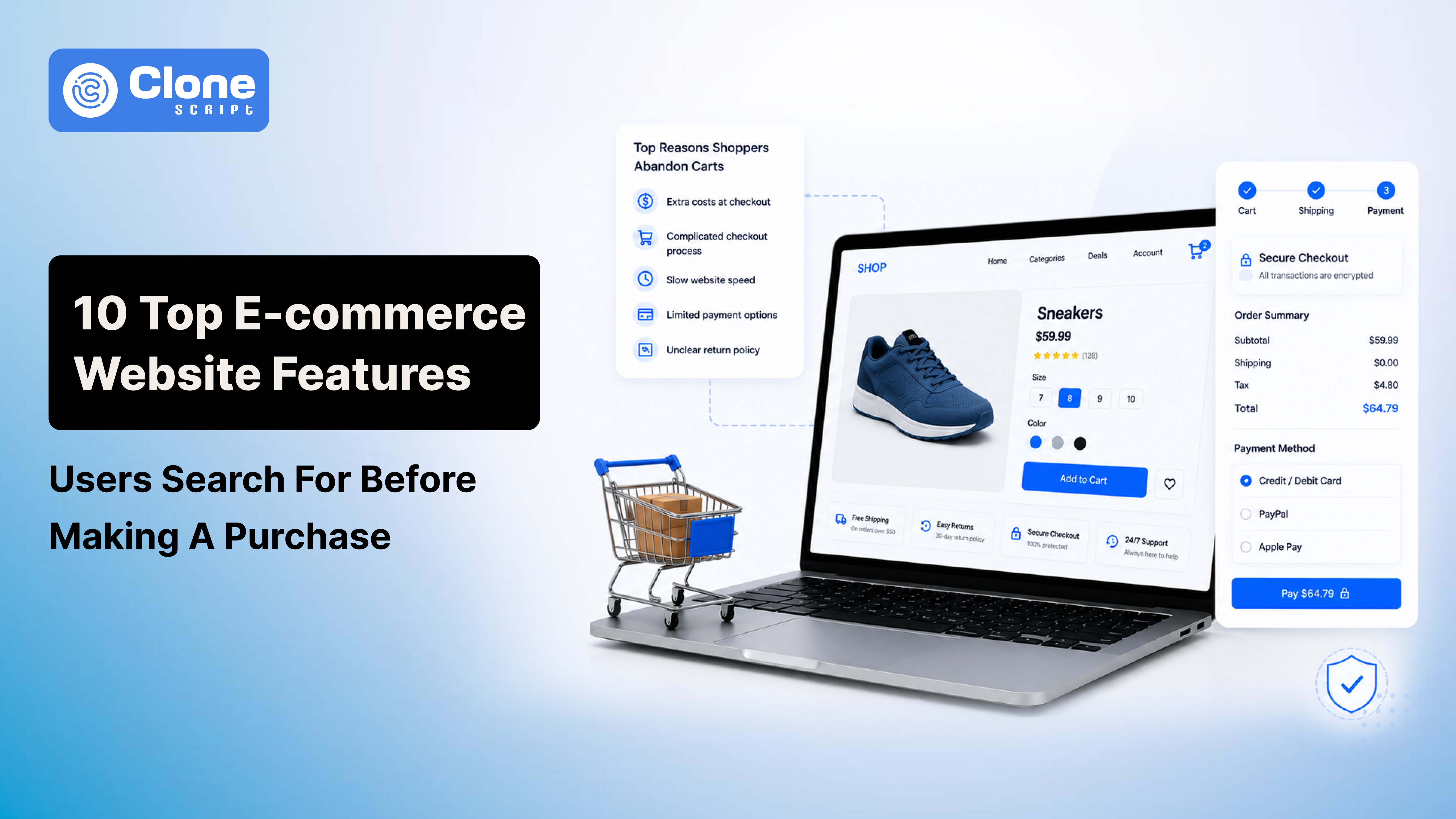
6. Keep Checkout Fast, Simple, and Transparent.
85.65% is the abandonment rate in e-commerce mobile apps, and 25% of users will quit the app after downloading it. (Source: App abandonment rate study by Alexander Jarvis)
What does that mean?
The checkout process is where many potential customers drop off. Optimizing the cosmetic app checkout UX is important now.
Here’s how:
-
Offer a clear, three-step flow: cart → address → payment. This balances a time-saving manner and urgency to trigger sales.
-
Provide multiple payment methods. From COD to online payments through local currencies will reduce the cart abandonment rate.
-
Allow guest checkout for convenience. This will clarify that the business is not involved in the data gathering but is helping people to make their shopping experience smooth.
-
Show all costs upfront, like shipping, taxes, and discounts. So, users aren’t surprised at the last step and skip to complete the purchase. Be transparent at every stage of the sales funnel.
-
Add small design touches like progress indicators and success animations to keep users motivated. Don’t make them confused because if you do, they will feel insecure and not complete the checkout.
-
The security badges on the cart page and payment interface build confidence in customers. They feel safe and proceed further to purchase the product.
Fast, honest, and frustrationless checkouts elevate your app’s reputation and user satisfaction. This will prove to be the best feature of the beauty e-commerce app.
7. Keep Performance Smooth and Lightweight.
No matter how stunning your design is, slow load times can ruin the experience.
Users don’t like to wait around 1 minute to get information only about the makeup product. They need it immediately. For that, your e-commerce mobile app has to be designed accordingly.
Here is the proven way to do that:
-
Optimize images. The image loading increases the load of the overall application. Try to use compressed images rather than raw clicks. Use WebP and PNG format. Don’t compromise the quality. Implement lazy loading on the app.
-
Use adaptive layouts. Making a mobile-friendly shopping experience with responsive app development practices improves the usability. From there, maximum users will download the app and buy the products.
-
Avoid heavy animations. To make the app lightweight, use minimal animations and visuals that are able to guide users to do next step. Getting information through engaging UI elements improves the brand name.
A mobile-first beauty app should feel fluid even on low-speed networks. Lightweight code, caching, and responsive design offer performance across all devices.
A smooth app not only enhances usability but also boosts search ranking and retention — because speed reflects quality.
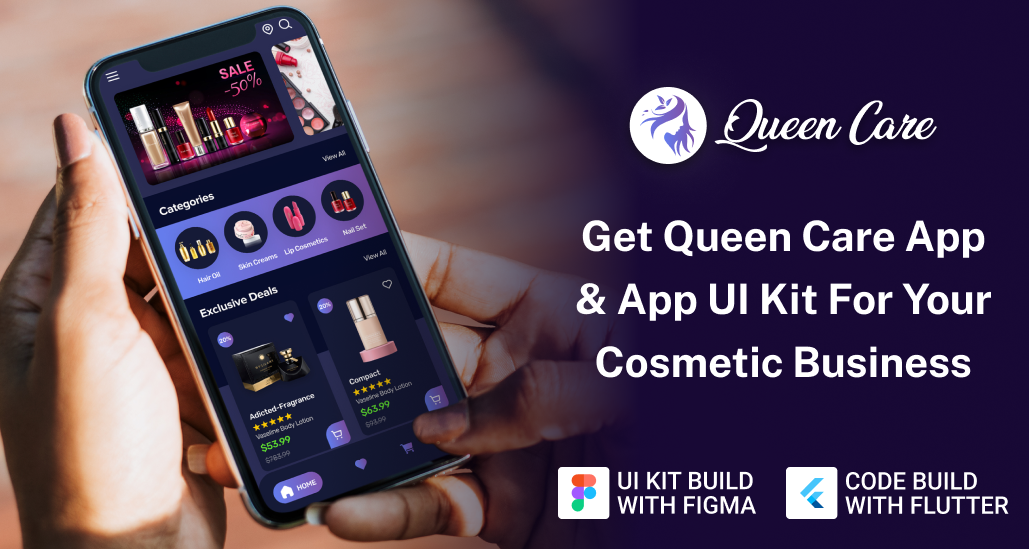
How the Cosmetic E-commerce App UI Kit Can Save Your Time and Cost?
Designing a cosmetic app from scratch takes time, resources, and technical skill. But with pre-designed templates like the Queen Care App Design Template, you can accelerate development without compromising quality.
This UI kit offers pixel-perfect layouts tailored for beauty brands, including:
-
Home screens
-
Product pages
-
Checkout flows
-
Profile designs
All these layouts are optimized for mobile-first usability. It contains cosmetic app UX best practices while maintaining a premium aesthetic.
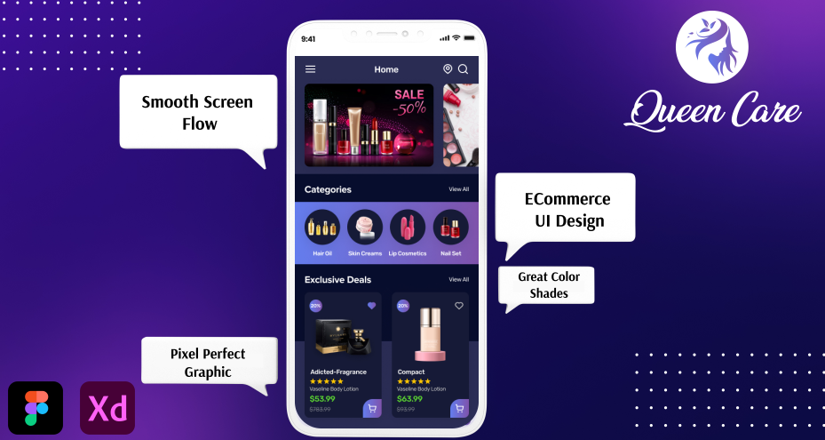
Whether you’re launching a new cosmetic e-commerce app or redesigning an existing one, this ready-to-use design kit saves hours of creative and coding effort. It helps you focus more on user experience than on wireframing from scratch.
Is an E-commerce App Clone Script Beneficial for Clients Seeking Custom Solutions?
Absolutely, especially when time and cost efficiency are top priorities.
The Queen Beauty Care App is a ready-made clone script that provides a customizable framework for developing a cosmetic e-commerce app. It’s not just a shortcut; it’s a head start.
You can personalize the design, integrate custom features, and launch faster, without reinventing the core functionalities. This script helps designers and developers create scalable, high-performing beauty apps with modern aesthetics and flawless UX.
For projects with tight timelines or budgets, a clone script offers the perfect balance between flexibility and efficiency.
Conclusion
Creating a stunning cosmetic e-commerce app is beyond design trends and value emotions, trust, and delight. A well-made interface can make a user feel pampered, understood, and inspired to explore more. The key is in designing not for devices — but for people, their feelings, and their journey toward beauty.
FAQs
-
How can push notifications enhance cosmetic e-commerce app engagement?
Personalized push notifications about offers, restocks, and new arrivals re-engage users, improving session frequency and conversion rates for cosmetic e-commerce apps.
-
What features do users expect in a cosmetic e-commerce app?
Users expect fast navigation, AR try-on, secure checkout, product comparisons, personalized recommendations, and high-quality visuals for a smooth beauty shopping experience.
-
How much does it cost to design a beauty product-selling app?
Design costs vary widely around $500 to $3000, typically based on complexity, screens, animations, and customization. Using UI kits or templates can significantly reduce overall design expenses.
-
How do I improve product discovery in an online shopping app?
Use smart filters, personalized recommendations, trending looks, visual categories, and search optimization to help users quickly find relevant cosmetic products.
-
How can apps increase repeat purchases?
Loyalty rewards, personalized offers, easy reorders, subscription options, and push notifications help motivate users to return and shop more often.