BTC - Bitcoin
 USDTERC20 - USDT ERC20
 ETH - Ethereum
 BNB - Binance
 BCH - Bitcoin Cash
 DOGE - Dogecoin
 TRX - TRON
 USDTTRC20 - USD TRC20
 LTC - LiteCoin
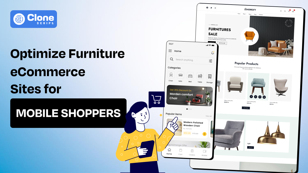
How to Optimize Furniture eCommerce Sites for Mobile Shoppers
Are you ready to transform your local furniture store into a digital showroom where customers can explore premium products from the comfort of their homes? With e-commerce website development, this dream is now a reality.
But here’s the catch: a great design alone won’t cut it in today’s mobile-first world. Over 60% of web traffic now comes from mobile devices, and without optimizing your site for these users, you risk losing a massive chunk of your audience.
In this article, we’ll guide you through proven strategies to optimize your furniture eCommerce site for mobile shoppers and achieve the growth your business deserves.
Why Is Understanding Mobile Shoppers' Behavior Useful?
Mobile shoppers are increasingly influenced by convenience, speed, and accessibility. They often engage in short, decisive sessions, frequently driven by "micro-moments." These behaviors significantly impact how furniture eCommerce businesses should design their mobile strategies.
For furniture eCommerce sites, this means:
-
Quick Visuals: Mobile users expect high-quality, zoomable images that load instantly. Slow-loading visuals can lead to higher bounce rates.
-
Actionable Information: Shoppers prefer concise, scannable product descriptions that provide all the necessary details, such as dimensions, materials, and shipping options.
-
Personalization: Leveraging data-driven personalization tools can boost conversions by offering product recommendations based on browsing history, previous purchases, or location.
Pro Tip: Use tools like Google Analytics and Heatmaps to analyze your mobile traffic data. Understanding where users drop off and which products get the most views can help refine your mobile strategy.
Prefer Mobile-Friendly Design in Website Development.
Think as a user about what a furniture e-commerce website design should be like. You prefer a functional and modern site where you can make your online shopping experience special that creates a memory.
But how can it be possible?
Responsive design is the foundation of a successful mobile eCommerce site. A responsive website confirms that your furniture store fits any screen size automatically and provides a consistent user experience.
Best practices to follow:
-
Thumb-Friendly Navigation: Buttons and links should be easy to clickable without zooming in.
-
Sticky Menus: Keep navigation accessible at all times, even when users scroll down. Use the toggle bar option for better navigation.
-
Minimalistic Design: Make the website design simple yet effective by cutting off the unrequired clutter menus. Prioritize essential elements like product categories, search bars, and CTAs.
Example: IKEA's mobile site presents a clean and intuitive design, making it easy for users to browse furniture collections on smaller screens.
Improving Load Speeds for Mobile Devices.
A slow website can be a dealbreaker for your furniture products. Studies indicate that a 1 second delay in page load time reduces conversions by 7%.
It’s a huge thing to focus on and resolve immediately.
Here are the strategies for optimizing e-commerce website speed for faster load times:
-
Image Optimization: Use compressed formats like WebP and lazy-loading techniques to improve performance.
-
Minify CSS and JavaScript: Reduce the size of unnecessary code files to speed up Javsscript rendering.
-
Content Delivery Network (CDN): Distribute content across servers to decrease latency. This will help your site to adjust the content without facing any glitches around the globe.
Pro Tip: Test your site’s speed with free tools like Google PageSpeed Insights. Check the report and red-colored warning and prioritize fixes that impact Core Web Vitals.
Emphasize on Mobile-Optimized Product Pages.
Once you correct and fix the site’s speed thereafter, optimizing the product pages for mobile devices is important.
Your product pages are the heart of your furniture eCommerce site. To keep mobile users engaged, these pages must be visually appealing and functionally stylish.
Essentials for product page optimization:
-
Use High-Quality Images: Offer zoomable images from multiple angles for each product enhancing the user experience.
-
Short Descriptions: Use bullet points to highlight key features like dimensions, materials, matchability, color options, and gift choices.
-
Quick Access to Reviews: Include customer reviews and ratings prominently on every product page so new users can know about your product and services.
Example: Wayfair’s mobile product pages balance rich visuals and concise information. So, users can make purchase decisions easily.
Integrating AR/VR Features to Furniture E-commerce Website.
One of the worst things for users of online furniture shopping is mismatched size selection. They buy heavy and wide products and then find it's not fit for their premises. This is a very common problem in furniture-selling stores.
Here Augmented reality (AR) and virtual reality (VR) technologies are game-changers for mobile furniture shopping. These tools allow users to visualize furniture in their own spaces, addressing one of the biggest pain points of online shopping.
Use cases of these cutting-edge technologies:
-
AR Viewers: Enable users to see how a sofa or table would look in their living room with 3D models' appearance.
-
VR Showrooms: Create immersive virtual environments where customers can explore furniture collections.
Case Study: Houzz reported that users engaging with their AR tool were 11 times more likely to make a purchase.
Enhancing Mobile Checkout Experience.
A streamlined checkout process is critical for reducing cart abandonment on mobile devices. Avoiding complex forms and multiple steps can prevent potential buyers from shopping. Keep the checkout simple, secure, and fast.
Here is the list of best strategies:
-
Guest Checkout Options: Allow users to purchase without creating an account.
-
Auto-Fill Features: Use autofill for shipping and billing information to save time.
-
Mobile Wallets: Integrate options like Apple Pay, Stripe, and PayPal for seamless transactions. Allowing e-commerce crypto payments will bring tech-savvy GenZs to your platform.
Stat to Note: Optimizing the checkout process for quick completion can increase conversion rates by 35%.
Focusing on Local SEO for Mobile Users.
Furniture eCommerce sites often have physical showrooms or local delivery services. Leveraging local SEO can attract nearby customers who use mobile devices for location-specific searches.
Best practices to follow for Local SEO:
-
Google My Business: Keep your profile updated with accurate business name, address, contact details, hours, and reviews.
-
Geo-Targeted Keywords: Use phrases like “modern furniture store near me” or “local furniture delivery” through blog articles and social media posts.
-
Mobile Maps Integration: Add clickable maps to your website for easy navigation.
Pro Tip: Encourage satisfied customers to leave reviews on Google, as these significantly impact local search rankings.
Start Mobile Marketing for Your Furniture E-commerce Site.
Mobile marketing can strengthen your efforts to reach shoppers where they are most active. From social media campaigns to SMS alerts, targeted strategies can drive both traffic and conversions.
Effective mobile marketing tactics include:
-
Push Notifications: Notify users about sales, restocks, or personalized recommendations.
-
Social Media Ads: Platforms like Instagram and TikTok are ideal for showcasing furniture in styled settings.
-
Shoppable Posts: Take advantage of social commerce as it enables direct purchases from social media platforms to simplify the furniture buying process.
Example: Brands like West Elm use Instagram shoppable posts to convert casual browsers into buyers.
Analytics and Continuous Improvement.
The key to long-term e-commerce success depends on tracking your business performance and making data-driven decisions. By monitoring mobile-specific metrics it became easier to identify bottlenecks and opportunities for growth.
Here is the list of tools to use:
-
Heatmaps: Tools like Hotjar can reveal where users interact most on your site.
-
A/B Testing: Experiment with different layouts, images, and CTAs to see what resonates with mobile users.
-
Mobile SEO Analytics: Regularly audit your mobile rankings and traffic sources. If not getting better results, refine your SEO strategy.
Conclusion
Optimizing furniture eCommerce sites for mobile shoppers is essential in today’s competitive landscape. By focusing on responsive design, fast load speeds, AR/VR integration, and seamless checkouts, you can create a mobile-friendly experience that drives conversions and builds customer loyalty.
The shift to mobile shopping is never going to be outdated, it rewards higher traffic and increased sales.
Take the first step today by auditing your site’s mobile performance and implementing these proven strategies. Contact us for more tailored solutions regarding your needs.