BTC - Bitcoin
 USDTERC20 - USDT ERC20
 ETH - Ethereum
 BNB - Binance
 BCH - Bitcoin Cash
 DOGE - Dogecoin
 TRX - TRON
 USDTTRC20 - USD TRC20
 LTC - LiteCoin
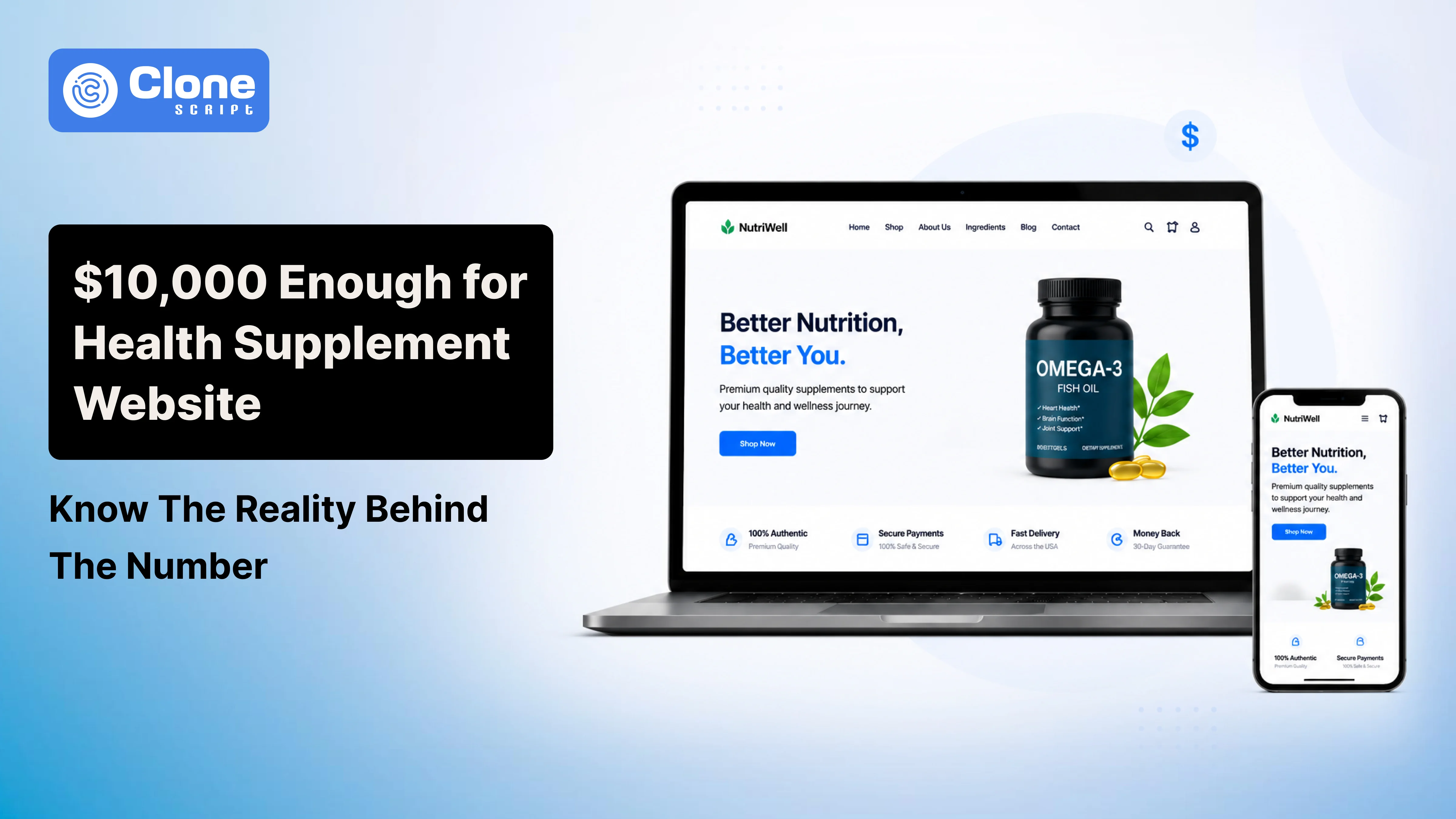
Top 12 E-commerce Design Trends for Health Supplement Websites
Here’s a fact that might surprise you: over 73% of consumers judge a company’s credibility based solely on its website design. In the health supplement world, where trust is the lifeblood of every sale, that statistic carries even more weight.
You can have the most scientifically backed formula and glowing testimonials. But if your website design looks outdated or confusing, visitors will click away long before reading a single product label.
That’s why e-commerce design trends are helpful. Here we will discuss them to make a platform that converts casual visitors into loyal customers. Knowing the reasons to have a brand website for a supplement business is a very effective way to reach customers.
How Design Shapes Trust and Conversions in Supplement E-commerce?
Design for the health and wellness sector isn’t like designing for fashion or tech. When customers shop for supplements, they’re making decisions that affect their health. That means every pixel must inspire confidence.
A strong health supplement website design does three key things:
-
Builds Trust – Through clarity, clean layouts, and authentic visuals, the buyers will judge the brand's authenticity.
-
Guides Users – With an easy-to-navigate structure and consistent hierarchy, the user interaction remains well-maintained.
-
Encourages Action – By making checkout simple and reassuring, the order repeat rate will be more acceptable.
The right design isn’t just about looking good; it’s about communicating integrity. From certifications to ingredient transparency, trust signals for supplements can make or break a visitor’s decision to buy.
12 E-commerce Design Trends for Health Supplement Websites
Here is the list of those online health supplement store website design trends:
-
Clean, Trust-Centered Visual Design
-
Storytelling-Driven Homepages
-
Immersive Product Visualization
-
Personalized Shopping Experiences
-
Subscription-Centric Store Design
-
Engaging Micro-Animations and Smooth Transitions
-
Health-Focused Content Integration
-
Mobile-Optimized Layouts and Speed
-
Smart Checkout Flows for Better Conversions
-
Social Proof and User-Generated Content
-
Video Demonstrations and Explainer Reels
-
Multi-Language and Global Reach
Here’s the understanding of why they’re useful.
1. Clean, Trust-Centered Visual Design
In an industry often clouded by marketing noise, simplicity wins.
The best supplement e-commerce design prioritizes clean, minimal layouts that allow the brand’s science and story to shine.
Designers are now adopting “clinical minimalism.”
What does that mean?
Using calm colors (greens, whites, neutrals), organized product grids, and easy readability will create a professional tone while signaling reliability and purity.
White space isn’t wasted space. It’s breathing room that helps users focus on what matters: trust and transparency.
2. Storytelling-Driven Homepages
Every strong brand starts with a story.
Wellness e-commerce websites are learning that customers buy why you do what you do. Not just what you sell.
The most successful supplement homepages are now storytelling-driven. Instead of overwhelming users with products, they lead with purpose: the founder’s mission, the science behind the formulas, or real stories of transformation.
Implementing scroll-based storytelling, combined with emotional imagery, helps brands feel more human and less transactional.
3. Immersive Product Visualization
Since users can’t physically see or feel supplements, visualization bridges that gap.
You have to design the supplement product page with the best practices, including:
-
360° product rotations. This can be helpful for buyers to check the entire product condition with nutritional and other information in an advanced manner.
-
Ingredient pop-ups explaining health benefits. Once the user lands on the product page then within 3-8 seconds, the short information has to be presented.
-
Lifestyle visuals showing real people using the product. If they find a previous customers are using the product and getting the benefits, the conversion rates will be higher.
These interactive details don’t just make a site look great — they reduce hesitation and boost conversions by giving customers confidence in what they’re buying.
4. Personalized Shopping Experiences
One of the strongest health supplement website trends is personalization. Shoppers today expect experiences tailored to their needs.
But we’re talking about the agile way.
Smart AI personalization for e-commerce (without overcomplicating it) allows users to take quizzes about their health goals and receive supplement recommendations instantly. This feature can be used in the supplement branding and marketing where customers feel something extraordinary.
The question is, how to do it?
From adaptive homepage banners to “Build Your Routine” features, implementing personalization makes customers feel understood, not sold to. It transforms a one-time purchase into a long-term relationship.
5. Subscription-Centric Store Design
The subscription model has become a goldmine for supplement brands and for website designers, but it introduces new UX challenges.
A good subscription UX for supplements must be transparent, flexible, and rewarding. Users should easily see how to:
-
Start or pause their plan. Just be simple here. Don’t be too fancy or use hard language to know how to cancel the plan or renew it.
-
Track shipments and rewards. Within a single click, users have to find the order they booked and the rewards they got after the purchase.
-
Adjust quantities or delivery frequencies. This customization feature helps the brand to sell more wellness products in both segments: B2B and B2C.
Subscription dashboards that visually track health goals can gamify the supplement shopping experience. This makes it enjoyable and sticky. You have to refer first to UI/UX design principles for the dashboard.
6. Engaging Micro-Animations and Smooth Transitions
Micro-animations are small, but their impact is noticeable in conversion. They create movement, guide the eye, and enhance the browsing rhythm.
Think of smooth transitions when hovering over a product card, or a gentle motion as ingredients load. These details make the health brand UX design feel more polished and alive.
The result?
When users find the site on Google and on the consideration stage of the conversion funnel, they will be amazed by the micro-interactions. From there, they proceed to the checkout and complete the purchase.
Used tastefully, animations increase interaction rates and reduce bounce. It gives the site a sophisticated feel.
7. Health-Focused Content Integration
Content is credibility. The best wellness e-commerce websites go beyond selling products. They educate buyers.
By integrating health-focused content layouts like blog posts, expert interviews, or nutrient calculators, designers can increase engagement time.
Once the site is live on the web, with expert blog writing, the SEO visibility will increase. From the organic leads that will be generated, conversion will remain higher.
This educational layer supports trust and positions the brand as an authority, especially valuable in the often unconvinced supplement space.
8. Mobile-Optimized Layouts and Speed
Today’s shoppers are browsing supplements between gym sessions and lunch breaks on their phones. That’s why a mobile-first supplement website is non-negotiable.
Designers must prioritize:
-
Fast loading times (under 2 seconds). This is a coding part of web development, but make sure the animations you added in the designs are loaded within the limit.
-
Finger-friendly buttons and scrolling. The elements and functionality have to be designed for mobile users. The space has to be occupied well on the device, and the content doesn’t have to be invisible.
-
Sticky CTAs that stay visible without being intrusive. The simplicity wins in customer retention and helps them to complete their goals.
Mobile optimization isn’t just good UX. It’s essential for SEO and conversions. A slow, clunky mobile site can lose half its visitors before they even view a product.
9. Smart Checkout Flows for Better Conversions
A beautiful homepage is worthless if checkout causes confusion. Studies show that a 10-second delay can drop conversions by 30%.
The best supplement e-commerce trends are implementing smart, simplified checkouts:
-
One-page layouts. Only a single-page checkout will increase the order completion rate and reduce the cart abandonment rate.
-
Clear progress bars. Use breadcrumbs on the checkout page that help buyers know where they are and how many steps are remaining to complete the purchase.
-
Autofill-enabled forms. To make user retention as expected, implement the systems for automation that fill in the details of customers as previously done.
In addition, add visual trust cues like SSL badges, secure payment icons, and money-back guarantees. These are all part of strong trust signals for supplements that reduce hesitation at the final step.
10. Social Proof and User-Generated Content
In wellness, seeing is believing. Social proof remains one of the most persuasive tools for conversion.
Designers are now integrating user-generated content directly into the site’s framework: testimonial sliders, before-and-after carousels, verified review badges, and influencer spotlights.
This isn’t just about social validation. It’s about authenticity. When users see others are successful with a supplement, it builds instant trust.
11. Video Demonstrations and Explainer Reels
Video continues to dominate digital engagement, and in supplements, it’s a game-changer.
Short, high-quality explainer reels or demo videos showcasing how supplements are made, how they’re taken, or why they work instantly elevate perceived value.
Embedding them strategically on product pages or landing sections keeps users hooked longer. It is a major benefit for both conversion and SEO.
12. Multi-Language and Global Reach
Health is universal. As supplement brands expand globally, multilingual and localized designs are now expected.
Smart designers go beyond translation. They culturally adapt visuals, color psychology, and even product messaging.
Currency toggles, region-based promotions, and inclusive imagery all contribute to a truly global supplement e-commerce design that welcomes users everywhere.
Why Using a Ready-Made UI Kit Speeds Up Quality Design
Let’s face it — creating a full-scale health supplement website design from scratch can be time-consuming. Designers juggling multiple clients need efficiency without sacrificing quality.
That’s where ready-made UI kits shine. The Health Supplement UI Kit offers a professional shortcut:
-
Pre-designed layouts built specifically for supplement brands.
-
Components that follow current e-commerce UI trends.
-
Easy customization in Figma.
-
Consistent spacing, typography, and conversion-friendly CTAs.
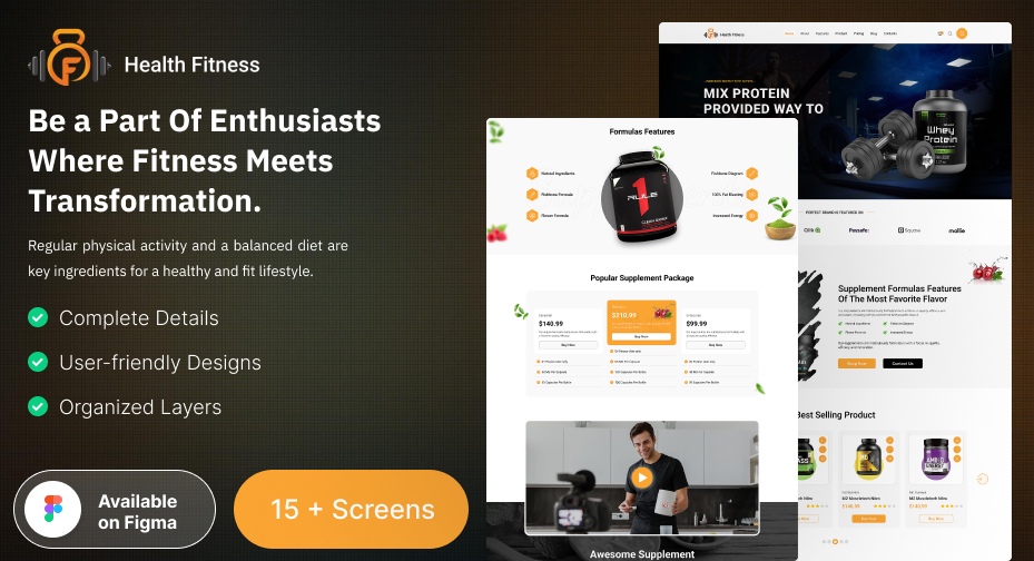
Using a kit like this ensures your project starts 80% done, freeing up your creativity for brand storytelling and user experience polish.
Conclusion
In the competitive wellness market, your design isn’t just the packaging — it is the product. A stunning, trustworthy health supplement website tells customers, “You can believe in us.” With these 12 e-commerce design trends, you’re not only keeping up with digital aesthetics — you’re helping brands build lasting trust in an age where health and honesty go hand in hand.
Whether you’re crafting a minimalist product page or developing a global supplement platform, remember: great design doesn’t shout; it reassures.
FAQs
-
How do color choices affect user trust on health supplement websites?
Color psychology plays a major role in user perception. Cool tones like green and white suggest health and cleanliness, while neutral backgrounds create balance and trust. Vibrant accent colors can highlight CTAs effectively, but too many bright hues may feel unprofessional in the wellness niche.
-
How can a designer make a supplement website stand out in a crowded market?
Focus on brand differentiation through storytelling, authentic imagery, and educational content. Integrate unique UX touches like wellness trackers, lifestyle tips, or interactive supplement finders that enhance the user experience beyond just shopping.
-
How can website speed impact supplement sales?
Even a one-second delay in load time can reduce conversions significantly. Optimize images, compress files, and use lightweight themes to ensure smooth navigation, especially for mobile users.
-
What kind of visuals work best for supplement product pages?
High-quality product photography, ingredient close-ups, lifestyle imagery, and clean packaging visuals are key. Avoid overly filtered stock photos. Authenticity always converts better in wellness e-commerce.
-
How can website design improve customer retention for supplement brands?
Incorporate loyalty programs, easy reordering systems, and subscription dashboards with progress tracking. A strong post-purchase UX keeps users engaged and encourages repeat purchases, a cornerstone of successful supplement ecommerce trends.