BTC - Bitcoin
 USDTERC20 - USDT ERC20
 ETH - Ethereum
 BNB - Binance
 BCH - Bitcoin Cash
 DOGE - Dogecoin
 TRX - TRON
 USDTTRC20 - USD TRC20
 LTC - LiteCoin
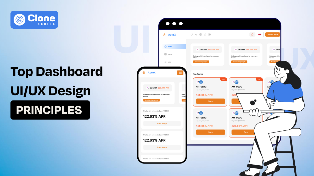
Top 20 Best and Modern Dashboard UI/UX Design Principles You Must Know in 2025
As web designers, our goal with dashboards is to translate complex data into clear, usable interfaces that help users make fast, smart decisions. Whether you're designing an analytics tool, CRM panel, eCommerce backend, or finance tracker, the principles of UI/UX you apply will make or break the user's experience.
In 2025, user expectations have evolved: real-time interactivity, clean visuals, mobile responsiveness, and smart personalization aren’t “nice to have.” They’re expected.
So let’s break down the 20 most important dashboard UI/UX design principles that every web designer must master this year with detailed explanations, examples, and insights.
Principle No.1: Design with User Goals in Mind.
Great dashboard design starts with knowing your audience's intent. Whether your user is a sales manager, data analyst, or logistics operator, they visit the dashboard to solve a problem or monitor performance.
Don’t overwhelm them with data they don’t need.
-
Focus on the most critical KPIs, tasks, or alerts. Ask: What’s the one thing the user must understand in 5 seconds or less? Prioritize that.
-
Conduct interviews, create user personas, and validate use cases before you design anything. This clarity ensures the dashboard serves its purpose, not just aesthetics.
Principle No.2: Prioritize Information Hierarchy
Information hierarchy helps users to distinguish what matters most quickly. Use layout, font sizes, colors, and grouping to establish visual weight. Key metrics or alerts should appear at the top or center, using strong contrast or size.
-
Secondary data can be subtler and placed lower or in tabs. Avoid a flat, cluttered display where everything seems equally important.
-
Instead, guide the eye through a story: highlight what's urgent, then provide context, then details. Done right, hierarchy reduces decision stuck and improves usability, especially for busy users who prefer to scan details.
Principal No.3: Visual Clarity Beats Visual Complexity.
Visual clarity is about stripping away unnecessary design elements to make information easy to process. Clean typography, proper spacing, consistent alignment, and limited color schemes make dashboards more digestible.
-
Avoid overloading users with complex graphs, multiple font styles, or heavy visual decorations. Each element should have a function, not just fill space.
-
In web design, white space is your friend. A clean interface helps users focus, reduces cognitive load, and improves long-term engagement.
Remember, simplicity isn't about being boring. It’s about being intuitive and clear.
Principal No.4: Real-Time Data Should Be Calm, Not Chaotic.
Dashboards need to reflect live data. But real-time updates should feel controlled.
-
Avoid rapid blinking or sudden layout shifts that overwhelm users.
-
Use smooth transitions for updates and show “last refreshed” timestamps.
-
Highlight new data steadily, maybe with a glow or animation.
-
Too much real-time noise creates distraction, not clarity. Also, provide manual refresh options when needed.
Design your system so users trust that what they’re seeing is current, but not at the expense of readability or mental comfort.
Principal No.5: Enable Personalization for Different Roles.
Every user has unique needs, even within the same organization. A customizable dashboard allows users to control how they view and interact with data. Let them rearrange widgets, save filter settings, switch between light and dark modes, or even build their layouts.
-
Personalization improves efficiency and satisfaction. It also reduces the need to create separate dashboards for every department or role.
The more tailored the experience, the more value the user derives, and that means better long-term engagement with your design.
Principal No.6: Choose the Right Chart Type for Each Data Set.
Using the wrong chart can mislead users or create confusion.
-
Line charts are ideal for trends over time, bar charts for comparison, pie charts (sparingly) for proportions, and tables for granular data. Avoid overly creative visuals unless absolutely necessary.
-
Your goal is communication, not visual novelty. Test different formats during wireframing and get feedback from non-designers.
Can they understand it at a glance? If not, revise it. A good chart doesn't just look good, it tells a clear, quick story.
Principal No.7: Simplify Navigation Structure.
Navigation is overlooked in dashboard design, but it plays a critical role in usability.
-
Keep your menu items clear, logically grouped, and accessible. Use a fixed sidebar or top nav bar so users always know where they are.
-
Dropdowns or nested items should be minimal. Also, use breadcrumbs to help users retrace their steps.
Complex dashboards need smart categorization, so don’t make users hunt. Know navigation as a map: the more intuitive it is, the faster users reach their destination.
Principal No.8: Make Dashboards Mobile-Responsive.
Mobile accessibility is no longer optional for executives, field workers, and remote teams, who all rely on phones and tablets. A responsive dashboard adapts its layout based on screen size.
Prioritize essential KPIs on small screens and use collapsible menus or tabs. Touch-friendly design is key: buttons should be large enough, and gestures like swiping should feel natural.
Reduce heavy animations or dense charts that don’t scale well. Test on real devices to check that the experience is seamless across breakpoints.
Principal No.9: Optimize for Fast Loading and Lightweight Performance.
A visually appealing dashboard is useless if it takes 10 seconds to load.
-
Optimize code, compress images, use lazy loading for non-critical sections, and paginate large data sets. Minimize backend calls by caching or pre-fetching data. Users expect responsiveness within 2–3 seconds.
-
Beyond that, frustration sets in. Use skeleton loaders to signal that content is coming. Also, audit the dashboard regularly for bloated libraries, slow scripts, or unnecessary animations.
Performance is part of the user experience. Don’t treat it separately.
Principle No.10: Avoid Cognitive Overload with Smart Layouts.
Cognitive overload happens when users are presented with too much information at once.
-
Use a clean layout with grouped content, section headings, and tabs. White space helps define zones and improves scanability. Avoid overloading the screen with too many charts, metrics, or menus.
-
Instead, guide users through layers, start with summary data, then offer drill-downs or filters. Consider progressive disclosure to hide complex options unless needed. Good UI respects the user’s mental bandwidth and presents content in digestible pieces.
Principle No. 11: Thoughtful Empty and Error States.
Design doesn’t end when data is missing. Empty and error states are opportunities to help users understand what’s wrong and what to do next.
-
If there's no data, explain why, and suggest an action: “No reports yet? Start by adding a data source.”
-
For errors, show helpful messages, not just codes. Use friendly language and supportive visuals. These states create trust and reduce frustration.
A well-designed empty state can feel like an onboarding moment, not a dead end.
Principle No. 12: Make Metrics Actionable.
Data is only useful if users know how to act on it.
For example, on an e-commerce marketplace platform, the dashboard design shows an indicator “Sales dropped 12% this week—click here to view product performance.” It guides the owner to make a proper decision to maintain consistency in the business operations.
-
Design your dashboard to connect metrics with actions. Include thresholds, indicators, or suggestions based on data trends.
-
Use color-coded badges, alerts, or call-to-action buttons directly linked to insights. This not only helps users understand the why behind the data but also what to do about it. They can feel turning a passive experience into an interactive, problem-solving one.
Acknowledging the metrics understanding through a proper testament of the UI design and powering up with the UX practices, it's a perfect combination of product success.
Principle No. 13: Use Microinteractions to Improve Feedback.
Microinteractions are prior design elements that improve usability and make dashboards feel more polished.
-
They include things like button hover states, chart tooltips, filter loading animations, or icon transitions. These tiny cues show that the system is responsive and interactive. They reassure users that an action was registered or a state has changed.
-
When implemented consistently, microinteractions enhance the user experience without distracting from content.
Identify them as the “body language” of your interface, small but meaningful.
Principle No. 14: Make Accessibility a Standard, Not a Bonus.
Your dashboard must be usable for everyone, including people with disabilities. This means designing for screen readers, ensuring strong color contrast, enabling keyboard navigation, and avoiding flashing content.
-
Use semantic HTML and ARIA attributes to make interactive components readable. Also, provide text alternatives for icons and charts. Accessibility is not just ethical, it’s a business imperative.
-
By making your dashboard inclusive, you widen your audience and meet compliance standards like WCAG and ADA. These are becoming legal requirements in many regions.
The inclusive dashboard design helps every stakeholder to access the information without too many problems. They can understand what they see, that’s all.
Principle No. 15: Let Users Filter and Segment with Ease.
Filtering is essential in data-heavy dashboards. Users should be able to slice and dice data by date, category, user, or location easily.
-
Place filters prominently, and use intuitive controls like dropdowns, chips, or sliders. Consider multi-select and auto-complete for large filter sets. Provide immediate visual feedback right away when a filter is applied to not losing attention.
-
Also, allow users to save filter presets or views for quick access later. The smoother the filtering experience, the faster users get to the insight they need.
This results in a quick attention to important details and informs all team members to manage further business operations. It brings positive work collaboration and business success.
Principle No. 16: Maintain Consistent Layout and Grid Systems.
Consistency builds trust in web design, especially a crypto website design. A standardized grid system ensures alignment, spacing, and rhythm across your dashboard. Stick to an 8pt or 12-column grid.
-
Use consistent margins, button sizes, and typography scales. This makes the design feel cohesive, even as content grows. When widgets, charts, or cards follow the same sizing logic, users intuitively understand how to navigate.
-
Visual inconsistency, like misaligned elements or jarring spacing, creates confusion and reduces professionalism. Build a design system or component library to enforce consistency across teams.
In UI designing, one point always remains at the top: to maintain consistency throughout the pages. After all, it’s a part of a professional brand; it should not be like a cheap store.
Principle No. 17: Support Data Export, Print, and Sharing Options.
Users often need to take dashboard data outside the platform. Make it easy to export reports to CSV, Excel, or PDF.
-
Add “copy to clipboard” for quick snippets. Allow screenshots, link sharing, or team-specific dashboard views. These small additions improve collaboration and make the dashboard a tool for communication, not just solo analysis.
-
If it’s enterprise-facing, consider scheduled report emails or Slack integration. Sharing functionality extends the dashboard’s usefulness beyond the app interface design and into real workflows.
As you provide the preferences for sharing the data throughout the system, it makes the task easier for executives to cut across the boundaries of making decisions in group meetings.
Principle No. 18: Test with Real Users, Not Just Stakeholders.
Stakeholders might have opinions, but real users have needs. Test your dashboard with actual end users.
-
Conduct usability tests to check if they understand the layout, navigate smoothly, and learn the data correctly. Observe how they interact with filters, drill-downs, or errors.
-
You’ll uncover issues you didn’t anticipate, like misused icons or unclear charts. Don’t wait until launch, start testing early with wireframes and prototypes. User feedback is the ultimate quality control in dashboard design.
Communicating with the users will clear the picture of where the design needs improvement and what works properly.
Principle No. 19: Reduce Text; Use Icons and Tooltips.
Dashboards are visual tools. Long text blocks clutter the layout and slow down comprehension.
-
Replace repetitive labels with icons (but label them for accessibility). Use tooltips for extra context or definitions.
-
Keep descriptions short and snappy. A user shouldn’t have to read a paragraph to understand a metric. If a term is complex, consider a glossary or a help icon that links to documentation.
For example, you asked to prepare a meme coin website design. You could add the functionality of hovering over a revenue figure to show the calculation formula of stake amounts. This will provide better clarification of how the crypto project is going.
Principle No. 20: Always Open to Welcome Feedback.
A dashboard is never truly finished. Once it’s live, gather user feedback regularly.
-
Use heatmaps, session recordings, or feedback widgets to learn what works and what confuses users. Monitor usage data to see which widgets get ignored.
-
Prioritize updates based on real-world use, not assumptions. Even simple tweaks like moving a KPI card or adjusting font size can improve clarity and satisfaction. Treat your dashboard like a living product that grows with your users, not a one-time design project.
Most of the successful dashboard designs don’t ignore what the users experience. If you do it correctly, the dashboard will be a great tool for them to consume proactively.
Conclusion
Dashboard UI/UX design in 2025 is no longer just about making things look sleek; it's about creating data experiences that are intuitive, actionable, and user-focused. Whether you're designing for enterprise teams, SaaS platforms, or internal tools, these 20 principles serve as a modern blueprint for success.
From clarity and hierarchy to accessibility and personalization, every decision you make in your layout shapes how users understand and act on data. As a web designer, your job is not just to present numbers; it's to design trust, speed, and insight into every click.
Keep refining, keep testing, and never stop designing with the user in mind. Because when your dashboard helps users to make smarter decisions effortlessly, that’s when your design truly delivers value.