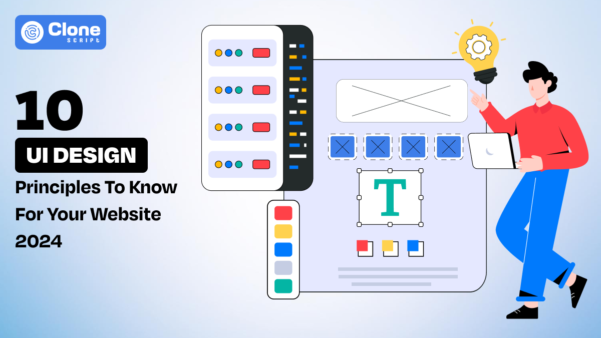
10 UI Design Principles That Will Revolutionize Your Website in 2024
Did you know? According to reports, 88% of online shoppers are never likely to come back to a website after a bad and frustrating user experience.
In the website trends of 2024, the UI design principles work as the guide to craft a useful, scalable, and perfect digital product.
A poorly designed user interface (UI) is considered a red signal. It can significantly impact your online business, leading to lost sales, decreased customer satisfaction, and a damaged brand reputation and goodwill.
On the other hand, a well-designed UI can drive conversions, improve customer loyalty, and set your website apart from the competition. This is the ultimate goal of the best responsive website design.
As the technology revolution is introduced to the web, a website is your digital brand gateway to capture a user's attention and influence them to take the desired action and accomplish the business objectives.
In this comprehensive guide, we'll delve into the 10 common UI design principles that can revolutionize your website in 2024.
By understanding and executing these principles, you'll be well on your way to crafting a website that not only looks stunning or modern but also delivers an exceptional user experience.
Let's explore it.
Understanding UI and UX
Before you deep dive into the website UI and UX design, it’s best to clarify the definition. So, you can easily understand the principles and differences between UI and UX.
A. Definition of UI Design
At its core, the UI or user interface design symbolizes making a visually appealing digital product. In that, you have to ensure using aesthetic visual elements to make the design responsive, scalable, and adaptable.
Most importantly, UI designs include everything that users will see and interact with. This includes colors, typography, layout, buttons, forms, and overall elegance. A well-designed user interface makes a product attractive, intuitive to navigate, and enjoyable to use for a long time.
B. Definition of UX Design
UX design focuses on creating the best interactive and engaging experience for digital products (e.g. websites). This includes factors like how much the design is usable, accessible, or helping the user to accomplish the goal.
Your UX design should be crafted with a complete understanding of user needs, and able to solve the pain points. For that, you have to conduct proper research regarding which kind of website UI design trends exist in 2024 and how you can address them for better reach.
C. Difference of UI and UX Design
UI and UX are the two main pillars of any web-based digital product used interchangeably. However, user interface design and user experience are different from each other such as the coins side. Most importantly, a perfect combination of these two is considered a web design challenge.
You can understand a website UI design is like the packaging of a product. It's about making the product visually attention-grabbing and attractive to potential customers with the help of eye-catching color palettes, graphic elements, progressive bars, and icons.
At the same time, a UX design is like the contents of the package. It's about ensuring that the product is high-quality, easy to use, meets customer needs, and provides unique value. To create a truly successful digital product, both UI and UX need to be considered in duo.
[Read Problems Of Buying Meme Coin Templates.]
User Interface (UI) Design Principles
1. Consistency: The cornerstone of great user experience
Consistency is one of the most fundamental UI design principles to keep focus on. It ensures that your website feels cohesive and predictable, making it easier for users to navigate and interact with. When elements are consistent, users can quickly learn how to use the website and avoid confusion.
Key aspects of maintaining consistency in UI design
- Use the same fonts, colors, and styles on the entire website. This creates a unified look and feel that is visually appealing and easy to recognize.
- Maintain a consistent layout structure across different pages from registration to complete checkout for e-commerce website development. This helps users understand the website's navigation and find the information they need.
- Buttons should always perform the same action when clicked, regardless of their location on the website. This can be achieved with responsive figma UI designs.
- Align your website's design with your brand's identity. This helps to strengthen your brand's message and create a strong connection with your audience.
2. Hierarchy: guiding users through your website
Move to another web UI design principle, and it is a "Hierarchy." This principle helps to organize and structure information on your website that is understood by search engines and humans. Consider establishing a clear visual hierarchy, you can guide users through your content and make it easier for them to find what they're looking for without any delay.
Key elements of Hierarchy in UI design include:
- Size: Larger elements are considered more important than smaller ones. So, break your web content into titles, headings, and subheadings showcasing appropriate information to users.
- Color: Use contrasting colors in web design to highlight important elements such as the header, navigation bar, footer, and other sections.
- Font weight: Preferring readable fonts in user interface designs is a great sign of the best UX, so implementing bold or heavier fonts can make text appear more prominent.
- Placement: To increase the engagement rate of your website user interface design, the placement of the elements is very crucial. It's good to place it at the top or left of the page where most of the users interact with.
- Spacing: Fair spacing between elements can create a sense of content and visual hierarchy and improve readability in small-sized smartphone devices.
3. Feedback: Providing Clear and Timely Information
The best responsive website design relies on clear and effective feedback representation. Your user interface designs should be helpful for users to understand the status of their actions and guide how to proceed further to complete it.
Keep note: effective feedback can improve the overall user experience and reduce the frustration that keeps engaging users on your website.
Key types of feedback in UI design include:
- Visual feedback: Implement visual cues, such as color changes, animations, or progress indicators that provide information about the user's actions.
- Haptic feedback: Make sure your design user interface has an option for vibrations or other physical sensations to provide feedback, especially on mobile devices.
- Audio feedback: For visually disabled users, you can try using sounds or voice prompts to deliver information or confirmation for completing the action.
- Textual feedback: With a clear and concise message, you can inform users about the status of their actions.
4. Accessibility: Ensuring Your Website is Inclusive
The fourth principle of UI design named "Accessibility" which means your website can be used by people with disabilities. With compliance with this principle, your website will be accessible, you can reach a wider audience, improve the overall user experience, and demonstrate your commitment to inclusivity. By investing in accessibility in user interface design, you are showing that you care about making a positive impact on the world.
Key accessibility guidelines to follow for best user interface design:
- WCAG (Web Content Accessibility Guidelines): These guidelines outline standards for making web content accessible to people with disabilities.
- ARIA (Accessible Rich Internet Applications): ARIA provides complete techniques for making web applications accessible to screen reader users.
- Color contrast: Ensure sufficient color contrast between text and background to make it readable for visually impaired people.
- Alternative text: Provide alternative text for images to describe the descriptive content for screen reader users who have poor internet connection.
- Keyboard navigation: Double-check that your website UI design can be navigated using a keyboard in mobile phones, without requiring a mouse.
- Focus indicators: Using clear focus indicators helps users to navigate your website using a keyboard. A responsive figma UI design can help create the best indicators for digital products.
- Captioning: Provide captions for videos and audio content to make them accessible to people who suffering from deafness or clear hearing.
[Read Why to Choose WordPress Meme Coin Theme.]
5. Clarity: Making Your Website Easy to Understand
Clarity is another important UI design principle to keep an eye on. Your website should be clear and concise as much as possible from clarifying the content to placements of call-to-actions.
Don't try to frustrate the users.
A precise website can help to guide users towards desired actions, such as making a purchase or signing up for a newsletter.
A proper navigation flow, content labeling, and better user experiences keep search engines informed from understanding the site content and indexing it. This can improve your website's search engine rankings and SEO efforts.
Key aspects of clarity in UI design include:
- Simple language: Don't use technical jargon. Keep using clear and simple language that is easy to understand for everyone.
- Consistent terminology: Use constant terminology throughout your website design to avoid confusion or frequent modifications.
- Logical structure: Organize your content logically and intuitively that is helpful for people and search engines to understand your website.
- Minimalist design: Maintain the website's user interface simple as much as possible. Avoid clutter and distractions to keep your website focused and easy to understand. Using a figma platform, you can create the best UI design with ease and maintain quality.
- Clear calls to action: Utilize clear and concise calls to action buttons and forms to guide users towards desired actions.
6. Affordance: Making Actions Obvious and Intuitive
Affordance is a website user interface design principle that refers to the sensed usability of an object. It is a crucial aspect of website design because it allows users to understand how to interact with a website without having to guess or experiment.
When components have clear affordances, users can intuitively understand how to use them, leading to a more seamless and enjoyable experience on your website.
Key aspects of affordance in UI design include:
- Visual cues: Employing visual cues for buttons, links, and icons with color, shape, and size to indicate that an element can be interacted with. For example, buttons may be colored differently than the rest of the page to make them stand out.
- Hover effects: Changing the appearance of an element when the user hovers over it with their mouse cursor. This can provide visual feedback and indicate that the element is easily interactive.
- Clear labels: Using clear and concise labels to describe the purpose of each element. For example, a button might have a label like "Submit" or "Click here."
7. Responsiveness: Adapting to Different Devices
Responsive user interface design is counted as a key success of your website development. There's no need to design the layouts for each device from desktop computers to tablets and smartphones. Having a mobile-responsive website UI design unlocks the opportunity to attract more customers and increase conversion rates around the globe.
Key aspects of responsive design include:
- Fluid layouts: Consider implementing fluid layouts that adjust to the width of the screen automatically, ensuring that content is displayed appropriately on different-sized devices from small to large. With figma responsive design, you can create a scalable UI for your web development project.
- Flexible images: Add images that scale to fit the screen size without losing quality and load initially with a proper internet connection.
- Media queries: Adding media queries to the UI design makes applying different styles based on the screen size and orientation of the device.
- Touch optimization: Design your website to be easy to use with touchscreens, including larger buttons and touch-friendly interactions to reduce the chances of using the website on particular devices.
8. Simplicity: Less is More
Simplicity is usually overlooked in UI design, but it's an important principle that can significantly improve the user experience. A simple and uncluttered interface is easier to understand, navigate, and use.
When designing a website or app, it's important to remember that users are often busy and distracted. A complex and cluttered interface can be overwhelming and frustrating, making it difficult for them to find what they need and complete their tasks. So, less is more appreciated in website design.
Key aspects of simplicity in UI design include:
- Minimalism: Create visual breathing room between elements to improve readability by using white space effectively. Remove unnecessary elements and distractions from your website.
- Clear hierarchy: Use a clear visual hierarchy to guide users through your content from the landing page to the contact page. Don't try to lose the user's attention by breaking the content hierarchy.
- Intuitive navigation: A simple interface is easier to understand and navigate, reducing the cognitive load on users and making it more likely that they will achieve their goals.
[Read Advantages for Developing E-commerce Mobile App]
9. Visual Balance: Creating Harmonious Designs
Visual balance is another essential UI design principle that contributes to the overall aesthetic appeal and usability of a website. A perfect visually balanced website is more credible to engage users and create a positive impression.
Be mindful of the perceived weight of elements and adjust their size, color, or placement accordingly. Prioritizing the figma UI designs can be a great choice for creating a useful product for your client.
Key elements of visual balance include:
- Weight: The correct weight of an element is influenced by its size, color, position, and complexity. Larger elements, brighter colors, and graphics placed closer to the center of the page are generally having more weight.
- Placement: The placement of elements on the page can also affect the overall balance.
- Contrast: Using contrasting elements can help to create balance. For example, a large, dark element can be balanced by a smaller, lighter element.
- Negative space: The amount of space around elements can also affect the appearance of the website. Negative space can help to create a sense of harmony and balance, even when elements are asymmetrical.
10. Usability: Making Your Website Easy to Use
To improve your website user experience, make sure the UI design has a characteristic of usability. It permits users to be more likely to engage with a website that is easy to use and understand.
Also, a usable website can lead to higher conversion rates to complete desired actions. Ultimately, keep focusing on usable web UI design to improve your brand's reputation and build trust with your users.
Key aspects of usability in website UI design include:
- Clarity: Make sure your website is easy to understand and navigate. Use clear language, consistent labeling, and intuitive navigation menus.
- Efficiency: Design your website to minimize the number of steps required for users to complete further tasks.
- Memorability: Make the user interface design easy for users to remember how to use your website. Use consistent design elements and familiar patterns.
- Errors: Prevent errors by designing your website to minimize the risk of mistakes. Provide clear error messages and helpful guidance once it occur.
- Satisfaction: Create a positive and enjoyable user experience. Consider factors such as aesthetics, speed, and responsiveness.
Considering the website user interface design principles for website development, you can create the best digital products for your clients. Once your client is satisfied with the solution you are entitled to believe your efforts in web design being successful.
[Read E-commerce Mobile App Can Transform Your Online Store For Best Brand]
Common Mistakes to Avoid In Web UI Design
Designing the user interface for a website is not easy and there's a chance for mistakes.
Here we mention some of the common issues of UI design.
1. Neglecting User Research
One of the most common mistakes in UI design is neglecting user research. User research is essential for understanding your target audience's needs, preferences, and behaviors. By conducting deep user research, you can identify pain points, gather feedback, and ensure that your website is designed to meet the needs of your users.
2. Overcomplicating Interfaces
Another mistake is overcomplicating interfaces. A cluttered and confusing interface can make it difficult for users to find what they need. It can lead to a negative user experience. So, it is important to keep your website's design simple and intuitive.
3. Ignoring Accessibility
Accessibility is often overlooked in UI design, but it is essential for ensuring that your website can be used by everyone, regardless of their abilities. Ignoring accessibility can signs to a negative user experience for people with disabilities and can also have legal implications.
Conclusion
In today's competitive digital landscape, the well-designed website design trends of 2024 are appreciated. Here, user interface (UI) is essential for success. By understanding and implementing the 10 UI design principles outlined in this article, you can create a website that is not only visually appealing but also highly functional, user-friendly, and responsive, too.
Remember, a modernized website is an investment in your business that can lead to increased conversions, improved brand reputation, and long-term success. So, take the time to prioritize website UI design and get the rewards.
Best Solution by All Clone Script
Are you looking to buy a perfect, modern, and aesthetic web UI design to accelerate your web development?
All Clone Script is the best company to take the help.
As our user interfaces are created under modern frameworks as in Figma responsive design, they remain professional and stylish for a long time.
Here is the list of website UI designs we offers:
- E-commerce
- Cryptocurrency and meme coins
- Education
- Food delivery
- Health & Fitness
- Blockchain
You can pick any of them as per your choice. However, if you need a custom UI design for your web development project, we can do that. Contact us with additional information and rest from it we will manage.
We’re waiting for your message, so hurry up and get your website ready without involving in designing work.
 BTC - Bitcoin
 USDTERC20 - USDT ERC20
 ETH - Ethereum
 BNB - Binance
 BCH - Bitcoin Cash
 DOGE - Dogecoin
 TRX - TRON
 USDTTRC20 - USD TRC20
 LTC - LiteCoin

