BTC - Bitcoin
 USDTERC20 - USDT ERC20
 ETH - Ethereum
 BNB - Binance
 BCH - Bitcoin Cash
 DOGE - Dogecoin
 TRX - TRON
 USDTTRC20 - USD TRC20
 LTC - LiteCoin
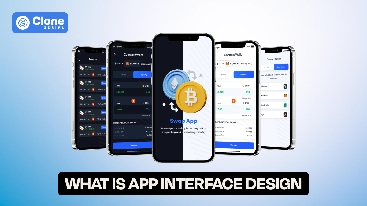
What Is App Interface Design? A Complete Beginner’s Guide
Ever downloaded an app, opened it full of excitement, only to close it within seconds because it looked confusing or felt clunky?
That right there is the result of poor app interface design.
In a world where we tap our screens more than we blink, a great interface can be the difference between an app people love and one they uninstall after the first try. But don’t worry if all of this sounds a bit technical right now.
In this beginner-friendly guide, we’ll break down exactly what app interface design is, why it matters, and how to start creating interfaces that users actually enjoy.
What Is App Interface Design?
App user interface design refers UI is all about how your app looks and feels when someone is using it. It covers everything your users see and touch, buttons, colors, icons, menus, layout, animations, and more.
Think of it as the face of your app. It’s the part users interact with to get things done, whether they’re ordering food, booking a flight, or tracking their steps.
The main goal?&
To make the app easy to use, visually appealing, and intuitive for every user.
You can have the smartest app in the world, but if the interface feels awkward or confusing, people will leave fast.
Why Is App Interface Design So Important?
Let’s say you open a shopping app. You can’t find the “Add to Cart” button, the colors are too bright, and the text is hard to read.
Would you keep using it? Probably not.
Here’s why great UI design (user interface design) is essential:
-
First impressions matter – Most users decide within the first few seconds if they’ll stick around or bounce.
-
It affects how people feel – A clean, smooth interface builds trust and satisfaction.
-
It drives conversions – Good design guides users to take action, like signing up or making a purchase.
-
It helps your brand stand out – In crowded app stores, looks do matter. To attract a first click, the app design is to have a unique appeal.
-
It keeps users coming back – An enjoyable app experience is key to retention. Especially in product-based businesses like e-commerce and food ordering.
In short, a great app interface isn’t just nice to have, it’s business-driven.
What’s the Difference Between UI and UX?
This is a question that a lot of beginners find hard to answer. Let’s clear it up.
-
UI (User Interface) is about how your app looks. Basically, it represents the visuals.
-
UX (User Experience) is about how your app works. It defines the user journey from opening the app to completing an action like purchase, booking, ordering, playing, etc.
Here’s a simple analogy:
UI is the steering wheel. UX is the driving experience.
A beautifully designed app (good UI) can still be frustrating if the flow doesn’t make sense (poor UX). Ideally, they should work hand-in-hand.
The Core Elements of App Interface Design
Now that you know what UI is and why it matters, let’s break down the building blocks of great app interface design.
1. Layout
This is the structure of your app’s screens, where everything sits. A good layout makes the app feel organized and predictable. It avoids clutter and helps users find what they need.
2. Typography
Fonts are more powerful than you think. They affect readability and tone. Use clean, legible fonts in the app with proper size and spacing to make text reading comfortable on small screens.
3. Colors
Colors guide attention and influence emotion. Choose a color scheme that aligns with your brand and creates enough contrast for readability. Also, don’t forget about dark mode support!
4. Buttons & Icons
These are the interactive elements. Buttons should look clickable (or tappable) and be placed where users expect them. Use Neuromorphism effects to make buttons more engaging. Icons should be familiar, like as shopping carts, hearts, or search magnifying glasses.
5. Imagery and Graphics
Images can bring your app to life, but only if used purposefully. Avoid overloading the interface in the app. Stick with visuals that support the content or functionality. Real images can be a good option to target potential users to invest in your products and services.
6. Navigation
Whether it’s bottom tabs, a hamburger menu, or swiping gestures, users should know exactly how to get from one part of the app to another. Keep the app design navigation intuitive and consistent.
7. Micro-interactions
These are the small animations or feedback actions (like a button bouncing or a loading spinner). They add polish and let users know the app is responding to their touch.
Tools You Can Use to Design App Interfaces (No Experience Needed)
Creating a sleek, user-friendly app interface in 2025 is easier with the right tools. Whether you’re a beginner or a seasoned designer, these top UI tools offer everything you need to design high-quality app interfaces.
-
Figma
Figma remains the industry favorite in 2025. It’s browser-based, free for individuals, and great for real-time collaboration. With powerful prototyping and a huge library of community templates, it’s perfect for both solo designers and teams.
-
Adobe XD
Known for its clean interface and fast prototyping, Adobe XD is ideal for creating interactive designs and animations. It integrates seamlessly with other Adobe design tools and is beginner-friendly.
-
Sketch
Sketch is a Mac-only tool loved for its vector editing and reusable components. Though it’s more popular with advanced designers, it offers excellent plugin support for extending functionality.
-
Framer
Framer combines design with code. It’s ideal for creating high-fidelity prototypes and micro-interactions, and now includes AI-assisted layout features to speed up your process.
-
Penpot
Penpot is a free, open-source tool gaining traction for cross-team design collaboration. It’s browser-based and flexible, great for startups and open-source projects.
Choose based on your design needs, team workflow, and comfort level.
How to Start Designing Your First App Interface (Step-by-Step)
Here’s a simple roadmap to get your feet wet in app interface design:
Step 1: Define Your App’s Purpose
Before you design a single screen, get clear on what your app is for and who it’s for. This step is your foundation. Ask:
-
What problem does my app solve?
-
Who is my ideal user?
-
What do I want users to achieve?
For example, if you're designing a fitness tracker for busy professionals, the design should be clean, quick to navigate, and goal-oriented. Knowing your audience influences everything—from layout to tone to functionality.
Step 2: Sketch Some Wireframes
Wireframes are basic outlines of your app screens, like the architectural blueprint before building a house. Don’t worry about colors, fonts, or fancy design yet. Just focus on layout and user flow.
You can sketch with pen and paper or use tools like Figma or Balsamiq to create low-fidelity wireframes. Ask yourself:
-
“Where should buttons go?
-
How does the user move between screens?
Step 3: Choose a Color Palette and Fonts
Now it’s time to bring personality into your design. Choose a color palette that reflects your brand (calm blues, energetic reds, modern neutrals—whatever suits your app).
Next, pick fonts that are clean, readable, and mobile-friendly. Consistency is key. Don’t use more than two or three font styles throughout your app.
Step 4: Add Interactions
This is where your interface comes to life. Add the following:
-
Buttons for actions (e.g., "Sign Up", "Submit")
-
Icons for clarity (e.g., a trash can for delete)
-
Input fields for forms (e.g., name, email, password)
It includes what users will tap, swipe, or scroll. Make sure interactive elements are placed where people expect them. Keep it intuitive. No one wants to go to the next step.
Step 5: Test and Improve
You’re not done once you’ve designed it. Testing is important.
Try walking through the app yourself. Better yet, ask someone unfamiliar with your project to use it. Watch how they interact, and note any confusion or hesitation.
Ask questions like:
-
“Is this button clear?”
-
“Can you find what you’re looking for?”
-
“Was anything frustrating?”
Then, refine based on feedback. Great interfaces aren’t built overnight. They evolve through testing and iteration.
Examples of Good App Interface Design
Sometimes the best way to learn is to study others. Here are some well-known apps with clean, effective interface design:
-
Instagram
Instagram’s interface is clean and familiar. With consistent layouts, easy-to-recognize icons, and smooth navigation, users can quickly post, browse, or interact with content without feeling overwhelmed.
-
Duolingo
Duolingo’s playful design keeps learners motivated. Bright colors, animated characters, and gamified progress tracking make the app feel like a game while maintaining clear, intuitive lesson flows for all ages.
-
Uber
Uber offers a streamlined experience. From opening the app to booking a ride, everything is fast and visual. Real-time maps, simple address input, and a clean design guide users effortlessly.
-
Headspace
Headspace’s interface is calm and welcoming. Soft color palettes, minimal elements, and a gentle onboarding process create a relaxing experience that aligns perfectly with the app’s mental wellness focus.
App Interface Design Trends in 2025
Want to future-proof your app? Keep an eye on these interface design trends:
-
Personalized UI with AI
AI-driven interfaces adjust layouts, content, and features based on user behavior, offering a more tailored, intuitive experience that feels unique to each individual’s habits and preferences.
-
Voice-Controlled Interfaces
Voice commands are gaining traction, especially in productivity and smart home apps, allowing hands-free navigation and faster task execution through natural language processing and intelligent voice recognition.
-
Augmented Reality (AR) UI
AR interfaces bring digital elements into the real world. Popular in retail, real estate, and education, they let users preview products or environments in real-time using mobile cameras.
-
Minimalist Layouts
Minimalist design emphasizes clarity by using smart white space, simple icons, and focused content. It improves readability and user experience by removing distractions and guiding attention to essential elements.
-
Dark Mode
Dark mode enhances visual comfort, saves battery on OLED screens, and is now expected in most apps. It adds aesthetic appeal while reducing eye strain during nighttime use.
Final Thoughts: Start Simple, Keep Going
You don’t need to be a pro designer to understand or even start working on app interface design.
Just remember:
-
Focus on clarity and simplicity.
-
Design for your users, not just your own preferences.
-
Keep testing and improving based on real feedback.
As you gain confidence, you’ll start to notice good and bad UI everywhere. You’ll develop an eye for what works.