BTC - Bitcoin
 USDTERC20 - USDT ERC20
 ETH - Ethereum
 BNB - Binance
 BCH - Bitcoin Cash
 DOGE - Dogecoin
 TRX - TRON
 USDTTRC20 - USD TRC20
 LTC - LiteCoin
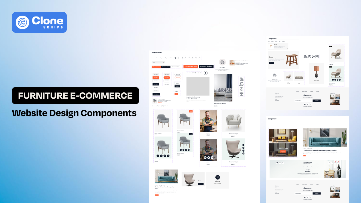
10 Key Design Components Every Furniture E-commerce Website Should Have
Furniture website design is a unique challenge, and it’s a fact. It’s not about adding 5 layouts with images and handing them over to the client for approval. Most designers make this mistake, and it costs them more revisions in design, extending the project deadline, and they feel doubtful.
We know online furniture shopping is slow, expensive, and comparison-requiring. People don’t buy a sofa the way they buy headphones. They browse, leave, return, measure spaces, and discuss decisions with others. A furniture website must support this behavior without friction.
The guide explains how furniture website design should be approached in Figma, using real design logic instead of surface-level tips. It also explains why certain furniture website design ideas work, while others look good but fail in practice.
Why Furniture Website Design Needs a Different Mindset?
Before discussing components, it’s important to understand why furniture websites behave differently from most e-commerce platforms.
Furniture products on the website are based on the following things:
-
Occupy physical space in real homes
-
Have long decision cycles.
-
Require visualization and comparison.
-
Often involves delivery complexity.
This means the best furniture website design is not the most animated or trendy one. It is the one that removes uncertainty step by step.
Here you have a two-way:
-
Pick a custom design option
-
Use a ready-made furniture store website template.
What the client wants, and you need to clarify and decide which option is better.
Let us be clear.
If the client needs to make a complete branded furniture website with complex features and is ready to spend thousands on design, then the first choice is good.
If you want to show the design to the client for prototype approval and handoff to the development team to start work on it, website design templates are a prominent choice.
A well-structured website helps designers focus on decisions instead of layouts, but only if the template is built around real buying behavior.
It’s ok to have an accurate design to help clients own a branded website for their furniture e-commerce. But what are the components that define the best e-commerce store?
10 Furniture E-commerce Website Design Components to Look
Most of the famous furniture e-commerce stores have these design components, and for your store also prefer:
-
Clear Navigation & Category Structure
-
Hero Section with Visual Focus
-
Trust & Social Proof Elements
-
Search & Filtering System
-
Product Listing & Grid Layout
-
Shopping Cart & Checkout Flow
-
Secure Payment Flow
-
Order Tracking System
-
Blog & Content Sections
-
Personalization & Recommendations
See what role these design components play in the website.
Component 1 — Clear Navigation & Category Structure
This component lays the foundation of a successful e-commerce store.
-
Navigation
First, when we open any famous furniture store on the mobile or desktop, we see the static section, a “navigation bar.”
Do you know that Navigation is where most furniture e-commerce websites quietly fail? Not because designers don’t try, but because they design navigation like a menu instead of a mental map.
Users don’t ask: “What SKU category does this product belong to?”
They ask: “What works in my living room, a wooden sofa or stylish chairs with comfort?”
A strong furniture website design starts by mirroring this mental model into a calming decision.
-
Category
When having different kinds of products, you can’t put on a single page of a category. Every product has to be presented according to spaces, types, materials, use cases, etc. So, a category-wise furniture representation helps customers to easily find what they need.
Here’s the common design pattern used for category dropdown:
Structuring navigation around rooms first > product types > materials, or styles.
We can say that navigation should be treated as a system with variants, not a static header. Designers should look for growth, seasonal categories, and promotion showcases without redesigning the entire structure each time.
In essence, when navigation feels intuitive and guided than push to sale, users explore more confidently. It directly affects engagement and return visits.
Component 2 — Hero Section with Visual Focus
The hero section on a furniture website is not a billboard. It is a visual orientation point to create interest in products. From there, the furniture shoppers will understand the context before commitment.
In other words, one of the best hero sections sets expectations about style, quality, and positioning. Here is how:
-
Highlighting the collection accurately, a room setup presentation, a seasonal theme like Christmas or New Year Sale, and representing use cases.
-
Large, well-explained visuals (images and videos) paired with restrained typography stand out from crowded layouts.
Some of the famous furniture websites use the hero sections to establish mood and direction. They do not try to push discounts aggressively.
From a design standpoint, hero sections should be flexible. Furniture brands often rotate collections, and rigid hero layouts become outdated quickly. The hero components should support different content lengths, image styles, and calls to action without breaking the layout.
A good hero doesn’t try to explain everything. It invites exploration.
Component 3 — Trust & Social Proof Elements
This is the third component of the furniture website, and it’s a “trust & social proof elements.”
Buying the furniture online, whether it’s a sofa, table, bed, or cupboard, is not as easy as purchasing t-shirts and shoes. As these products are heavy and utilize more space on the premises, it takes time to finalize the decision.
People hesitate, compare, and often seek reassurance before adding the furniture to the cart. This is where trust and social proof quietly influence decisions.
-
Trust elements
First, understand the trust elements. These elements are embedded naturally into the browsing experience just near the decision points. Some of the examples are product ratings, customer reviews, delivery assurance, and return policies.
-
Social proof
Next is social proof. In the best furniture website design, social proof is subtle but consistent. A small rating near product titles, verified buyer tags in reviews, and clear delivery timelines do more than promotional badges ever will.
To make sure the website is designed for users, the trust elements should follow the same visual rhythm as the rest of the site.
Inconsistent styles or oversized icons can actually reduce credibility. It can’t be retrieved once it's gone.
When working in Figma, designers should create reusable components for ratings, reviews, and policy highlights so they appear uniform across the site.
Component 4 — Search & Filtering System
Search and filtering are often treated as technical features, but in furniture e-commerce, they are core design components.
-
Search suggestion
Most users don’t arrive knowing exactly what they want. They browse broadly and narrow slowly. A search system that only works for exact keywords creates friction early in the journey.
So, what is a good furniture search to support?
It has to support discovery. Auto-suggestions with product images, category hints, and popular searches help users move forward instead of hitting dead ends.
-
Filtering option
Filtering plays a similar role. The goal is not to show every possible option, but to help users eliminate what doesn’t fit their needs. In reality, a few high-impact filters, price, material, size, and color do most of the work.
States like “applied,” “cleared,” and “no results” deserve just as much attention as the default view. A good filtering experience makes large catalogs feel manageable.
When designing this in the Furniture website, search and filters should be treated as interactive flows, not static UI elements.
Component 5 — Product Listing & Grid Layout
Behind a e-commerce website product page, the landing page design psychology works for one intention: to help customers make decisions.
Yet designers treated product listing pages as a secondary screen, and then all goes to ruin.
So, why is listing page design important for a furniture store?
In reality, listing pages function as comparison tools. Users scan, pause, compare, and scroll repeatedly. Then, finally, they decide let’s purchase the product.
If essential information is missing at this stage, users are forced to open multiple product pages, and this is the red signal.
-
The role of grid layouts
Effective grid layouts balance visual appeal with information density. Here is the explanation.
-
Every product card clearly communicates what the product is, how much it costs, and what makes it different from other products.
-
Maintaining consistent image ratios and spacing properly manages the entire layout without affecting the UX.
Designers should test how layouts behave with different product counts, image styles, and screen sizes. The best furniture website design focuses on reducing friction during comparison, not just making grids look neat.
Component 6 — Shopping Cart & Checkout Flow
The shopping cart on a website is not a final step. It is a review space.
Users reach the cart to double-check decisions, not to rush into payment. So, a shopping cart has to be designed accordingly. Creating urgency feels unsuitable for high-value products like furniture.
Here are the elements that define what a well-designed cart shows:
-
Large product visuals
-
Clear pricing
-
Editable quantities
-
Delivery information without hiding details
It should feel calm and informative, rather than pushing towards sales.
Now, let’s move forward towards the checkout layout. Here, playing the game of fire will cost you more as users not completing the checkout, the revenue goes down, and the brand reputation will be affected.
We recommend the things to follow when designing a checkout page e-commerce website:
-
Clear steps
-
Visible progress (preferable breadcrumbs)
-
Early cost disclosure (shipping costs)
-
Delivery address (home address, city, country)
-
Contact information
Your goal is to help users move forward confidently, not surprise them by adding more details, which is the biggest reason for cart abandonment.
The best practice is to prototype the cart and checkout as a continuous experience, not isolated screens. This helps you identify friction points early and refine transitions before e-commerce website development.
Component 7 — Secure Payment Flow
Thinking only of security in a furniture store is just a backend concern? No, it’s not. It is also a design responsibility.
As furniture items are purchased with higher amounts, the security should be reflected at every point in the online payment page. A single point of friction leads directly to canceled purchase, and business doesn’t want that kind of ROI.
So, what defines the payment page design it is safe or not? Here are elements considered to add:
-
Clear indicators, such as payment method logos
-
Encryption cues
-
Payment status (processing, successful, failed)
-
Concise explanations (order status screen queue, accepted icons or animations)
These elements allow customers to believe their privacy is not compromised, and they can proceed with the payments.
The question is what the payment page flow should look like.
Choosing the payment method (digital wallet, credit/debit cards, bank transfer, crypto payments) > entering details > confirm payment.
While integrating payment gateways to your e-commerce website (take a guess, PayPal), include the logo of it in the design. This also increases the trust in payment completion as online transactions are not exposed.
You can say that a secure payment flow should look trustworthy before it is technically secure.
Component 8 — Order Tracking System
Order tracking is usually overlooked in design discussions, yet it plays a major role in post-purchase experience.
It’s common to know that furniture delivery takes time. During that time, users want clarity. A simple, well-designed order tracking system reduces anxiety and support requests.
Good tracking design shows the following details:
-
Current order status: This element shows every phase of the order history from confirmation to the current status, like dispatched, in transit, and out for delivery.
-
Expected delivery timeline: This helps customers to know when their furniture product to be delivered, and they can arrange a prior time for easy delivery.
-
Contact or support options: This information provides contact information regarding delivery concerns or any related queries.
-
Delivery company details: This clearly states which delivery company is responsible for product handover to the door. This interface also includes other shipping details, like by train, ship, and air.
In essence, tracking pages should be clear and easy to understand. Overdesigning this area can confuse users instead of helping them.
Including order tracking as part of the overall furniture website design shows attention to the full customer journey, not just the sale.
However, if partnering with delivery partners, they offer complete support through API-based integration that comes along with pre-designed templates for the tracking page.
Component 9 — Blog & Content Sections
Content on a furniture website is not decoration. It is decision support.
To make content marketing efforts optimized for an e-commerce website, the “Blog Section” becomes most important. Just copying the blog theme from another platform does not make it good to believe.
The blog layout design has to make the purchase decision easy. Here, we recommend the approach to follow:
-
Blog listing landing page with categories
-
Bifurcation of the latest, popular, and most viewed blogs
-
Blog detail page
-
Rich text support (headings, images, embed, links, typography)
-
Author & publish, update date fields
-
Featured image
However, other important pages like About Us, Contact, Privacy Policy, Return & Exchange Policy, and Refund Policy are also designed to make communication easy.
Design-wise, the blog and content sections should not feel disconnected from the shopping experience. Content should feel like an extension of the store, both visually and structurally.
Component 10 — Personalization & Recommendations
Website personalization tools help to make customers feel they are in your virtual furniture store. But never to compromise the design aspect.
What does that mean?
Completing the product purchase on an e-commerce store is a first-time interaction. It’s a good one. But when they visit again, then approaching them with a recommendation like “similar products,” “complete the room,” or “frequently paired items” keeps them connected with the brand. Random suggestions break trust quickly.
Recommendation modules should be flexible and reusable. Their placement should feel intentional, usually after users have engaged with a product or category.
This design pattern has been identified in a famous online furniture website, as they use personalization to reduce effort.
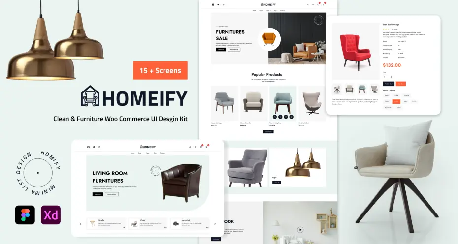
Looking for a ready-made solution that has every component available?
Yes, we have.
Homeify Furniture Website Figma Design Template
This Homeify website design template is made in Figma and contains every UI component, icons, images, sections, and layouts that help you to make a business website for clients. Customizing the design as per the brand guidelines, like setting colors, changing the logo, and restructuring the sections according to priority, saves your time from manual trial on it.
Final Thoughts
Furniture e-commerce design is not about trends. It’s about patience, structure, and respect for how people make high-value decisions.
As a designer, your work succeeds when users feel informed, not rushed.
That’s what defines professional furniture website design.