10 Best Hero Section Examples of Famous Websites You Can Refer To
Most websites stay silent. Not because the product is weak, the market is wrong, or the technology is outdated. But because the first screen does not do its job. You hold it right: it’s all about the hero section.
Users arrive, glance for a few seconds, feel uncertain, and leave. This failure almost always happens in the website’s hero section.
So, what is the best way to reduce these chances and improve the entire website UI design and UX optimization efforts?
This article will explain everything, like the hero section definition, and the famous website examples that win the customer’s trust with the right use of this section.
What Is the Definition of a Hero Section on a Website?
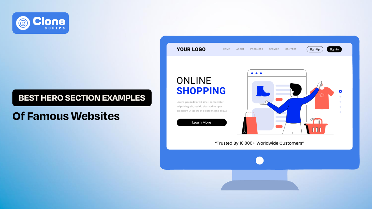
A hero section is the first interaction point that the user can initially see. It is the most prominent content block at the top of a webpage, positioned above the fold. The intention behind designing a hero section is to communicate the core value proposition and guide the users to take the next action.
Don’t ever try to understand the hero section is the combination of a simple header and subheadlines; stick with the CTAs. This section introduces the brand messaging, layout, visual emphasis, and interaction into a single decision-making surface.
It fulfills the perspective of both user experience and business.
-
UX Perspective: The hero section reduces uncertainty. It tells users they are in the right place and helps them decide what to do next.
-
Business Perspective: It is the highest-impact conversion area on the page, directly influencing bounce rate, engagement, and perceived trust.
So there’s no doubt to say this is a well-designed hero section that creates alignment between user expectations and product promise. From there, the rest of the page to deepen understanding becomes easy.
5 Advantages of Having a Prominent Hero Section on the Website
Don’t have an interesting hero section on your business website, you’re missing these advantages to entitle:
-
Immediate Orientation
A well-optimized hero section does not confuse users but guides them naturally to the offering. This means they can understand the product or services in a second and decide to navigate the website for more information and reduce cognitive load.
-
Faster Trust Formation
Even if your product is genuine and service is top-notch, customers need a trust element to justify your brand. The hero section does half of the work through premium design quality, clarity of message, and visual consistency to communicate legitimacy before any interaction occurs.
-
Clear Behavioral Direction
The intention of having a hero section on the website is to give a proper path to users on what to do next. It should not confuse the users. Through content hierarchy, color contrast, and CTA placement, the possible outcome like clicks and interaction with the brand.
-
Improved Engagement Metrics
Most of the interaction on the website is done on the hero section, and it can be identified from the heatmap. Analyzing engagement metrics like scroll, explore, interact, and click, you can see the result after the change you have made.
-
Direct Impact on Conversions
To drive a conversion on a website, the hero section plays the anchor role. For example, a sign-up on the newsletter platform, a product demo video on an e-commerce website, or searching for food on a foodtech website.
In short, without the perfect hero section, your website becomes just an NPA asset for your business that can’t get leads, conversions, and brand awareness.
What Elements Are Available in the Hero Section?
There are two types of elements that can usually be found in the website’s hero section:
-
Core Elements
-
Secondary Elements
Let’s understand them.
-
Core Elements
In this type of element, the following are included:
-
Headline: The headline is the most important component to communicate a clear outcome or benefit, not a vague mission.
-
Subheadline: The subheadline adds specificity or clarifies to the audience what the product or service is and why it's useful for their needs.
-
CTA button: The primary call to action defines the next step, like booking the service, watching the demo, or contacting sales.
-
Visuals: The hero visual, whether UI, illustration, or motion, reinforces the message rather than decorating it.
-
Secondary Elements
These elements generally include:
-
Secondary CTAs: These buttons help primary CTAs to drive conversions, like we usually see the button “Contact” aside from “Book Now.”
-
Social proof: To add more trust in your product or service, the testimonials or trusted brands in the hero section add transparency.
-
Input fields: This is usually a contact form or a details filling block where it can be used for communication purposes.
-
Subtle animation: The minimal animation for loading, success, or queue increase the user feedback.
-
Navigation shortcut: Adding more accessibility to the website will be helpful to users through buttons and breadcrumbs.
These elements should only be introduced when they reduce frustration or improve clarity. Every additional element increases cognitive load and must earn its place.
10 Best Hero Section Example Websites for Design Inspiration
When designing a website, refer to these hero section types of examples:
-
Linear.app
-
Raycast
-
Superhuman
-
Vercel
-
Framer
-
Pitch
-
Unsplash
-
Headspace
-
Locomotive.ca
-
Hotjar
Let’s look at what every example carries.
1. Linear.app - Minimal Typography-Focused Hero Section
Linear is a modern issue-tracking and project management tool built for high-performance software teams. Its hero section reflects the product’s core promise: speed, focus, and zero friction. The design immediately signals that Linear is engineered for serious product work, not bloated workflows.

Best About Hero Section:
-
The headline is short and outcome-focused. It avoids marketing promotion and speaks directly to developer priorities.
-
A dark, restrained color palette adds weight to a technical, performance-driven brand identity.
-
The product UI is shown honestly, without decorative exaggeration that builds immediate trust.
-
Subtle motion communicates responsiveness and speed rather than visual spectacle.
-
The secondary elements of trusted brands highlight the USP of this app.
-
Generous spacing keeps attention centered on the value proposition.
-
The primary CTA is calm and non-pushy. It aligns with Linear’s low-friction onboarding philosophy.
2. Raycast - Product UI Preview Hero Section
Raycast is a macOS productivity launcher designed for power users and developers, along with the Windows BETA version. The good part of this website’s first section is that it instantly connects with a niche audience by emphasizing control, speed, and keyboard-driven workflows. This means users can understand what the product actually is.

Best About Hero Section:
-
The headline avoids generic productivity language and speaks directly to advanced users.
-
Real command interface visuals demonstrate practical, everyday use cases.
-
Bright accent colors add personality without confusing the layout.
-
Motion is fast and responsive, introducing the product’s performance promise.
-
Visual hierarchy leads users naturally from message to interface to action.
-
The CTA feels like an invitation to explore rather than a sales push.
3. Superhuman - Split Layout (Content + Visual) Hero Section
By visiting the Superhuman’s (productivity tool) hero section, you can see what it does best at the first level. They implement the split layout that contains content and visuals about the product offerings. Generally, this type of hero section can be found in SaaS providers who want to convey the service along with the real use cases.

Best About Hero Section:
-
A bold, confident headline frames the product as a competitive advantage.
-
The minimal copy creates focus and authority in the serving segment.
-
High-contrast typography improves clarity and confidence in the use cases.
-
Visual restraint signals premium positioning, as users identify the value proposition.
-
Subtle social proof with loop effects in the secondary element supports credibility without distraction.
-
The CTA just after the subheadline emphasizes belonging and access, not just signup.
4. Vercel - Dark-Mode, High-Contrast Hero Section
The most famous type of hero section is a high-contrast layout with a dark mode appearance. The Vercel website, an AI cloud infrastructure platform, correctly employs the dark mode first section. As the user audience is developers and product teams, the headline directly talks about their needs and preferred viewing experience.

Best About Hero Section:
-
It displays a clear value proposition without technical jargon that improves utility.
-
The colorful backgrounds add depth while preserving readability.
-
Having a strong typographic hierarchy supports instant scanning with ease.
-
Dual CTAs serve different user intents, like starting deployment or watching a demo.
-
The clean layout sounds reliable and scalable for the audience.
-
The pixel-driven background highlights the product development that silently showcases the use case.
5. Framer - Motion-Driven Hero (Subtle) Section
In most productivity tools, the more utility depends on what it tells instantly. The Framer website works correctly with simple motion effects regarding newly made websites on the platform. From this kind of presentation, users can instantly connect with themselves to the product use cases. All credit goes to the motion style hero section that communicates creative freedom and experimentation, appealing to designers who want more control than static tools allow.

Best About Hero Section:
-
Its expressive headline focuses on the creative possibility that most other tools ignore.
-
Live interactions replace confusing descriptions in other no-code website marketplaces.
-
The motion effect from every scroll demonstrates capability, not decoration.
-
A visual hierarchy balances energy and clarity of the product to present formally.
-
The CTA encourages hands-on exploration of what users will get.
-
The first section reflects the product’s flexible mindset, like Figma vs Framer.
-
The secondary element has a social proof section that highlights the trustworthiness.
6. Pitch - Brand-Storytelling Hero Section
Not a single business wants to compromise when it comes to branding. Through the hero section, most of the brand awareness efforts can be optimized. But how? See the Pitch website’s landing page section: the headline, the color, the clickable navigation, everything is optimized for the product use case.

Best About Hero Section:
-
A vibrant color palette establishes a strong brand identity in the competition.
-
Headline emphasizes collaboration and speed that traditional software can’t highlight.
-
The animated slide previews show real use cases to point out the product’s importance.
-
A visual rhythm keeps the section engaging for conversions.
-
The motion design showcases the teamwork and progress.
-
CTA language focuses on shared productivity, offering clarity.
7. Unsplash - Search-First / Utility Hero Section
Unsplash is a platform for a high-quality visual library for free stock photography. In this segment, users are in a hurry to search and get the image easily. Unsplash’s hero section does the job very perfectly by adding a search bar and a subheadline about the use cases. After it, the different types of image representation get the attention of visitors.

Best About Hero Section:
-
A full-width imagery section creates instant emotional engagement.
-
The minimal text avoids competing with visuals and gives what’s now trending.
-
The search bar embedded directly in the hero adds proper utility.
-
Neutral typography supports readability even on smartphones or small-sized devices.
-
Dynamic images keep the experience fresh every time the user visits.
-
The CTA button does not push to sales but talks about genuine use cases.
8. Headspace - Illustration-Based Hero
The MedTech platforms have to be designed very carefully, and for that hero section is the most important factor to focus on. Headspace, an online meditation website, is the right example of it. Presenting two illustration screens referring to the health checkup and plan subscription for mindfulness highlights what is important for patients. No general or marketing copy or animations needed.

Best About Headspace Hero Section:
-
The empathetic headline speaks to the user's feelings and invites them to use the service.
-
The soft color palette reduces cognitive load when users need attention for mediation.
-
Friendly illustrations presentation offers emotional trust, even a first first-time users.
-
The gentle motion creates mindfulness about the services.
-
A spacious layout enhances calmness that can be a masterstroke for mental well-being.
-
The CTA button feels supportive, not urgent to book the service.
9. Locomotive.ca - Portfolio / Creative Studio Hero
Locomotive is a digital-first design agency helping businesses to present their brand uniquely. The best thing about the locomotive’s hero section is that the immediate connection with the users through visuals, typography, and motion effects wins the trust. So, showcasing their portfolio is not text-driven, but the visuals tell the entire story in a promising way.

Best About Locomotive.ca Hero Section:
-
The experimental typography challenges conventions and sets the platform apart.
-
A scroll-based interactions create a unique experience that can rarely be found.
-
The minimal copy lets visuals lead with perfection.
-
A strong contrast establishes confidence for users to take an interest in the offerings.
-
Motion is intentional and narrative-driven based on the user’s preferences.
-
The filters attract the right clients, which improves conversions.
10. Hotjar - Conversion-Focused SaaS Hero
The first impression should be positive in the Software-as-a-Service industry because it relates to conversions. The Hotjar website is the right example of how to convince users without being too promotional. Simply explaining the complexity makes the product more useful and scalable to users for their needs.

What’s Special About Hotjar’s Hero Section?
-
The headline directly addresses user pain points, such as analyzing the heatmap.
-
Illustrations humanize abstract data in a scannable way.
-
A clear hierarchy guides product understanding in a proposed manner.
-
Trust signals appear early, which improves interaction with the brand.
-
Proper messaging reduces intimidation and doubts, like no credit card needed.
-
CTA follows the explanation logically.
These examples are not just an inspiration for the hero section design but also provide guidelines on what to do. Building a successful website depends on the proper presentation of functionality. Always prefer to be on the right track and value what users need.
What Practices Should Designers Follow When Designing a Hero Section?
Here is the practice web designer can consider for the hero section design. You can also follow:
-
They should begin with clear messaging before visual styling.
-
The hero section must instantly communicate what the product is, who it is for, and why it matters.
-
Strong visual hierarchy is essential. Headlines should lead, supporting text should clarify, and CTAs should stand out naturally.
-
Designers should avoid overcrowding and focus on one primary action.
-
Performance, accessibility, and responsiveness must be considered from the start, not as afterthoughts.
-
Motion and visuals should direct to the meaning, not distract.
-
Most importantly, hero sections should be tested and refined based on real user behavior, not personal preference.
Every website is designed to become helpful to users, so what type of hero section to use depends on what you want to achieve: brand awareness, sign-up, leads, etc.
The general question most web design teams have: Should we go with the ready-to-use user interface (UI) kits or not? Let’s get the answer.
Why Ready-Made UI Kits Help Speed Up Hero Section Design?
Here is an overview of using the website UI kits helpful in product designing:
-
These UI kits accelerate hero section design by removing repetitive structural decisions.
-
They provide pre-tested layouts, spacing systems, typography scales, and responsive components that designers can trust.
-
Instead of rebuilding foundations, designers can focus on refining messaging, visual storytelling, and brand differentiation.
-
UI kits also ensure consistency across screens and projects. It reduces design debt.
-
For teams, they improve collaboration and speed up iteration. Getting feedback in web development cycles has become faster.
When used correctly, UI kits do not limit creativity. They free designers to spend time on solving real UX and communication problems rather than reinventing basic patterns.
AllClone Script has 175+ ready-made Figma website UI design kits in different segments like crypto, finance, e-commerce, learning, food, web3, blockchain, SaaS, taxi booking, etc.
Conclusion
Understand that a hero section is not a trend or a visual flourish. It is a strategic surface where clarity, trust, and intent converge. The best hero sections orient users quickly, respect their attention, and guide behavior without force. By studying how leading products design their hero sections, designers can create first impressions that are not only visually strong but genuinely effective. Using the ready-made UI kits also becomes helpful to deliver the product to clients.
FAQs
-
What are the different types of hero section website designs that exist?
There are seven types of hero sections: image-based, video, split layouts, product-focused, minimal text, interactive, and search-based. Every section is designed to match user intent and business goals.
-
Is the color combination important in the hero section design?
Yes. Color combinations strongly impact first impressions, readability, emotional response, and brand trust. Proper contrast improves accessibility, while consistent brand colors help users instantly recognize and understand the website.
-
Is there any chance to improve the conversions through the first section of the website?
Yes. A clear value proposition, strong headline, focused CTA, and relevant visuals in the hero section can significantly improve engagement, reduce bounce rates, and increase overall conversion rates.
-
Using a no-code website development tool makes my site professional?
Yes, when used correctly. No-code tools can produce professional websites if designers focus on layout, typography, performance, and branding instead of relying solely on default templates.
-
What common mistakes should I have to avoid for the e-commerce website hero section?
In the e-commerce website hero section, mistakes are as follows: not adding clutter layouts, unclear headlines, wrong CTA placement, irrelevant visuals, and slow-loading media. The section has to highlight the value, product, and trust without hiding the key offers.
-
Can I change my existing website hero section for more sign-ups?
Yes. You can update your hero section to increase sign-ups, but keep the core promise unchanged. Maintain brand colors, use supporting tones, and place clear CTAs where users can easily see and click.
 BTC - Bitcoin
 USDTERC20 - USDT ERC20
 ETH - Ethereum
 BNB - Binance
 BCH - Bitcoin Cash
 DOGE - Dogecoin
 TRX - TRON
 USDTTRC20 - USD TRC20
 LTC - LiteCoin

