BTC - Bitcoin
 USDTERC20 - USDT ERC20
 ETH - Ethereum
 BNB - Binance
 BCH - Bitcoin Cash
 DOGE - Dogecoin
 TRX - TRON
 USDTTRC20 - USD TRC20
 LTC - LiteCoin
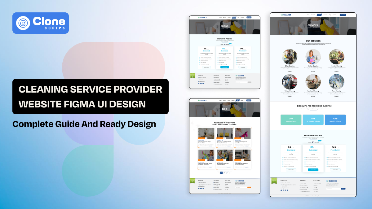
Cleaning Service Website Figma Template for Local Businesses
The on-demand cleaning service business is becoming more localized than a global footprint. Here, the website design is important because even though the homepage seems to be confusing, the button is not working, or the background color does not appear as expected, the users will leave.
What does that mean?
A strategic cleaning service website design does more than showcase services. It builds credibility, communicates professionalism, and guides visitors toward booking. Designing this experience in Figma allows structured layouts, scalable systems, and seamless client-side developer collaboration.
This guide explains how to design a high-converting cleaning website from scratch, including UI strategy and practical implementation guidance. We also include the Figma design template that can be useful for development.
Why Cleaning Service Website Design Matters in 2026
The local services market has become digitally competitive. Franchise brands like Molly Maid and Merry Maids invest heavily in clean layouts and trust-building design. Even aggregator platforms such as Handy prioritize simplified booking interfaces.
Nowadays, customers are wise, clever, and organized to judge the service quality before clicking the booking button. This includes visual clarity, structured service presentation, and strong calls-to-action, which directly influence conversion rates. A well-designed interface reduces doubt and increases appointment submissions.
Modern cleaning websites must focus on three fundamentals:
-
Trust-first presentation: Clear visuals and certifications build an immediate reliability perception.
-
Service clarity: Visitors must instantly understand available cleaning packages.
-
Booking simplicity: Fewer steps (2-3) increase completed service requests significantly.
Web designers who understand these principles build websites that generate measurable results.
Core Pages Required in a Cleaning Service Website
A structured site architecture improves both usability and performance. Each page must serve a distinct conversion purpose rather than existing as filler content. Below is the essential page structure for a professional cleaning company website.
-
Homepage
The homepage should function as a conversion funnel. It must clearly state what the business does, where it operates, and how to book.
Here are the essential homepage elements to focus on:
-
Hero section: A website’s hero section mentions a clear headline that communicates value and service area instantly.
-
Primary CTA: Having a visible booking button encourages immediate user action even on mobile devices.
-
Service preview grid: The cleaning service page’s quick overview prevents unnecessary navigation friction.
-
Testimonials block: Social proof increases confidence and inquiry rates to make marketing campaigns successful.
Keep messaging concise and action-oriented for the website.
-
Services Page
Don’t consider the service page only a landing page. It works as a service booking engine.
The services page should provide structured explanations of all offerings. Believe in simplicity and avoid long paragraphs, and instead focus on scannable service breakdowns.
Here are common service categories to focus on:
-
Residential cleaning: This includes routine home cleaning tailored to weekly or monthly schedules.
-
Deep cleaning: It is known for intensive cleaning, covering overlooked areas, and sanitization.
-
Move-in / move-out cleaning: This can include a preparation cleaning for tenants and landlords.
-
Commercial cleaning: This is a perfect option for office and workspace sanitation services for businesses.
Each service card should contain a short description, benefits, and a CTA that specifically presents what the customer will get.
-
About Page
Look, not a first time websit visitor booked the service initially. That’s why the About page is required. Cleaning businesses are trust-driven operations. Customers want reassurance that professionals entering their homes are trained and verified.
Include these credibility signals on this page:
-
Licensed and insured statement: Clearly demonstrates compliance and operational professionalism. Try to add third-party links that the service provider is genuine.
-
Experience timeline: Mention how many years of service your cleaning has completed, and it’s required to establish authority and reliability.
-
Team introduction: Displaying the workforce behind the cleaning company with LinkedIn, X, and Facebook profiles. Humanizing the brand increases emotional trust.
-
Mission statement: Communicates service standards and quality commitment through realistic and emotionally connecting words.
Do not forget to add authentic imagery because it works better than stock photography.
-
Pricing Page
Pricing page design on the cleaning service website is a clear landing page with the intent of purchasing the service with a single bunch or bundled with a subscription.
Transparent pricing improves lead quality. When customers understand expected costs, they are more likely to proceed confidently.
Important pricing components to add to the website:
-
Package tiers: This can help to clearly define cleaning levels and pricing to simplify customer decisions.
-
Add-on services: Sometimes, customers need additional service so this helps them to pay extras. This increase average order value.
-
Custom quote CTA: This provides a flexible pricing option for larger cleaning requirements such as commercial complexes, schools, library and exhibition halls.
-
Comparison layout: The structured pricing tables highlight value differences effectively.
Avoid overwhelming users with too many pricing variations.
-
Booking Page
This page directly affects revenue generation. The layout must reduce friction and make scheduling intuitive.
Here are the core booking elements to know:
-
Step-by-step form: Dividing fields for online booking steps through the website improves completion rates significantly.
-
Date and time selector: The booking engine has to be optimized with a calendar interface to ensure clear appointment selection.
-
Address input field: This is required for local service validation, and providers will easily reach the place.
-
Confirmation CTA: Strong final action increases booking commitment and conversion rates.
Note that: simplify the user journey wherever possible.
-
Contact Page
The contact page should eliminate confusion. It must clearly display essential communication channels.
Key aspects to include in this page:
-
Clickable phone number: Customers can easily call the customer service without filling in the time-consuming details.
-
Google Map embed: To improve the trust of the cleaning service company, it’s perfect to display the service location and operational legitimacy.
-
Business hours section: Sets expectations for response times clearly, that reduce confusion.
-
Email contact form: This is an alternative channel for non-urgent inquiries and has to be present.
Accessibility in cleaning service website improves local trust.
UI Design Principles for Cleaning Service Websites
Designing for cleaning services requires intentional minimalism. The aesthetic must reflect cleanliness and professionalism without appearing prominent.
-
Trust-Driven Color Palette
Color psychology directly impacts perception. Cleaning brands often use combinations of blue, green, and white to signal freshness and reliability.
Our design recommendations are:
-
Blue tones: This is known for conveying professionalism and structured service reliability.
-
Green accents: This tone suggests eco-friendly cleaning solutions and safety.
-
White space: It is required to enhance clarity and reinforce cleanliness perception.
Avoid overly saturated or aggressive color schemes.
-
Visual Hierarchy
A strong hierarchy guides user attention naturally. Headlines, subheadings, and CTAs should be clearly differentiated in size and weight.
Cleaning website hierarchy best practices:
-
Large primary headings: Capture attention within the first three seconds through the convincing headlines. You may ask web copywriters to help with it.
-
Consistent spacing system: Try to maintain rhythm and structured readability with prominent spacing.
-
Bold CTA buttons: Guide users toward primary conversion actions like booking an appointment or asking for a quote.
-
Icon-supported layouts: Improve scannability for service descriptions with easy-to-follow presentation steps.
Consistency builds a professional appearance on the website.
-
Conversion-Focused CTA Strategy
Calls-to-action must be deliberate and repetitive without feeling intrusive. A cleaning website should never make users search for booking options.
Follow this CTA placement strategy:
-
Above-the-fold button: Visible immediately, the CTA on the first interaction, and works without scrolling.
-
Sticky header CTA: Try to add the header to be accessible throughout the browsing experience.
-
Post-testimonial CTA: This has to capture interest after social proof exposure.
-
Footer CTA reinforcement: Try to encourage action after a full-page review and fulfill the expectation.
Here, the action-oriented wording performs best.
-
Mobile-First Approach
Mobile users represent the majority of local search traffic. Designing mobile screens first ensures better usability and streamlined layouts.
Mobile considerations are as follows:
-
Large tap areas: Reduce accidental clicks and frustration.
-
Short vertical sections: Prevent excessive scrolling fatigue.
-
Minimal form fields: Faster input improves booking completion.
-
Optimized images: Faster load speeds reduce abandonment.
Mobile experience directly impacts conversion rates.
Essential Homepage Layout Structure
A high-performing homepage follows a structured visual sequence. Each section should move the user closer to booking.
-
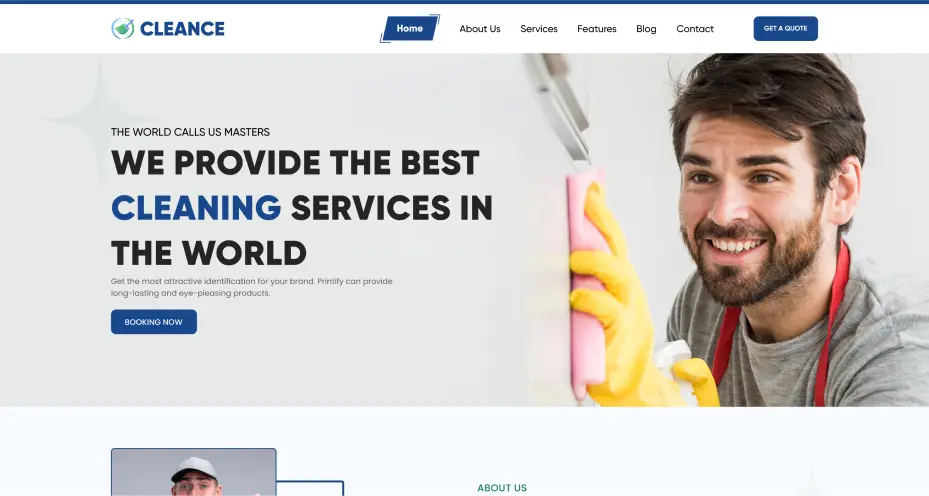
Hero Section
The hero must communicate value immediately. It sets expectations and anchors the rest of the page.
Include the following:
-
Clear service-focused headline: This has to state exactly what the business offers.
-
Supporting subheadline: It has to apply the reliability and professionalism message.
-
Primary CTA button: This can direct visitors toward scheduling action.
-
Supporting image: Displaying lifestyle imagery enhances emotional connection.
Avoid vague marketing language as it confuses users about what to do next.
Why Choose Us Section
This section highlights competitive advantages. It should reinforce reasons to trust the business.
Use short benefit-focused points:
-
Experienced staff: This demonstrates professional training and cleaning expertise.
-
Eco-friendly products: They appeal to health-conscious and family-focused customers.
-
Satisfaction guarantee: It reduces risk perception for first-time clients.
-
Background-verified team: This can ensure safety and reliability reassurance.
Clarity in the presentation of a cleaning service provider's website increases persuasion.
-
Services Overview Grid
The services grid allows quick comparison. Visual cards improve readability.
Structure each card with:
-
Service title: Clearly identifies the cleaning category offered, like domestic, commercial, or deep.
-
Short description: This summarizes benefits in concise language.
-
CTA link: This encourages deeper service exploration or booking.
-
Icon or image: It enhances visual recognition and comprehension speed.
Maintain consistent card sizing on the website.
How It Works Section
Process simplification reduces hesitation. Customers feel confident when steps are predictable.
Three-step model example:
-
Book online: Choose the service and schedule a preferred appointment.
-
Professional cleaning: Verified team performs requested service thoroughly.
-
Relax comfortably: Enjoy a clean home without operational stress.
Visual numbering improves flow clarity. Try to add it.
-
Testimonials Section
Testimonials validate service claims. Place this section after services for maximum impact.
Include the following:
-
Customer name and location: This adds authenticity to review statements.
-
Star rating display: It provides a quick visual quality assessment.
-
Short review text: Highlights reliability and service satisfaction customers experience.
-
Customer image (optional): This increases emotional credibility significantly.
The carousel format works effectively in this section.
Wireframe to High-Fidelity Design in Figma
Designing systematically prevents unnecessary revisions. Start with layout planning before adding colors or typography.
-
Low-Fidelity Wireframe Stage
At this stage, focus only on structure. Use grayscale blocks and placeholder text.
Key actions to consider:
-
Define section hierarchy: This is required to determine information order logically.
-
Establish a spacing system: For maintaining a consistent vertical rhythm, the spacing has to be prominent.
-
Plan CTA placement: Thic help to identify conversion focus areas early.
-
Map user journey: To visualize the flow from the homepage to booking, improve the conversion.
Avoid design distractions and animations that don’t relate to the website.
-
High-Fidelity Design Stage
After validation, apply branding and styling. Introduce typography, colors, and imagery.
Refinement steps are as follows:
-
Apply typography scale: Define headings and paragraph styles clearly to help users.
-
Create button variants: Include hover and active interaction states for a professional site look.
-
Use Auto Layout: Ensure responsive adaptability across breakpoints and manage the website's appearance.
-
Organize components: Simplify future edits and development handoff for UI components.
Structured systems save time later.
Conversion Optimization Elements for Cleaning Websites
A well-designed cleaning website should reduce doubt. Strategic UI elements increase trust and booking confidence.
Important trust indicators are:
-
Google review badge: This website allows visitors to see the real customer satisfaction metrics.
-
Insurance certification icons: It demonstrates compliance and operational legitimacy.
-
Before-and-after imagery: Visual proof of cleaning effectiveness can be shown in this section.
-
Local service area section: This can confirm operational coverage and accessibility.
Subtle reassurance builds stronger engagement.
Urgency elements may also be used carefully:
-
Same-day availability notice: This can encourage immediate action during emergencies.
-
Limited-time discount banner: This incentivizes booking within promotional periods.
-
Satisfaction guarantee badge: With this feature, it reduces perceived service risk.
-
Quick-response promise: This is useful for improving customer confidence in communication reliability.
Balance urgency with professionalism in this section.
Responsive and Developer-Friendly Design
Designers must consider website development feasibility. Clean file organization prevents delays and confusion.
Implementation best practices:
-
Consistent naming conventions: It simplifies collaboration with front-end development teams.
-
Organized layers and frames: This improves navigation inside design files.
-
Export-ready assets: SVG icons and optimized images streamline integration in this feature.
-
Component-based structure: This enables scalable multi-page consistency on the website.
Well-structured Figma files reduce post-design revisions.
Cleance: Cleaning Service UI Design Template Features
The Cleance is a Figma website design template. It is structured around practical business needs and includes fully designed pages tailored for cleaning companies.
Included the following sections:
-
Homepage layout: A conversion-focused hero, services, and testimonials blocks help in brand awareness.
-
Service detail pages: A structured breakdown for individual cleaning offerings improves conversions.
-
Pricing page design: A comparison-based layout for package presentation makes the task easier for customers.
-
Booking interface: A streamlined form optimized for user convenience is necessary.
Note that each page follows modern UI standards.
The design system includes predefined typography styles, button variants, and reusable components. Mobile screens are pre-built to ensure responsive consistency. Designers can easily customize colors, fonts, and imagery to match client branding.
This structure significantly reduces project timelines while maintaining professional standards.
Conclusion
A cleaning service website must communicate professionalism instantly. It should simplify booking, highlight service quality, and encourage trust at every step. Strong UI structure directly impacts inquiry and scheduling rates.
Designing inside Figma enables systematic layout development and scalable component systems. When structured correctly, the design becomes easy to adapt, responsive, and developer-friendly. A conversion-focused cleaning service website is decorative and strategic.
If your goal is to create a modern, high-performing cleaning company website, structured UI planning will determine long-term success.