BTC - Bitcoin
 USDTERC20 - USDT ERC20
 ETH - Ethereum
 BNB - Binance
 BCH - Bitcoin Cash
 DOGE - Dogecoin
 TRX - TRON
 USDTTRC20 - USD TRC20
 LTC - LiteCoin
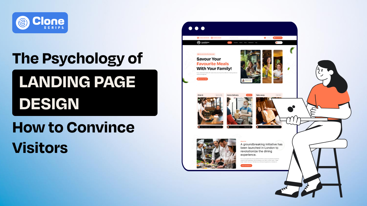
The Psychology of Landing Page Design: How to Convince Visitors
Have you ever been completely hooked by a professional business website? You land on the homepage, and everything happens with just a click. It's easy to navigate, visually appealing, and it practically pushes you towards that shiny 'buy now' button. That, my friend, is the magic of a well-designed landing page.
Think about the last time you browsed Amazon for a newly launched Samsung phone. Was it a smooth and satisfying experience? Did the website intuitively guide you towards the perfect phone for your needs? That user-friendly experience is helpful? You can thank the landing page design for that.
In this blog, we're diving deep into the psychology behind designing landing pages. We'll explore how to use the authority of design to captivate visitors, understand their desires, and ultimately, convince them to take action. Buckle up, because we're about to unlock the secrets of high-converting landing pages!
The Psychology of Persuasion: Beyond the Basics
In landing page UI/UX design optimization you have to go beyond the basic rules. There are two additional yet important factors you have to know: 1. Cognitive biases and 2. Emotional triggers.
Let’s understand them in detail.
1. Cognitive Biases: Going Deeper
Knowing the user’s behavior and its predicted action has been checked by cognitive biases. Here’s the overview to look at:
-
Loss Aversion: Humans have a stronger emotional reaction to losses than gains. On a landing page, you can take advantage of this by emphasizing what a visitor might lose if they don’t act. For example, phrases like “Limited-time offer” or “Don’t miss out on exclusive savings” tap into this bias effectively.
-
The Zeigarnik Effect: This principle suggests that people remember unfinished tasks more than completed ones. You can create curiosity by designing elements that hint at incomplete information or next steps—like a progress bar or a preview of benefits to unlock upon signing up.
-
The IKEA Effect: People value things they help create. Integrating customizable features, such as a product configurator on an e-commerce website or modifying an e-learning platform with a personalized quiz can make users feel invested. This involvement increases their emotional connection to your product or service.
2. Emotional Triggers: Going Beyond Fear and Urgency
As most people use the internet worldwide, they’re not just looking to close the deals but they prefer only those brands who offer them something unique and tailored for their needs. So, you have to create a high-converting website page design by triggering emotional feelings. Check the best practices.
-
Nostalgia: Don’t overlook the power of positive memories to create a connection. Use visuals, language, or themes that evoke nostalgia—such as vintage-inspired designs or references to “better times.” This emotional resonance can make visitors more inclined to trust and engage with your brand.
-
Curiosity: Encourage curiosity by asking intriguing questions or presenting unexpected visuals. Headlines like “Discover the Secret Behind...” or “You Won’t Believe How Easy...” boost clicks and exploration of products and services you offer.
-
Sense of Community: Humans desire belonging. Highlight exclusive benefits or create a narrative of joining a larger group. For example, emphasizing that “10,000 others have already joined” or using testimonials can promote trust and a sense of integrity.
UX Principles for High-Converting Landing Pages
Having a complete yet effective understanding of landing page UX design is considered a remedy for transforming outdated web applications into the newest ones that users prefer to see. Here is the list of design principles.
1. Microinteractions: How Small Details Create Delight
Microinteractions are subtle elements that enhance user experience and engagement. They welcome users and put an effort into increasing the website engagement rate.
Here are examples include:
-
Smooth Animations: A button that subtly grows when hovered over. It is useful in landing page design for e-commerce sites to showcase the “Buy Now” and “Add to Cart” buttons effectively.
-
Personalized Greetings: It uses the visitor’s name or location to create a stronger connection instead of closing the deal. Suppose you’re designing an e-learning platform so welcoming users with their names and locations helps you to convince them to take a desired action such as video consultancy or course inquiry.
-
Interactive Elements: People are bored with simple and outdated website surfing. They looking for something unique and special so features like sliders or toggles that invite user interaction.
All of these seemingly minor details create an intuitive, delightful web experience that keeps visitors engaged.
2. Progressive Disclosure: Keeping Interest Alive
Progressive disclosure involves revealing information in stages to avoid overwhelming the visitor. It is important to make users feel safe and excited without pushing them into the sea of information.
Take a look at how you can keep users on the front stage:
-
Use accordions to hide less critical details, allowing users to focus on key information. For example, you’re designing a landing page for a SaaS company, and maintaining the readability flow not only increases the UX but is considered a trust signal.
-
Implement a step-by-step guide or form that unfolds as users interact, keeping them curious and involved. For special cases like lead generation landing page design, it’s important to minimize the too much information asked as it triggers to leave the platform immediately.
Depending on this approach reduces cognitive load and increases the likelihood of visitors staying on the page.
3. Visual Hierarchy: Guiding the Visitor’s Eye
The landing page conversion optimization (CRO) is based on how effectively visual hierarchy is maintained and ensures visitors focus on the most important elements first. If it’s not properly optimized or confusing the users what to do next results as the high bounce rate and low engagement rate for the website.
Here we put some recommended techniques to maintain the hierarchy on page design.
-
Size: Make headlines and calls-to-action larger than supporting text. It is important to hold the user’s attention and guide them to complete the action such as booking an appointment or purchasing the products and services.
-
Color: Use contrasting colors to highlight buttons or key messages. Try to make the page design attractive and interesting so that once the visitor lands on it they make a better decision.
-
Placement: Position critical elements, like CTAs, above the fold. Optimize landing page design call to action for immediate visibility so users can click it on mobile regardless of having a desktop larger screen.
4 Emerging Trends in Landing Page Design
A landing page design is a dynamic field where creativity matters always. With emerging trends, your design is not just optimized for current needs but able to accomplish the futuristic requirements.
1. Chatbots
-
Integrating chatbots can enhance user engagement by offering instant support and guidance. For example, e-commerce website AI chatbot integration chatbot could help answer common questions or direct visitors to the most relevant information, increasing conversion rates.
2. Interactive Elements
-
Gamification elements like quizzes, polls, or progress trackers can captivate visitors. For instance, an interactive quiz that recommends products based on user preferences not only entertains but also guides visitors toward a purchase decision.
3. Personalized Experiences
-
People love personalization and it helps to build an emotional connection. Tailor content dynamically based on user behavior or demographics.
-
For example, a SaaS website landing page design displays service recommendations or testimonials that align with the visitor’s interests. It creates a more personalized and persuasive experience.
4. AI-Powered Design
-
AI tools can optimize landing page elements by analyzing user behavior to predict what will work best. From headline suggestions to layout tweaks, AI can fine-tune your design for maximum impact. Also, Artificial Intelligence in customer experience is used across industries.
Real-World Examples and Case Studies
Here are examples of high-converting landing page designs to know how they can be helpful for brands.
Example 1: Dropbox
-
Dropbox’s landing page implements simplicity, focusing on a single CTA and minimal text. The visual hierarchy ensures visitors immediately understand the value proposition. By highlighting its ease of use and showing a progress bar for setup, Dropbox effectively taps into the Zeigarnik Effect.
Result: Dropbox’s simplicity increased its sign-up rates by 10%. (Source: [Dropbox Marketing Insights, 2022]
Example 2: Airbnb
Airbnb’s landing pages emphasize community and trust. Using testimonials, user-generated photos, and localized content, they build a sense of belonging and reliability. This approach aligns with emotional triggers like community and nostalgia.
Result: Airbnb’s focus on trust resulted in a 15% higher booking conversion rate. (Source: [Airbnb Growth Report, 2022])
Example 3: HubSpot
HubSpot uses chatbots and micro-interactions to guide visitors. Their lead generation landing pages also employ progressive disclosure, presenting features in digestible sections that maintain interest.
Result: HubSpot’s interactive elements improved lead generation by 20%. (Source: [HubSpot Annual Conversion Study, 2023]).
Ready-made Landing Page Designs
Looking for a ready-to-use landing page design at a minimal cost? Here are some of them.
Conclusion
To craft a persuasive landing page, you must coordinate psychological insights with UX best practices. By using cognitive biases, emotional triggers, and emerging trends like AI and personalization, you can create a compelling user journey that drives conversions.
Remember, the key to sustained success lies in continuous testing and optimization. Experiment with different layouts, messages, and features to discover what resonates most with your audience. Start thorough A/B testing for the designed landing page and determine what has to be optimized.
Looking to elevate your landing page strategy? Contact us. We will help you design advanced landing pages for websites, mobile apps, or web applications.
FAQs
-
What is the ideal length of a landing page?
The ideal length depends on your audience and offer. Short landing pages work for simpler products, while longer ones are better for complex or high-value offers.
-
How important are visuals on a landing page?
Visuals are crucial for creating a strong first impression and guiding user attention. Use high-quality images and videos that align with your message.
-
Should I use multiple CTAs on my landing page?
It’s best to have one primary CTA to avoid confusing visitors. Secondary CTAs can be included if they support the main objective.
-
How often should I update my landing page?
Regularly review and update your landing page to ensure it remains relevant, functional, and aligned with current trends.
-
Are chatbots necessary for a landing page?
While not essential, chatbots can significantly improve user engagement and provide instant support, especially for complex products or services.
-
What are the charges for landing page design?
The price of the landing page design is based on your custom requirements. Most of the web designers charge around $100 to $500, while freelancers may take $30 to $70/hour based on their experience. Compare the services they offer and then make a decision.