BTC - Bitcoin
 USDTERC20 - USDT ERC20
 ETH - Ethereum
 BNB - Binance
 BCH - Bitcoin Cash
 DOGE - Dogecoin
 TRX - TRON
 USDTTRC20 - USD TRC20
 LTC - LiteCoin
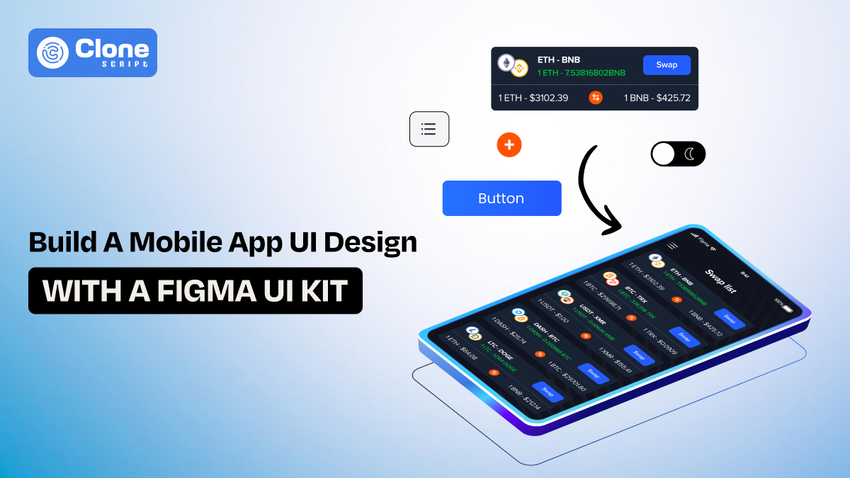
How to Build a Mobile App UI with a Figma UI Kit: Step-by-Step Guide
Figma UI kit is becoming the first choice of mobile app developers due to its flexibility, convenience in managing the entire workflow, and saving time overall.
Ask any developer who’s launched a mobile app what’s the hardest part they face? A back-end integration of feature testing. They will mostly tell you about app interface design, referring to UI.
Having a modern, clean, and user-friendly interface lays the foundation of top top-ranked product. Conversely, if you waste time making pixel-perfect screens, you stand behind the competition, not outranking them.
In this step-by-step guide, you’ll learn exactly how to build an applicating UI using a Figma app UI kit. From choosing the right kit to customizing components, prototyping, and preparing for developer handoff. We’ll cover the real-world workflow that modern app teams rely on to ship faster and design better.
Why Use a Figma UI Kit for Mobile App Design?
If you’re writing all your code, you’re probably already using libraries or frameworks like Tailwind, React Native, or Flutter to save time. The same principle applies in design. The UI kit is a smart shortcut to bring the product live in days, not months.
Here’s why working with a Figma UI kit just makes sense:
-
Time-saving: There a prebuilt layouts, components, and interaction patterns available means you don’t have to design every screen manually.
-
Systemized UI logic: Most kits follow grid systems and visual hierarchy that match iOS/Android guidelines.
-
Code-ready components: Good kits use naming conventions and Auto Layout to keep designs organized and developer-friendly.
-
Visual consistency: Reusable styles, tokens, and components make sure every part of the UI feels cohesive, even when you scale.
In other words, the app UI design kit is your front-end boilerplate. It gives you structure, saves setup time, and lets you focus on building features instead of tweaking pixels.
Figma App Designing Prerequisites to Know
Before you open Figma, make sure the basics are covered and you’re equipped with the right tools and mindset:
What You’ll Need
-
Figma Account: Choose the account type from two options: Free or Pro. Get one depending on your needs.
-
A solid Figma UI kit: Pick a professionally designed kit that suits your project, dashboard UI, game UI, or mobile app interfaces.
-
Clear app flow or feature list: Know what you’re building. Write down the main screens (login, profile, settings, etc.).
-
Understanding of platform design standards: Familiarity with iOS Human Interface Guidelines or Android Material Design helps avoid mobile app redesign UI/UX challenges later.
Optional but Helpful:
-
Use a plugin like “Iconify” or “Blush” for quick access to icons and illustrations.
-
Use Figma’s “Auto Layout” and “Components” features if you plan to build scalable UIs.
If you're a developer working alone, think of this phase as defining your UI architecture. Just like code architecture, poor planning here slows everything later.
Also, don’t just focus on how it looks. The best app UI design starts with user experience (UX) in mind. Sketch your wireframes or outline your flows before jumping into visuals.
Focusing on app interface design trends makes your product modern and optimized for user expectations to fulfill, whether it’s shopping, e-learning, gaming, or any service-providing business.
6 Steps to Build a Professional Mobile App UI in Figma
Follow these six steps to create a polished, branded, and visually attractive app design:
Step 1: Choose the Right UI Kit
The first decision is choosing the right Figma templates. Don’t just grab any kit, especially a free one. Prefer premium UI kit comes with optimized layouts, web design components, and documentation. Pick one that matches your product type.
-
Building a fintech dashboard? Look for a dashboard UI kit with charts, tabs, and clean card layouts.
-
Building a mobile game? Choose a game app interface design in Figma with iconography, animations, and stylized components.
-
Need a general-purpose mobile app UI? Use a standard app UI kit for startups with login flows, modals, and navigation patterns.
Make sure your kit includes:
-
Auto Layout
-
Named and grouped layers
-
Both light and dark themes (if required)
-
Platform support (iOS/Android/Flutter)
Step 2: Create a New Figma Project
Start a new Figma file and import your Figma UI kit. You can drag in components or open the kit in another tab and copy-paste them into your working file.
Organize your pages:
-
Page 1: Style Guide
-
Page 2: Components Library
-
Page 3: Screens / Flows
This will keep your file tidy and easy to navigate. A good organization makes developer handoff cleaner later, especially when working in teams.
Step 3: Plan Your User Flow
Instead of jumping into screen design, map out your user journey. You can use Figma’s “Wireframe Kit” or draw rectangles for each screen.
This lets you build only what’s needed and define flow logic before you touch visual components.
-
Welcome / Splash screen
-
Signup / Login
-
Home Dashboard
-
Add Task
-
Task Detail
-
Settings
This lets you build only what’s needed and define flow logic before you touch visual components.
Step 4: Customize the Components
Drag components from the Figma UI into your working screens. Start building:
-
Use navbars, modals, buttons, and cards from the kit
-
Replace placeholder text/images with real content
-
Apply brand colors using global styles
-
Use auto-layout for responsive resizing
-
Maintain a consistent padding (8px / 16px grid)
Want to speed up future changes? Convert custom elements into your components.
Think modular. Like reusable React or Flutter widgets, Figma components should scale.
Step 5: Build Out Each Screen
Now it’s time to turn wireframes into actual screens. Use your mapped flow to design one screen at a time. Begin with key screens (like login or dashboard) and expand from there.
-
Use 375px width for mobile designs (iPhone X baseline)
-
Stick to a 4px or 8px spacing grid
-
Use consistent paddings and margins
-
Group repeated elements (list items, menu blocks) into variants
-
Apply a harmonious color palette
-
Use consistent typography hierarchy (Title → Subtitle → Body → Caption)
-
Follow platform patterns (bottom tabs for mobile, floating action button on Android)
Don’t forget to check responsiveness. If your app will support tablets too, design versions for different breakpoints.
Step 6: Link Screens for Prototyping
Figma lets you prototype directly within the editor. Use “Prototype” mode to link buttons to corresponding screens (e.g., login → dashboard). This helps stakeholders, testers, and developers understand how the app flows.
Add tiny animations or transitions to preview how your app will feel in motion.
For example, if you have a Web3-ready mobile game app development, then the design part can be done using these steps. Mobile game designing in Figma is a very appropriate option to quickly start the project and focus on the required frontend and backend development instead of managing every pixel to iterate and test.
Proven Tips to Make Your Mobile UI Stand Out
Creating a functional UI is step one, but defining a delightful one is where design shines. Use these tips to go beyond the basics:
-
Use visual hierarchy smartly: Guide the user's attention with font weights, color contrast, and layout positioning.
-
Don’t overcrowd: Keep interfaces clean. One primary action per screen is a good rule of thumb.
-
Design for touch: Ensure tap areas are at least 44x44px and buttons have enough spacing around them.
-
Minimize cognitive load: Don’t overload users with too many choices per screen.
-
Include microinteractions: Use hover effects, loading indicators, and subtle feedback to make the UI feel alive.
-
Use white space: A good mobile UI design looks better. Crowding affects usability.
-
Test your designs: Share clickable prototypes with real users or developers for early feedback.
Above all, test your designs. What looks good to you might be confusing to a user. Prioritizing their feedback can prove as a gold mine to make your app more polished and optimized for better engagement.
Exporting the Ready Design and Handoff to the Developer.
Once your app design is ready, it’s time to hand it over to developers. Figma makes this process frictionless.
-
Inspect Tool: Developers can click on any layer to get size, padding, color, and CSS details.
-
Assets Export: Mark icons or images as exportable and define file types (PNG, SVG, etc).
-
Design Tokens: If your team uses design systems, export variables for colors, spacing, and fonts.
-
Comment Mode: Developers can ask questions directly on the design.
Organize screens by user flow and label frames clearly. Group all reusable components in a separate page for developer reference.
Why Choose Our Figma App UI Kits?
UI kit in mobile app development, including for iOS and Android, works as a key element to help start the workflow without getting involved in designing.
At All Clone Script, our Figma UI kits are created specifically for real-world mobile apps, with hundreds of hours of design experience behind every component.
Here’s what makes the app UI kit unique:
-
Built with auto-layout, constraints, and variants for speed and flexibility
-
Includes 100+ mobile screen templates across categories (dash UI, eCommerce, health, game UI)
-
Designed for both iOS and Android platforms
-
Organized layers, reusable components, and global styles
-
Dark and light modes are available out of the box
Whether you're designing your next fintech app or building the next big social platform, our UI design Figma kit is built to save you time while delivering world-class design quality.
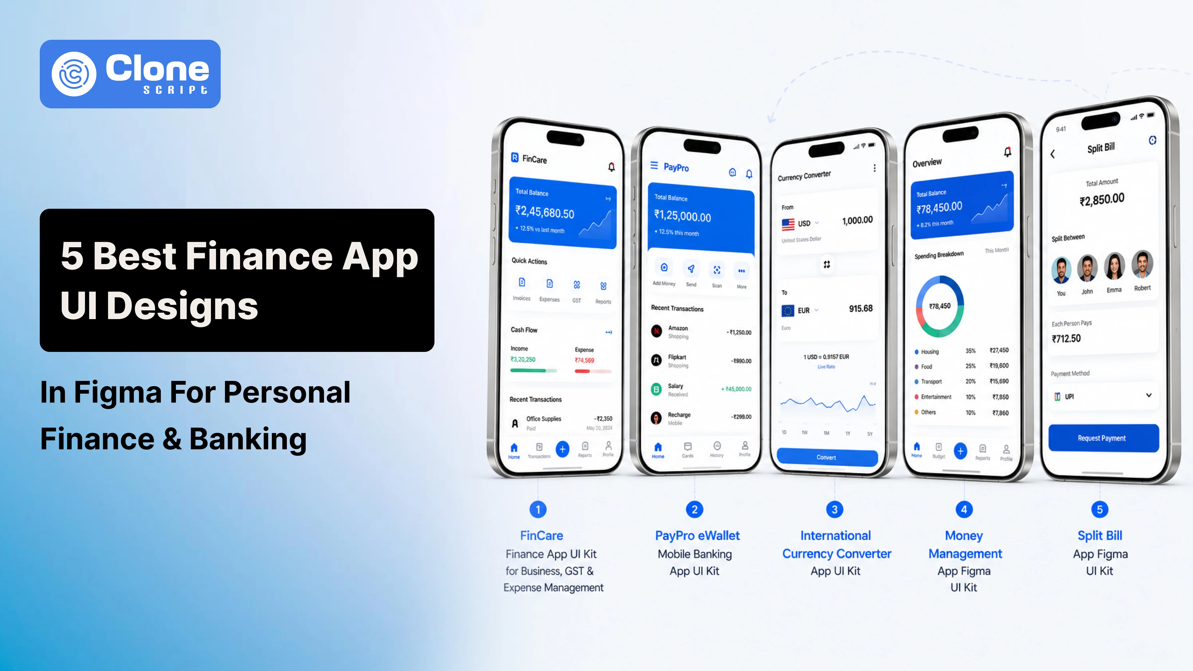
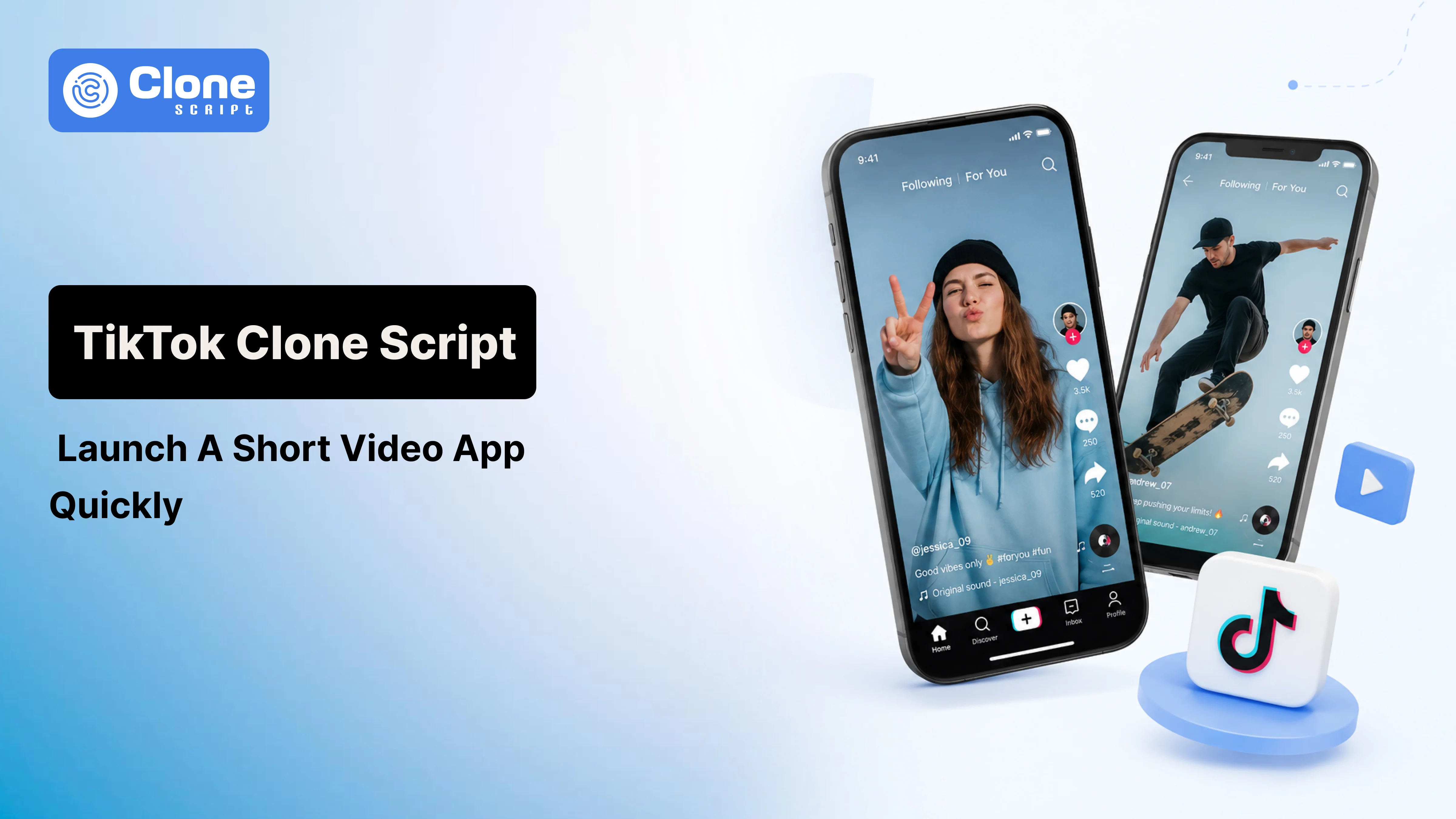
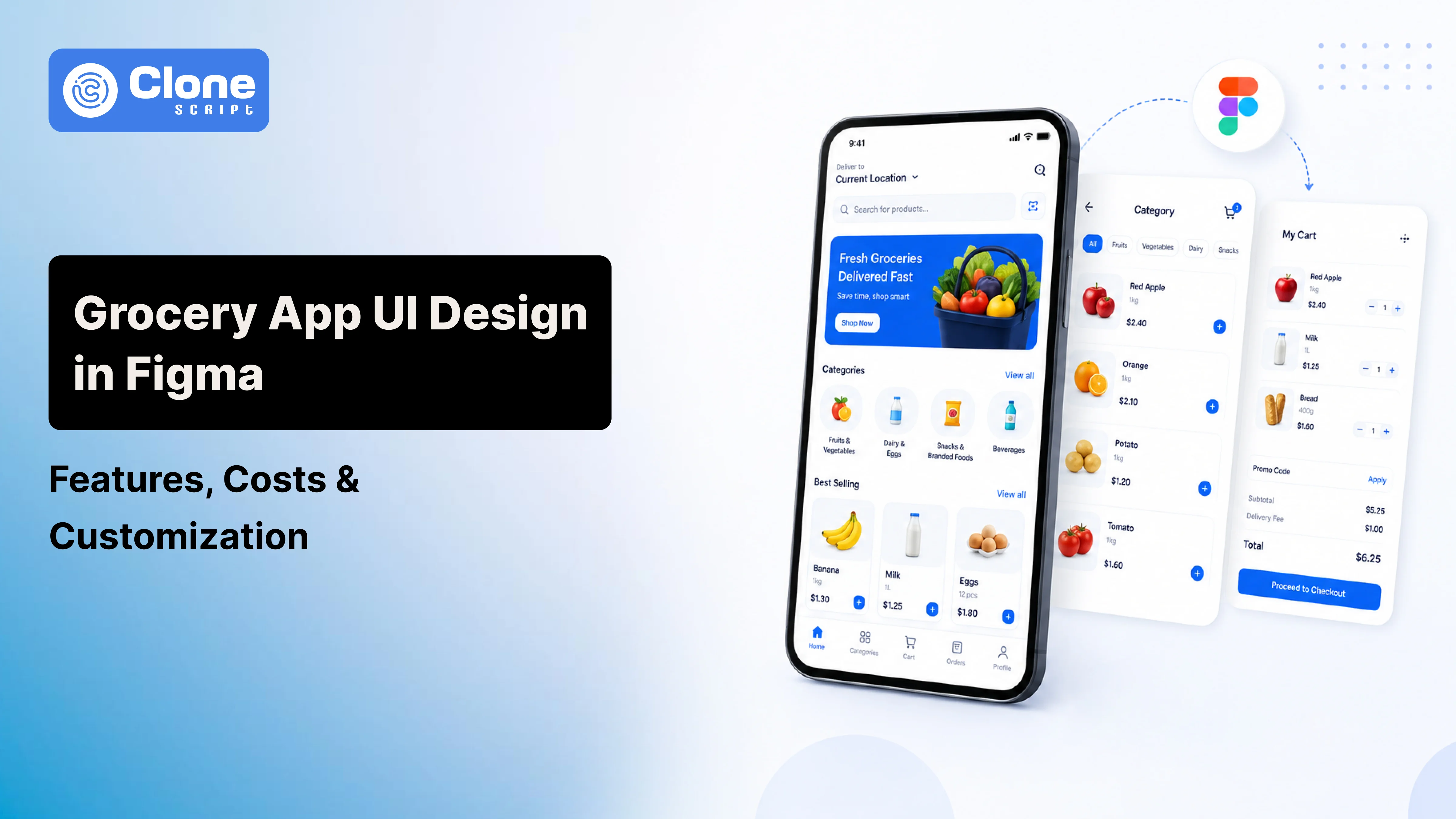
You can also check Top Selling App UI Designs.
Explore Our Professional UI Kits
Conclusion
Building a professional-grade mobile app UI design doesn’t have to take weeks or cost thousands. By starting with a well-crafted Figma kit, you cut down on repetitive tasks and focus on what really matters, creating a seamless user experience.
From choosing the right kit and planning your user flow to customizing components and handing off to developers, Figma offers everything you need to design faster, collaborate smarter, and build better.
Ready to bring your app idea to life? Buy a UI kit, open Figma, and start designing. Your next hit app could be just a few clicks away.
FAQs
-
What is a Figma UI kit?
A Figma UI kit is a collection of pre-designed UI elements like buttons, cards, forms, and complete layouts that you can use to speed up app design in Figma.
-
How do I use a Figma UI kit for app design?
Import the UI kit into Figma, copy components into your working file, and customize them according to your app’s needs. It saves time and maintains design consistency.
-
Is a UI kit suitable for both iOS and Android designs?
Yes, most app UI kits are platform-neutral or provide variants for both iOS and Android platforms, following respective design guidelines.
-
Can I use a UI kit for a dashboard or game UI?
Yes. There are dashboard UI and game UI kits tailored specifically for analytics apps, admin panels, and games. For dashboard platform development or game concept clarification, the UI kits are available.
-
What's the difference between Figma templates and UI kits?
Figma templates include full-page layouts or pre-built flows, and UI kits provide atomic components used to build your layouts.