BTC - Bitcoin
 USDTERC20 - USDT ERC20
 ETH - Ethereum
 BNB - Binance
 BCH - Bitcoin Cash
 DOGE - Dogecoin
 TRX - TRON
 USDTTRC20 - USD TRC20
 LTC - LiteCoin
Best React UI Framework For Front-end Web Development Project
Front-end web developers use React to build consistent and scalable user interfaces, yet many find UI implementation more challenging than application logic.
Why?
React primarily focuses on state-driven rendering and component composition, but it does not provide ready-made UI interface patterns or design systems. Here, the best React UI framework is helpful.
In this article, we will talk about some of the best user interface frameworks that can be used in React development. We also explain how React differs from traditional JavaScript libraries. Ultimately, which of these frameworks is helpful is easy for you to decide.
What Is the Definition of a React UI Framework?
A React UI framework is a structured collection of reusable interface components like buttons, forms, modals, and navigation layouts. They are designed to work natively with React’s component-based architecture.
Most React UI frameworks require some level of configuration to align with project requirements.
Using them, developers have control over behavior through props and state. Most frameworks include layout systems, theming mechanisms, and accessibility features.
Whether you build a service appointment booking app or an e-commerce marketplace, everything will be managed correctly.
While React UI frameworks do not significantly limit application logic. They do shape how components are structured, styled, and composed within a front-end architecture.
5 Tips to Choose the Best React UI Framework for Your Project
In React front-end development, choosing the correct framework is important as it lays the foundation for technical choices.
-
Focus on the project size and scalability.
In small startup-based development projects, simplicity and speed matter most. However, larger front-end applications require UI frameworks that support scalability, modular architecture, and shared design systems. Choose a framework that accommodates future growth without forcing major refactorings.
-
Prioritize customization and theming.
Development teams frequently work with constantly changing brand requirements. A React UI framework should offer flexible theming options that integrate cleanly with client-side styling strategies. This can include CSS variables, design tokens, or JavaScript-based themes.
-
Consider performance and bundle size.
User experience and performance remain critical concerns in front-end development. Deploying heavy UI libraries can increase load times if not managed properly. Frameworks that support tree-shaking and component-level imports help to maintain fast, responsive user interfaces.
-
Strong community support and documentation matter.
Reliable documentation and active community support are essential in professional design workflows. Most popular frameworks offer support during development by providing tested patterns, updates, and real-world solutions.
-
Accessibility and responsiveness are top priorities for teams.
Accessibility is a core responsibility in website development. UI frameworks with built-in keyboard navigation, semantic markup, and responsive behavior help developers meet usability and compliance standards without extensive custom work.
Once you know the tips to pick the best client-side framework for React, let’s see an example.
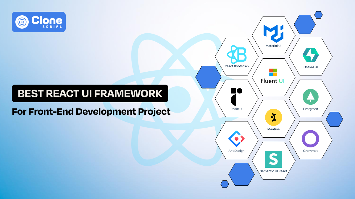
Top 10 React UI Frameworks to Use in Client-side Web Development
In React development, the following UI frameworks can be used for an optimized web development cycle and expected output from the product.
-
Material UI (MUI)
-
Chakra UI
-
Fluent UI
-
React Bootstrap
-
Radix UI
-
Evergreen
-
Mantine
-
Ant Design
-
Semantic UI React
-
Grommet
Let’s see what the UI frameworks are; it’s a unique thing, and a use case.
1. Material UI (MUI)
Material UI is a production-ready React UI framework commonly used in large-scale front-end development. It provides a complete design system with tightly controlled components. So, managing UI consistency, state-driven layouts, and long-term client-side maintenance in complex React applications is easy.

Why use Material UI?
-
Component Depth: In this framework, advanced UI components like data grids, pickers, and dialogs are already available, which reduces custom development work.
-
Theme Architecture: A centralized theming helps to maintain consistent styling across large front-end codebases without handling it manually.
-
TypeScript Integration: With strong typing, developers can improve reliability in enterprise-sized client-side development.
-
Ecosystem Stability: If any issue persists during the design process, the larger development community is on the way to help. MUI has nothing to do with backend maintenance.
Use Case with Example
This React UI is commonly used in complex SaaS dashboards. It includes a role-based analytics platform requiring consistent layouts, complex tables, and scalable theming across multiple client-side modules.
2. Chakra UI
Need control over digital products’ styling, layout logic, and component behavior in the evolving codebase? Then, Chakra UI is the right choice. The best part of this UI framework is that it values the developer’s requirements in managing the accessible web product development cycle.

Why use Chakra UI?
-
Style-Prop Architecture: Using this framework, developers can enable inline, token-based styling without external CSS dependencies.
-
Composable Components: It encourages small, reusable UI patterns aligned with React’s composition model to make a good digital product in the meantime.
-
Accessibility by Default: Chakra UI includes accessibility-aware components that minimize, but do not eliminate, the need for manual ARIA handling.
-
Design-System Friendly: Here, development teams don’t have to face the lags or working issues. The framework works well with custom tokens and scalable front-end architectures.
Use Case with Example
This React UI can be useful for product teams to build a data-heavy platform where the design and functionality dynamically change. There’s no need to break the consistency.
3. Fluent UI
Fluent UI is a React-based component library designed primarily for enterprise and productivity-focused applications. It is built to support interfaces where consistency, accessibility, and predictable behavior matter more than visual experimentation or heavy customization. This UI is commonly used in applications with dense information, frequent user interactions, and long usage sessions.

Why use Fluent UI?
-
Interaction Contracts: Fluent UI components are built with accessibility in mind. It offers strong default support for keyboard navigation, focus management, and screen reader compatibility.
-
Consistent Interaction Behavior: Components in this framework follow well-defined behavior standards for states, transitions, and user input. So, the interface behaves consistently across different areas of an application.
-
Predictable State Representation: UI components are designed to clearly reflect the application state. This is particularly important in complex workflows where users rely on visual cues to understand system status.
-
Enterprise-Oriented Stability: Fluent UI emphasizes reliability and long-term maintainability, so it can be suitable for applications that grow without frequent redesigns.
Use Case with Example
Fluent UI works well for issue-tracking systems, internal dashboards, or customer support tools. These tools are used repeatedly to interact with lists, forms, and panels. The overall functionality depends on consistent behavior rather than visual novelty.
4. React Bootstrap
React Bootstrap is a UI library that mostly front-end teams use for layout reliability and predictable responsive behavior in digital products. It can be combined with the React components and a grid design system for proven functionality. There’s less work to do with the CSS, and the reusable components speed up the development cycle.

Why use React Bootstrap?
-
Grid-Centric Thinking: This UI library offers clear layout boundaries for every size of device used on the website and apps. It reduces responsive layout bugs.
-
Explicit Component Structure: React Bootstrap components expose behavior clearly, which aids long-term maintainability.
-
Styling Predictability: With Bootstrap, the CSS conflicts can be reduced in large front-end codebases. It can be flexible for scalability.
-
Migration-Friendly Design: This Bootstrap UI fits teams transitioning from traditional responsive HTML/CSS patterns to advanced front-end development.
Use Case with Example
React Bootstrap is well-suited for rebuilding legacy content portals or corporate websites where stable layouts, consistent spacing, and cross-device reliability are more important than advanced client-side interaction logic.
5. Radix UI
Radix UI is a useful React UI library focused on accessibility, composability, and behavioral correctness rather than visual styling. Instead of shipping pre-styled components, Radix provides low-level primitives that handle interaction logic, keyboard behavior, and ARIA attributes. So, from there, teams can build fully custom designs without reimplementing accessibility rules.

Why use Radix UI?
-
Accessibility-First Primitives: Radix components implement WAI-ARIA patterns by default to handle focus management, keyboard navigation, and screen reader behavior correctly.
-
Headless Component Architecture: In this UI, components ship without styles. Front-end teams have full control over layout and visual design to retain consistent, predictable behavior.
-
Composable by Design: Each primitive is designed to be composed with others, enabling flexible UI patterns without rigid structural constraints or hidden issues.
-
Framework-Agnostic Styling Compatibility: Radix integrates cleanly with Tailwind CSS, CSS Modules, styled-components, and design-token-based systems. It is suitable for scalable front-end architectures.
Use Case with Example
Radix UI is well-suited for building custom design systems in React, such as internal admin platforms or SaaS products where strict accessibility requirements and fully bespoke UI styling are mandatory.
6. Evergreen
Evergreen is a React UI framework developed by Segment, designed to support internal tools and enterprise dashboards where clarity, consistency, and safe interactions matter more than visual experimentation. It provides a proper design system and a curated set of components intended for operational interfaces rather than consumer-facing products.

Why use Evergreen?
-
Opinionated, Stable Design System: Evergreen offers consistent spacing, typography, and component behavior to reduce UI fragmentation in internal applications.
-
Accessibility-Conscious Components: Components follow common accessibility practices, including keyboard navigation and sensible focus handling, without requiring extensive manual configuration.
-
Operational UI Focus: The component set is tailored for forms, tables, dialogs, and workflows commonly found in admin panels and internal tools.
-
Low Visual Overhead: Evergreen avoids heavy visual customization to help teams prioritize usability and correctness over branding flexibility.
Use Case with Example
Evergreen is suitable for internal dashboards, admin panels, or data management tools where UI consistency, predictable behavior, and low maintenance are more important than custom visual identity.
7. Mantine
Mantine is a modern React UI framework that combines styled components, hooks, and utility APIs to support feature-rich front-end applications. It is particularly valued for its extensive component set and strong developer experience rather than strict adherence to a predefined design philosophy.

Why use Mantine?
-
Comprehensive Component Library: Mantine offers a wide range of components, including forms, modals, tables, and overlays. This can reduce the need for additional third-party UI dependencies.
-
Built-In Hooks and Utilities: The framework includes React hooks for state management, responsiveness, and UI behavior. To implement complex interactions more efficiently, developers can rely on it.
-
Flexible Theming System: Mantine supports theme customization through JavaScript-based configuration. From there, teams adapt components to different brand requirements.
-
Balanced Abstraction Level: It provides more structure than other libraries while remaining more flexible than heavily opinionated design systems.
Use Case with Example
Mantine works well for SaaS applications and dashboards that require many interactive UI elements and rapid feature development without building a custom design system from scratch.
8. Ant Design
Ant Design is a comprehensive React UI framework optimized for data-intensive and enterprise-level applications. It provides a highly structured design system and a rich set of components aimed at complex workflows and information-dense interfaces.

Why use Ant Design?
-
Data-Oriented Components: Ant Design provides one of the most comprehensive built-in solutions for filtering, sorting, and managing large datasets within React applications.
-
Strong Layout and Hierarchy Rules: The design system emphasizes clear alignment and spacing that help users scan and compare information in dense interfaces.
-
Workflow-Friendly Patterns: Built-in support for step-based flows, validation-heavy forms, and multi-stage interactions simplifies enterprise UI development.
-
Mature Ecosystem: Ant Design is widely adopted, with extensive documentation and long-term community support.
Use Case with Example
Ant Design is commonly used in analytics dashboards, reporting systems, and enterprise management platforms where users interact with large datasets and complex workflows daily.
9. Semantic UI React
Semantic UI React is a component library that emphasizes readable, intention-driven UI composition. Instead of focusing on advanced interaction patterns, it prioritizes clear structure and semantic meaning in front-end code.

Why use Semantic UI React?
-
Semantic Component Naming: In this framework, Components are named after their purpose (e.g., Menu, Segment, Message). This makes UI code easier to understand and reason about.
-
Straightforward Layout Composition: The library encourages clear separation of content sections without complex configuration.
-
Low Behavioral Complexity: Most components focus on presentation rather than intricate interaction logic to reduce cognitive overhead.
-
Content-Focused Design: Semantic UI works best when content organization and readability are more important than visual customization.
Use Case with Example
Semantic UI React fits documentation platforms, internal knowledge bases, or content-heavy applications where clarity and structural consistency matter more than rich interactivity.
10. Grommet
Grommet is a React UI framework built with a strong emphasis on accessibility, responsiveness, and design consistency. It is used in environments where inclusive design and cross-device usability are primary requirements for applications. From there, the development of accessible web products can be easy for the design and development teams.

Why use Grommet?
-
Accessibility-Centered Design: The components are designed to support keyboard navigation, screen readers, and accessible interaction patterns by default.
-
Responsive Layout System: Grommet provides layout primitives that adapt across screen sizes without relying on complex CSS overrides.
-
Design Token Support: Centralized theming helps maintain consistency and reduces accessibility issues over time.
-
Predictable Navigation Patterns: Focus management and structural landmarks are handled consistently across components.
Use Case with Example
Grommet is suitable for public-sector applications, compliance-driven platforms, or enterprise tools where accessibility standards and responsive behavior are non-negotiable requirements.
There are some more React Framework examples for UI available, but we include these. Which UI framework is useful for a web development project depends on the features and in-built design system required.
Why is using React UI frameworks beneficial for the development cycle?
These frameworks simplify the development process by reducing repeated UI work, keeping interfaces consistent, and helping front-end teams ship product features faster with fewer revisions.
Why does this make a real difference?
-
Less Time Spent on UI Decisions: Developers don’t need to rethink layouts, spacing, or interaction behavior for every feature. This keeps the momentum steady throughout the project.
-
Faster, More Confident Releases: Working with proven components allows teams to move from idea to implementation. It’s not required to second-guess visual or usability choices.
-
Consistency Across the Application: A shared UI system ensures the interface feels unified, even as multiple developers contribute to the same codebase.
-
Smoother Team Collaboration: Designers and developers speak the same UI language, and it results in reduced back-and-forth and unnecessary revisions.
-
Easier Long-Term Maintenance: Updates and improvements can be made once and reflected everywhere that keeping the front-end stable as the product grows.
With the readymade UI framework, the development teams can manage the React-based web application cycle effectively and get the expected outcome.
Key difference between popular JavaScript libraries and React
Here is the difference between JavaScript libraries and React to consider.
|
Area of Comparison |
JavaScript Libraries (jQuery, utility-based libs) |
React |
|---|---|---|
|
Development Model |
An imperative approach where DOM updates are handled manually |
Declarative model where UI is derived from application state |
|
DOM Interaction |
Direct DOM manipulation increases complexity as UI grows |
Virtual DOM optimizes updates and minimizes unnecessary re-renders |
|
UI Architecture |
Script-driven with loosely structured UI logic |
Component-based architecture with clear separation of concerns |
|
State Handling |
State is often scattered across event handlers or plugins |
Centralized, predictable state-driven rendering |
|
Scalability |
Suitable for small or interaction-light interfaces |
Designed for large-scale front-end and client-side applications |
|
Maintainability |
Refactoring becomes difficult as dependencies increase |
Easier maintenance through isolated, reusable components |
|
Performance at Scale |
Performance degrades as DOM operations increase |
Optimized rendering improves performance in complex UIs |
|
Team Collaboration |
Harder to enforce consistent UI patterns across teams |
Shared component systems improve consistency and teamwork |
|
Typical Use Case |
Enhancing static pages with limited interactivity |
Building full-featured, interactive web applications |
This difference clarifies why a JavaScript library is used and what’s the importance of React UI frameworks.
Just following the React application development tips is not enough now; you have to go with the smart moves and methods.
Select React Website Templates for Quality UI and Code
React website templates provide structured reference implementations that demonstrate how UI components, layouts, and routing are organized in real-world front-end applications.
Why is it useful?
-
Establishes a Clear Starting Structure: Templates offer a predefined project layout that helps developers avoid inconsistent file organization and unclear component boundaries during early setup.
-
Demonstrates Practical Component Composition: They show how individual UI components are assembled into pages, layouts, and flows. It reflects patterns commonly used in production React applications.
-
Reduces Initial Setup Time: By starting from an existing structure, teams can focus on application logic instead of repeatedly solving basic architectural decisions.
-
Supports Consistency and Maintainability: When used as a reference rather than a final solution, templates help consistent UI patterns while remaining flexible for long-term client-side development.
There’s a difference between React UI and Template, as both have different use cases in application development.
Get these templates from a dedicated and reliable provider or marketplaces. When evaluating templates, teams should assess code quality, documentation, and long-term maintainability rather than focusing solely on visual presentation.
Conclusion
Choosing the right React UI framework is less about following trends and more about understanding the kind of interface the development team is building. Each framework discussed in this guide addresses a different set of front-end challenges, from handling complex data and interactions to ensuring accessibility and long-term maintainability. There is no universal “best” option, only tools that are better suited to specific problems.
FAQs
-
Which is the best React UI framework for front-end development?
There is no single best option. The right React UI framework depends on project size, UI complexity, and performance needs. It also depends on the application prioritizes data density, accessibility, or customization.
-
Are React UI frameworks good for large-scale applications?
Yes. Most React UIs are designed to support scalable front-end architectures. They provide reusable components, consistent patterns, and predictable behavior across large, long-performed codebases.
-
Does React UI affect performance?
Yes, if used incorrectly. Choosing modular frameworks, importing components selectively, and avoiding unnecessary abstractions help maintain good client-side performance.
-
Is it necessary to use a UI framework with React?
No. React works without a UI framework. But frameworks reduce repeated UI work, improve consistency, and speed up development in most professional front-end projects.
-
Can I build custom designs using React UI frameworks?
Yes. Most frameworks support theming and customization. So, developers can adapt components to custom design systems without rewriting core UI behavior.
-
What should I consider before choosing a React UI framework?
Consider UI complexity, accessibility needs, team experience, long-term maintenance, and how closely the framework aligns with your product’s interaction and layout requirements.