BTC - Bitcoin
 USDTERC20 - USDT ERC20
 ETH - Ethereum
 BNB - Binance
 BCH - Bitcoin Cash
 DOGE - Dogecoin
 TRX - TRON
 USDTTRC20 - USD TRC20
 LTC - LiteCoin
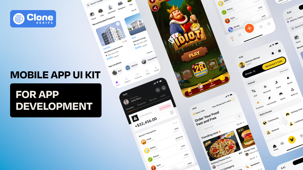
Why is a Mobile App UI Kit Being Most Popular in App Development?
Have you ever stared at a blank screen in your code editor, fingers hovering over the keyboard, wondering how on earth you’ll piece together that sleek login flow or the perfect dashboard?
You’re not alone.
In 2025, with deadlines breathing down our necks and users expecting pixel-perfect experiences at lightning speed. So, reinventing every button, form field, and nav bar from scratch just doesn’t cut it anymore.
That’s where mobile app interface (UI) kits come in. They’re like the spice rack in your kitchen, ready-made ingredients that let you whip up gourmet dishes without starting from zero.
You want to know why UI kits have become the unsung heroes of modern app development. We’ll share real anecdotes, sprinkle in hard-earned lessons, and arm you with practical tips to decide when and how to tap into a UI kit. So, you can make products faster, collaborate smoothly, and get better results.
Ready?
Let’s go.
Without UI kits, deadlines, design, and developer dread exist.
Picture this: Your team is currently working on an NFT iOS app development. It’s Friday afternoon, your team’s sprint review is Monday, and the designer just dropped 12 new screens into your inbox. You open the mail and find the layouts with different button styles, color codes, and grid systems.
Your stomach churns. You know you can code through the weekend, but the result will likely feel cobbled together. That’s the developer’s dread. It’s a waste of time on one-off components when your mind should be on core functionality.
Mobile UI kits were invented to solve exactly this problem.
They are opinionated design frameworks. But instead of abstract theories, you get concrete, drag-and-drop-ready assets that translate directly into code.
Suddenly, that login screen isn’t a blank canvas; it’s a template you can tweak and own in minutes. You and your team still get to customize fonts, colors, and animations, but you’re not reinventing the wheel every sprint.
And when the PM asks, “Can we add dark mode by Tuesday?” You can say, “Absolutely.”
With the app ui kit, speed is your superpower.
Let’s face it: speed isn’t just a nice-to-have. It’s the difference between capturing market attention and fading into the App Store abyss. According to recent developer surveys, teams using UI design kits integrate interfaces up to 60% faster than those coding UIs by hand.
Why?
Because the foundation is already created for you.
Imagine you’re building a daily yoga training mobile app. A typical project requires:
-
Onboarding screens with progress indicators
-
Real-time activity tiles
-
Profile settings and edit forms
-
Progress charts and motivational badges
Without a UI kit, each of these elements demands custom styles, spacing rules, and even accessibility checks (yes, voice-over labels and contrast ratios matter). You have to hire a professional web designer who works on mobile app UI and UX design proactively.
But with a good UI kit, those elements live in pre-built, test-ready components that you can drag into your Figma file or import from an NPM package. You tweak the text, swap the icons, and maintain the user flow. You’re ready for the next move in app development.
Here’s the kicker: that extra time you save doesn’t vanish. You can run more user tests, polish animations, or explore new features. Your codebase stays cleaner, bugs drop, and stakeholders start trusting your estimates again. Speed creates a better app development cycle.
Consistency in the app design is the unsung hero of UX.
Have you ever been in an app where one screen’s primary button is round and green, and the next screen’s is rectangular and teal? That stark inconsistency feels sloppy and breaks user trust. In a world where delight matters almost as much as function, consistency is the unsung hero.
UI kits bake consistency into every pixel. They come with design tokens and things like:
-
Color palettes (primary, secondary, warnings, successes)
-
Typography scales (heading sizes, body text, captions)
-
Spacing systems (modular grids, margin, and padding rules)
-
Icon libraries (consistent stroke weights, brand-approved icons)
When you use these tokens, your app feels cohesive. You know that tapping any button will evoke the same animation, that every modal dialog respects the same inset, and that every chart uses your brand’s color rules.
For developers, that means fewer questions for designers and fewer pixel-perfect reviews from QA. And for users, that translates into a sense of trust and professionalism.
For example, you’re working on a fashion e-commerce mobile app development. You can’t afford to lose a sale by just a small margin of error, such as a confusing user experience.
By choosing an e-commerce mobile app UI kit, you can reduce the chances of losing sales. This result is thanks to the best e-commerce UX practices.
App interface design and UX is a different thing work correlately to make a final product useful, futuristic and prominent for users.
Designer-Developer harmony can be possible through UI kits.
Ask any developer about their biggest pain point, and a top contender will be “design handoffs.” Static PNGs, mismatched grids, and scattered style guides have tormented teams for years. UI kits bring everyone onto the same page (literally).
Here’s how it can be solved:
-
Single source of truth: Designers and developers work from the same component library in Figma (or Sketch). If the button changes, it updates everywhere.
-
Auto-layout magic: Update a parent container’s padding, and children adjust automatically.
-
Code exports: Many kits include React Native or Flutter packages; developers pull from NPM instead of copying CSS or SVG manually.
-
Documentation portals: Kits often ship with Storybook or ZeroHeight docs that show usage examples and code snippets.
The result? Fewer Slack pings at 11:47 PM asking, “What hex code is that purple?” When design and dev share a language, the whole project hums along.
Beyond design, code-first kits are preferable.
Some UI kits stop at static visuals. The exciting evolution is the code-first kit. It's just like getting both the recipe and the pre-measured ingredients delivered to your doorstep.
Platforms like FlutterFlow, Anima, Locofy, and Plasmic let you design screens visually and export production-ready code instantly. No more translating design specs into JSX by hand; you get React Native components or Flutter widgets that are:
-
Themed: They respect your brand’s token settings (colors, fonts, spacing).
-
Accessible: Built-in ARIA tags or semantic SwiftUI modifiers.
-
Tested: Many kits include unit or snapshot tests for components.
Developers still have agency. You can tweak props, wrap components with your logic, and optimize performance. But you’re not spending days on pixel alignment or manual asset slicing.
When your product manager dreams up an A/B test for a new onboarding flow, spinning up variants becomes a joy instead of a curse.
When (and When Not) to choose a UI kit in mobile app development.
UI kits aren’t magic pixie dust, and they’re not a one-size-fits-all solution. Use them when:
-
You’re building standard patterns: logins, lists, forms, and dashboards.
-
You need to validate quickly: MVPs, prototypes, investor demos.
-
You operate in multi‑app ecosystems: white-label products, franchise apps, and agency portfolios.
-
You have limited design resources: small teams, solo devs, and side projects.
Hold off when:
-
Your app demands highly custom interactions: games, VR/AR experiences, experimental gestures.
-
You’re crafting a bespoke brand identity: luxury fashion apps, award‑winning UX showcases.
-
Accessibility or localization requires specialized flows not supported by the kit out of the box.
In those cases, use the UI kit as a springboard. Adopt its grid and token system, but build custom components to fill your unique needs.
There are differences between ready-made and custom UI design kits. Pick the relevant one according to your business requirement.
Picking your perfect UI kit depends on you.
With dozens of kits on the market. From free, open-source libraries to premium design system subscriptions, the question is, how do you choose? Here’s a quick buyer’s guide:
-
Platform Focus: React Native? Flutter? Native iOS (SwiftUI) or Android (Compose)? Pick a kit built for your stack.
-
Token Flexibility: Look for kits that let you override colors, fonts, and breakpoints via code or design tokens.
-
Component Coverage: Does it include everything you need, like modals, carousels, charts, data tables, or just buttons and forms?
-
Documentation & Support: Check active GitHub issues, Slack channels, and detailed examples.
-
Performance & Size: Check bundle size impact and tree-shaking capabilities.
-
License & Cost: Understand free vs. paid, one-time vs. subscription, and commercial terms.
Pro Tip: Try a small proof-of-concept: integrate core components into a sandbox project, build a few screens, and measure time saved and UX consistency before committing fully.
Looking ahead: The future of UI kits.
As we roll deeper into 2025, UI kits are poised to get even cooler:
-
AI-powered suggestions: Think Figma GPT recommending button styles or responsive layouts based on your copy and user personas.
-
Adaptive, fluid design: Components that auto-adjust to any screen shape, foldables, tablets, wearables, without manual breakpoints.
-
Two-way sync: Edit a component in code and see the change reflect instantly in Figma (and vice versa).
-
Out-of-the-box accessibility: Dynamic type, screen reader labels, and contrast checks baked into every component.
The line between design and development will blur further, and UI kits will sit smack in the middle, orchestrating seamless experiences.
All Clone Script’s Professional Solutions to Mobile App UI Kits
All Clone Script brings top inspiring UI design kits related to app development. We offer different kinds of app UI kits, including:
-
Education
-
Sports betting
-
Food delivery
-
E-commerce
-
SaaS
-
Crypto
-
Web3 platforms
-
Games
-
Service-based (taxi booking, doctor appointment booking, car wash, tattoo studio, etc.)
Need further support from the best mobile app UI kits provider? Contact us. You can find the relevant UI kits based on your app development project.
Conclusion
If you’ve ever thought, “I wish I could just focus on features instead of fiddling with button margins,” then mobile app UI kits are your new best friend. They let you tap into a shared design language, accelerate your workflow, and deliver consistent, polished experiences that users and project managers will rave about.
In 2025, a well-chosen UI kit isn’t a crutch; it’s a competitive advantage. It frees your mind for the big problems, such as AI integrations, backend optimizations, and delightful animations, rather than pixel tweaks.
So next time you boot up Xcode or VS Code, ask yourself: why code that button from scratch? With a UI kit, you’ll finish faster, ship smarter, and finally close your laptop on time.