Top 10 Latest Website Design Trends Of 2024 To Standout With Perfection
In this competitive world, traditional websites are just static billboards where the same and simple interactions are always done. But nowadays, the latest web design trends bring something extraordinary to our eyes, where every click and scroll uncovers a new layer of depth and engagement.
This is the future of web design, and it's happening now.
In 2024, the best websites do not just contain visually stunning appearances. However, the immersive experiences captivate users and leave a lasting impression. From including a dark mode to augmented reality and scroll-triggered animations to ethical web design, the latest trends push the boundaries of what's possible.
Ready to dive into a world of web design innovation? Where the unique things meet the users' needs and help them to accomplish their goals.
Let's explore the top 10 trends that are shaping the digital landscape and discover how you can use them to create a website that truly stands out.
2024’s Latest Web Design Trends List
Considering the modern web design trends of 2024, you can craft an elegant, aesthetic, and scalable product that competes with others. In other words, imagine your website as a canvas and these trends are the paintbrushes. By adhering to these latest design trends, you can transform your design into a masterpiece that truly matters to users.
Here's the list of the latest web design trends.
- Dark Mode
- Voice User Interfaces (VUIs)
- Augmented Reality (AR) and Virtual Reality (VR)
- Microinteractions
- Minimalist Design
- Adaptive Design
- Personalized Experiences
- Scroll-Triggered Animations
- Accessibility-Focused Design
- Ethical Web Design
Let's understand each trend one by one with its best implementation.
1. Dark Mode: Accessible For Every Moment


 Dark-mode websites are very important in today's world. Users are spending most of their time in front of white-colored screens. To relax their eyes and frustration, a black theme mode on the website works as the remedy.
Examples of Dark Mode websites: X (formerly Twitter) and SpaceX.
Why it matters:
Dark mode has become necessary in new web design for several reasons.
- First, it's easier for the eyes, especially in low-light conditions or for users with some visual sensitivities.
- Second, it can help preserve battery life on devices with OLED or AMOLED screens.
- Third, a dark-mode website can create a more sophisticated and premium feel for your website.
Best practices for implementation:
To effectively execute dark mode on the website, consider these guidelines.
- Provide a seamless transition between light and dark modes, allowing users to easily switch between them.
- Use high-contrast colors and ensure text is readable in both modes.
- Test your website thoroughly on different devices (e.g. desktops, tablets, and mobile phones) and browsers (Google Chrome, Safari, Edge, Firefox) to confirm compatibility.
- Finally, provide a clear option for users to toggle between light and dark modes, either through a dedicated button or a setting in your website's preferences.
By following these best practices, you can create a visually appealing and user-friendly dark mode-enabling website that caters to the preferences of your audience.
2. Voice User Interfaces (VUIs): The Future of Web Interaction
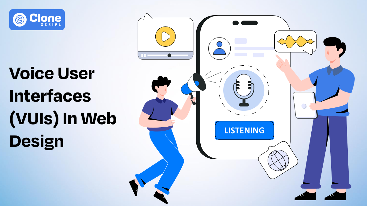
Another latest web design trend emerged as the "Voice User Interfaces" that helps you to stand out from the competition. Since mobile utilization found growth, users are looking to eliminate the typos and emphasize voice searches.
Now, the internet is easily available everywhere, users are interacting with websites in different ways. They don't just try to fill the search box but they speak and get the information in nanoseconds.
Examples of VUIs: Google, YouTube, and Spotify.
Why it matters:
Voice user interfaces (VUIs) are revolutionizing how we interact with modern technology. They offer a more natural and intuitive way to access information and perform tasks while speaking the words.
By integrating VUIs into your website, you can enhance user experience, improve accessibility, and potentially reach a wider audience, especially those with disabilities or who prefer hands-free interaction.
Best practices for implementation:
To effectively implement a VUI, consider the following guidelines.
- Clearly define the scope and purpose of your VUI, ensuring it aligns with your website's goals.
- Use natural language processing (NLP), machine learning (ML), and artificial intelligence (AI) to enable an accurate understanding of user queries.
- Provide clear instructions and feedback to guide users through the interaction. Test your it thoroughly to identify and address any potential issues.
By following these best practices, you can create a Voice User Interface that enhances your website's functionality and provides a seamless user experience.
Read 10 UI Design Principles To Make Your Website More Aesthetic and Modern.
3. Augmented and Virtual Reality: Immersive Experiences on the Web
Designing a business website is not just only a task to do. However, new technologies introduced to the web and considering them will make your product more useful and helpful in the future, too.
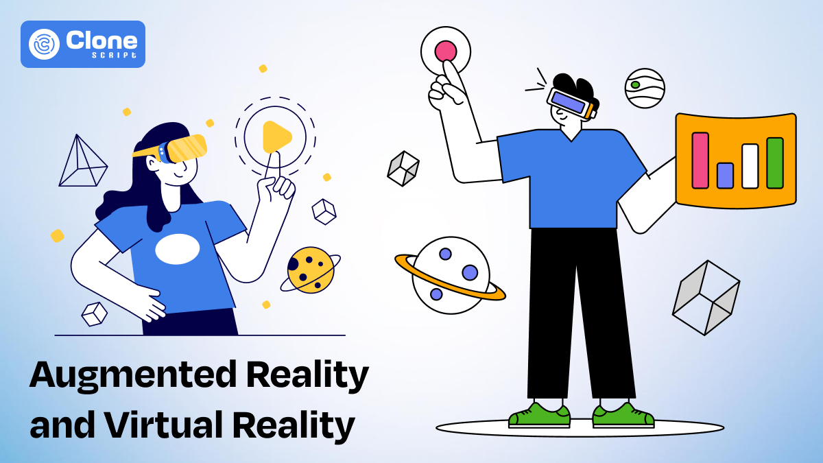
Augmented Reality (AR) and Virtual Reality (VR) are considered the hot current trends of web design. After the blockchain and artificial intelligence were introduced to the web, having a website supporting AR and VR work as the core weapon. This can be helpful when designing a site for an online RPG, e-commerce online store, or professional course-selling platforms.
AR and VR technology integrated websites examples: Lavazza x Arsenal - WebAR Football, Volvo, JBL, and Viture.
Why it matters:
Augmented reality (AR) and virtual reality (VR) are transforming the way we engage and rely on digital content. By combining the physical and digital worlds, AR and VR can create immersive and engaging experiences that enhance user engagement and provide unique value.
For example, it showcases products in a virtual showroom or provides interactive tutorials. AR and VR offer endless possibilities for web innovation.
Best practices for implementation:
To effectively integrate AR and VR into your website, consider the following approaches.
- Choose the right and perfect technology based on your goals and target audience.
- Design websites that are intuitive, user-friendly, modern, and easy to use.
- Ensure compatibility and security with various devices, browsers, and platforms.
- Prioritize user experience and accessibility, especially for users having some disabilities.
With these best practices, you can create AR and VR experiences that leave a lasting impression and set your website apart from the competition.
4. Microinteractions: The Small Details That Matter

In the web design trends of 2024, adding micro-interactions counts as an unforgettable user experience. It encourages the users to interact quickly with the website and make an informed decision on the current stage. Ultimately, the micro-interactions on the website are intended to help everyone to accomplish their goals.
Microinteractions examples in websites: Amazon, PayPal, Coursera, and Grammarly.
Why it matters:
In modern web design, attracting users is very important and for that micro-interactions are the correct option to hold their attention. As of now, every day something new is introduced to the web, you have to keep the focus on improving the website design for the future.
Don't try to push users into a whirlpool of information instead provide them with information for their actions such as progress bars, visual cues, and color changes.
Best practices for implementation:
- When designing micro-interactions in a new website, focus on simplicity and relevance. Ensure they align with the overall user journey and enhance the functionality of your website.
- Use subtle animations and haptic feedback to provide visual and tactile cues.
- Test your micro-interactions thoroughly to make sure they are intuitive and enjoyable.
To elevate your website's looks and create a more engaging user experience, micro-interactions are a must.
Read 10 Mistakes To Avoid Buying a Meme Coin WordPress Template Online.
5. Minimalist Design: Less is More

To design a futuristic website, you have to utilize the white space correctly and keep the appearance clutter-free. Don't ever try to make the website messy with too much content, graphics, visual elements, and text. It's a not good sign for a user experience and leads your product to failure.
As new things could be introduced to the web design, you should keep the current theme simple as much as possible. So, when you identify such an element that makes your site more professional and modern, it could be easily integrated.
Minimalist design examples: Design Co., Tinker, Finnovaslr, and Desktronic.
Why it matters:
Minimalist design has gained popularity in recent years due to its focus on simplicity and clarity to create a sense. By removing unnecessary elements, minimalist websites create a clean, concise, uncluttered interface that is easy to navigate and visually appealing. This approach can improve user experience, enhance website performance, and create a memorable brand identity.
Best practices for implementation:
- To effectively implement the minimalist design, prioritize essential content, and eliminate distractions that draw eyes.
- Use a limited color palette and simple typography to create a cohesive visual experience.
- Ensure that all elements are aligned and spaced consistently.
- Optimize images or videos for faster loading times.
These guidelines help you to create the best website with a minimalist design by restricting the bad UX. It improves the site's aesthetically pleasing look and makes it properly functional.
6. Adaptive Design: A Must-Have for the Modern Web

In 2024's website design trends, emphasizing adaptive design is very important. By designing your website with consideration of all devices that users prefer, your product could be accessible to everyone. Meanwhile, overlooking the responsive design will not contribute to the share of a successful product launch. You may lose your investment or time from it.
Adaptive design examples: Home Depot, Air India, Visa, PNC Bank, and Canva.
Why it matters:
In today's mobile-first world, adaptive design is essential for ensuring that your website looks and functions flawlessly on all devices, from smartphones to desktops. As your designs are automatically adjusted to different screen sizes and resolutions, it provides a consistent and optimal user experience, regardless of how users access your website.
Best practices for implementation:
- To effectively implement adaptive design in a website, use a responsive framework or CSS media queries.
- Prioritize mobile-first design to ensure your website functions well on smaller screens.
- Test your website on different kinds of devices and browsers to identify and address any compatibility issues.
- Optimize images and content for different screen sizes to maintain performance.
Considering these best practices helps you to create an accessible, user-friendly, scalable, and secure website. So, that performs seamlessly on each device and browser without any glitches.
7. Personalized Experiences: Tailoring the Web to the Individual

Your web design should be complies with each user's needs and offer them a personalized experience. Keep the focus on what your target audience is (after deciding the buyer personas), considering demographics, interests, and preferred devices to surf the web. From there you can get complete details of how your design should be and in which way it can be helpful for users.
Personalized experience website examples: Amazon, Coursera, Instacart, and McDonalds.
Why it matters:
In the age of data-driven marketing, personalized experiences are becoming increasingly important to beat the competition. With inbound tailoring content and recommendations to individual users, you can create a more relevant and engaging website experience. This can result in higher conversion rates, increased user satisfaction, and stronger customer loyalty.
Best practices for implementation:
- To deliver personalized experiences, first, you have to collect user data and analytics to understand your audience's preferences and behaviors.
- Use targeted content, recommendations, and product suggestions based on individual profiles.
- Implement a robust personalization engine like as push notifications to deliver relevant content in real time.
- Continuously test and refine your personalization strategies to ensure they are effective and meet the evolving needs of your users.
Personalized web designing is an emerging trend of 2024 and it's a gateway to enter the large market of customers and drive success.
Read Food Delivery Mobile App Development Steps To Make A Successful App.
8. Scroll-Triggered Animations: Bringing Your Website to Life

Those days are gone when users have to scroll the entire website to get further information. Now, through scroll-triggered animations, they can explore the site with ease and take the desired actions. That's why considering this web design trend for your website will be beneficial.
Scroll-triggered animations on the website: Ambuja Cement, NASAProspect, Apple, and Twinbru.
Why it matters:
Scroll-triggered animations add a dynamic and engaging element to your website. To stand out from the competition, your website should be uniquely designed and offer an interactive experience to everyone. It should guide visitors through content, and influence them for decision-making. By using animations strategically, you can create a more immersive and memorable experience for your users.
Best practices for implementation:
- When using scroll-triggered animations, ensure they are relevant to the content, website theme, user demographics, and interests to enhance the UX.
- Choose animations that are subtle and don't distract from the main message you want to convey through representation.
- Optimize performance to avoid delays or lag affecting user experience.
- Test your animations on various devices and browsers to ensure better compatibility.
Don't forget to add scroll-triggered animations and visual elements in website design because it's the best chance to shine in the competition and make the digital product famous.
9. Accessibility-Focused Design: Creating Websites for Everyone
Designing a website for everyone is considered a common web design challenge. As each user has their preferences, interests, and mindset gathering it in a single design is tough, but not impossible. As you're designing the website in 2024, you have to focus on each user's needs, no one should be excluded.
Accessible website design examples: Amazon, Canva, PayPal, and Grammarly.
Why it matters:
Accessibility-focused design ensures that your website is usable by people with disabilities, making it more inclusive and accessible to a wider audience. There are three benefits you can leverage with this web design trend: 1. improve user experience, 2. enhance your brand reputation, and 3. comply with legal requirements.
Best practices for implementation:
- To create an accessible website, follow established accessibility guidelines such as WCAG (Web Content Accessibility Guidelines).
- Use clear and consistent labeling for all elements.
- Write descriptive alternative text for images and other non-text content, so users with poor internet connections read the text instead of leaving the site quickly.
- Assure your website is working fine with assistive technologies like screen readers.
- Test your website with users who have disabilities to identify and address any accessibility barriers.
To rank well in the competition, you have to make sure the website you design is easily available for everyone. It should be helpful for them to accomplish their goals and keep focusing on the improvement.
Read E-commerce Mobile App Advantages To Know Before Making Any Decision.
10. Ethical Web Design: Building a Responsible Digital World

The future of web design is based on ethical practices. You have to make sure the design is not affecting user privacy, compliance with data protection regulations, and motivating the greener energy consumption. This will impress your users and make your website more professional and reputable among others.
Ethical web design examples in websites: Microsoft, and Lenovo.
Why it matters:
Ethical web design goes beyond traditional aesthetical appearance and responsive functionality. It considers the social, environmental, and ethical implications of website creation and usage. As you focus on ethical web design principles, you can contribute to a more sustainable and equitable digital landscape.
Best practices for implementation:
- To practice ethical web design, prioritize accessibility and inclusivity.
- Minimize your website's environmental impact by optimizing performance and using sustainable hosting.
- Respect user privacy and avoid excessive data collection.
- Be transparent about your website's practices and policies. Support ethical sourcing and fair labor practices in your supply chain.
By incorporating ethical considerations into your design process, you can create a website that aligns with your values and contributes to a positive digital future.
Conclusion
The future of web design is very bright with advanced technology may be introduced. So, creating a website is not a task to mandatory perform but keep sticking with the trends in designing, you can craft a useful product. It means to make a website competitive and unique, focusing on trends is the ultimate solution.
Best Solution By All Clone Script
As you looking the complete web design solutions for your project?
Don't worry.
All Clone Script brings a wide range of choices in front of you from e-commerce website development and RPG game development to e-learning platform to NFT marketplace app.
You can take our web designing services in two ways: 1. UI/UX design for a website, and 2. Mobile app UI/UX design.
As we're relying on modern technologies and tools like Figma our web design remains useful, professional, and optimized for a user experience.
Want to take your web development efforts to the top by following the web design trends of 2024? Contact us and let us know what are you trying to achieve and the remaining will be managed.
We're not designing the website but creating a useful product that helps you to stand out from the competition and establish your brand's presence.
 BTC - Bitcoin
 USDTERC20 - USDT ERC20
 ETH - Ethereum
 BNB - Binance
 BCH - Bitcoin Cash
 DOGE - Dogecoin
 TRX - TRON
 USDTTRC20 - USD TRC20
 LTC - LiteCoin

