BTC - Bitcoin
 USDTERC20 - USDT ERC20
 ETH - Ethereum
 BNB - Binance
 BCH - Bitcoin Cash
 DOGE - Dogecoin
 TRX - TRON
 USDTTRC20 - USD TRC20
 LTC - LiteCoin
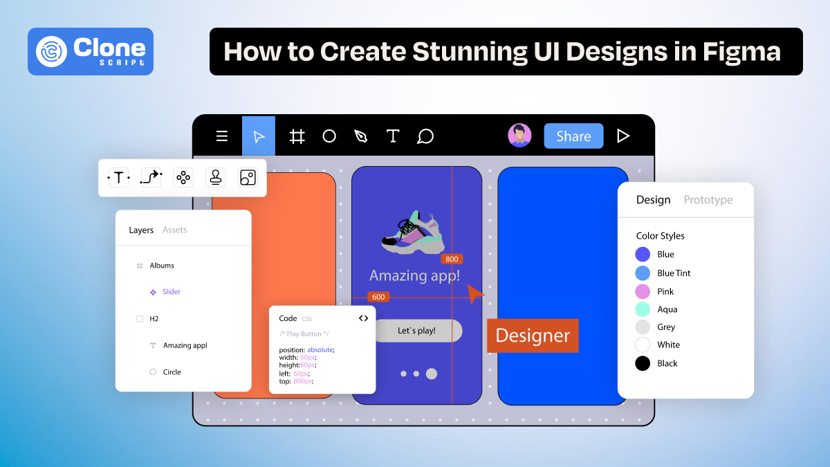
How to Create Stunning UI Designs in Figma: A Step-by-Step Guide
Figma has redefined how we design digital interfaces. Whether you're crafting the next viral app UI or a sleek web dashboard, Figma provides a collaborative, cloud-based platform that combines creative freedom with structured design systems. But making a user interface (UI) that’s not just functional, but stunning, requires more than knowing tools. It demands a strategic, detail-oriented design process.
In this guide, we’ll walk through how to turn a blank Figma interface into a pixel-perfect UI, from wireframing to exporting, using components, Auto Layout, and advanced tricks that seasoned designers use to stand out.
Getting Started with Figma UI Design.
Before diving into visual aesthetics, it’s better to structure your Figma UI project.
Start by defining your target: Are you building a mobile UI design, a site UI design, or a dashboard UI?
Figma’s infinite canvas allows you to design across breakpoints using Frames for different screen sizes.
Organize your project with clearly named pages like “Wireframes,” “UI Mockups,” and “Components.” This structure makes your Figma app design scalable.
Pro Tip: Pull from Figma UI kits or the best Figma design templates as a starting point. These kits follow modern standards and help establish consistent UI web design principles.
Understanding Figma’s UI Design Tools.
To truly test Figma’s potential, you must go beyond dragging shapes. The platform offers a toolkit that can scale from a single web page UI design to a full mobile app design kit in development.
Use the following:
-
Frames to simulate devices
-
Grids and Guides for pixel alignment
-
Constraints for responsive Figma web design
-
The Inspect tab for CSS-ready properties
Styles like colors, shadows, and typography can be saved as reusable tokens useful for when working in Figma design systems.
Use Figma components in combination with Auto Layout for responsive, reusable design assets. This is especially useful when working on complex UI design dashboards or game UI elements.
Building Wireframes First.
Wireframing in Figma is essential to lay down interaction flow and visual hierarchy before adding polish. Start with low-fidelity gray boxes, placeholder text, and icons. Prioritize structure and flow over visuals.
Why it matters:
-
Speeds up iteration. There’s no need to change the code again and again.
-
Clarifies functionality. Save time for indicating the button or form use cases.
-
Provides early feedback. Designing a complex app like a crypto app will be tested before a full-fledged launch to avoid product failure.
-
Reduces design debt. Don’t require hiring or taking the help of professional web designers.
Use Frames to define device boundaries and stick to a grid system. Even at the wireframe level, using UI templates or placeholder Figma components can save hours later in development.
Whether you're working on Figma web design or mobile app UI design, wireframes help stakeholders visualize content flow before style decisions.
Using Auto Layout for Responsive Design.
Figma Auto Layout is what makes your design fluid and flexible. It allows components to grow or work based on content or screen size, perfect for responsive UI design.
Here’s how:
-
Set direction: vertical for forms, horizontal for navbars
-
Use padding and spacing rules.
-
Nest Auto Layouts for Modular Scalability
Use it in:
-
Dynamic card designs. For Web3 games, different types of layouts are required according to device sizes.
-
Forms that adjust to error messages. To present a message in a concise and readable format is helpful.
-
Buttons with variable text. For adjusting the button size according to the device size, it adapts.
Combine Auto Layout with constraints for layouts that behave predictably across screen sizes. This is a must in creating responsive design website templates.
Creating and Using Components & Variants.
Reusability is the secret sauce in scalable design. With Figma components, you can create a master element like a button or a navbar and reuse it across all screens. Update it once, and every instance reflects the change.
Go further with variants:
-
Manage multiple states (hover, disabled, active)
-
Use toggles in the right panel to switch between styles
-
Improve your prototyping and dev handoff
Create your own Figma UI kit from components and variants. Share it as a team library for faster collaboration in enterprise-grade app UI design or dashboard UI projects.
Designing for Web vs Mobile UI in Figma.
Understanding the platform context is important. Web UI design and mobile UI design each come with their constraints and opportunities. After all, web and mobile apps have differences, so the design should reflect them.
In Figma, use the following:
-
Use separate Frames for desktop, tablet, and mobile.
-
Apply different breakpoints for responsive design.
-
Adapt text, spacing, and touch targets based on the device.
Key tips:
-
Web UIs support hover states, wider layouts, and side navigation.
-
Mobile UIs focus on vertical scroll, tap interactions, and gesture-based flows.
Use Figma components smartly by creating device-specific variants and reusing them across platforms.
Whether you're designing for a game UI or an admin panel, tailoring your layouts to the target device is non-negotiable.
Using UI Kits & Design Systems in Figma
Why waste time on web design? Figma UI kits offer ready-made elements like:
-
Buttons: Pre-designed buttons maintain a consistent style, hover states, and responsiveness, speeding up prototyping and reducing repetitive manual work.
-
Input fields: Ready-to-use input fields streamline form creation with standard spacing, labels, and validation states, ensuring usability and design consistency.
-
Navigation bars: UI kits offer navigation templates that adapt across devices, supporting intuitive site architecture and faster layout integration.
-
Color palettes: Built-in color schemes add brand consistency, accessibility, and visual harmony without starting from scratch or guessing contrast ratios.
-
Typography scales: Predefined font hierarchies balance readability and design aesthetics, making content structure clean and responsive across screen sizes.
This is especially helpful for:
-
Mobile app UI design: Figma kits accelerate mobile design with scalable components, mobile grids, and native-style interactions for iOS and Android apps.
-
UI design dashboards: Dashboards benefit from UI kits offering complex data widgets, charts, and structured layouts that enhance user flow and performance.
-
Site UI design: Website design templates provide consistent layouts, footers, CTAs, and section blocks. It helps developers and designers collaborate efficiently from day one.
Choose kits tailored to your niche, whether it’s a dash UI for analytics or an OTT video streaming website UI design for entertainment apps.
Download customizable Figma templates from trusted sources. Popular platforms offer web design kits that are production-ready and time-saving.
Using a design system brings visual consistency and speeds up onboarding for new designers or developers.
Finalizing and Exporting Your UI Design.
Your design is complete. Now let’s hand it off professionally. Start with:
-
Clean layer naming: Use clear, consistent names for layers so developers easily understand structure and hierarchy during handoff or future edits.
-
Grouping and flattening assets: Group related elements and flatten when necessary to simplify exports, reduce layers, and improve performance in development tools.
-
Setting up export sizes (1x, 2x, SVG): Prepare assets at multiple resolutions for different screen densities, ensuring sharp visuals on Retina, Android, and responsive devices.
In Figma, developers can use the Inspect panel to grab:
-
CSS snippets: Developers can extract auto-generated CSS for fonts, colors, and layout properties. It is accelerating front-end implementation with fewer mistakes.
-
iOS & Android dimensions: Figma provides pixel-accurate dimensions tailored to platform guidelines. It is ideal for native app development on iPhone and Android devices.
-
Font specs and color codes: Developers can quickly access typography settings and HEX/RGB values, maintaining visual fidelity across design and code environments.
Also, consider integrating:
-
Zeplin: Sync Figma files with Zeplin for enhanced developer specs, code snippets, and organized style guides outside of Figma.
-
Jira: Link Figma designs to Jira tickets, improving design-to-development collaboration and tracking implementation status across agile workflows.
-
Storybook: Use Storybook to turn Figma components into interactive, code-based UI libraries for scalable, consistent frontend systems.
Final QA includes zooming in to check paddings, hover states, and mobile UI design responsiveness using the Figma prototype preview.
This attention to detail defines the quality of your UI web design or Figma website handoff.
Pro Tips to Make Your UI Design Stand Out
Want your designs to look premium? Try these expert-level tips:
-
Use micro-interactions: Animate button hovers or slide-in panels.
-
Limit your color palette: Stay on-brand and reduce visual clutter.
-
Follow an 8px spacing system: Ensures scalable and consistent spacing
-
Master typography: Use hierarchy and alignment instead of just different fonts
-
Design with real content: Avoid lorem ipsum; use meaningful text and data
-
Include dark mode: Boost accessibility and modern appeal
A great UI design in Figma feels intuitive. The user should never stop to think about how to use the interface.
These details turn a basic layout into a high-quality Figma design that users love and developers respect.
Final thoughts
Creating a stunning UI in Figma involves much more than dragging boxes. From low-fidelity wireframes to responsive, component-driven systems, every step shapes the end-user experience. Whether you're designing a mobile app UI, a dashboard UI, or a modern website UI design, Figma gives you all the tools. Combine that with creativity, structure, and a few pro tricks, and you’ll build UIs that are not just beautiful, but unforgettable.