What Makes the Best Grocery Website Design? 10 Must-Have Features and Examples
In today’s digital era, having a simple brick-and-mortar grocery store is no longer enough to stay competitive. To succeed, grocery store owners need to invest in a functional, responsive, and advanced grocery website that sets their business apart.
Recent predictions suggest that by the end of 2024, 70% of U.S. consumers will prefer online grocery shopping, with spending in this sector reaching $100 billion by 2025. This trend highlights the urgent need for a unique, user-friendly grocery website design.
The best grocery website design is not just about listing products. It’s about delivering a shopping experience that’s fast, convenient, and engaging. Modern design and unique features such as AI-driven product recommendations and Voice-enabled search can hold customers’ attention and boost loyalty.
This guide will explore must-have features and design examples that define the most successful grocery websites, helping you create an online store that both attracts and retains customers.
1. User-Centric Navigation and Search Bar
The goal of any grocery website is to make it as easy as possible for customers to find what they need quickly. Most grocery stores often have thousands of items, so intuitive navigation and a powerful search function are non-negotiable.

Features to Include:
-
Clear Categories: Organize products into logical categories such as "Fruits & Vegetables," "Dairy & Eggs," "Snacks & Beverages," etc. So, users can easily locate them.
-
Search with Filters: The search bar should allow users to apply filters like price, brand, and dietary preferences, helping them narrow down choices quickly.
Example of UX Optimized Navigation and Search Bar:
Amazon Fresh and Instacart do an excellent job with their search functionality, offering instant product suggestions, filters, and image-rich search results.
2. Focusing on Mobile-friendly Web Design
Mobile commerce is on the rise, and grocery shopping is no exception there. Busy customers are likely to shop on the go for daily essentials like milk, vegetables, wheat, etc. So, prioritizing mobile optimization in the UI/UX website designing part is an important component of any online grocery store.

Features to Include:
-
Responsive Design: Ensure the website adapts seamlessly to different screen sizes, offering a consistent and user-friendly experience across devices.
-
Mobile-Friendly Checkout: Simplify the checkout process for mobile users by using touch-friendly buttons, autofill options, and easy navigation back to the cart.
Example of Mobile Optimized Grocery Website Design:
Walmart’s grocery section has a fully optimized mobile version that’s easy to navigate. With large icons, clear text, and a user-friendly layout that streamlines the entire shopping process.
3. High-Quality Images and Product Descriptions
In website design preferring the comprehensive section is important. Unlike a physical store where customers can see and feel products, an online store must rely on visuals and descriptions to convey product quality and details. This helps customers to choose their favorite products.

Features to Include:
-
HD Product Images: Show high-resolution images from multiple angles, allowing customers to view products closely and decide their freshness.
-
Detailed Descriptions: Add product descriptions that include important information like ingredients, nutritional values, brand details, and usage recommendations.
Example of High-Quality Image and Product Description in Website Design:
Whole Foods’ online store combines high-quality images with descriptions. This emphasizes quality, organic sourcing, and product benefits, reinforcing their brand values and customer expectations.
4. AI-driven Personalized Recommendations
Customers love personalization in online shopping. So, including an AI-driven personalization feature in website design is important for increasing customer satisfaction and loyalty. By recommending products based on previous purchases or browsing history with the help of AI can create a customized shopping experience. It encourages repeat visits and larger purchases.

Features to Include:
-
Suggested Products: Display related items or add-on suggestions based on what the customer has in their cart or their browsing behavior. AI chatbot integration with the website recommends the product based on the customer’s preferences, reducing the purchase time.
-
Loyalty Program Integration: Offer rewards and discounts for frequent shoppers and suggest items based on loyalty points or promotions they may qualify for.
Example of Personalized Recommendation in Grocery Website Design:
Kroger’s website uses personalized recommendations effectively, suggesting items that customers often purchase together and showing frequently bought items based on the customer’s profile.
5. Easy, Secure, and Safe Checkout Process
In online grocery shopping, customers prefer a simple, secure, and faster checkout process. This reduces friction and ensures customers complete their purchases. Design a robust checkout process in a grocery website and ensure it offers an optimal experience. A lengthy or complicated checkout is one of the main reasons customers abandon their carts.

Features to Include:
-
One-Click Checkout Option: Allowing returning customers to purchase items quickly with saved information makes the process more convenient.
-
Multiple Payment Methods: Offer various payment options like credit cards, digital wallets, cryptocurrency, and PayPal. Secure payment gateway integration allows you to accept payments from customers.
-
Clear Shipping and Delivery Options: Include details about delivery times, pickup options, and any fees upfront, reducing last-minute surprises.
Example of Secure Checkout Process in Grocery Website Design:
Instacart’s checkout process is simple and user-friendly, with options to save payment details and choose delivery times in advance. This allows users to easily shop for their daily essentials without wasting time in product searches and entering the card details manually again.
6. Inventory Transparency and Real-Time Updates
To run your grocery store website effectively, transparent inventory management is very important. Meanwhile, real-time updates inform the customers to their favorite products are selling fast and it generates curiosity for making the purchases. Design the website with a complete stock management system to avoid any conflicts during the checkout and at the time of shipping.

Features to Include:
-
Stock Availability Indicator: Show if an item is out of stock and allow customers to sign up for notifications when it’s available again.
-
Substitution Options: Provide alternative suggestions when items are out of stock to help customers complete their shopping list.
Example of Real-time Stock Management in Grocery Web Design:
Amazon Fresh does an excellent job of indicating stock availability, letting customers know when certain items might run out soon. This kind of approach not only creates the website's USP but creates an incredible image in the customer’s mind.
7. Social Proof and Customer Reviews
Most customers make grocery purchases by reading previous customers' reviews regarding the product’s freshness, checkout process, shipping facility, and order fulfillment. Adding social proof design in your grocery e-commerce website development builds trust to bring new customers. So, having a system for testimonials and feedback through Google reviews will give the extra chance to be featured in local searches.

Features to Include:
-
Customer Ratings and Reviews: Allow customers to rate products and share their experiences. Google Reviews can be the best choice for site SEO ranking and social proof.
-
Featured Testimonials: Highlight testimonials from happy customers or loyal users to boost credibility. Attaching their review screenshot or authorized links to social media accounts delivers trust to new customers.
Example of Customer Reviews in Web Design:
Thrive Market effectively uses reviews to build trust. They display product ratings and allow users to filter products based on top-rated items.
8. Advanced Filters for Dietary Preferences
Don’t assume your grocery website is visited by the general public. Health-conscious shoppers often look for specific dietary items such as gluten-free, vegan, or organic products. Designing advanced filters makes it easier for them to find products that align with their needs.
Features to Include:
-
Dietary Filters: The website design should allow users to filter by dietary needs, allergens, or organic certification.
-
Labels on Product Images: Include visual labels (like "organic" or "vegan") on product images for quick identification. This reduces their time on product preferences.
Example of Filter in Grocery Website Design:
Sprouts Farmers Market offers filtering options for dietary preferences and tags their product images with clear labels, helping customers easily identify items that match their dietary needs.
9. Integrated Delivery and Pickup Options
The main reason for grocery website development is to reduce the conflict in the store during the product delivery. Many grocery stores now offer both delivery and curbside pickup options, which are essential for customer convenience. Integrating these options directly into the website improves user experience and customer satisfaction.

Features to Include in Web Design:
-
Delivery Scheduling: Having flexible delivery scheduling options helps customers to choose specific times or same-day options.
-
Pickup Slot Reservation: For curbside or in-store pickup, customers should be able to reserve a time slot that’s convenient for them.
Example of Delivery and Pickup System Integration in Website Design:
Target’s grocery section integrates delivery and pickup options seamlessly, enabling users to select the method that best fits their schedule. Ultimately, they don’t have to wait for their turn to pick up the order and compromise with the product quality.
10. Visual Design and Branding Importance
Your website design should be visually appealing and successfully complying with the branding tone. The advances in visuality in grocery sites play a significant role in shaping a customer's perception of the brand. A clean, professional design builds trust and sets the tone for a pleasant shopping experience.
Nowadays, customers cannot easily interact with static and simple websites. They prefer to visit a dynamic and advanced website where the buttons, icons, visual elements, and features are available at the correct place.

Features to Include:
-
Consistent Branding: Use colors, fonts, and images that reflect your brand identity, giving the site a cohesive look and feel.
-
Clean Layouts: Avoid cluttered pages. Keep the focus on simplicity and ease of navigation.
Example of Visual Design and Branding in Web Design:
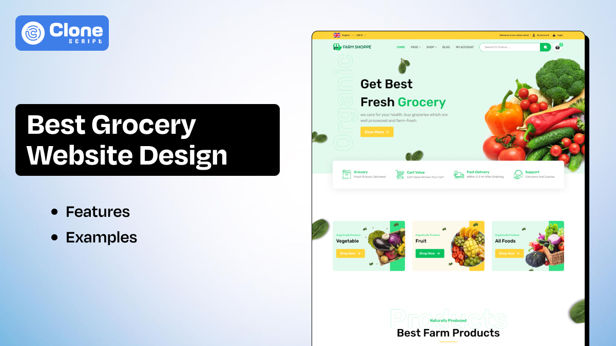
FreshDirect employs a sleek, modern design that combines clear navigation with colorful, appetizing images. This makes it easy for users to find products and feel good about their purchases.
Implementing the required features to your grocery website design will not get new customers but create goodwill in their minds. Having valuable goodwill for business is very important to differentiate in the market.
All Clone Script’s Comprehensive Solution for a Grocery Website Design and Development
Are you looking for a grocery website design and development?
Look no further than “All Clone Script - a web development company.”
We offer a complete package for website design and development by using cutting-edge solutions and technology. Whether you just need UI and UX design for the website, web and app development, everything we have.
Here we found the best suitable service for your online grocery store development.
Need any further help? Let’s talk. Contact us for your custom requirements and we will be back with the complete solution.
Wrapping Up: Crafting the Ideal Grocery Website
For retail grocery store owners, investing in a well-designed website is a gateway to scaling up, attracting loyal customers, and delivering a seamless shopping experience. By incorporating user-friendly navigation, high-quality visuals, personalization, and an efficient checkout process, you can elevate your grocery website to meet modern expectations.
Remember, the best grocery website design isn’t just about aesthetics; it’s about creating a platform that offers functionality, convenience, and an exceptional shopping experience through the wise usage of advanced technology.
If you're ready to transform your online grocery store, start implementing these features today, and watch your customer satisfaction and sales grow.
 BTC - Bitcoin
 USDTERC20 - USDT ERC20
 ETH - Ethereum
 BNB - Binance
 BCH - Bitcoin Cash
 DOGE - Dogecoin
 TRX - TRON
 USDTTRC20 - USD TRC20
 LTC - LiteCoin

