BTC - Bitcoin
 USDTERC20 - USDT ERC20
 ETH - Ethereum
 BNB - Binance
 BCH - Bitcoin Cash
 DOGE - Dogecoin
 TRX - TRON
 USDTTRC20 - USD TRC20
 LTC - LiteCoin
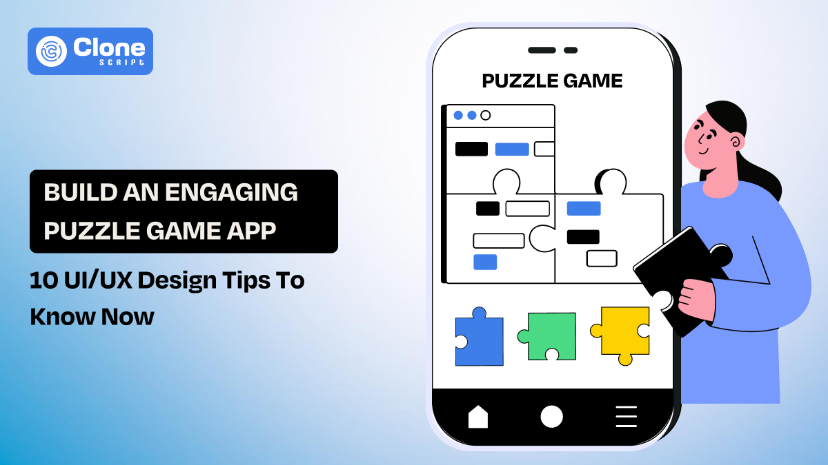
10 UI/UX Tips for Designing an Engaging Puzzle Game App
Ever notice how a good puzzle game can make you “just one more level” yourself into missing dinner? That’s not luck — that’s great design. The truth is, no matter how brilliant your gameplay mechanics are, a clunky interface will have players uninstalling faster than you can say “loading screen.”
In the world of puzzle games, design isn’t decoration — it’s the game’s soul. Every shade, icon, and transition shapes how players think, feel, and engage.
So if you want your puzzle game to feel less like an app and more like an experience, these 10 UI/UX tips will help you get there. Let’s get your design game as addictive as your gameplay.
Why Design Matters the Most in a Puzzle Game App?
To be honest, a brilliant puzzle wrapped in bad design is like serving fine wine in a paper cup. Sure, it works — but no one’s coming back for a second pour.
In puzzle games, every design choice directly impacts the experience. Clunky buttons, loud colors, or confusing icons break concentration faster than a notification ping.
A well-thought-out interactive game layout, on the other hand, builds flow. It keeps players in “the zone.” That sweet spot where time disappears and only the puzzle remains.
Additionally, considering the most appropriate design trends of puzzle games will prove to be an engine that drives success.
Why Understanding the Psychology Behind Puzzle Gameplay Is Important?
Here’s a fun fact: our brains love solving puzzles because each win releases a tiny hit of dopamine — the same chemical that makes social media so addictive.
So when you design a puzzle game, you’re not just building screens — you’re building neural pathways to satisfaction.
That’s why puzzle game UX principles go beyond looks. You’re designing for the human mind:
-
Clarity reduces anxiety and helps players focus. Be transparent and don’t try to confuse.
-
Consistency builds trust and predictability. From color palette to button sounds, everything should be maintained.
-
Feedback fuels motivation and keeps players coming back. When they get information as much as possible through animations and pop-ups, they are amazed.
Get the psychology right, and your game becomes less of an app — and more of an emotional experience.
10 UI/UX Tips for Puzzle Game App Design
Here are the puzzle game app UI and UX design tips to consider right now:
1. Keep Puzzle Game Interface Clean and Distraction-Free.
The first thing is that the game interface has to be instantly noticeable and interesting.
Why?
Players are downloading the puzzle game to test their knowledge and have some fun.
But, if you clutter the designs is proving to be the enemy of clarity. Your interface should feel like a quiet, minimalist workspace. Not a carnival.
Focus on the following:
-
Every pixel should earn its place.
-
Use whitespace generously.
-
Prioritize the puzzle itself and let everything else quietly support it.
When players can focus without mental frustration, they’ll stay longer and play better. Think “Zen garden,” not “Times Square.”
2. Choose Colors That Reflect Calm and Focus.
Colors can make or break your game’s mood. The most famous and successful puzzle mobile games use color not just as decoration, but as a key functional element to guide and amaze users.
Ever tried solving a brain teaser on a bright red background? Yeah, it’s not fun.
-
Stick with colors that soothe the eyes and center the mind: cool blues, muted greens, or soft pastels.
-
Subtle gradients add polish without stealing the show.
For example, using the dark and heavy colors on the homescreen that do not abide by the theme of the game will just prove to be a failure of the product.
In other words, it looks like offering a tea in the name of wine.
Remember: in puzzle games, your palette should whisper “stay awhile”, not scream “look at me!”
3. Use Intuitive Icons and Visual Cues in a Puzzle Game.
Icons are like road signs in the mind games. Players should understand them instantly without needing a map.
Whether you’re designing the game for kids up to 12 years with the intention of learning or for younger adults to test their brain knowledge, the icons play a key role. The app’s thumbnails to sidebar icons should be easily identified.
Do you know what result it causes?
People surely uninstall your puzzle game because they feel something is off, and don’t even try to play the game again after a frustrating experience.
So, what is the best way to prevent it?
-
It’s a simple approach: stick with universal symbols (star for "rating," a gear for "settings," or a circular arrow left for "undo/retry") and pair them with simple animations.
Suppose a glowing “hint” icon or a bouncing “retry” button helps players feel guided, not lost.
The psychology of a great puzzle game works on usability. In that, icons do the talking, so players can do the solving.
4. Design Natural Flow Between Game Screens.
Nothing kills a puzzle game vibe like clunky and unrealistic transitions, like clicking the app icon, redirecting to the in-app purchase screen as the first interaction.
In other words, your screens should flow like water — seamless, predictable, calming, and make sense.
For that, first, map out your player journey.
Think like a player and visualize when you click the app, then what’s the thing you like to see on the home screen, and by proceeding with game levels, what drives you to get results. Each movement should feel natural, not forced.
But how to do it?
-
Use micro-interactions (like a satisfying swipe or gentle fade) to make navigation feel intuitive. Smooth transitions make players feel smart — and who doesn’t love that?
Designing the entire game with a step-by-step approach makes the mobile puzzle app development task easier for your team as well.
5. Optimize User Journey for Quick Game Access.
Here’s a golden rule: if it takes longer to start your game than to solve the first puzzle, you’ve lost half your players.
What does that mean?
Players are very smart now, and they never like to wait in a queue, just like getting items in supermarket stores. They prefer immediate actions, and in the puzzle game segment, the microseconds delay results in players quickly preferring competitors.
Here are some examples of it.
-
Five-step registration method that increases the players' frustration for onboarding.
-
Long tutorials to start playing the game by setting up the difficulty levels as needed.
-
A confusing in-app purchase system that does not make sense anymore in gameplay.
The best puzzle app onboarding tip is to let users dive straight in and learning by playing.
Keep it light, quick, and interactive. Think of it as a warm handshake, not a full-blown PowerPoint presentation.
6. Add Meaningful Animations and Feedback In-Game.
Animations are the applause of your interface, so use them wisely and perfectly. They should reward, not distract.
To improve the engagement rate, it is very useful. After all, players are looking for instant feedback on whether they clear the level or fail to complete it.
Not adding the visual and meaningful animations keeps your game static and not interesting, to win the trust of players. If they get only a text message instead of visuals, they will surely uninstall the app.
You never want it.
Follow these tips in game designing:
-
When a player solves a level, celebrate it! A little sparkle, a soft chime, or a confetti burst goes a long way.
-
When they make an error, a minimal shake or fade-out gently says, “Try again.”
These micro-moments of feedback are what transform an app into a living experience, a key ingredient in puzzle game UI best practices.
7. Maintain Visual Consistency Across All Game Levels.
Consistency builds comfort. From comfort, the app gameplay is judged for an interactive or poor user experience.
Think, whenever you play any mind-testing puzzle game or such a quiz, then what do you notice?
The same color, layout, icons, and functionality are available on the app. This kind of approach encourages you to play the game for a longer time. Right?
So, when every button, color, and font feels familiar, players trust your design and focus on solving puzzles, not figuring out where “Next” is this time.
This can result in more recognized appreciation in the number of downloads of the app, clears the level with more gameplay time, and gets more in-app purchases.
-
Establish a clear design system for your UI elements in puzzle apps. Covers everything from spacing to typography. Make sure new levels look fresh but still feel like home.
Because nothing says “professional” like a game that feels coherent, guiding towards the pattern, even when it surprises.
8. Create Engaging Progress and Reward Systems.
Humans love progress. We crave that satisfying “You’re almost there!” moment.
Most of the puzzle games are designed with the user’s needs in mind, and the “Rewards” section is important.
Why?
When a player completes a level, number 1 or 1001, they look for a reward in return. Offering them useful rewards will make a positive impact and result in prioritized gameplay for more.
You can invest in the following:
-
Incorporate visual progress cues in the game design. It includes badges, progress bars, star ratings, or streak counters. Each one of these gamification elements triggers a little rush of pride that keeps players hooked.
Balance challenge and reward. While too easy levels are like a childish game (until your audience is kids). Sometimes being overwrought towards a challenge can feel punishing rather than fun.
Find that “just right” difficulty curve by focusing on the players' preferences. Once you're done that, your mobile puzzle game UX will be pure dopamine.
9. Keep Game Controls Simple and Predictable.
Ever played a game where you spend more time fighting the controls than the puzzles? That’s a UX nightmare.
Make sure the players are in the driver's seat when playing the game, not you. They have to be able to find game controls like sounds, effects, and set difficulty levels with minimal effort.
In short, your controls & touch targets should be as natural as possible.
But, How?
-
Design the layouts of the control board that are big enough for any thumb, whether it’s a 13-year-old kid or a 30-year-old young person.
-
Make sure it is responsive on the first tap and consistent throughout the game.
It’s okay to say that better control of the gameplay is useful. Not forget to be logical, too.
Because predictability builds confidence, and it drives more engagement. When players feel in control, they play for longer and blame themselves (not you) when they mess up, such as fail to get rewards or lose the hint.
10. Design Puzzle Game for All Screen Sizes and Devices
From tiny phones to giant tablets, your game should shine everywhere. Whether it’s an Android, iOS, or tablet, the app should work without any lag or issues.
However, it’s a part of a front-end app development accompanied by the backend architecture deployment.
For that, a responsive design is non-negotiable. Because once your puzzle gaming mobile app is live on the web, the Play Store, users across the world will like to download it on different OS systems with different screen sizes.
What can you do?
-
Test the design on multiple screens, maintain scalable assets, and use adaptive grids to preserve layout balance.
No matter the device, your game should feel smooth, centered, and comfortable. A truly elite puzzle game app UI/UX never breaks its own flow.
In essence, with these tips, the game does not just become an ordinary app. It remains at the top list of the player’s choice.
Bonus Tip – Keep Updating the Puzzle Game Based on Player Behavior
Players evolve, and so should your game be.
Track player behavior: where they pause, quit, or replay. That’s not just data; it’s a direct conversation with your audience.
Use it to refine your puzzle game performance optimization strategy. Every small tweak — faster load time, smarter hint logic, improved navigation — adds up to a better experience.
And remember: a living game is a loved game.
How Ready-Made Puzzle Game App UI Can Help You?
If you’d rather skip reinventing the wheel (or in this case, the puzzle grid), ready-made puzzle game UI kits can be your best friend.
These kits come packed with elegant layouts, pre-tested design systems, and scalable assets that let you focus on creativity instead of the grunt work.
Presenting two premium game UI design kits to get in Figma:
-
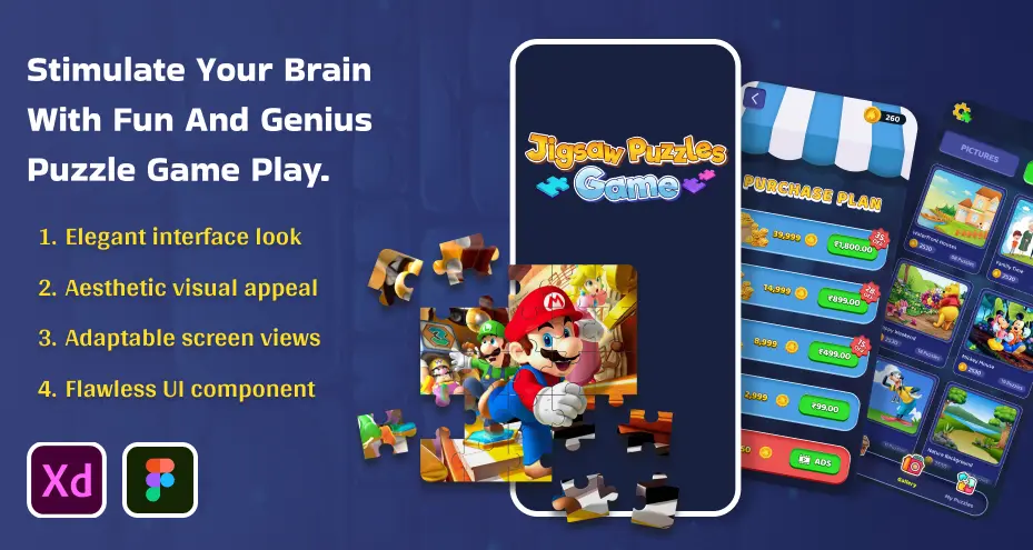
JigSaw Puzzle Game UI Kit
-
Cross Word Games UI Kit
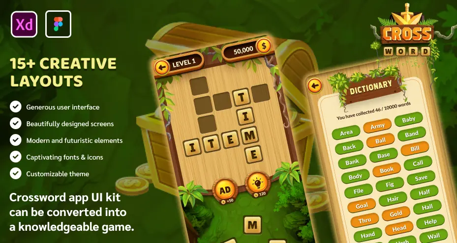
They’re beautifully designed, flexible, and most importantly, crafted to impress even the pickiest clients.
Final Thoughts
A truly engaging puzzle game doesn’t just test logic — it captivates hearts. When you combine elegance, empathy, and purpose, UI design becomes storytelling.
Your players don’t just play your game; they live in it, breathe in it. If you do it right, keep coming back for more.
So keep it clean, human, and emotionally intelligent. Because at the end of the day, great design isn’t about making things look good — it’s about making people feel good while they play.
FAQs
-
How do I make my puzzle game more accessible to all players?
Use readable fonts, adjustable color contrast, and scalable UI elements. Accessibility ensures inclusivity, improving engagement across age groups and devices.
-
How important is load time for a puzzle game app?
Fast load time directly affects retention. Players expect instant access. Optimize assets, defer non-essential elements, and aim for <3 Seconds start-time to maintain flow and avoid drop-offs.
-
Should puzzle apps support offline play or only online mode?
Offering offline mode increases usability and reach. Users should be able to play without internet, enhancing engagement and accessibility. Then offer online features (leaderboards, multiplayer) as added value.
-
How do I balance the difficulty in a puzzle game to retain users?
Start with easy levels that teach mechanics intuitively, then gradually ramp up the challenge. Monitor when players drop out and adjust pacing to maintain engagement without frustration or boredom.
-
What role does user feedback (haptics/sound) play in puzzle game design?
Feedback (visual, sound, haptic) gives players assurance that their actions are recognized. It encourages correct moves, gently addresses errors, and fosters emotional connection, key to a strong puzzle game UX.