BTC - Bitcoin
 USDTERC20 - USDT ERC20
 ETH - Ethereum
 BNB - Binance
 BCH - Bitcoin Cash
 DOGE - Dogecoin
 TRX - TRON
 USDTTRC20 - USD TRC20
 LTC - LiteCoin
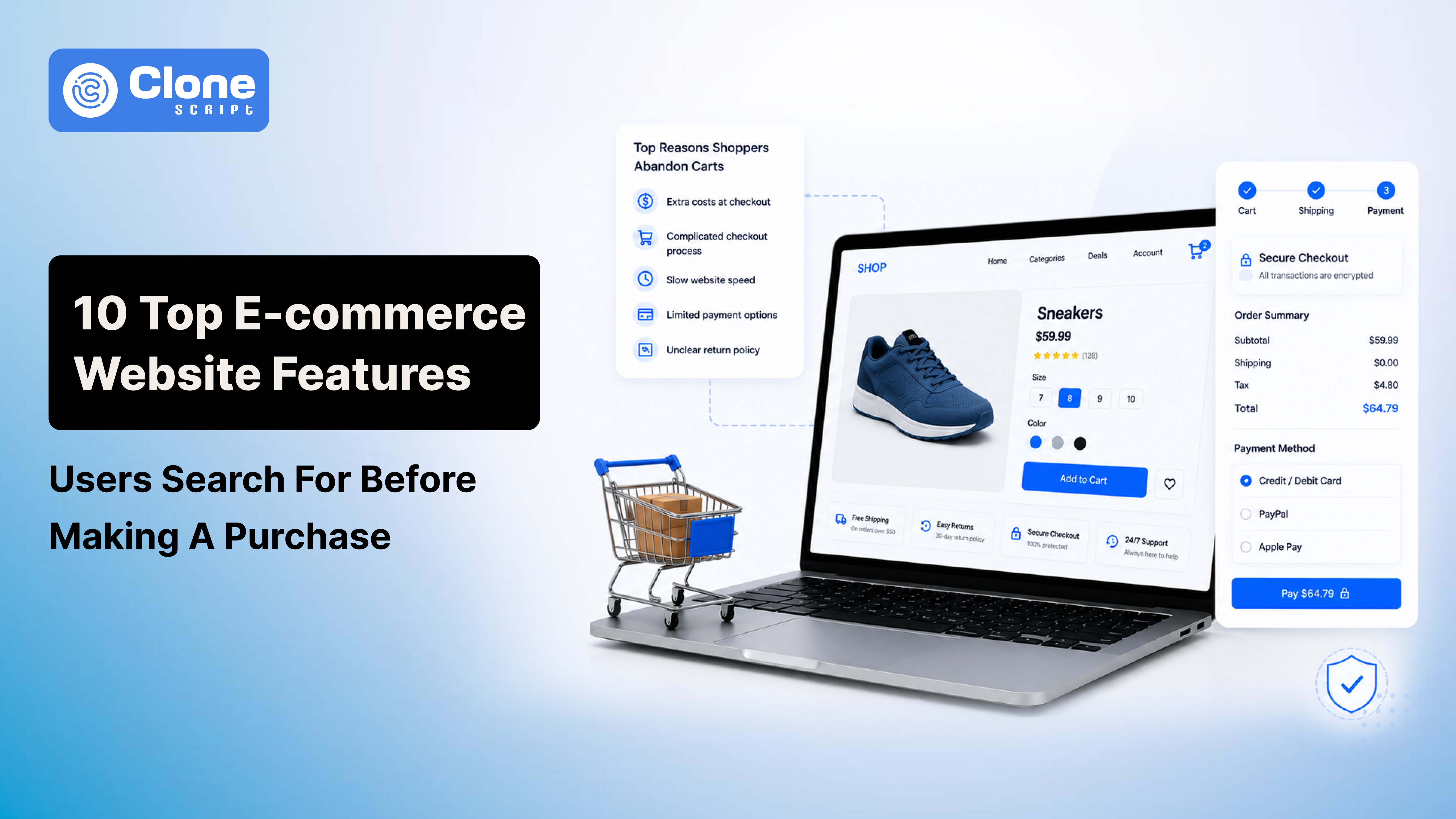
10 Top E-commerce Website Features Users Search for Before Making a Purchase
A customer lands on your e-commerce website ready to buy.
Then they hesitate.
They can't find the delivery date. Shipping fees suddenly appear at checkout. The return policy is buried in the footer. The product page leaves unanswered questions. Within seconds, they're gone.
Most businesses assume shoppers abandon purchases because of price. In reality, many leave because the buying experience creates doubt.
Baymard Institute found that the average cart abandonment rate is 70.22%.
One of the biggest reasons? Unexpected costs like shipping and taxes. Other shoppers walk away because checkout feels complicated, delivery information is unclear, or the website simply doesn't inspire confidence.
For entrepreneurs, this means more traffic won't fix a problematic funnel.
For developers, adding trending features won't compensate for friction in the customer journey.
The brands that convert consistently aren't always the ones with the biggest budgets. They're the ones that answer customers' concerns before they become objections.
In this article, we'll explore the e-commerce website features shoppers actively look for before making a purchase. More importantly, you'll get what to prioritize first and what users wish brands would stop doing altogether.
Why Understanding User Buying Anxiety Matters More Than Adding More Features
Most online shoppers don't wake up looking for reasons to abandon their carts.
They arrive with the intention to buy.
The problem is that buying online comes with a level of uncertainty that doesn't exist in physical stores. You can't touch the product, ask an employee a quick question, or walk out with your purchase immediately. Instead, customers are forced to make decisions based on the information a website provides.
When that information feels incomplete, hesitation takes over.
In fact, a PwC survey found that 43% of consumers are willing to pay more for greater convenience, while poor experiences can quickly push them toward competitors. Customers don't separate the product from the experience of buying it. To them, they're part of the same decision.
This is where many businesses get it wrong.
Entrepreneurs respond to declining sales by increasing advertising budgets. Developers may focus on visual enhancements or introducing new features. Meanwhile, customers are asking much simpler questions:
-
Can I trust this website?
-
Is this product right for me?
-
What will this actually cost me?
-
What happens if something goes wrong?
-
How easy is it to complete my purchase?
The websites that convert well aren't necessarily the ones with the most advanced functionality.
They're the ones that remove doubt at every stage of the buying journey.
The ten e-commerce website features in this guide do exactly that. Each one addresses a specific concern customers have before clicking the "Place Order" button.
The 10 E-commerce Website Features Customers Actually Look For
These features are what every customer always thinks when visiting to purchase products or services, a Google-searched site, or finding it on the Instagram feed.
-
Transparent Pricing and Shipping Information
Few things frustrate online shoppers more than discovering extra charges at the final step of checkout.
You've probably experienced it yourself. A product seems reasonably priced until shipping fees, taxes, or service charges suddenly appear. What started as a straightforward purchase now feels misleading.
Baymard Institute found that 39% of shoppers abandon their carts because extra costs are too high, making it the most common reason people leave without buying. The issue isn't always the amount itself. Often, it's the surprise.
Customers want clarity before they invest their time in the checkout process. They expect to see:
-
Shipping costs
-
Estimated taxes
-
Realistic delivery dates early in the journey
Even a simple message like "Arrives by Tuesday" can reduce uncertainty.
So, what do developers have to do? Surface pricing details before checkout, particularly on the product page. Do not hide them behind multiple steps.
For entrepreneurs, transparent pricing builds credibility. Customers may forgive higher costs, but they rarely forgive feeling deceived.
When shoppers know exactly what they're paying and when their order will arrive, they're far more likely to complete the purchase.
-
Authentic Customer Reviews and Social Proof
Shopping online requires a leap of faith.
You can't hold the product in your hands or judge its quality in person. That's why many shoppers scroll straight to the review section before reading anything else. They're not just looking for star ratings. They're looking for reassurance from people who have already taken the risk.
According to BrightLocal, 97% of consumers read online reviews before making a purchase, while most shoppers trust reviews more when they include photos and detailed experiences.
Interestingly, perfect five-star ratings can sometimes create suspicion. A few balanced reviews often feel more believable than overwhelming praise.
That means it's important to make reviews easy to browse with filters, verified purchase badges, and user-uploaded images.
Businesses have to implement such strategies for encouraging customers to share honest feedback after delivery. Do not chase only positive ratings.
People trust people more than marketing messages. When potential buyers see real experiences from real customers, uncertainty fades, and confidence grows.
-
Product Pages That Answer Questions Before Customers Ask Them
Have you ever landed on a product page and thought, "This looks interesting, but I still don't know enough to buy it"?
That's exactly where many e-commerce businesses lose potential customers.
Look, when a shoppers already wish to add the product to their cart and complete the checkout, they do not want to spend time asking about dimensions, materials, or compatibility. They want to know how a product actually works.
If finding basic information requires extra effort, many simply leave and look elsewhere.
See this number.
According to a survey by Salsify, 87% of shoppers say product content is extremely or very important when deciding whether to buy.
What does that mean?
The product page isn't just a place to showcase items. It's where buying decisions are made.
The strongest product pages anticipate questions before customers have to ask them. They include the following:
-
Detailed specifications
-
Size guides
-
Multiple images
-
Videos
-
FAQs
-
Comparison charts when necessary
The work for an e-commerce developer is to maintain the clarity over creativity. This should be a goal for the entire website.
Otherwise, a business has to face a potential lost sale due to any unanswered question.
The easier you make it for customers to understand what they're buying, the easier it becomes for them to click "Add to Cart."
-
Fast Loading Speeds Across Devices
A slow website doesn't just waste your customer's time. It changes how they perceive your business.
Imagine walking into a physical store where no one greets you, the lights flicker, and finding a product takes longer than expected. You'd probably question whether you should buy from that store at all.
The same thing happens online.
Before shoppers judge your products, they judge the experience of using your website. If pages hesitate to load, images take too long to appear, or checkout feels unwanted, confidence begins to disappear.
Customers start wondering:
-
Will my payment go through?
-
Is this business reliable?
-
Should I just try another website instead?
Google's research found that when page load time increases from one to three seconds, the probability of a visitor leaving rises by 32%. That's not a minor technical issue. It's lost revenue hiding behind a loading spinner.
In website development, speed has to be treated as a feature. This can include:
-
Optimized images
-
Efficient code
-
Caching
-
Strong Core Web Vitals directly influence how users experience the site
Businesses have to think that investing in improving online store performance is building trust in customers’ community.
Because in e-commerce, every second doesn't just affect speed. It affects confidence. And confidence is the difference between a completed purchase and an abandoned cart.
-
Mobile-First Shopping Experience
If your e-commerce website still feels like a desktop experience squeezed onto a smaller screen, you're already losing customers.
This might sound harsh, but in 2026, a poor mobile experience is no longer a usability issue. It's a business decision.
According to Statista, mobile devices account for nearly 60% of global e-commerce traffic. Yet many online stores continue to frustrate shoppers with tiny buttons, endless form fields, intrusive pop-ups, and filters that are impossible to use with one hand.
Customers don't consciously think, "This website isn't mobile optimized."
They think: "I'll buy this later."
Most of the time, later never comes.
For developers, mobile-first means designing for thumbs before cursors. Simplify navigation, shorten forms, and test experiences on actual devices instead of relying solely on browser simulations.
For entrepreneurs, stop treating mobile optimization as a future enhancement after launch.
For many customers, mobile isn't the secondary experience.
It is the experience.
And if buying from your store feels easier on a competitor's phone screen than yours, you've already lost the sale before the product had a chance to compete.
-
Guest Checkout and Frictionless Purchasing
Few things affect buying intent faster than forcing customers to earn the right to give you money.
A shopper has found the product, agreed with the price, and decided to check out. Then the website interrupts with a familiar demand:
Create an account to continue.
At that moment, what should have been a simple transaction turns into another task. Customers suddenly have to think about passwords, email verification, and whether this purchase is worth the extra effort.
Baymard Institute found that 19% of U.S. online shoppers abandoned an order because the site wanted them to create an account first.
It's a surprising mistake because the hardest part convincing someone to buy has already happened.
The solution isn't eliminating customer accounts. It's making them optional. Offer guest checkout, enable autofill, support express payment methods, and invite users to create an account after the purchase is complete.
For entrepreneurs, remember this: customers aren't visiting your website because they dream of joining another membership program.
They came to buy a product.
The easier you make it to say "yes," the fewer opportunities you create for them to reconsider.
-
Multiple Secure Payment Options
Nothing exposes the gap between intention and execution quite like reaching checkout and realizing you can't pay the way you want.
It happens more often than businesses think.
A customer has compared products, read reviews, and decided to buy. Then they discover their preferred payment method isn't available. No digital wallet. No UPI. No Buy Now, Pay Later option. Just a handful of choices that don't fit how they usually shop.
At that point, convenience wins over loyalty.
According to a PPRO report, 94% of customers prefer to pay in their local currency. Customers naturally gravitate toward options they already trust and use regularly.
But payment flexibility isn't only about choice. It's also about reassurance.
Shoppers look for familiar names. Seeing providers like PayPal, Apple Pay, Google Pay, or trusted card gateways signals that their financial information is being handled securely.
For developers, payment integrations in an e-commerce website should reflect where customers are shopping, not what's easiest to implement.
For entrepreneurs, refusing to adapt to customer payment preferences isn't protecting your business. It’s creating unnecessary barriers to revenue.
Customers shouldn't have to change how they pay just to buy from you.
If another store offers the same product with a smoother checkout experience, they'll choose convenience every time.
-
Clear Return Policies and Accessible Customer Support
Every online purchase comes with a question customers rarely say out loud:
"What happens if this doesn't work out?"
Maybe the product arrives damaged. Maybe the size isn't right. Maybe it simply doesn't match expectations.
Before clicking the purchase button, shoppers often look for an escape route. Not because they're planning to return the item, but because they want to know they can.
In fact, a survey by Narvar found that 96% of consumers say an easy return experience would encourage them to shop with a retailer again.
This is where many businesses make a costly mistake. They hide return policies in the footer, bury support information behind multiple pages, or make contacting someone feel like solving a puzzle.
For developers, return policies and support details deserve visibility near product pages and checkout, not as an afterthought.
For entrepreneurs, a generous and clearly explained policy doesn't increase fear. It reduces it.
Customers don't expect perfection.
They expect accountability.
When people know there's a straightforward process if something goes wrong, buying feels less risky. And when buying feels less risky, hesitation gives way to confidence.
-
Trust Signals That Feel Genuine
Shoppers don't spend time analyzing whether a website has trust signals.
They simply ask themselves one question:
"Does this store feel legitimate?"
The answer forms within seconds.
An unfamiliar brand, vague contact information, overly aggressive pop-ups, and countdown timers screaming "Only 2 minutes left!" can trigger suspicion instead of urgency. Rather than encouraging action, they make customers wonder what the business is trying to hide.
According to Edelman's Trust Barometer, 81% of consumers say they need to trust a brand before making a purchase decision. Trust isn't earned through flashy badges alone. It's built through consistency and transparency.
Here, the developers have to display real business information, accessible contact details, authentic customer feedback, and secure checkout indicators where customers naturally look for reassurance.
For entrepreneurs, stop relying on fake scarcity tactics and manufactured urgency.
Modern shoppers are more skeptical than ever. They can tell the difference between confidence and manipulation.
The websites that earn trust don't pressure customers into buying.
They give people enough confidence to decide for themselves.
-
Search, Filters, and Product Discovery That Respect Customers' Time
Customers don't visit your website to admire your navigation.
They come to find something.
And if they can't find it quickly, they won't work harder. They'll leave.
This is one of the most overlooked realities in e-commerce.
Businesses spend thousands perfecting homepage banners while shoppers head straight to the search bar. They know what they want or at least have an idea of it. The website's job is to help them get there with as little friction as possible.
Why its important?
Google reports that 43% of retail shoppers start their online journey by searching, not browsing. Yet many e-commerce sites still offer search experiences that return irrelevant results, confusing categories, or filters that break the moment customers try narrowing their options.
For developers, invest in predictive search, intuitive filters, sorting options, and inventory visibility. A search function should understand customer intent, not simply match keywords.
For entrepreneurs, remember that every extra click is a chance for distraction.
People don't abandon purchases because they enjoy exploring alternatives.
They abandon them because finding the right product became harder than it should have been.
The best e-commerce experiences don't force discovery.
They quietly guide customers to exactly what they came for.
Conclusion
Do the best e-commerce websites win by offering more features? Not anymore. They win by removing doubt. When businesses prioritize transparency, convenience, and trust, customers feel confident enough to buy. Build experiences that answer questions, reduce friction, and respect your shoppers' time, and conversions will follow.