BTC - Bitcoin
 USDTERC20 - USDT ERC20
 ETH - Ethereum
 BNB - Binance
 BCH - Bitcoin Cash
 DOGE - Dogecoin
 TRX - TRON
 USDTTRC20 - USD TRC20
 LTC - LiteCoin
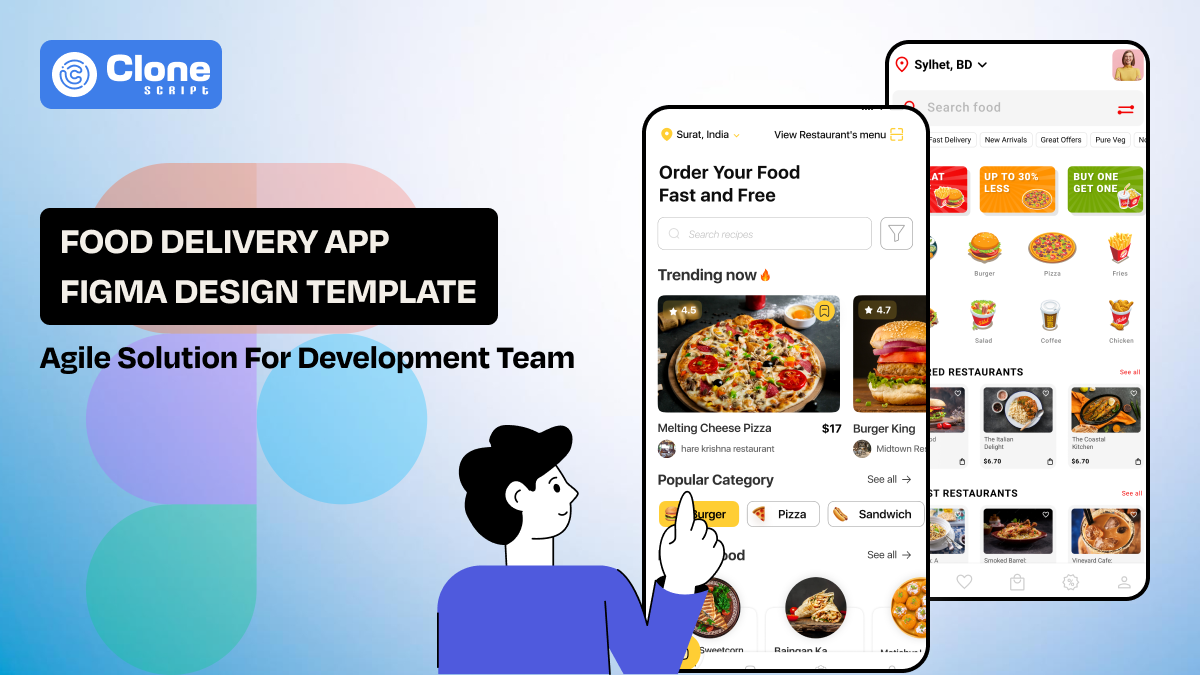
Food Delivery App Figma Design Template Agile Solution for Development Team
In the U.S., DoorDash, Uber Eats, and Grubhub serve the consumer for online food delivery services. Coming to India, Swiggy and Zomato are making a positive impact. Behind these FoodTech giants' success, their mechanisms work, and the business apps remain a top priority.
When a Food delivery startup reaches out to your development agency, they have a vision to next stand with the listed food tech corporation with a mobile application. They need it in a minimal time and a budget-friendly manner. Now you know how tough it is to accomplish. One single mistake in a design can ruin the overall project.
This is where a well-structured Figma design template becomes more than a design shortcut. Instead of treating UI files as static visuals, development teams now rely on templates as working blueprints that support real-world logic, component reuse, and smoother handoffs between design and engineering.
This article explains how a food delivery app's Figma templates should be evaluated, adapted, and used throughout the product lifecycle. The focus is not on visual trends but on usability, readiness, and development impact—the things that matter once coding actually begins.
Why Choose a Figma Design Template?
A Figma design template is a starting framework that eliminates repetitive design work and speeds up early-stage development. The complex product design structure, like restaurant browsing, ordering, managing payments, real-time updates, and handling user data, has been managed with a design that requires consistent UI patterns.
Choosing a template that teams can use:
-
Launch MVPs faster without compromising structure
-
Maintain visual consistency across multiple features.
-
Reduce design-developer misalignment.
-
Avoid rebuilding common UI patterns from scratch.
The design templates are not raw UI components, but they organize screens with logical flow. It applies reusable UI components and uses consistent styles. This allows developers to focus on implementing business logic rather than interpreting unclear designs.
From a cost perspective, startup teams can reduce the design cost by allowing customization as the product grows.
Food Delivery App Template Includes These Core Screens
Thinking every template for food delivery is production-ready, in reality, they may not be. Why? Some focus only on attractive home screens while missing important states required during real usage.
A complete template should include the following core screens:
-
Home and Discovery
This is the first screen used for any food delivery app development, where users interact initially. Here, search, categories, banners, filters, and restaurant listings can be found. Developers rely on these screens to connect back-end discovery logic and APIs.
-
Restaurant and Menu Screens
To order the food from the app, these screens have to support the following elements:
-
Item variations, where users can see what kind of food items have been listed.
-
Add-ons and modifiers allow them to personalize the food as required.
-
Availability states, as per the food items preparation and last in stock, have to be updated accordingly.
-
Pricing changes are required to be fair and easy to understand as items are added to the cart.
In essence, templates should clearly show how menu items expand, collapse, and update in response to user actions.
-
Cart and Checkout
These screens are important to make the conversion rates higher and maintain them. The first is a proper cart flow that includes:
-
The empty cart state has to be appealing and emotion-creating, inspiring users to make an order.
-
Item update interactions make it easy for food orderers to know what has been changed after adding or removing items from the cart.
-
Error handling requests helps users know what kind of steps they have to take now.
-
The delivery address selection screen is important to put in the relevant information to get food items delivered to the preferred location.
-
Payment method selection has to include debit/credit cards, net banking, UPI, or COD. Also, crypto payments can be added.
Food ordering checkout is where most logic complexity exists, so UI clarity at this phase is required.
-
Order Tracking
The live order tracking screens are related to curiosity management, and they decided why users will app the use again. So, retention matters.
-
Status changes as order confirmed, food prepared, pick-up, and reaching in 20 minutes have to be changed dynamically.
-
The estimated delivery time has to include icons, text, and the delivery partner's real-time status in a visual way.
-
The order details presentation has to be effective and minimal, like order number, items, quantity, customization, restaurant name, total paid amount, etc.
-
Cancellation or delay handling screen is designed to support users in what they do and be consistent to help them.
-
The food and delivery rating screen is also helpful to trust other new users about the service they want to experience.
-
Profile and Order History
These screens handle repeat engagement and require clean data presentation. Allowing users to customize their profile for name, payments, and the previous order section keeps their trust in the app.
Design templates missing these elements often require heavy rework later, reducing the initial time-saving benefit.
How Developers Should Evaluate a Figma Template with Core Architecture?
When choosing a Figma template, you have to consider the internal structure of the Figma file. It matters as much as the appearance does.
-
Component-Based Structure
The components structured in the template provide a proper separation that keeps the design and development phases on the same stage.
-
Atomic components (buttons, icons, inputs): These components are important to maintain consistent branding across the application and never give a chance to experience confusion.
-
Reusable blocks (cards, modals, list items): These components make the task easier for repetitive design work, as you can use them whenever required.
-
Full screens: These layouts have a set of icons, images, components, and other assets that can be customized as per the branding and optimized for mobile screens.
The component in the Figma can work with the front-end frameworks like React Native or Flutter. Implementing those components is becoming smoother and more agile.
-
Naming Conventions
There are multiple layers, and assets are included in a world-class food delivery mobile app. To manage the handoff to the developer, clear layer and component names reduce confusion. Developers should instantly recognize what a component represents without needing constant clarification.
-
Auto Layout and Responsiveness
Figma’s Auto Layout is the most liked feature for both designing and development teams. Most premium templates are designed with this feature. It ensures the spacing and alignment adjust logically. This helps developers understand how components behave across devices.
-
Avoiding Page-Level Overdesign
Overly detailed page-level designs with hard-coded values often slow development. This is unacceptable when the client needs the app to be live, but the development team is correcting the issues. Using the flexible components helps in managing the complex layouts in real data.
What Is Design System Readiness?
A design system readiness is a template that means the visual structural flow is made with the scaling needs in mind. So, in the future, if any food delivery app feature has to be added to the re-designing work is not required.
Now you have a question about what design-ready system is included?
-
Defined color tokens: The primary, secondary, and other brand colors are mentioned in the template with layouts.
-
Typography styles with clear hierarchy: The fonts are optimized to suit other elements and keep the branding consistent across the sections.
-
Consistent spacing rules: To improve user experience even on mobile devices, the margin, border, padding, and spacing rules are applied.
-
Icon standards: In the layouts, the icons have to be easily recognizable for developers and users. Use a mostly relevant set as it makes it familiar to the appropriate audience.
-
Button states (default, disabled, loading): Every button has to convey the message to provide feedback, like it is set to default, disabled for non-required, and loading the layout.
-
Dark mode support: This is another indicator of maturity, especially for food delivery apps frequently used at night.
When these elements are centralized, developers can map them directly to code variables and style tokens. This improves consistency across features and reduces UI drift over time.
A template without a basic design system may look polished initially, but it becomes harder to maintain as features grow.
From Figma to Code: Developer Handoff Workflow
Once the food delivery app template you selected for the development process, you have to follow this workflow. It helps to work as an agile developer, not as a traditional method.
-
Inspect Mode Usage
Inspect mode is the primary bridge between visual design and frontend implementation. When opening the Figma file, you have the choice to inspect the panel. This option allows you to extract the following elements:
-
Spacing: With a consistent spacing based on a cleat system (for example, 8px or 4px), you can map these values to CSS, layout grids, or spacing tokens in code.
-
Font styles: What type of font family, size, weight, line height, and letter spacing has been implemented can be identified. Templates have pre-defined text styles, and with customization, use them in the app.
-
Colors: Color values shown in Inspect mode should reference shared color styles rather than random hex codes. This makes it easier to define theme variables, supports dark mode, and prevents color mismatches across the app.
-
Component sizes: Developers depend on width, height, and alignment values to understand how components scale. Auto Layout components build reflect flexible behavior rather than fixed dimensions, which is more realistic for real data.
The design templates should be structured so these values are easy to understand and reuse.
-
Asset Export
Assets are often the first point of friction during handoff if they are not prepared correctly.
-
Icons: Icons should be vector-based and exportable as SVG whenever possible. This allows developers to scale them without loss of quality and style them dynamically through code.
-
Images: Raster images should be optimized for performance and exported in formats like PNG or WebP, depending on platform needs. Avoid embedding oversized or uncompressed images available in the templates that slow down development builds.
-
Consistency: All assets should follow a clear naming convention so developers can identify their purpose without opening each file. Grouping assets logically inside Figma also reduces confusion during export.
When assets are export-ready, developers spend less time cleaning files and more time implementing features.
-
Reducing Back-and-Forth
Frequent clarification requests usually indicate that the design file doesn't have clarity, not that developers missed something.
-
Clear annotations: Notes explaining interactions, edge cases, or conditional behavior help developers understand intent without guessing. For example, explaining what happens when a list is empty or a payment fails.
-
Logical grouping: Components and screens should be grouped in a way that reflects the actual app structure. When developers can quickly find related elements, they work faster and with fewer mistakes.
-
Reusable components: These components reduce questions about whether similar-looking elements should behave the same way. If something is a component, developers know it should be implemented once and reused consistently.
Good templates answer questions before they are asked. Instead of introducing uncertainty, they act as a shared reference that both designers and developers trust.
How to Use the Templates Across Sprints for Agile Workflow?
In agile environments, delays often happen when development depends on final UI decisions. A well-structured template reduces this dependency by giving teams a stable UI foundation that evolves incrementally rather than all at once.
-
Breaking Screens into Sprint-Sized Deliverables
This is the best approach to follow for a food delivery app, as famous apps do.
Instead of treating the app UI as a single large deliverable, teams can split screens into logical units such as onboarding, discovery, cart, or checkout. Each sprint can focus on a specific flow or feature set.
Because templates already define layout patterns and components, developers can implement one screen at a time without worrying about visual inconsistencies. This also allows product managers to prioritize features based on business value rather than design readiness.
-
Allowing Developers to Start Work Before Final Polish
In many teams, waiting for pixel-perfect designs slows progress. With a template, developers can start building layouts, navigation, and data wiring early.
As long as components and spacing rules are clear, visual refinements such as color tweaks or micro-interactions can be added later. There is no need to make major refactorings.
-
Iterating Designs Alongside Backend Logic
Back-end development realities surface only after development begins with API limitations, edge cases, or performance considerations. In templates, designers can adapt screens easily and maintain the overall structure.
Because components are reused across screens, changes made to one element automatically propagate throughout the UI. This smart approach keeps everything consistent while adapting to real data behavior.
-
Versioning Design Updates in Figma
Design updates can be saved and reviewed using Figma’s versioning tools. This allows teams to:
-
Compare iterations, like how much time the icons have been replaced.
-
Revert changes if needed, as the client wants the payment flow designed with extra security elements.
-
Align UI updates with sprint milestones as decided when onboarding the food delivery app development project.
Developers can reference specific versions during implementation and reduce the risk of building against outdated designs.
-
Supporting Faster Onboarding for New Team Members
When UI patterns are predictable and well-documented, new team members can quickly understand how screens are structured and how components are reused. This minimizes onboarding friction and helps new contributors become productive sooner.
App design templates act as living documentation, showing how the product is built rather than just describing it.
Recommended Food Delivery App Figma Templates
The food delivery app templates below are suitable for real-world implementation because they focus on usable components, predictable layouts, and full user flows rather than static screens.
-
TasteTreasure – Online Food Delivery App UI Kit
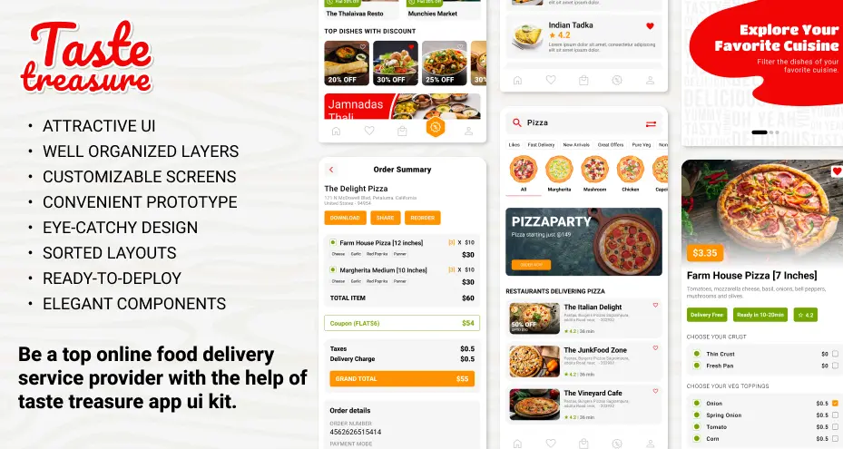
TasteTreasure is built to help product and development teams accelerate food delivery app development. This template provides a structured, ready-to-use UI foundation that supports both early launches and long-term scalability.
Feature Highlights:
-
Includes complete user flows from onboarding to order tracking.
-
Structured components support consistent reuse across screens.
-
Layouts align with common food delivery app logic.
-
Designed to adapt easily as new features are added.
Use Case:
If the client requires a food delivery app only for a certain region with a local flavor added, use this template.
-
FoodBit – Food Order & Delivery App Design
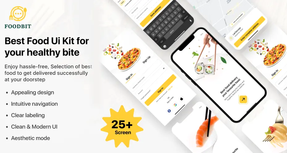
FoodBit is designed for teams that prioritize speed and simplicity. It offers a clean and modular UI foundation that enables rapid development without unnecessary complexity or visual overhead.
Feature Highlights:
-
Covers core ordering, cart, and checkout flows.
-
Modular UI elements simplify implementation and updates.
-
Minimal styling supports quick branding changes.
-
Suitable for frequent iterations in agile workflows.
Use Case:
If the client has a vision to be a standard food delivery chain aggregator app, then this template can be an appropriate choice.
Validation Before Development (Design QA Checklist)
When you are going to develop a food delivery mobile app for iOS and Android, or a web also follow this design QA checklist.
-
Are all user flows complete?
First, check that every step a user takes on the app is designed clearly from start to finish. For example, a user can browse food, add items to the cart, place an order, and see order confirmation without missing screens.
-
Are empty, loading, and error states included?
The UI should show meaningful screens when there is no data, a delay, or a failure. For instance, showing a “No restaurants available” message instead of a blank screen.
-
Is the text readable on all backgrounds?
The third number checklist is to optimize the text so that it is easy to read regardless of background color or image. White text on a light image should have an overlay or shadow to improve contrast.
-
Are touch targets large enough?
In food delivery apps, the touch has to be optimized for easy reach, and buttons and interactive elements have to reflect the action. The “Add to Cart” button is large enough to tap comfortably on a mobile screen.
-
Does content overflow properly?
The UI should handle long text or large numbers in the layout. Having a long restaurant name wrap neatly instead of overlapping other elements works properly.
-
Is the UI adaptable for localization?
The design should support different languages and text lengths. For example, a checkout button can expand to fit longer translated text like German or French.
Completing this checklist before development helps teams avoid redesigning screens, rewriting code, or delaying releases later in the project.
Scalability Considerations for Growing Food Delivery Products
As food delivery products grow, the UI must handle increased complexity without losing consistency or usability. Scalable templates allow teams to add new regions, features, and integrations with core screens.
-
Multi-city operations: The UI should support different locations, delivery zones, and availability rules. Keep note that location-based changes must not affect the overall layout or navigation structure.
-
Multiple vendors: The design has to optimize to handle many restaurants while maintaining consistent UI patterns. Vendor-specific data should fit naturally into shared components.
-
New payment methods: Payment screens must allow additional options without layout changes. The structure should remain stable as payment integrations expand.
-
Feature expansion (subscriptions, promotions): The UI should accommodate new features within existing flows. Added elements must not disrupt core user journeys.
Why flexibility matters?
Rigid designs create rework as the product grows. Flexible layouts reduce redesign effort and development time.