BTC - Bitcoin
 USDTERC20 - USDT ERC20
 ETH - Ethereum
 BNB - Binance
 BCH - Bitcoin Cash
 DOGE - Dogecoin
 TRX - TRON
 USDTTRC20 - USD TRC20
 LTC - LiteCoin
8 UI/UX Best Practices to Follow For Tap-to-Earn Game App Design
Most players don’t want a mobile game that feels like assembling IKEA furniture without instructions. In the world of tap-to-earn games (T2E), where the core interaction remains as simple as that, well, tapping, good design is what separates a viral hit from a forgotten app.
Here’s a fact to chew on: over 80% of mobile users uninstall an app within the first three days if the user experience feels confusing or slow. Here’s the thing: is not about the Hamster Kombat T2E crypto game cost. But every millisecond of delay or unclear button is a lost opportunity for engagement (and revenue).
So, how do you design a tap-to-earn game UI that keeps players hooked, not frustrated? This guide dives into actionable, expert-backed best practices. It helps your game shine in a crowded marketplace.
Let’s start with the most important rule: keeping things simple and clear.
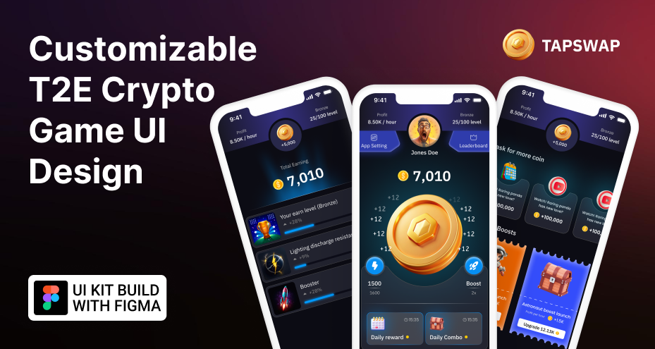
1. Simplicity & Clarity: Make Every Tap Count
When it comes to designing a tap-to-earn game UI, simplicity is important. The entire game is built around the user’s desire to tap, earn, and repeat. If your interface feels like solving a Rubik’s Cube in the dark, players won’t stick around.
Why Simplicity Matters More Than Ever?
Let’s put it into perspective: studies show that the average mobile app session lasts just 3 to 5 minutes. In a T2E game, you don’t have time to waste on complicated menus, vague icons, or confusing navigation. Every screen should be laser-focused on the primary goal—tapping.
-
“The best interfaces don’t make you think twice about what to do next.” – Usability expert - Jakob Nielsen
A clear app interface design directs players naturally toward the action. No guesswork, no distractions—just an irresistible tap button front and center.
Design Tips for Clarity
Consider these tips to add transparency in the game design:
-
Prioritize the Main Action: The tap button should occupy the most prominent space on the screen.
-
Limit Choices: Don’t overwhelm players with too many options at once. Display secondary functions only when necessary.
-
Use Clear Labels & Icons: Instead of ambiguous icons, pair them with text (e.g., use a clear coin icon alongside the word “Balance”).
-
Feedback Is Key: Every tap should immediately reflect visually and audibly, whether through an animated coin or a satisfying click sound.
Pro Tip for Developers
When prototyping in Figma, start by building a wireframe that includes only the essential elements. Ask yourself: If a player opened this screen for the first time, would they know what to do in under 3 seconds? If the answer is no, strip it down further.
2. Responsive Layouts & Platform Adaptiveness: Designing for Every Screen
Don’t assume that designing the interface work for iOS users, along with a group of users who prefer a web version of the app instead of downloading it. In T2E games, interaction and clarity always remain top priority. Whether a player is tapping away on a small 5-inch smartphone or a large tablet, the UI must adapt gracefully without sacrificing usability.
In today’s diverse ecosystem of devices, a one-size-fits-all UI doesn’t fit well.
Why Responsiveness Matters?
As of 2025, over 61.5% of global web traffic comes from mobile devices. When it comes to gaming, Android and iOS devices vary widely in screen sizes, resolutions, and aspect ratios. Without a responsive layout, a tap button that looks perfectly placed on one device might be tiny or off-screen on another.
An adaptive UI validates the following elements in designs:
-
Tap areas remain large enough (minimum recommended size: 48x48 dp) to prevent missed taps.
-
Visual elements don’t overlap or appear misaligned.
-
The core interaction, the tap button, always stays prominent, regardless of screen orientation or size.
Prototyping Tip in Figma
When creating your Figma UI template for a tap-to-earn game, design multiple frames representing different screen sizes (e.g., 360x640, 720x1280, 1080x1920). Apply constraints in Figma to ensure elements resize or reposition appropriately when the frame is resized.
Use Figma’s “Auto Layout” feature to make the design flow adapt automatically as you scale your frames.
3. Engagement through Animations & Micro-Interactions: Making Every Tap Satisfying
In a tap-to-earn game, the core interaction is repetitive by nature. Without well-thought-out feedback, even the most rewarding mechanics can feel dull. This is where micro-interactions and animations come in, as they transform a simple tap into a moment of joy.
Most of the T2E games are designed with the intention of increasing the repeat rate. But, without real-time feedback, you can’t identify how to do it. Using micro-interactions and engaging animations, the simple tap can be turned into a joyous moment for players.
Why Micro-Interactions Matter?
Why Micro-interactions matter in the tap-to-earn game module?
Humans are wired to respond to immediate feedback. Every time a player taps the screen, they’re subconsciously asking, “Did that work?” If the game doesn’t respond instantly and in an enjoyable way, players feel disconnected.
In general, humans love to get an immediate response in accordance with their action. So, if they can’t get the indication of what to do next, then they feel disconnected. But, through micro-interactions, you can guide them very concisely and appropriately.
A study by Google found that 53% of mobile users abandon a site or app that takes longer than 3 seconds to load or respond. Now, imagine a tap-to-earn game where a player taps and nothing happens for half a second—frustration guaranteed.
Prototyping in Figma
When creating a tap-to-earn game UI design with Figma, simulate animations by creating multiple frames that show different states (e.g., before tap, tap effect, post-tap balance update).
Creating a prototype of the T2E game UI design in Figma can be done through multiple frames to represent different states (e.g., before tap, tap effect, post-tap balance update). This will help you with frontend app development and aligns with the backend.
Link them in Figma’s prototyping mode with timed transitions to showcase the intended interaction flow.
Fun Fact
People are 40% more likely to engage with content that provides immediate visual feedback. So don’t make tapping feel like a chore. Make it rewarding, entertaining, and even a little addictive.
4. Accessibility Excellence: Designing for Everyone
Accessibility in game design is a necessity. A well-designed game UI should be usable by everyone, including players with visual, motor, or cognitive impairments. Ignoring accessibility isn’t just bad practice; it’s leaving a large portion of potential players out of the fun.
Why Accessibility Matters?
Consider this: According to the World Health Organization, over 2.2 billion people worldwide have some form of vision impairment or blindness. That’s a massive audience that can only enjoy your game if it’s designed with accessibility in mind.
Beyond altruism, accessibility makes business sense. Games that are easy to use for everyone tend to get better reviews, higher retention rates, and wider market reach.
Key Accessibility Principles for Tap-to-Earn Games
-
High Contrast & Readable Fonts
Low contrast or tiny text is a huge accessibility blocker. Use contrasting colors (for example, a bright yellow button on a dark background) and check fonts that are large and legible.
-
Screen Reader Support
Every actionable element (especially the central tap button) should have proper accessibility labels. Don’t make it too fancy or ugly to be understood. Follow simplicity, as most users prefer.
-
Color-Blind Friendly Design
Avoid relying solely on color to convey information. Instead of showing green for success and red for failure, use icons or text labels as well.
-
Adjustable UI Elements
Let players adjust font sizes or toggle a high-contrast mode from settings. This option feels like a personalized gaming experience and creates a good image of the entire brand.
If your game forces players to squint harder than reading a shampoo bottle under dim light, you can bet they’ll hit “Uninstall” faster than they can say “tap-to-earn.”
Figma’s Role in Accessibility
When designing in Figma, use plugins like “Able” or “Contrast” to simulate color blindness and check contrast ratios. This helps prevent design mistakes early in the prototyping phase.
Additionally, when using a Figma UI template for a tap-to-earn game, set your components up with clear layers and naming conventions. This makes it easier to communicate accessibility features to developers during handoff.
5. Performance‐First Design: Speed Is the Name of the Game
When players open a tap-to-earn game app, they expect instant gratification. The very nature of these games is built around fast, repetitive interactions that deliver rewards in real time. If a player taps and nothing happens or worse, if the app stutters, they don’t just lose interest; they uninstall the app.
Why Performance Matters?
Unlike strategy games, where players might tolerate loading screens or delays between actions, tap-to-earn games depend on their responsiveness. Every tap should feel snappy and rewarding. In the world of the T2E game, even a half-second delay between tap and reward can feel like an eternity.
In these kinds of games, speed creates a sense of flow, a seamless loop of tap, feedback, and reward that keeps players engaged.
Key Strategies for Performance Optimization
-
Lazy Loading of Assets
Only load heavy assets (like in-game store images, advanced animations, or sound files) when absolutely needed. For example:
-
The coin animation assets should load when the player taps for the first time.
-
The store layout should load after the player opens it, not at app launch.
Don’t load everything up front. Focus on delivering the core experience first, the tap interaction. Secondary features like the in-game store, leaderboards, or advanced animations can load in the background or on demand.
-
Efficient Use of Images
Compress images into lightweight formats like WebP, or use vector-based icons where possible. This keeps the app size small and prevents excessive memory use.
-
Avoid Overdraw
Excessive overlapping UI elements can cause the GPU to work harder and slow down the app. Design flat interfaces where elements don’t unnecessarily overlap.
-
Smart Animation Implementation
Instead of running complex physics-based animations that burden the processor, use simple but satisfying animations (e.g., scaling, fading, or basic movement). Keep frame counts low and use hardware-accelerated transitions.
-
Efficient State Management
Avoid rebuilding the entire UI on every tap. Use efficient state management solutions like Provider, Riverpod, or Bloc in Flutter to update only the necessary UI components.
Prototyping Performance in Figma
Although Figma doesn’t run live code, you can simulate performance awareness by creating multiple prototype flows. Avoid designing heavy visual assets in early prototypes. Instead, use placeholders that reflect expected performance characteristics.
6. Real-World Player Feedback: The Secret Sauce to UI/UX Success
No matter how much you test your tap-to-earn game UI in development or how perfectly your Figma prototype looks on paper, the ultimate judge is the player. Real-world feedback isn’t just helpful, it’s the single most valuable tool for refining your game’s UI and UX.
Why Player Feedback Is Important?
Players don’t care about your design rationale or the technologies you used. They care about whether the game is easy, fun, and rewarding to play. According to a survey by Apptentive, over 70% of app users will abandon an app due to a poor user experience, while only 15% uninstall due to bugs.
The reality is simple: players will tell you what works, what doesn’t, and more importantly, what they expect next.
How to Collect Meaningful Feedback?
Here’s an overview to get better feedback on the game design:
-
In-App Surveys
Invest in short, targeted surveys asking specific questions such as:
-
“Was it easy to find the tap button?”
-
“Did the animations make the experience more enjoyable?”
This will help you to understand where the work is required.
-
Example: After a player taps the main button 10 times, prompt a small survey that doesn’t interrupt gameplay:
“Hey! Quick question: Did the tap feel responsive today? 👍 / 👎”
-
Behavior Analytics
Tools like Firebase Analytics or Flurry can track detailed player interactions:
-
How many taps per session?
-
Where do players drop off?
-
Which UI elements do they interact with most (or avoid)?
From here, the identification of loopholes in design and development can be acknowledged, and proceed with the fix.
-
Example Insight: If you discover that players rarely open the in-game store, maybe your store icon is too hidden or confusing.
-
Community Engagement
Monitor forums, social media, and in-game feedback channels. Players voice frustrations or suggestions in community spaces before sending official reports.
If your players aren’t telling you what’s wrong, they’re probably just uninstalling quietly. Real-world feedback is your game’s secret weapon to stay ahead.
Can I Use a Figma Design Template for T2E Game Development?
Yes, you can get a Figma app design template for tap-to-earn game development. These templates are not just a layout containing UI elements, but a properly optimized UX solution without needing any professional help.
With this smart and advanced solution, you can keep focus on the most complex aspects of game development, like backend integration and QA & testing.
Quick UI/UX Checklist: Your Go-To Tap-to-Earn Design Cheat Sheet
When you’re racing against deadlines, handling code bugs, and trying to polish game mechanics, it’s easy to lose sight of the user experience. That’s why having a focused UI/UX checklist for your tap-to-earn game is invaluable. Think of it as your secret weapon to avoid costly mistakes and keep the player experience razor-sharp.
1. Is the Tap Area Obvious and Large Enough?
-
Make sure the primary tap button is prominent, centrally placed, and big enough for easy interaction (recommended minimum size: 48x48 dp).
-
Avoid hiding it under other elements or using icons that aren’t clearly labeled.
Example: A bold, brightly colored “Tap to Earn” button with a clear label beats a small icon tucked in the corner every time.
2. Are Secondary Functions Cleanly Hidden?
-
Settings, store, and other features should not clutter the main interface.
-
Use hamburger menus or simple icons placed away from the tap area.
Example: Instead of crowding the main screen with store items, use a small, clearly labeled “Store” icon in the corner that expands when needed.
3. Does the Layout Adapt Smoothly Across Devices?
-
Test your UI across multiple screen sizes and orientations.
-
Ensure the tap button stays central and no elements overlap or shrink too small.
Pro Tip: Use Figma’s Auto Layout and constraints during prototyping to maintain adaptability.
4. Are Micro-Interactions Meaningful and Lightweight?
-
Every tap should trigger satisfying feedback (animated coin, sound effect).
-
Keep animations efficient. Avoid large file sizes or excessive frame counts.
Example: Instead of a complex particle explosion, a simple coin scale-up animation reinforces action without draining performance.
5. Have Accessibility Best Practices Been Implemented?
-
High contrast between text and background.
-
Clear, screen-reader-friendly labels for important buttons.
-
Alternative indicators for color-blind players.
Example: Add text labels to icons, not just color cues. The content should sound good immediately and not take much time to be understood.
6. Is Performance Optimized for Speed and Responsiveness?
-
Prioritize lazy loading of assets.
-
Compress images and use vector formats where possible.
-
Avoid rebuilding the whole UI on every state change and update only what’s necessary.
Real Insight: A one-second delay in tap response can reduce player retention by up to 16%.
7. Is Real-World Player Feedback Driving Your Updates?
-
Collect in-app surveys and analyze behavioral analytics.
-
Monitor community channels for recurring feedback.
-
Iterate designs in Figma based on real player insights.
Example: After noticing players struggling to locate the store, one game increased icon size and moved it from a corner to a visible top bar.
Conclusion
A great tap-to-earn game UI isn’t about complexity. It’s about making the core action simple, satisfying, and addictive. Every design decision should guide players toward effortless interaction without confusion or delay. Prioritize clarity by keeping the tap button prominent, using adaptive layouts that work across devices, and enhancing engagement with subtle animations that reward every action. Don’t forget accessibility, design for players of all abilities.
Most importantly, never stop iterating based on real player feedback. When performance, simplicity, and thoughtful UX work together, your tap-to-earn game becomes not just playable, but irresistibly fun to keep tapping.
FAQs
-
What is the key to designing a successful tap-to-earn game UI?
The key is simplicity and clarity. The main tap button should be prominently placed, easy to understand, and provide instant visual or auditory feedback. Minimizing clutter and focusing on the core interaction ensures players stay engaged without confusion.
-
What is important in designing a successful T2E game UI?
Keeping focus on simplicity and clarity is the ultimate way to make the game UI acceptable. Additionally, the main tap button should be placed where the thumb can easily reach, and the responsive settings keep players engaged.
-
How can I optimize user experience in a tap-to-earn game using Figma?
Use Figma’s Auto Layout and constraints to create adaptive designs that work on various screen sizes. Simulate animations through prototype flows and test color contrast for accessibility. Building reusable components helps iterate faster based on real player feedback.
-
Why is performance important in tap-to-earn game UI design?
Performance directly affects user retention. Slow animations or delayed responses frustrate players. Optimizing asset loading, using vector graphics, and implementing lazy loading to keep players engaged longer.
-
Can Flutter be used effectively for tap-to-earn game UI development?
Yes. Flutter offers powerful widgets like LayoutBuilder and efficient state management tools that help create responsive, high-performance tap-to-earn game UIs.
-
How does accessibility improve tap-to-earn game engagement?
Accessible design makes your game playable by a wider audience, including people with visual or motor impairments. High contrast, readable fonts, proper screen reader labels, and alternatives to color-based cues offer a smooth experience for everyone.