BTC - Bitcoin
 USDTERC20 - USDT ERC20
 ETH - Ethereum
 BNB - Binance
 BCH - Bitcoin Cash
 DOGE - Dogecoin
 TRX - TRON
 USDTTRC20 - USD TRC20
 LTC - LiteCoin
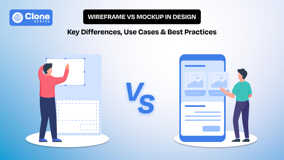
Wireframe vs Mockup in Design: Key Differences, Use Cases & Best Practices
In web design, whether it’s a website or mobile application, two terms are common: wireframe and mockup. Both of these are important for you because they decide how efficiently your project moves from concept to launch. Usually, the foundation of success starts from here, and if it has been compromised, the overall efforts are of no value.
In this guide, we explain the differences between wireframes and mockups, along with where they are used. We also discuss the misconceptions about it and understand with a real workflow, so you can get an idea of what to do.
What Is a Wireframe?
A wireframe is the starting point of a digital design. It defines how content is structured and how users move through a page, without focusing on visual styling. At this stage, the goal is clarity proving. Not aesthetics. Designers use wireframes to decide what goes where and how users interact with each section.
The question is what wireframes include?
-
Basic layouts for headers
-
Navigation
-
Content blocks
-
Buttons
-
Footers
Instead of real images or copy, placeholders are used to represent elements. This keeps discussions focused on layout, hierarchy, and usability, rather than colors, fonts, or branding preferences.
You can say that wireframes act as a shared reference. Why? Developers understand functionality early, product managers can validate requirements, and stakeholders can review structure without distraction. Most importantly, wireframes help designers identify usability issues early, when changes are easier and less expensive to make.
In short, a wireframe is not about how the product looks. It’s about how it works.
What Is a Mockup?
A mockup represents the visual direction of a design. Once the structure is clear through wireframes, mockups show how the product will actually look to users. This is where layout decisions are combined with colors, typography, spacing, imagery, and branding elements.
Unlike wireframes, mockups use real or near-final content. Buttons look like buttons, text reflects actual copy, and images match the intended style. This helps designers evaluate visual hierarchy, readability, and brand consistency before anything moves into development.
Clients and stakeholders can’t understand more with a wireframe, but with a mockup design, they can. Visual details are easier to react to than abstract layouts, which makes feedback more concrete and actionable. For developers, mockups serve as a visual reference that reduces ambiguity during implementation.
A mockup answers a different question than a wireframe. Instead of “Does this layout work?”, it asks “Does this look and feel right?”
Wireframe vs Mockup: Head-to-Head Comparison
A comparison table of wireframe and mockup helps you to clarify for what the single approach works and when both are required.
|
Aspect |
Wireframe |
Mockup |
|---|---|---|
|
Primary Purpose |
Define structure, layout, and user flow |
Present the final visual appearance |
|
Design Stage |
Early stage of the design process |
After wireframe approval |
|
Level of Detail |
Low fidelity |
High fidelity |
|
Visual Styling |
None or minimal (grayscale) |
Full styling with colors, fonts, and imagery |
|
Content |
Placeholder text and image blocks |
Real or near-final content |
|
Focus Area |
Usability, hierarchy, and functionality |
Visual hierarchy, branding, and aesthetics |
|
User Interaction |
Indicates basic interactions (navigation, buttons) |
Shows interaction states visually (hover, active, disabled) |
|
Typography |
Generic fonts or text blocks |
Final font choices, sizes, and line spacing |
|
Color Usage |
Rarely used or avoided |
Brand colors and UI color system applied |
|
Feedback Type |
Functional and UX-focused |
Visual and brand-focused |
|
Iteration Speed |
Very fast to change |
Slower due to visual dependencies |
|
Cost of Changes |
Low |
Higher compared to wireframes |
|
Stakeholder Understanding |
Requires explanation |
Easy to understand at a glance |
|
Developer Use |
Clarifies layout and feature requirements |
Guides UI implementation and styling |
|
Design Validation |
Validates structure and flow |
Validates look, feel, and consistency |
|
Risk Reduction |
Prevents usability issues early |
Prevents visual and branding mismatches |
|
Typical Tools |
Balsamiq, Figma (low-fidelity), Whimsical |
Figma, Sketch, Adobe XD, Photoshop |
Key takeaway:
- Wireframes reduce functional risk.
- Mockups reduce visual and branding risk.
Using both correctly is not extra work—it’s what keeps design projects predictable, efficient, and professional.
Additional Things Designers Should Consider
Whether using a wireframe or mockup, keep these things maintained.
1. Communication Value: Wireframes are better for internal alignment, while mockups work better for external communication. Choosing the wrong format for the wrong audience often leads to confusion.
2. Client Expectations: Clients who see mockups too early may focus on colors and fonts instead of structure. Starting with wireframes helps set the right expectations from the beginning.
3. Design System Dependency: Mockups should always reference a design system. Wireframes do not require one, but they should still respect basic layout rules and spacing logic.
4. Scalability: Wireframes scale better when designing large products like dashboards or SaaS platforms. Mockups are more effective once patterns are established.
5. Team Size and Workflow: Smaller teams may combine wireframes and mockups, but larger teams benefit from keeping them separate to reduce rework and misalignment.
6. User Testing Stage: Early usability testing works best with wireframes. Visual testing and brand perception are more effective with mockups.
When to Use Wireframes?
Wireframes are most effective at the early stage of the design process, when ideas are still evolving, and structural decisions matter more than visual details.
-
Early planning and discovery: Wireframes help translate requirements into a clear layout. This becomes easier to spot missing sections, weak hierarchies, or broken user flows.
-
Testing layout and navigation: Designers can evaluate how users move through pages and screens without being distracted by colors or typography.
-
Collaboration with developers and product teams: Wireframes clarify functionality early, such as navigation logic, user actions, and page relationships. It reduces assumptions during development.
-
Stakeholder reviews focused on usability: Reviewing wireframes keeps discussions centered on structure and logic rather than visual preferences or branding opinions.
-
Fast iteration and low-cost changes: Layout changes can be made quickly, saving time and effort before moving into high-fidelity design.
In short, wireframes are best used to think, test, and refine structure before committing time to visual design.
When to Use Mockups?
Mockups are best used after the structure and flow are confirmed, when the focus shifts from layout decisions to visual clarity and presentation.
-
After getting wireframe approval: Mockups are built on validated wireframes. It validates that visual design is applied to a layout that already works.
-
Visual design and branding decisions: They help designers finalize colors, typography, spacing, and imagery while maintaining brand consistency.
-
Client and stakeholder presentations: Mockups are easier for non-designers to understand, and provide feedback more specific and actionable.
-
Design validation before development: They allow teams to review visual hierarchy, readability, and overall look before handing designs to developers.
-
Developer handoff and implementation: Mockups serve as a clear visual reference, reducing ambiguity during front-end development.
In short, mockups are used to validate how the product looks and feels once the structure is already in place.
Common Misconceptions about Wireframes and Mockups
Wireframes and mockups are often misunderstood, especially when teams rush through the design process or use these terms interchangeably. Clearing these misconceptions helps designers set the right expectations, improve collaboration, and avoid unnecessary rework later in the project.
-
“Wireframes are just rough sketches.” Wireframes are intentional design artifacts created to define structure, hierarchy, and user flow. While they may look simple, every element is placed with purpose.
-
“Mockups can replace wireframes.” Mockups assume that layout and flow are already validated. Skipping wireframes usually results in visual revisions caused by unresolved structural issues.
-
“Wireframes are only for UX designers.” Developers, product managers, and stakeholders rely on wireframes to understand functionality, screen relationships, and interaction logic early.
-
“Mockups are only about visuals.” Mockups also help validate readability, spacing, contrast, and visual hierarchy, all of which directly affect usability.
-
“High fidelity means better design.” A polished mockup does not guarantee good usability. A strong design starts with a clear wireframe, not detailed visuals.
-
“Clients don’t need to see wireframes.” Involving clients at the wireframe stage helps align expectations and prevents late-stage structural changes.
-
“One wireframe fits all screens.” Wireframes should account for responsive behavior, especially for complex layouts and multi-device products.
-
“Tools determine quality.” Whether created in Figma, Sketch, or on paper, effectiveness comes from clarity and intent, not the tool itself.
Addressing these misconceptions, check wireframes and mockups are used strategically rather than mechanically. This leads to better design decisions and smoother project execution.
Example Workflow: From Wireframe to Mockup (E-commerce Website & App)
In e-commerce web design, clarity and speed matter. Wireframes and mockups help teams align on structure first and visuals later. This reduces friction in a process that involves designers, developers, marketers, and business stakeholders.
-
Requirement understanding and user goals:
Start by identifying core user actions such as browsing products, searching, adding to cart, and completing checkout. Business goals like promotions, upsells, and conversions should be defined early.
-
Low-fidelity wireframes for key screens:
Create wireframes for important pages, including the home page, category listing, product detail page, cart, and checkout. Focus on content hierarchy, navigation placement, and user flow without visual styling.
-
Review usability and flow:
Validate whether users can easily move from product discovery to purchase. At this stage, issues like hidden filters, unclear CTAs, or complex checkout steps are easier to fix.
-
Responsive wireframes for web and app:
Adapt wireframes for desktop, tablet, and mobile views. For apps, consider thumb reach, bottom navigation, and screen transitions.
-
Stakeholder and developer review:
Share wireframes with product managers and developers to confirm feasibility, data requirements, and technical constraints.
-
High-fidelity mockups for visual design:
Once wireframes are approved, apply branding, typography, colors, imagery, and UI components. Mockups should reflect the final shopping experience.
-
Visual validation and iteration:
Review mockups for consistency, readability, trust signals (badges, reviews), and conversion-focused elements like CTAs and pricing visibility.
-
Final design handoff:
Deliver mockups along with spacing, color tokens, and component references for accurate implementation.
This workflow helps to identify e-commerce designs that are user-focused, scalable, and conversion-ready, without unnecessary rework at later stages.
Best Practices to Use for Wireframe and Mockup (Especially for Design Teams)
Strong and agile design teams treat wireframes and mockups as decision-making tools, not just deliverables. Following consistent practices helps reduce friction, improve collaboration, and maintain design quality across projects.
-
Always start with wireframes before visual design: Defining structure and user flow first prevents visual decisions from masking usability issues.
-
Keep wireframes intentionally simple: Avoid colors, detailed typography, or imagery, so feedback stays focused on layout and functionality.
-
Design with real use cases in mind: Wireframes should reflect actual user actions, edge cases, and content needs, not ideal scenarios only.
-
Annotate wireframes clearly: Add notes for interactions, logic, and behavior to avoid assumptions during development.
-
Validate wireframes with developers early: Early technical feedback reduces redesign caused by feasibility issues later on.
-
Apply a design system at the mockup stage: Mockups should follow predefined UI components, spacing rules, and typography scales for consistency.
-
Use real or realistic content in mockups: Placeholder copy often hides layout problems. Real content visualizes spacing and hierarchy issues.
-
Design for responsiveness from the beginning: Mockups should reflect how layouts adapt across devices, especially for complex interfaces.
-
Limit visual experimentation late in the process: Usually, visual changes after mockups are approved often delay development timelines.
-
Document decisions and iterations: Keeping a record of why changes were made helps teams stay aligned and on board faster.
When wireframes and mockups are used with discipline, design teams gain better clarity, fewer revisions, and smoother handoffs, regardless of project size.
Conclusion
Wireframes and mockups are not interchangeable steps in the design process. Each serves a distinct purpose and supports different decisions at different stages. When used correctly, wireframes reduce functional risks early, and mockups prevent visual and branding issues later. Skipping or misusing either often leads to unnecessary revisions, misalignment with developers, and delivery delays.
For design teams, the key is not choosing one over the other, but knowing when and why to use each. A structured approach starting with wireframes and moving into mockups creates clarity, improves collaboration, and results in designs that are both usable and visually consistent.
In essence, strong design outcomes begin with the right foundation and are completed with the right level of detail.