BTC - Bitcoin
 USDTERC20 - USDT ERC20
 ETH - Ethereum
 BNB - Binance
 BCH - Bitcoin Cash
 DOGE - Dogecoin
 TRX - TRON
 USDTTRC20 - USD TRC20
 LTC - LiteCoin
Why People Visit Your Store But Don’t Buy Anything (10 Proven Fixes With Examples)
There is a very specific kind of frustration store owners know.
You see people walk in. They pick products. They ask questions. They spend time. Some even say, “I’ll just look around.”
And then, they leave.
No purchase. No commitment. Just polite exit energy.
This happens in physical retail stores, e-commerce websites, showrooms, creative gear stores, fashion outlets, everywhere. Traffic is not the real problem anymore. Conversion is.
Retail behavior studies suggest that more than half of store visitors don’t convert on the first visit. But what’s more interesting is why.
People don’t avoid buying because they don’t like your products. They avoid buying because something inside the buying journey creates uncertainty, effort, or emotional discomfort.
Let’s understand the real reasons and practical fixes that actually work.
They Don’t Understand What Makes You Worth Choosing.
Most stores assume customers will “figure it out.” They won’t.
When a visitor enters a store or lands on a homepage, their brain is scanning for one thing:
relevance.
If they cannot quickly understand why your store is better, different, or safer to buy from, they switch into passive browsing mode.
Here is the example.
A creative equipment store once had a clean, beautiful layout. But customers kept walking in circles without buying. Later, they realized something important: nothing inside the store told customers who the products were perfect for.
They added small positioning labels:
-
“Best for YouTube creators.”
-
“Perfect for wedding filmmakers.”
-
“Starter kit for beginners”
They see sales improved, not because products changed, but because customers finally felt seen.
Fix: Make your store speak in outcomes, not categories.
Pricing Triggers Silent Doubt.
Most stores believe price objections are about affordability. Often, they are not.
When customers pause in front of a product, they are usually trying to answer one internal question: “Will this feel worth it later?”
If the value difference is not immediately clear, hesitation begins.
Today’s shoppers are informed and fast. Many open comparison pages, read quick reviews, or check marketplace prices while still inside the store. When they cannot confidently explain to themselves why one option costs more, they move into safe mode, browsing without commitment.
This example can be helpful.
An electronics retailer noticed visitors repeatedly testing premium headphones and then quietly leaving. After observing conversations, he realized buyers were unsure whether the higher price meant long-term performance.
They introduced small comparison cards:
-
“Battery lasts 2× longer.”
-
“Stronger build for daily travel.”
-
“Lower cost per year of use.”
They recognize that sales of premium models increased. The pricing stayed the same. Customers simply felt more certain.
Fix: Don’t rush to reduce the price. Reduce the doubt by making the value easy to understand.
The Store Feels Transactional, Not Trustworthy.
Customers don’t always walk into a store ready to buy. Many walk in ready to evaluate risk.
They observe small signals, how products are displayed, how staff interact, whether other customers look confident, and whether policies are visible. Trust is rarely built through big promises. It is built through quiet reassurance.
If a store feels purely transactional, visitors become guarded. They browse, but they don’t commit. They like the product, but something inside tells them to wait.
Often, this happens when there are no visible reviews, no real usage proof, and no clear return or support messaging. The buying environment starts to feel uncertain.
Here is the example.
A mid-sized apparel store noticed customers trying on outfits, taking mirror photos, and leaving. Later, they added a simple board near the trial area:
-
“Trusted by 15,000+ customers this year.”
-
“7-day easy exchange.”
Nothing else changed. But conversions improved because hesitation was reduced. Customers felt safer making a decision.
Fix: Make trust visible before customers start questioning it. Confidence grows when risk feels managed.
Too Many Options Create Mental Confusion.
More products don’t always mean more sales. Sometimes they mean more confusion.
When customers face too many similar choices, their thinking starts working harder than expected.
Instead of feeling excited, they begin to feel tired. This is where browsing slowly turns into silent withdrawal. They keep looking, comparing, rechecking, but the decision never happens. Here, the conversion rate optimization strategy has to be implemented.
The problem is that many stores (offline and online) unintentionally create this situation. Business thinks, customers will get freedom of choice, and on the customer side, it looks like they are doing unpaid research.
When the mental effort becomes too high, people choose the easiest option, delaying the purchase.
See this example.
A digital tools marketplace once noticed users spending long minutes scrolling through dozens of plugins without buying. They later introduced curated sections like:
-
“Best for beginners.”
-
“Most used by agencies.”
-
“Top value bundle.”
Decision time is reduced. Sales improved. Customers didn’t lose choice. They gained clarity.
Fix: Guide decisions instead of confusing visitors. Curated recommendations often convert better than unlimited options.
Store Layout Disrupts Natural Exploration.
Customers don’t explore stores as randomly as we assume.
Their movement is guided by instinct, clear pathways, visible categories, and comfortable spacing.
When a layout feels cramped, confusing, or forces people to backtrack, browsing starts to feel like an effort. And once effort enters the experience, interest slowly drops.
Here are the common issues:
-
Stores block product discovery.
-
Important items get hidden behind crowded racks.
-
High-interest sections sit in corners with low visibility.
Customers walk past products they might have loved simply because the flow doesn’t lead them there.
The example is explaining it.
A gadget showroom once struggled with low conversions despite multiple daily customer visits. After observing visitor movement, they realized two central display units were creating physical congestion.
Customers were avoiding that area altogether. When the store redesigned the layout into a simple circular browsing path, movement became smoother. Visitors explored more sections, and sales improved without any pricing or promotional changes.
Fix: Design your layout like a guided journey. When exploration feels natural and comfortable, buying decisions follow more easily.
Staff Interaction Feels Either Pushy or Absent.
Most customers don’t enter a store or a website expecting a sales pitch.
They enter with curiosity, confusion, or a rough idea of what they might need. What happens next often depends on how the staff shows up.
If assistance feels aggressive, customers become defensive. If no one approaches at all, they feel unsupported. Both situations quietly reduce the chances of a purchase.
Buying decisions become easier when customers feel guided, not chased.
See this example.
A camera showroom once noticed visitors spending long minutes testing products but leaving without clarity. The issue wasn’t pricing or product range. It was conversation quality. Staff were either recommending expensive models too quickly or staying distant to avoid pressure.
The store changed one small habit. Employees began opening conversations with:
-
“What kind of content are you planning to create?”
-
“What problem are you trying to solve?”
Customers started sharing real needs. Recommendations became more relevant. Average purchase value improved because trust improved.
Fix: Train staff to understand before they recommend. Supportive guidance converts better than persuasive selling. AI in customer experience is preferable for a business website.
Products Don’t Tell a Future Story.
Customers don’t buy products only for what they are. They buy them for what they help.
When shelves or product pages focus only on specifications, sizes, or technical features, visitors struggle to connect emotionally. The brain understands the information, but the heart doesn’t feel the outcome. And without that mental picture of the future, decisions stay incomplete.
The example here.
A content creator gear store once displayed microphones with detailed spec sheets. Visitors appreciated the information but still hesitated. Later, the team added small usage story tags near products:
-
“Great for recording podcasts in noisy rooms.”
-
“Used by travel vloggers for clear outdoor audio.”
-
“Perfect first mic upgrade for beginners.”
Suddenly, customers could imagine themselves using the product in real situations. Conversations became more decisive. Purchases became quicker. Nothing about the product changed; only the context did.
Fix: Show customers what life looks like after buying. When people can picture real benefits, commitment feels easier.
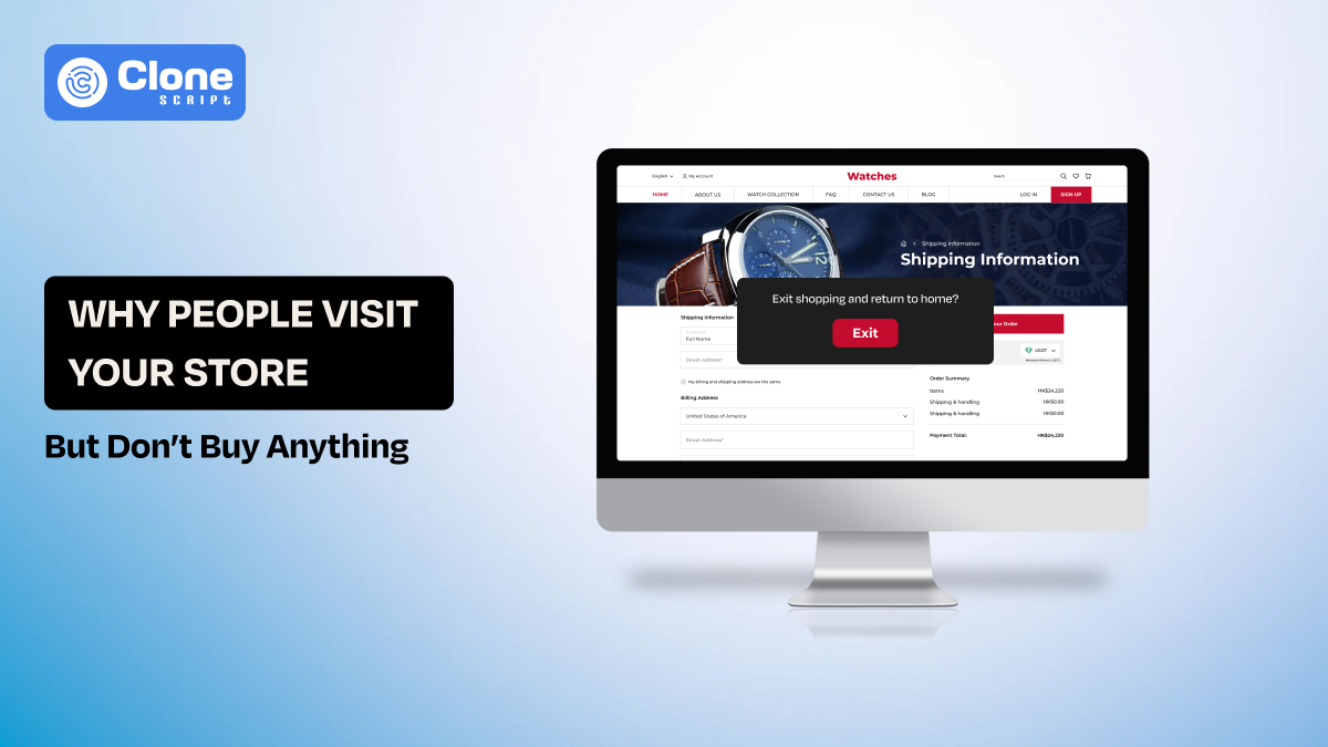
Checkout Feels Like a Final Obstacle.
Sometimes the hardest part of selling is not convincing the customer. It is completing the purchase smoothly.
A visitor may already be mentally ready to buy, but if the final steps feel slow, confusing, or inconvenient, that readiness starts to weaken. Long billing queues, limited payment options, or unclear processes can quietly break buying momentum.
Customers today are used to speed. They expect transactions to feel simple and predictable.
When checkout turns into waiting or repeated form-filling, frustration builds. Even small delays can trigger second thoughts like, “Maybe I should come back later.”
Here is the example.
A mid-sized electronics store noticed customers holding products and then placing them back after seeing the checkout line. The store introduced mobile billing devices so staff could process payments anywhere on the floor. Queue anxiety was reduced immediately. More impulse purchases were completed because the decision window stayed open.
Fix: Treat checkout as part of the experience, not just a transaction step. The easier the final action feels, the higher the chances of conversion.
Visitors Are Still in Research Mode.
Not every person who walks into your store is ready to buy. Some are exploring, comparing, or simply trying to understand what options exist. They may like your product, ask genuine questions, and still leave, not because they are uninterested, but because their decision process isn’t complete yet.
Modern customers move through multiple touchpoints before purchasing. They want to see, touch, check reviews, discuss with friends, or compare prices online. If a store expects instant commitment from every visitor, it often misses opportunities to convert later.
Here is the example.
A lighting equipment store noticed many visitors carefully noting product names or clicking photos before leaving. Instead of pushing harder for immediate sales, they introduced QR cards that allowed customers to save shortlisted items and receive setup tips later. Within weeks, repeat visits and delayed purchases increased.
Fix: Support the research journey instead of resisting it. Capture interest, stay helpful, and give customers reasons to return when they are ready.
The Emotional Atmosphere Feels Cold or Uninviting.
Sometimes customers don’t buy because of something they can’t clearly explain.
The products are good. Prices are fair. Staff is available. Yet, the overall feeling inside the store doesn’t encourage commitment. Emotional atmosphere plays a bigger role in buying decisions than most businesses realise.
People naturally stay longer and spend more in environments where they feel comfortable, relaxed, and welcome. Harsh lighting, cluttered displays, tense staff behaviour, or overly transactional conversations can make the space feel mechanical. When the environment lacks warmth, customers subconsciously avoid making decisions there. They browse, observe, and leave.
Here is the example.
A small creative supply store once struggled with conversions despite strong interest. Later, they introduced softer lighting, background music, and weekend demo sessions where visitors could casually try products over coffee. Traffic remained similar, but purchases increased because customers felt emotionally at ease.
Fix: Design an environment people enjoy being in. Comfort and positive energy often turn hesitation into action.
Famous Brand Insight: How IKEA Converts Exploration Into Buying
A globally admired example of conversion psychology in action is IKEA.
Instead of letting customers wander, IKEA designs a guided journey through fully built rooms, living spaces, kitchens, and workstations. This approach does something powerful: it removes imagination effort.
Customers don’t need to visualize how furniture will look. They experience it.
This increases dwell time and encourages bundled purchases. You don’t just buy a chair, you buy a setup.
IKEA also balances structure with shortcuts on the website. Customers can skip sections if needed, preventing frustration. This balance between control and freedom builds comfort.
The brand proves that conversion is about designing meaningful exploration.
Conclusion
If people visit your store but don’t buy, it doesn’t mean your business is failing. It means your buying journey has friction points you may not be noticing yet.
Conversion improves when you:
-
Reduce mental effort
-
Remove uncertainty
-
Build trust early
-
Guide decisions
-
Create emotional comfort
Great stores display products and design experiences that make saying yes feel natural.
Start observing customers this week. Where do they pause? Where do they hesitate? Where do they walk away?
Those moments are insights waiting to become growth.