BTC - Bitcoin
 USDTERC20 - USDT ERC20
 ETH - Ethereum
 BNB - Binance
 BCH - Bitcoin Cash
 DOGE - Dogecoin
 TRX - TRON
 USDTTRC20 - USD TRC20
 LTC - LiteCoin
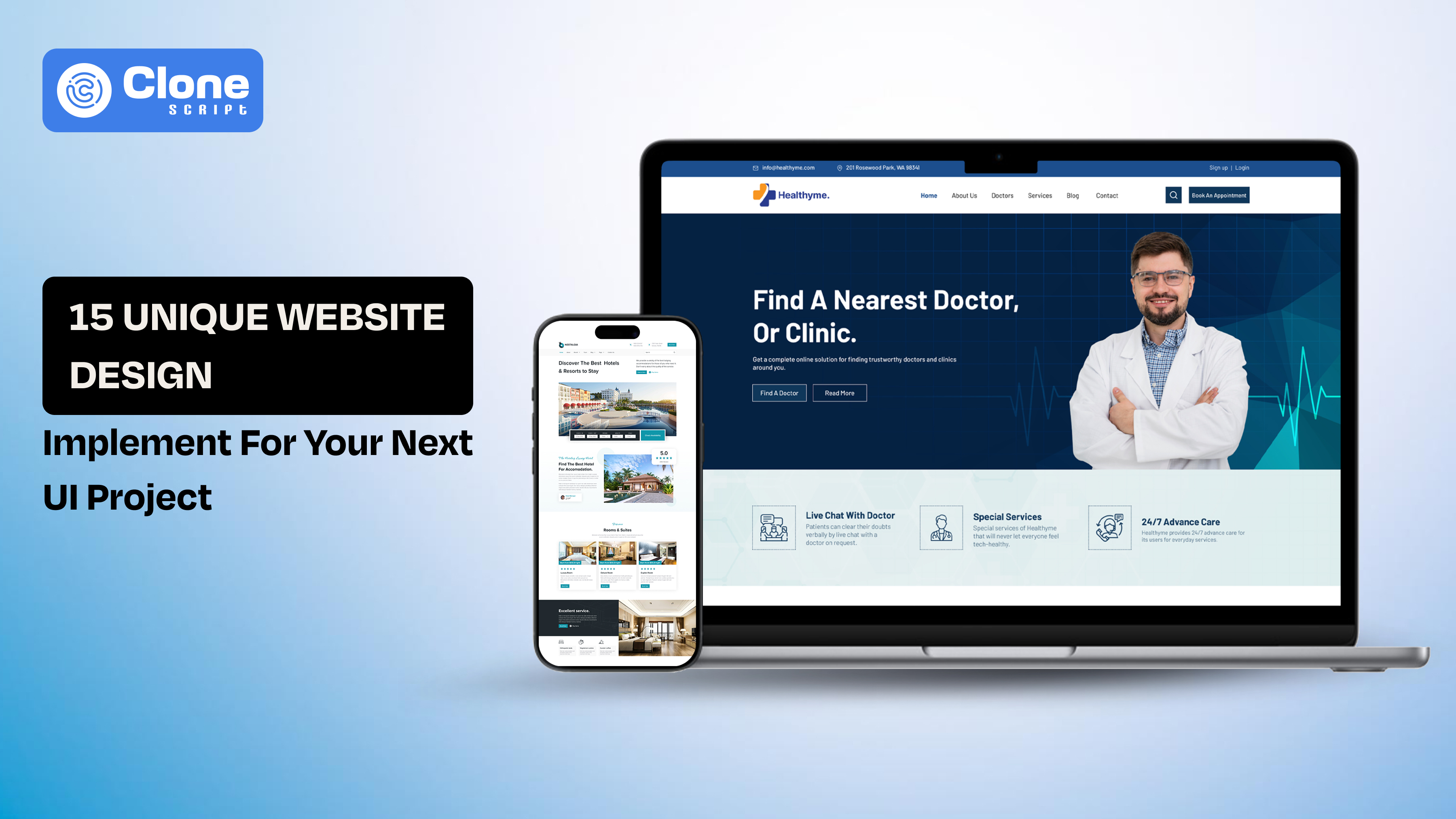
15 Unique Website Design Ideas to Implement in Your Next UI Project
You see the best website design ideas in YouTube videos and Instagram reels, and think it’s good to implement in the real project. But when opening the Figma or any other tool and trying to apply it, the reality is different.
Your work is to choose the right design pattern for the right problem as a UI designer. Three things have to balance: usability, performance, and business goals. A visually maintained layout means nothing if it slows down the website or confuses users.
These 15 unique website design ideas help you to make practical, scalable, and conversion-focused digital projects. Each idea includes when to use it, when to avoid it, and how it impacts user experience and engagement.
To make this actionable, we’ve also included real UI design examples and Figma-based systems you can reference or use to accelerate your workflow.
1. Dashboard-Centric UX for Complex Platforms
“Make complex data easy to understand” is the primary goal of the dashboard platform design. The work includes organizing large amounts of data into structured, scannable, and interactive panels.
When to Use
-
SaaS platforms with multiple features
-
Healthcare or appointment systems
-
Real-time analytics dashboards
-
Admin panels or back-end tools
When to Avoid
-
Simple marketing websites
-
Portfolio or static content sites
-
Low-interaction landing pages
UX & Business Impact
-
Improves decision speed by reducing cognitive load
-
Enhances data visibility and hierarchy
-
Increases user retention in complex platforms
Implementation Tips
-
Use grid systems to maintain alignment
-
Prioritize data hierarchy (most important at top-left)
-
Add filters and quick actions for efficiency
-
Avoid overcrowding, use progressive disclosure
2. Modular Card-Based Layouts for Content-Heavy UI
Modular website design is one of the most opted-for ideas when creating content-heavy platforms. Here, card-based design breaks content into independent, reusable blocks, making it easier for users to scan, compare, and interact with information.
When to Use
-
E-learning platforms
-
OTT/streaming websites
-
Blogs or content platforms
-
Product listing pages
When to Avoid
-
Data-dense dashboards require proper comparison
-
Highly linear storytelling layouts
UX & Business Impact
-
Improves readability and scanability
-
Boosts engagement through visual grouping
-
Enables responsive and scalable design systems
Implementation Tips
-
Maintain consistent spacing and padding
-
Use clear visual hierarchy inside cards (title > meta > CTA)
-
Avoid overloading cards with too much information
-
Add hover or microinteraction UX states for engagement
3. Personalization-Driven Interfaces
Personalization in UI design becomes a top trend because it adapts content, layout, or recommendations based on user behavior, preferences, or history. This approach makes interfaces feel more relevant and engaging.
When to Use
-
E-commerce platforms
-
Streaming services
-
SaaS tools with returning users
-
Content platforms with varied user intent
When to Avoid
-
Privacy-sensitive platforms without user consent
-
First-time user experiences (cold start problem)
-
Small-scale websites without behavioral data
UX & Business Impact
-
Increases user engagement and session duration
-
Improves conversion rates through relevant content
-
Builds user loyalty and retention
Implementation Tips
-
Start with basic personalization (recent items, trending)
-
Avoid over-personalization that feels intrusive
-
Use clear user consent and transparency
-
Combine personalization with a strong default UX
4. Conversion-Focused Booking Flows
A booking-focused UI is designed to minimize friction between intent and action. Every element, including dates, pricing, availability, and CTAs, is structured to guide users toward completing a booking.
When to Use
-
Hotel and resort websites
-
Travel and event booking platforms
-
Appointment-based services
-
Rental or reservation systems
When to Avoid
-
Content-first platforms
-
Informational websites without transactions
UX & Business Impact
-
Reduces drop-offs in multi-step flows
-
Improves conversion rates and revenue
-
Builds user trust through clarity and transparency
Implementation Tips
-
Keep steps minimal (ideally 2–3 screens)
-
Use sticky CTAs (Book Now, Check Availability)
-
Show price breakdown upfront
-
Add trust signals (reviews, ratings, policies)
5. Service-Based UX with Clear CTAs
Service-based UI focuses on driving immediate action, typically through strong CTAs like booking, contacting, or requesting a quote.
When to Use
-
Cleaning services
-
Healthcare providers
-
Local businesses
-
Home services platforms
When to Avoid
-
Exploration-heavy platforms (like OTT or blogs)
-
Complex multi-step SaaS systems
UX & Business Impact
-
Increases lead generation and conversions
-
Reduces decision fatigue
-
Improves user clarity and direction
Implementation Tips
-
Use one primary CTA per screen
-
Highlight CTAs with contrast and spacing
-
Add supporting microcopy (“Book in 2 minutes”)
-
Include trust badges and testimonials
6. Niche Branding Through Visual Identity
This approach focuses on creating a distinct visual personality through typography, color, illustrations, and layout, making the product instantly recognizable.
When to Use
-
Crypto and Web3 platforms
-
Beauty and fashion brands
-
Startup landing pages
-
Creative portfolios
When to Avoid
-
Highly regulated industries (finance, legal)
-
Data-heavy enterprise dashboards
UX & Business Impact
-
Builds brand recall and differentiation
-
Attracts the target audience faster
-
Enhances emotional connection with users
Implementation Tips
-
Define a clear visual system (colors, typography, spacing)
-
Avoid overdesign, balance creativity with usability
-
Ensure brand consistency across pages
-
Test readability and accessibility
7. Content-First UI Design
Content-first design prioritizes information clarity over visual decoration. The layout, typography, and spacing are structured to make content easy to read, scan, and consume.
When to Use
-
E-learning platforms
-
Blogs and knowledge bases
-
News and media websites
-
Documentation-heavy products
When to Avoid
-
Highly visual branding websites
-
Animation-heavy landing pages
UX & Business Impact
-
Improves readability and comprehension
-
Increases session duration and engagement
-
Reduces bounce rate on content-heavy pages
Implementation Tips
-
Use strong typography hierarchy (H1–H4, body, captions)
-
Maintain optimal line length (60–75 characters)
-
Break content with visual separators and spacing
-
Avoid clutter; content should breathe
8. Multi-State UI for Real-Time Systems
Multi-state UI handles different system conditions like loading, success, error, empty, and live updates, ensuring a smooth experience across all scenarios.
When to Use
-
Healthcare dashboards
-
Live sports or trading platforms
-
SaaS analytics tools
-
Messaging or notification systems
When to Avoid
-
Static websites with minimal interaction
-
Simple landing pages
UX & Business Impact
-
Improves system reliability perception
-
Reduces user confusion during delays or errors
-
Enhances trust in real-time applications
Implementation Tips
-
Design for all states, not just the ideal one
-
Use skeleton loaders instead of spinners
-
Provide clear error messaging with recovery options
-
Maintain visual consistency across states
9. Scroll-Based Storytelling
Scroll-based storytelling uses progressive content reveal, animations, and transitions to guide users through a narrative as they scroll.
When to Use
-
Landing pages
-
Product showcases
-
Brand storytelling websites
-
Marketing campaigns
When to Avoid
-
Data-heavy dashboards
-
Utility-focused applications
UX & Business Impact
-
Increases user engagement and interaction depth
-
Improves message retention
-
Encourages exploration and time-on-page
Implementation Tips
-
Keep animations subtle and purposeful
-
Maintain fast loading performance
-
Use visual cues to guide scrolling
-
Avoid overwhelming users with excessive motion
10. Trust-Driven UI Design
Trust-driven UI focuses on reducing user hesitation by incorporating credibility signals, transparency, and reassurance elements directly into the interface.
When to Use
-
Healthcare platforms
-
Booking and travel websites
-
Financial services
-
Any platform handling user data or payments
When to Avoid
-
Creative portfolios where persuasion is not critical
-
Experimental UI concepts without transactional intent
UX & Business Impact
-
Increases conversion rates by reducing anxiety
-
Builds user confidence in sensitive actions
-
Improves brand credibility and retention
Implementation Tips
-
Add reviews, ratings, and testimonials
-
Display clear pricing and policies upfront
-
Use trust badges (secure payment, certifications)
-
Maintain clean, predictable UI patterns
11. Minimalist UI with Functional Depth
Minimalist UI removes unnecessary elements while maintaining high functionality beneath a clean interface. The focus is on clarity, not emptiness.
When to Use
-
SaaS platforms
-
Service-based websites
-
Productivity tools
-
Content-focused platforms
When to Avoid
-
Branding-heavy or experimental designs
-
Platforms requiring dense data display
UX & Business Impact
-
Reduces cognitive load
-
Improves task completion speed
-
Enhances focus and usability
Implementation Tips
-
Prioritize essential elements only
-
Use whitespace strategically
-
Avoid hiding critical features under minimalism
-
Ensure contrast and readability remain strong
12. Multi-Device Adaptive Layouts
Adaptive UI ensures that designs are optimized across devices, not just responsive but context-aware for mobile, tablet, and desktop usage.
When to Use
-
E-commerce platforms
-
Streaming services
-
SaaS tools
-
Global consumer products
When to Avoid
-
Internal tools with fixed device usage
-
Kiosk-based interfaces
UX & Business Impact
-
Improves mobile engagement and retention
-
Increases accessibility across user segments
-
Enhances overall user satisfaction
Implementation Tips
-
Design mobile-first, then scale up
-
Optimize touch interactions for smaller screens
-
Simplify navigation on mobile
-
Test across real devices, not just emulators
13. High-Impact Hero Sections
The hero section is the first visual and informational touchpoint users see. A high-impact hero combines clear messaging, strong visuals, and a focused CTA to communicate value immediately.
When to Use
-
Landing pages
-
Product launches
-
Startup websites
-
Campaign-specific pages
When to Avoid
-
Utility dashboards
-
Data-heavy internal tools
UX & Business Impact
-
Captures user attention within seconds
-
Improves first impression and clarity
-
Increases CTA clicks and engagement
Implementation Tips
-
Focus on one clear message + one primary CTA
-
Use high-quality visuals or illustrations
-
Keep text concise and benefit-driven
-
Ensure above-the-fold clarity (no confusion)
14. Structured Navigation for Deep Platforms
Structured navigation organizes complex systems into clear, hierarchical, and intuitive pathways, helping users find what they need quickly.
When to Use
-
SaaS platforms
-
E-learning systems
-
Healthcare dashboards
-
Multi-feature applications
When to Avoid
-
Single-page websites
-
Minimal landing pages
UX & Business Impact
-
Reduces user frustration and drop-offs
-
Improves task completion rates
-
Enhances overall usability
Implementation Tips
-
Use clear labels and logical grouping
-
Limit menu depth to avoid confusion
-
Add search functionality for large systems
-
Highlight active states and breadcrumbs
15. Visual Commerce Optimization
Visual commerce focuses on using imagery, layout, and interaction design to influence purchasing decisions and improve product discovery.
When to Use
-
E-commerce websites
-
Beauty and fashion platforms
-
Product showcase websites
When to Avoid
-
Content-first platforms
-
Data-heavy enterprise tools
UX & Business Impact
-
Increases product engagement
-
Improves conversion rates
-
Enhances shopping experience
Implementation Tips
-
Use high-resolution product images
-
Enable quick previews and hover states
-
Optimize product filtering and sorting
-
Keep checkout flow simple and distraction-free
Real UI Design Examples You Can Use in Your Next Project
Below are practical UI design systems aligned with the ideas discussed above. Each example helps you move from concept to execution faster, while maintaining consistency, scalability, and usability.
1. Edvora – Professional Digital Learning Platform UI
Best for: Content-first UI, modular layouts, structured navigation
Edvora is a strong example of how to design content-heavy platforms without overwhelming users. It uses card-based layouts, clear typography, and structured navigation to organize courses, lessons, and user progress. This makes it ideal for e-learning platforms where clarity and engagement are critical. UI designers can leverage this system to build scalable learning experiences that balance usability with functionality.

2. Synexa – Hospital Appointment Dashboard UI
Best for: Dashboard-centric UX, multi-state UI, trust-driven design
Synexa demonstrates how to manage complex healthcare workflows through a clean and structured dashboard interface. It effectively organizes appointments, patient data, and system states without creating cognitive overload. This design is especially useful for platforms requiring real-time updates and multiple user actions. Designers can use this as a reference for building high-clarity dashboards in regulated industries.

3. Vibeflix – OTT Streaming Website UI
Best for: Card-based layouts, personalization, scroll storytelling
Vibeflix showcases how modern streaming platforms use modular UI systems combined with personalized content delivery. The interface is designed to increase engagement through categorized content, dynamic sections, and visual hierarchy. It’s particularly useful for designers working on media platforms where discovery and retention are key goals. The layout also adapts well across devices, making it highly scalable.

4. Royal Palace – Online Booking Website UI
Best for: Conversion-focused flows, high-impact hero sections
Royal Palace is designed to guide users smoothly from exploration to booking. It combines strong visuals with clear CTAs and structured booking steps, reducing friction in the user journey. This makes it ideal for travel and hospitality platforms where user decisions need to be quick and confident. Designers can adopt this approach to improve conversion rates in booking-based applications.

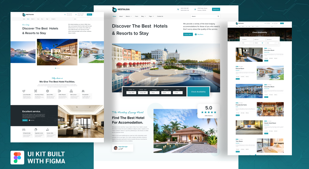
5. NESTALGIA – Hotel and Resort Booking UI
Best for: Trust-driven UI, storytelling, booking UX
NESTALGIA blends visual storytelling with functional booking interfaces, creating a balance between inspiration and usability. It uses imagery, reviews, and structured layouts to build trust before prompting action. This design approach is effective for hospitality brands that rely heavily on emotional engagement. UI designers can use it to create immersive yet conversion-focused experiences.
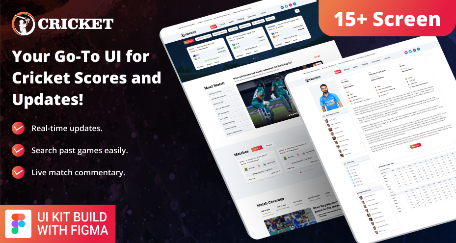
6. Cricket Live Scorecard and News UI
Best for: Real-time UI, multi-state systems, content-first design
This UI kit demonstrates how to handle live data updates without sacrificing clarity. It organizes scores, match stats, and news into a structured format that is easy to scan. This is particularly valuable for platforms requiring constant updates, such as sports, finance, or analytics dashboards. Designers can learn how to manage dynamic content efficiently.
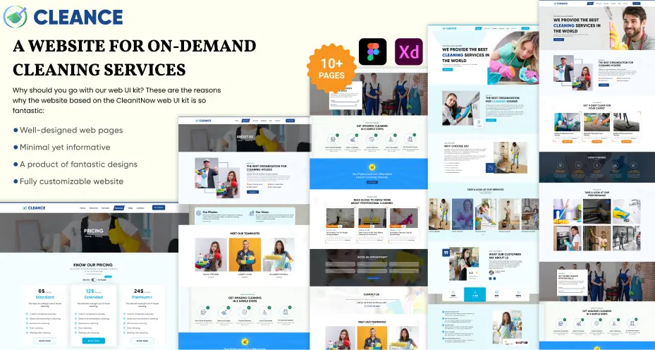
7. Cleance – Cleaning Service Booking UI
Best for: Service-based UX, strong CTAs, minimalist design
Cleance focuses on simplicity and action-driven design, making it easy for users to book services quickly. It uses clear CTAs, minimal distractions, and structured service listings to guide users toward conversion. This makes it ideal for local service platforms where speed and clarity are essential. Designers can replicate this approach for lead-generation-focused websites.
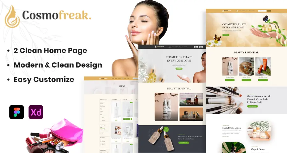
8. Cosmo Freak – Cosmetic E-commerce UI
Best for: Visual commerce, branding, product-focused layouts
Cosmo Freak highlights how visual presentation directly influences purchasing decisions. The UI uses high-quality imagery, organized product displays, and intuitive navigation to enhance the shopping experience. It’s especially useful for beauty and fashion brands where aesthetics play a major role. Designers can use this as a reference for building conversion-driven e-commerce platforms.
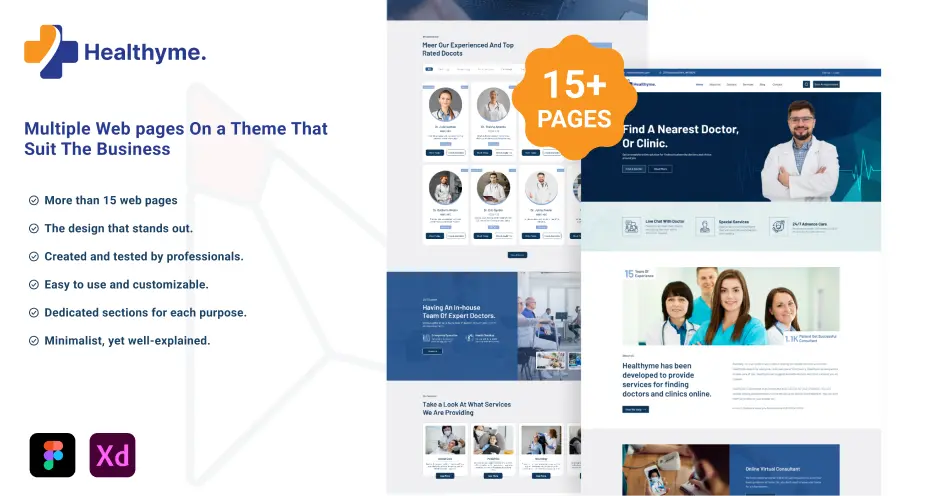
9. Healthyme – Health Service Website UI
Best for: Trust-driven design, service UX, accessibility
Healthyme is built around clarity, trust, and ease of access, which are essential in healthcare platforms. It uses structured layouts, simple navigation, and accessible design patterns to help users find services and book appointments quickly. This UI is ideal for designers working in sensitive domains where user confidence is critical.
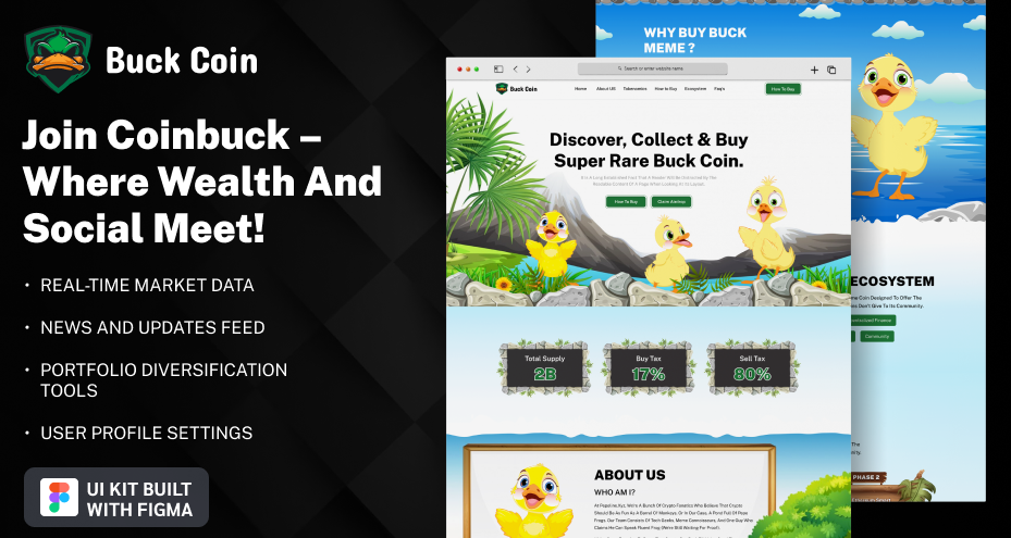
10. Buck Meme Coin – Crypto Website UI
Best for: Niche branding, high-impact visuals, experimental UI
Buck Meme Coin demonstrates how to create a bold and memorable visual identity. The design uses strong typography, vibrant colors, and unconventional layouts to stand out in a competitive niche. It’s ideal for Web3 or startup projects that rely on branding differentiation. Designers can use this approach to create visually distinct and engaging interfaces.
Final Thoughts: Which Design Idea Should You Use?
Choosing the right design approach depends on your project type and goals.
Quick Decision Guide
| If You’re Designing | Use This Idea |
|---|---|
| SaaS Dashboard | Dashboard-Centric UX |
| Booking Platform | Conversion-Focused Flows |
| E-commerce Store | Visual Commerce Optimization |
| Content Platform | Content-First UI |
| Service Website | Strong CTA-Based UX |
Pick the right idea for the website design, then follow the tips mentioned and create a high-quality digital product.