BTC - Bitcoin
 USDTERC20 - USDT ERC20
 ETH - Ethereum
 BNB - Binance
 BCH - Bitcoin Cash
 DOGE - Dogecoin
 TRX - TRON
 USDTTRC20 - USD TRC20
 LTC - LiteCoin

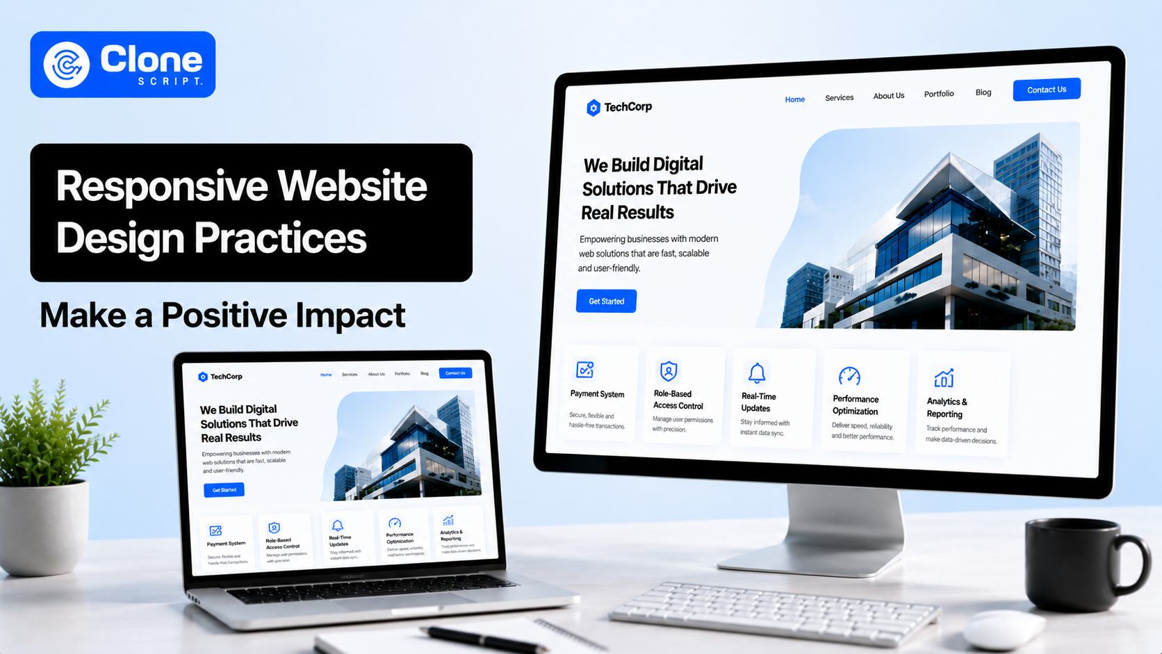
How Responsive Website Design Practices Can Make a Positive Impact
A responsive website used to mean one thing: “Does the layout fit on mobile?”
That definition is outdated.
Today, responsive website design practices influence almost every performance metric that matters:
-
Google rankings
-
Core Web Vitals
-
Mobile conversions
-
Accessibility compliance
-
Bounce rates
-
Front-end scalability
-
Even long-term development costs
And the gap between “mobile-friendly” and “properly responsive” is getting wider every year.
A website can technically work on smartphones while still:
-
Failing Core Web Vitals
-
Frustrating users with layout shifts
-
Hiding important content on smaller screens
-
Creating thumb-navigation issues
-
Loading oversized desktop assets
-
Breaking on foldables and ultra-wide displays
This is exactly why modern responsive design is no longer a visual design topic alone. It’s now a performance engineering and business optimization discipline.
In this guide, you’ll learn:
-
How modern responsive web design benefits SEO and conversions
-
Why component-based responsiveness is replacing traditional breakpoints
-
How mobile-first indexing architecture affects layout decisions
-
Where most responsive UX failures happen
-
How advanced responsive systems improve scalability across products
Let’s start with the biggest shift happening in frontend architecture right now.
Responsive Design Is Moving From “Pages” to “Components.”
For years, responsive systems were built around viewport breakpoints.
Most websites still use structures like this:

This approach worked when websites were relatively simple:
-
Fixed content pages
-
Predictable layouts
-
Limited device variation
But modern interfaces are supporting modular web design.
Today’s websites contain:
-
Reusable product cards
-
Embedded widgets
-
Dynamic CMS blocks
-
SaaS dashboards
-
Expandable UI modules
-
AI-generated content layouts
And this is where traditional breakpoint logic starts failing.
Why viewport-based responsiveness breaks modern layouts
A user interface component doesn’t care about the entire browser width.
It only cares about the space available inside its parent container.
For example:
-
A pricing card inside a sidebar
-
A product tile inside a carousel
-
A dashboard widget inside a split-screen layout
Maybe all exist on the same desktop viewport while having completely different available widths.
Traditional media queries ignore this reality.
That creates:
-
Broken card structures
-
Inconsistent typography
-
Overflowing CTAs
-
Uneven spacing systems
-
Fragile front-end codebases
This is why advanced responsive website design practices are shifting toward component-level responsiveness.
CSS Container Queries Are Changing Responsive Architecture.
One of the biggest front-end changes in recent years is the rise of container queries.
Instead of responding to the viewport, components respond to their own container dimensions.
That sounds small.
But architecturally, it changes everything.
CSS container queries vs media queries
Traditional media queries:

Container queries:

The difference is strategic.
Media queries create page-dependent layouts.
Container queries create self-aware components.
This improves the following:
-
Front-end maintainability
-
Reusable UI structures
-
CMS flexibility
-
Layout consistency
For large-scale products, this can reduce responsive override complexity.
Instead of maintaining endless breakpoint exceptions, components adapt independently.
That means fewer layout bugs during scaling.
Fluid Responsive Grid Layouts Reduce Layout Fragility.
Rigid grids are one of the most common causes of poor responsive UX.
Many websites still rely on:
-
Fixed column counts
-
Hardcoded spacing
-
Inflexible widths
This creates awkward gaps across:
-
Tablets
-
Ultra-wide screens
-
Foldables
-
Landscape mobile devices
Modern fluid responsive grid layouts solve this problem.
Using CSS Grid for adaptive scaling
Instead of defining exact columns, modern layouts use dynamic sizing logic.
Example:

This allows layouts to do the following:
-
Expand naturally
-
Collapse intelligently
-
Preserve spacing consistency
-
Adapt without excessive breakpoints
The UX impact is massive.
Users experience:
-
Smoother browsing
-
Cleaner visual hierarchy
-
More stable interactions
-
Better readability
Meanwhile, developers gain:
-
Leaner CSS
-
Fewer overrides
-
Easier maintenance
-
More scalable systems
This is where responsive design starts influencing engineering efficiency directly.
Mobile-First Indexing Changed Responsive SEO Forever.
Responsive design used to be mostly a usability concern.
Now it’s deeply tied to search visibility.
Google’s mobile-first indexing architecture evaluates the mobile experience as the primary version of a website.
That means responsive failures directly affect website SEO performance.
And many websites still misunderstand this.
Mobile responsiveness is not the same as mobile optimization.
A website can technically resize on mobile, pass basic viewport tests, and appear functional while still delivering poor mobile UX.
Google increasingly evaluates:
-
Interaction quality
-
Visual stability
-
Rendering speed
-
Accessibility
-
Layout consistency
This is why responsive web design benefits extend far beyond appearance.
A well-engineered responsive system improves:
-
Engagement signals
-
Page experience metrics
-
Crawl efficiency
-
Session duration
-
Conversion rates
And all of these indirectly affect search performance.
Core Web Vitals and Responsive Design Are Now Connected.
Most Core Web Vitals problems originate from poor responsive implementation.
Not from the server.
Not from hosting.
From front-end developed layout architecture.
Poorly responsive systems increase CLS.
Cumulative Layout Shift (CLS) happens when layouts move unexpectedly during loading.
Common causes include:
-
Images without dimensions
-
Ads injecting dynamically
-
Inconsistent responsive spacing
-
Lazy-loaded sections without reserved height
Users hate this.
Especially on mobile.
Imagine trying to tap a CTA and the layout suddenly shifts.
That instantly damages trust.
The fix: structural responsiveness
Modern responsive systems reserve layout space before assets load.
Example:

This simple practice stabilizes rendering dramatically.
The result you can get:
-
The web page loads more smoothly
-
Users can trust the website
-
The Core Web Vitals metrics improve
-
A lower bounce rate on the analytics
Responsive Images Improve Both UX and SEO.
One of the biggest responsive performance mistakes is serving desktop-sized assets to mobile devices.
This destroys LCP performance, bandwidth efficiency, and mobile rendering speed. It happens constantly.
Responsive image delivery matters
Modern responsive image systems use:
-
srcset
-
sizes
-
lazy loading
-
next-gen formats
Example:

This allows browsers to load only the image size actually needed.
The impact on:
-
Faster mobile rendering
-
lower data usage
-
Proper Largest Contentful Paint
-
Improved user retention
On image-heavy websites, this can improve performance scores.
Most Mobile UX Problems Are Actually Ergonomic Problems.
This is where many responsive guides become too theoretical.
Real users do not interact with websites using perfect desktop behavior patterns.
They use:
-
Thumbs
-
Gestures
-
One-handed navigation
-
Interrupted attention spans
Responsive design must adapt to physical interaction behavior.
Thumb-zone responsive UX
A CTA placed beautifully on a desktop may become difficult to reach on mobile.
Users naturally interact within thumb-access zones.
Ignoring this creates friction during:
-
Checkout flows
-
Lead generation
-
Onboarding
-
Navigation
Responsive layouts should prioritize:
-
Reachable buttons
-
Safe spacing
-
Larger interaction targets
-
Lower-screen CTA positioning
This directly improves mobile conversion rate optimization and UX performance.
Responsive Forms Often Destroy Mobile Conversions.
Forms remain one of the highest abandonment areas on mobile.
Most failures come from bad responsive implementation.
Common issues include:
-
There is a tiny input field
-
The keyboard overlap exists
-
Excessive typing frustrates users
-
Multi-column mobile layouts appear
-
Difficult tap targets to be followed
Better responsive form design
Modern responsive form systems focus on:
-
Single-column structures
-
Contextual mobile keyboards
-
Progressive disclosure
-
Autofill compatibility
Example:

Small front-end improvements reduce friction significantly.
Lower friction means:
-
More completed signups
-
Correct lead generation
-
Improved checkout completion
This is where responsive website UX and UI design became directly tied to revenue.
Environmental Responsiveness Is Becoming Standard.
Modern responsiveness now includes environmental adaptation.
Not just screen resizing.
Users increasingly expect websites to respond to:
-
Dark mode preferences
-
Reduced motion settings
-
Contrast settings
-
Device orientation changes
This creates a more adaptive experience.
Dark mode responsiveness
Dark mode is no longer optional for many users.
Especially on SaaS platforms, dashboards, developer tools, and productivity applications.
Example:

This allows interfaces to match user system preferences automatically.
Benefits include reduced eye strain, improved accessibility, longer engagement sessions, and correct nighttime usability.
Modern responsive design practices increasingly treat environmental adaptation as a baseline UX requirement.
Foldables Are Breaking Old Responsive Systems.
Foldable devices expose a major weakness in traditional breakpoint-driven design.
Layouts can now change during interaction, mid-scroll, while forms are active.
Old responsive systems were never built for this.
Contextual layout stacking matters now.
Users expect layouts to adapt fluidly without resetting forms, losing scroll position, and collapsing interaction states.
This requires:
-
Resilient component systems
-
Flexible grid logic
-
State-preserving UI structures
Static breakpoint architecture struggles badly here.
Modern responsive systems handle continuity far more effectively.
Hiding Mobile Content Is a Serious UX Mistake.
One of the worst responsive shortcuts is hiding desktop content on mobile.
Designers often remove comparison tables, specifications, feature explanations, and navigation layers to “simplify” the interface.
But users still need that information.
Progressive disclosure works better.
Instead of removing content, responsive systems reorganize it.
Using accordions, tabs, expandable drawers, sliders, and bento layouts allows mobile users to access full information without cluttering the interface.
This improves UX continuity, SEO depth, user trust, and engagement quality.
Information parity matters.
Especially for:
-
SaaS websites
-
E-commerce platforms
-
Service businesses
-
Technical products
Responsive Design Systems Improve Development Scalability.
Poor responsive architecture increases technical debt quickly.
Especially on growing platforms.
Many front-end website teams spend an enormous amount of time maintaining:
-
Breakpoint overrides
-
Layout exceptions
-
Patch fixes
-
Inconsistent components
Modern responsive systems reduce this complexity significantly.
Design systems now require responsive logic
Tools like Figma are increasingly used:
-
Auto Layout
-
Responsive tokens
-
Scalable spacing systems
-
Adaptive component structure
This improves alignment between website designers, front-end developers, and product teams.
Instead of handing off static mockups, teams define layout behavior systems.
That shift reduces regression bugs.
The Real Business Impact of Responsive Website Design Practices
Most companies still underestimate the extent to which responsive UX affects revenue.
But the data is visible everywhere.
Poor responsive experiences increase:
-
Bounce rates
-
Abandoned carts
-
Support tickets
-
User frustration
-
Lead drop-offs
Meanwhile, optimized responsive systems improve:
-
Conversion rates
-
Engagement duration
-
SEO performance
-
Retention
-
Customer trust
And unlike short-term growth hacks, responsive infrastructure improvements compound over time.
That’s what makes them valuable.
Conclusion
The definition of responsive design has fundamentally changed.
It’s no longer about shrinking desktop layouts into smaller screens.
Modern responsive website design practices now influence everything from accessibility to long-term product maintenance.
The highest-performing websites today are:
-
Component-driven
-
Performance-optimized
-
Ergonomically designed
-
Environmentally adaptive
-
Structurally resilient
The companies investing in advanced responsive systems are gaining measurable advantages across both UX and search visibility.
The next step is simple.
Audit your current front-end system and identify:
-
CLS instability
-
Oversized mobile assets
-
Hidden responsive content
-
Layout shift problems
-
Tap-target failures
-
Unnecessary responsive scripts
Because modern responsiveness is no longer a visual enhancement.
It’s infrastructure.