BTC - Bitcoin
 USDTERC20 - USDT ERC20
 ETH - Ethereum
 BNB - Binance
 BCH - Bitcoin Cash
 DOGE - Dogecoin
 TRX - TRON
 USDTTRC20 - USD TRC20
 LTC - LiteCoin

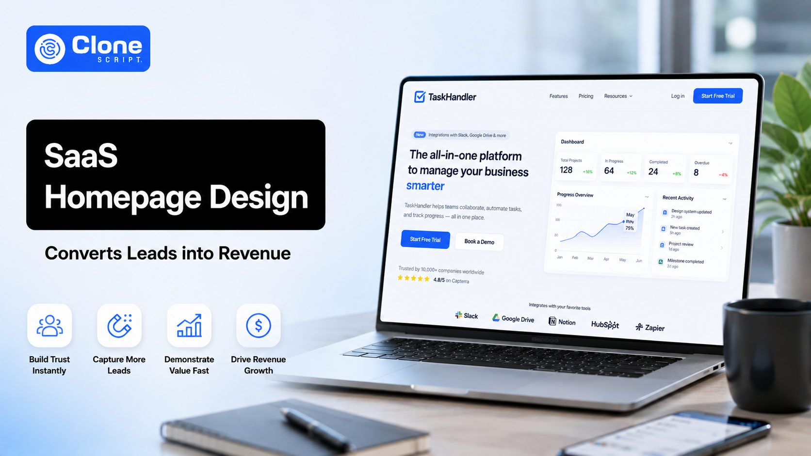
How to Design a SaaS Homepage That Converts Leads into Revenue
A SaaS homepage has a short window to make an impression.
Visitors arrive from Google searches, paid ads, review platforms, social media, referrals, or direct brand searches. Some are actively comparing software. Others are only beginning to understand their problem. A few may already be ready to book a demo.
That means your homepage is not simply a branding page. It is part salesperson, part product showcase, and part conversion.
Yet many Software-as-a-Service companies approach homepage design the wrong way.
They focus on animations, abstract messaging, oversized visuals, and creative headlines that sound impressive internally but fail to explain anything useful to actual buyers.
The result is predictable: traffic arrives, visitors scroll briefly, and then leave without taking action.
A well-designed SaaS homepage does the opposite. It creates clarity, builds trust, and moves the right visitor toward revenue-generating actions.
In this guide, you’ll learn how to design a SaaS homepage that not only looks professional but actually converts leads into paying customers.
Why SaaS Homepage Design Matters More Than Most Companies Realize
For many Software-as-a-Service businesses, the homepage becomes the first major interaction between the product and a potential customer.
Unlike campaign-specific landing pages, a homepage must serve multiple audiences at once.
A startup founder may want pricing details.
A marketing manager may want to compare features.
A technical buyer may look for integrations.
An enterprise decision-maker may look for trust indicators.
Your homepage has to handle all of these expectations without creating confusion.
This is where poor SaaS websites lose conversions.
According to Unbounce conversion benchmark research, SaaS landing pages convert at a median rate of 3.8%, which shows how competitive and conversion-sensitive this space is.
That percentage might seem small at first, but even minor improvements matter.
If your homepage receives 10,000 monthly visitors, improving conversion from 3% to 5% can create a meaningful increase in demos, trials, and ultimately revenue.
Homepage design is not a visual exercise.
It is a growth decision.
Start With a Clear Value Proposition Above the Fold.
The first section of your homepage determines whether people stay or leave.
This section, commonly called the hero section, must immediately explain what your product does.
Unfortunately, many Software-as-a-Service websites fail here.
You have likely seen headlines like: “Empowering intelligent digital transformation for modern businesses.”
It sounds polished.
It also says almost nothing.
Your homepage headline should be simple enough that a first-time visitor understands your offering within seconds.
For example: “Customer support software that helps teams respond faster.”
This works because it communicates three things clearly:
-
What the product is
-
Who it is for
-
What benefit it offer
That combination reduces friction.
Visitors should not have to interpret your messaging.
What a Strong Hero Section Should Include
A high-converting hero section usually contains four key elements.
-
A Clear Headline
Avoid jargon.
Avoid clever phrasing.
Focus on direct communication.
Strong examples include:
-
Project management software for creative teams
-
Accept crypto payments without complex setup
-
CRM software built for fast-growing startups
Each example immediately explains the product category and intended user.
-
Supporting Subheadline
Your subheadline should add useful detail.
It should explain how the product works or what specific pain point it solves.
Example: “Track conversations, automate workflows, and manage customer support from one dashboard.”
This gives clarity without overwhelming the visitor.
-
Primary Call-to-Action
A homepage needs one clear action.
Good CTA examples include:
-
Start Free Trial
-
Book a Demo
-
Get Started
-
See Pricing
Weak CTA examples include:
-
Explore
-
Learn More
-
Discover More
The difference is intent.
High-converting CTA copy tells users exactly what happens next.
-
Product Visuals
People evaluating software want to see the software.
Use these:
-
Dashboard screenshots
-
Interface previews
-
Workflow demonstrations
-
Product UI visuals
Avoid generic office stock photography.
A smiling team around a laptop does not explain your product.
Focus on Benefits Instead of Features.
One of the most common Software-as-a-Service homepage mistakes is feature overload.
Companies list everything their software can do, but fail to explain why it matters.
Feature-focused messaging often sounds like this: “Advanced analytics dashboard with customizable reports.”
That tells users what exists.
It does not explain why they should care.
A stronger version would be: “Track customer behavior and spot revenue opportunities faster.”
Now the benefit is obvious.
This matters because buyers do not purchase software for features alone.
They buy outcomes.
They want efficiency.
Cost savings.
Better workflows.
Faster growth.
Reduced manual work.
When writing homepage copy, connect every feature to a practical result.
A useful formula is: Feature → Benefit → Business Impact
Example: “Automated payment reminders help reduce overdue invoices and improve monthly cash flow.”
That is far more persuasive than listing “automated reminders” as a standalone feature.
Build Trust Early in the Buying Journey.
Trust is a major conversion factor in SaaS.
Visitors are often evaluating software from unfamiliar brands.
If they feel uncertain, they leave.
This is why social proof matters.
Trust indicators reduce hesitation.
They reassure potential buyers that your product is credible.
-
Effective Trust Signals for Software-as-a-Service Homepages
Customer logos are one of the fastest ways to establish legitimacy.
If known brands use your software, showcase them clearly.
Even smaller businesses respond positively to recognizable names.
Testimonials are also effective, but only when they feel specific.
A generic quote like: “Great software. Highly recommended.” adds little value.
A stronger testimonial sounds like: “Our onboarding time dropped by 38% after switching.”
Specific outcomes feel believable.
Review platform ratings can also influence conversions.
If your SaaS is listed on G2, Capterra, or TrustRadius, these signals help comparison-stage buyers.
Security trust badges matter too.
This becomes especially important for software handling payments, personal data, or enterprise workflows.
Examples include:
-
GDPR compliance
-
SOC 2 certification
-
SSL security
-
ISO compliance
Trust is not optional in Software-as-a-Service.
It is part of conversion design.
Simplify Software-as-a-Service Homepage Navigation.
Navigation affects user behavior more than many teams realize.
A cluttered navigation menu creates friction.
When visitors see too many choices, decision-making slows down.
This is known as cognitive overload.
A typical overbuilt SaaS navigation might include:
-
Features
-
Integrations
-
Pricing
-
Blog
-
Resources
-
Webinars
-
Community
-
Support
-
Docs
-
Partners
-
Marketplace
-
Careers
That is too much for a homepage experience.
Your navigation should guide users toward decision-making.
A cleaner structure often works better:
-
Product
-
Solutions
-
Pricing
-
Customers
-
Resources
-
Login
-
CTA button
Additional content can remain accessible deeper in the site architecture.
The homepage should prioritize conversion flow.
Design a SaaS Website for Mobile Experiences.
Many SaaS teams still optimize primarily for desktop users.
That is a mistake.
Even if high-value conversions happen on desktop, mobile often creates the first impression.
If your homepage performs poorly on mobile, visitors may never return.
Common mobile issues include:
-
Slow load speeds
-
Oversized visuals
-
Unreadable text
-
Awkward navigation
-
Hard-to-tap buttons
-
Broken layouts
A strong mobile software-as-a-service homepage should feel effortless.
Best practices include: Using compressed visuals, simplifying layouts, shortening forms, and ensuring CTA buttons remain easy to interact with.
Complex design rarely performs better on mobile.
Clarity wins.
Explain the Product Without Overwhelming Visitors.
One challenge in SaaS homepage design is explaining functionality without creating information overload.
Some homepages explain too little.
Others attempt to explain everything.
Neither works well.
A simple storytelling framework helps.
-
Present the Problem First.
Start with the customer’s pain point.
Example: “Managing leads across multiple spreadsheets slows sales teams down.”
This creates relevance.
-
Show the Solution.
Introduce your software as the answer.
Example: “Centralize lead management, automate follow-ups, and track conversions in one place.”
Now users understand what the product does.
-
Show the Outcome.
Explain the result.
Example: “Close deals faster without losing visibility.”
This creates a natural persuasive flow.
Problem.
Solution.
Outcome.
It is simple, effective, and easier for users to process.
Use Multiple Strategic Calls-to-Action in a Software Product.
A single CTA at the top of the homepage is rarely enough.
Not every visitor is ready to act immediately.
Some need more context.
Others need reassurance.
That is why CTA placement matters.
Your homepage should create multiple logical conversion opportunities.
Effective CTA placement often includes:
-
Hero section
-
After the product explanation
-
After testimonials
-
After the trust-building section
-
Near pricing previews
-
Footer
Consistency matters.
If your main CTA is “Start Free Trial,” keep that language consistent.
Switching between “Book a Call,” “Contact Sales,” and “Get Started” creates friction.
Clear messaging reduces hesitation.
Reduce Signup Friction in Your Software Service Website.
Long forms reduce conversions.
This is especially true for SaaS products targeting self-serve users.
If someone wants to try your product, asking for too much information too early creates unnecessary resistance.
A signup form requesting: phone number, company revenue, industry details, team size, budget range, and business goals may feel intrusive.
Shorter forms convert better in many cases.
If your model supports free trials, minimal signup requirements often improve performance.
For demo requests, some qualification is reasonable.
But even then, brevity matters.
Ask for what is necessary.
Not what might be useful later.
Be Transparent About Pricing in a SaaS Platform.
Pricing uncertainty creates hesitation.
Visitors often want qualification signals before investing time.
Even if you do not publish full pricing, directional transparency helps.
Examples include:
-
Plans starting from $49/month
-
Enterprise pricing available on request
-
Custom plans for larger teams
Hidden pricing can sometimes make sense in enterprise sales.
But for many Software-as-a-Service businesses, excessive pricing ambiguity hurts conversions.
Users dislike uncertainty.
Clear expectations improve decision-making.
Optimize for Speed and SEO.
A homepage that converts also needs discoverability.
SEO and conversion optimization should support each other.
Site speed plays a major role here.
Heavy scripts, autoplay videos, bloated animations, and oversized media files hurt both rankings and user experience.
Faster pages reduce bounce rates.
They also improve usability.
SEO basics still matter:
-
Keyword-optimized headings
-
Clear metadata
-
Logical internal linking
-
Mobile responsiveness
-
Fast loading performance
Traffic matters.
But converting that traffic matters more.
Keep Testing and Improving the Software Service Website.
No homepage is permanently finished.
Buyer behavior changes.
Competitors evolve.
Messaging assumptions become outdated.
That is why conversion optimization is ongoing.
Track metrics such as:
-
Click-through rates
-
Trial signup rates
-
Demo submissions
-
Bounce rates
-
Scroll depth
-
Lead-to-customer conversion
Behavior analysis tools can reveal friction points.
Sometimes small adjustments create significant gains.
A stronger headline.
A shorter form.
A clearer CTA.
A simplified hero section.
Optimization is often incremental, but the business impact compounds over time.
Conclusion
A SaaS homepage should do more than look polished.
It should actively move visitors toward becoming customers.
The most effective SaaS homepages focus on clarity, trust, usability, and conversion strategy.
If your current homepage attracts traffic but struggles to generate revenue, design may not be the only issue.
Messaging, structure, and user experience play a much bigger role.
A better homepage is not about adding more elements.
It is about removing friction between interest and action.