BTC - Bitcoin
 USDTERC20 - USDT ERC20
 ETH - Ethereum
 BNB - Binance
 BCH - Bitcoin Cash
 DOGE - Dogecoin
 TRX - TRON
 USDTTRC20 - USD TRC20
 LTC - LiteCoin
Top E-Learning Website Figma Templates for UI/UX Design (Real Use Cases)
When we talk about e-learning platforms in India, names like BYJU'S and Unacademy often come to mind. On a global level, platforms such as Coursera, edX, and Udemy have set strong benchmarks. What makes these platforms successful isn’t just their content—it’s the quality of their UI/UX design. From the moment users land on the homepage to completing a course, every interaction is optimized for a smooth and engaging experience.
However, designing such experiences is not a quick task. It requires careful research into user behavior, learning patterns, and interface structure, along with the implementation of solid design principles. For UI/UX designers, building these systems from scratch can be time-intensive and complex.
In this guide, we’ll explore the best e-learning Figma templates for UI/UX design and how to use them effectively in real projects. More importantly, you’ll learn how these templates align with modern UX patterns used by platforms and how to adapt them into production-ready, scalable design systems.
What Makes a Great E-Learning UI/UX Design?
Structuring content in a way that supports learning, retention, and engagement defines the perfect example of the best e-learning website UI and UX design. Only aesthetics can’t make the e-learning website prominent.
On education websites, users interact for longer periods, making usability and clarity important.
-
Clear Course Structure and Navigation
Learners should be able to browse categories, access lessons, and understand their path without friction. A well-organized hierarchy, modules, lessons, and subtopics, reduces confusion and directly improves course completion rates. Consistent navigation patterns (sidebar, breadcrumbs, progress indicators) reinforce orientation.
-
User-Centric Dashboards
Dashboards function as the operational hub for learners. They should surface enrolled courses, progress status, deadlines, and recommendations in a concise, scannable layout. Applying professional dashboard UI/UX principles ensures users can take action quickly without cognitive overload.
-
Progress Tracking and Motivation
Every digital learning platform integrates progress visibility. Elements like completion percentages, streaks, badges, and milestones create momentum and reinforce habit formation. These mechanics are essential for improving retention and long-term engagement.
-
Distraction-Free Learning Interface
Lesson pages should prioritize focus over decoration. Excessive icons, animations, or visual noise interrupt comprehension. A clean layout, clear typography, structured content blocks, and minimal distractions help users stay immersed in the material.
-
Responsive and Accessible Design
E-learning platforms must perform seamlessly across devices. Responsive layouts ensure usability across mobile, tablet, and desktop, while accessibility standards (readability, contrast, keyboard navigation) make content more accessible to a broader audience. This combination enables anytime, anywhere learning without friction.
Best E-Learning Website Figma Templates for UI/UX Designers
The Figma website design template has to support real e-learning workflows, scalability, and efficient design execution. The following templates are structured to help designers move faster while aligning with the UX principles discussed above. The visual appeal is not enough.
-
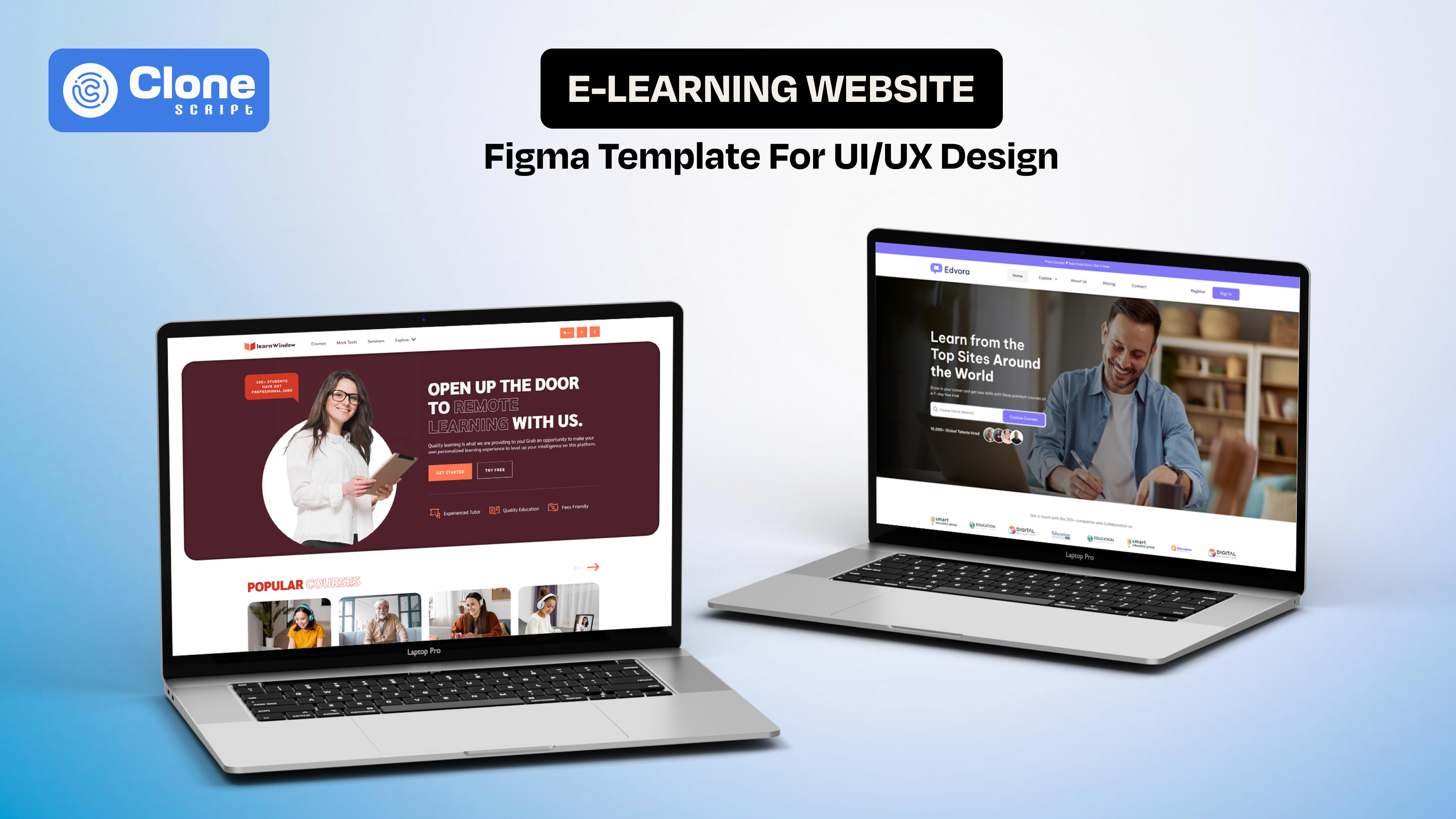
Edvora – E-Learning Website Figma Design (Complete Platform UI)
Edvora is designed as a full-scale e-learning website template, making it ideal for designers working on complete LMS platforms or course marketplaces. It includes structured layouts that reflect real product requirements, not just static screens.

What does it include
-
Comprehensive page coverage
It includes the homepage, course listings, course detail pages, dashboards, and user profiles, covering the entire product flow.
-
Built for a learning structure
Course modules, categories, and navigation are pre-designed to support clear learning paths. There are no additional requirements to fulfill.
-
Dashboard-focused UX
The design provides ready-made layouts for progress tracking, enrolled courses, and user activity. That helps teams to hand off clear instructions to front-end development.
-
Monetization-ready design
Pricing pages, subscription flows, and checkout interfaces are included, aligning with SaaS-based learning platforms.
This template is best suited for designers who need a complete, production-ready UI foundation for e-learning products.
-
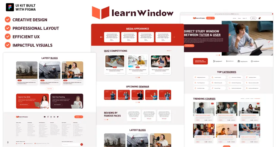
Learn Window – E-Learning UI Kit Figma Design (Component-Based System)
Learn Window takes a different approach by offering a modular UI kit, focused on reusable components rather than full-page templates. This makes it highly flexible for rapid prototyping and iterative design for online learning platforms.
What does it include
-
Pre-built UI components
This website design includes elements like login screens, course cards, dashboards, reviews, and interaction modules.
-
Flexible design system approach
Components can be reused and adapted across multiple screens. That means you can improve consistency and speed of online LMS platform development.
-
Engagement-focused elements
Figma UI covers features like quizzes, ratings, and user feedback systems to enhance interaction design.
-
Customizable layouts
Ideal for designers working on different types of e-learning platforms or experimenting with variations.
This UI kit works best for designers who prioritize speed, flexibility, and scalable component-based design.
The selection ensures you’re not just picking templates. You’re choosing design systems that align with real e-learning UX requirements, making your workflow more efficient and your final product more effective.
How to Choose the Right E-Learning Figma Template
Selecting a template should be a product decision, not just a design preference. The right choice depends on how well the template supports learning workflows, scalability, and implementation feasibility.
-
Define the Product Type First
Start by identifying what you’re designing: a course marketplace, LMS platform, or instructor-led learning system. Each requires different UI structures. Marketplaces need strong discovery flows, while LMS platforms focus more on dashboards and progress tracking.
-
Evaluate UX Coverage, Not Just Screens
Many templates look complete but miss critical flows. Check whether the template includes course listing, lesson pages, dashboards, onboarding, and payment flows. Missing flows will slow down your process later.
-
Check Component Structure in Figma
A good template should be built with Auto Layout, reusable components, and variants. This ensures you can scale the design without breaking consistency. Poorly structured files increase rework and reduce efficiency.
-
Assess Customization Flexibility
Avoid rigid designs. The UI template should allow you to modify layouts, typography, and components based on different learning models or branding requirements.
-
Consider Developer Handoff
Design is only one part of the process. Ensure the template follows clear naming conventions, spacing systems, and grid structures so developers can easily translate it into code.
Common Mistakes to Avoid
-
Choosing templates based only on visual design
-
Ignoring missing user flows (checkout, onboarding, progress tracking)
-
Using templates without adapting them to real product logic
-
Overcomplicating UI with unnecessary elements
Choosing the right template ensures you’re not just saving time. You’re building a scalable, user-focused e-learning experience that aligns with both design and business goals.
How to Customize E-Learning Figma Templates for Real Projects
Using a template is only the starting point. The real value comes from how effectively you adapt it to match your product requirements, user behavior, and business model. A generic layout won’t deliver results unless it’s aligned with real-world use cases.
-
Align the Template with Your Learning Model
Start by mapping the template structure to your product type, whether it’s a self-paced LMS, live class platform, or course marketplace. Adjust flows like course discovery, lesson access, and user dashboards to reflect how users will actually interact with the platform.
-
Refine Course and Content Hierarchy
Templates include placeholder structures. You should reorganize them based on course depth, module breakdown, and lesson sequencing. A clear hierarchy improves usability and helps users navigate content without confusion.
-
Customize UI Components for Consistency
Standardize elements like buttons, cards, navigation bars, and forms using Figma components and variants. This ensures consistency across screens and makes future updates easier, especially in large-scale projects.
-
Optimize Dashboards for Real Data
Replace static placeholders with realistic data points such as progress percentages, course timelines, and activity summaries. This helps you design actionable dashboards, not just visually complete.
-
Adapt for Branding and Visual Identity
Modify typography, color systems, and spacing to match the brand. Ensure the design maintains readability and accessibility, especially for long learning sessions.
-
Prepare for Developer Handoff
Clean up your Figma file by organizing layers, naming components clearly, and maintaining a consistent grid system. This reduces friction when translating design into development.
Key Outcome
By customizing templates this way, you move from:
-
Generic UI layouts to product-driven design systems
-
Static screens to functional user experiences
This approach ensures your e-learning design is not only visually appealing but also usable, scalable, and ready for real-world implementation.
UX Patterns That Improve Learning Engagement
The intention of a learning website is to keep users consistently engaged over time. The most famous platforms implement UX patterns that encourage continuity, motivation, and interaction without overwhelming the learner.
-
Guided Learning Paths
Instead of leaving users to explore randomly, high-performing platforms use structured learning paths. Step-by-step progression, prerequisites, and clear next actions reduce decision fatigue and help users stay on track.
-
Micro-Interactions for Feedback
Small UI responses, like progress updates, button states, or completion confirmations, provide instant feedback. These micro-interactions in user experience reinforce user actions and make the experience feel responsive and intuitive.
-
Gamification Elements
Incorporating features like badges, streaks, points, or leaderboards adds a layer of motivation. These elements tap into user psychology, encouraging consistent usage without forcing engagement.
-
Contextual Recommendations
Suggesting relevant courses or lessons based on user behavior improves content discovery and retention. Personalized recommendations reduce effort and increase the likelihood of continued learning.
-
Chunked Content Delivery
Breaking lessons into smaller sections improves comprehension and retention. Long-form content is divided into manageable units, allowing users to learn at their own pace without cognitive overload.
-
Seamless Resume Experience
Users should be able to continue exactly where they left off. Features like “resume learning” or saved progress eliminate friction and support long-term engagement.
Why This Matters for Designers
These patterns shift your design from a static interface to a dynamic learning system. When applied correctly, they directly impact:
-
User retention
-
Course completion rates
-
Overall platform engagement
Turning Figma Templates into Scalable Design Systems
A template helps you start fast. But without systemization, it won’t scale. To support real e-learning products, you need to convert static screens into a structured design system that can evolve with new features, users, and content.
-
Establish a Component Architecture
First of all, break down the core components like navigation, course cards, lesson blocks, forms, and dashboards. Then, the process for converting the repeated elements into reusable components with variants (states, sizes, and interactions). This ensures consistency and reduces duplication as the product grows.
-
Implement Auto Layout and Constraints
In Figma UI designs, use Auto Layout to create flexible, responsive components that adapt to content changes. This is critical for elements like course listings, dashboards, and mobile views, where layout shifts frequently.
-
Define Design Tokens
In this step, you have to focus on the design token management. Standardize your colors, typography, spacing, and grid system. Design tokens create a single source of truth, making it easier to maintain visual consistency and apply global updates across the product.
-
Create Scalable Page Templates
Instead of designing isolated screens, build page-level structures (e.g., course page, dashboard, lesson view) that can be reused and extended. This approach aligns design with real product workflows.
-
Align with Development Standards
Structure your Figma files to mirror development logic, clear naming conventions, organized layers, and consistent spacing. This simplifies Figma design-to-HTML code translation and reduces back-and-forth with developers.
-
Document Usage Guidelines
A system is only effective if it’s usable. Document how components should be used, when to apply variants, and how layouts adapt across devices. This ensures consistency across teams.
Key Outcome
By transforming e-learning UI design templates into a design system, you move from:
-
One-time design assets into long-term scalable infrastructure
-
Visual consistency to product consistency
This is what allows designers to handle complex e-learning platforms efficiently, without redesigning from scratch every time a new feature is introduced.
Conclusion
Designing effective e-learning platforms requires more than visuals. It demands structured UX, scalable systems, and the right tools. With the right Figma templates, you can accelerate workflows while maintaining quality and consistency across complex interfaces. But you can’t ignore the importance of a website UI design and UX where the product is highly scalable and requires a custom solution rather than a pre-built one.
Are you ready to design an e-learning experience that users actually complete and return to? Make it identical to the next best platform with the procedure that most professional UI designers and UX developers do.