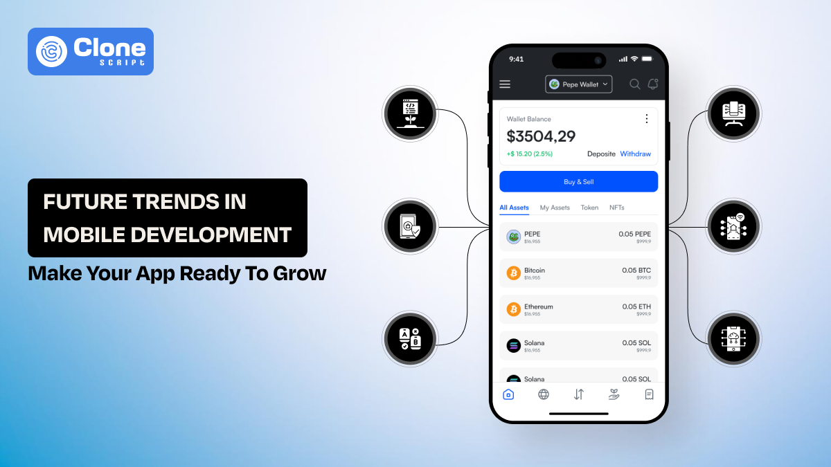
BTC - Bitcoin
 USDTERC20 - USDT ERC20
 ETH - Ethereum
 BNB - Binance
 BCH - Bitcoin Cash
 DOGE - Dogecoin
 TRX - TRON
 USDTTRC20 - USD TRC20
 LTC - LiteCoin
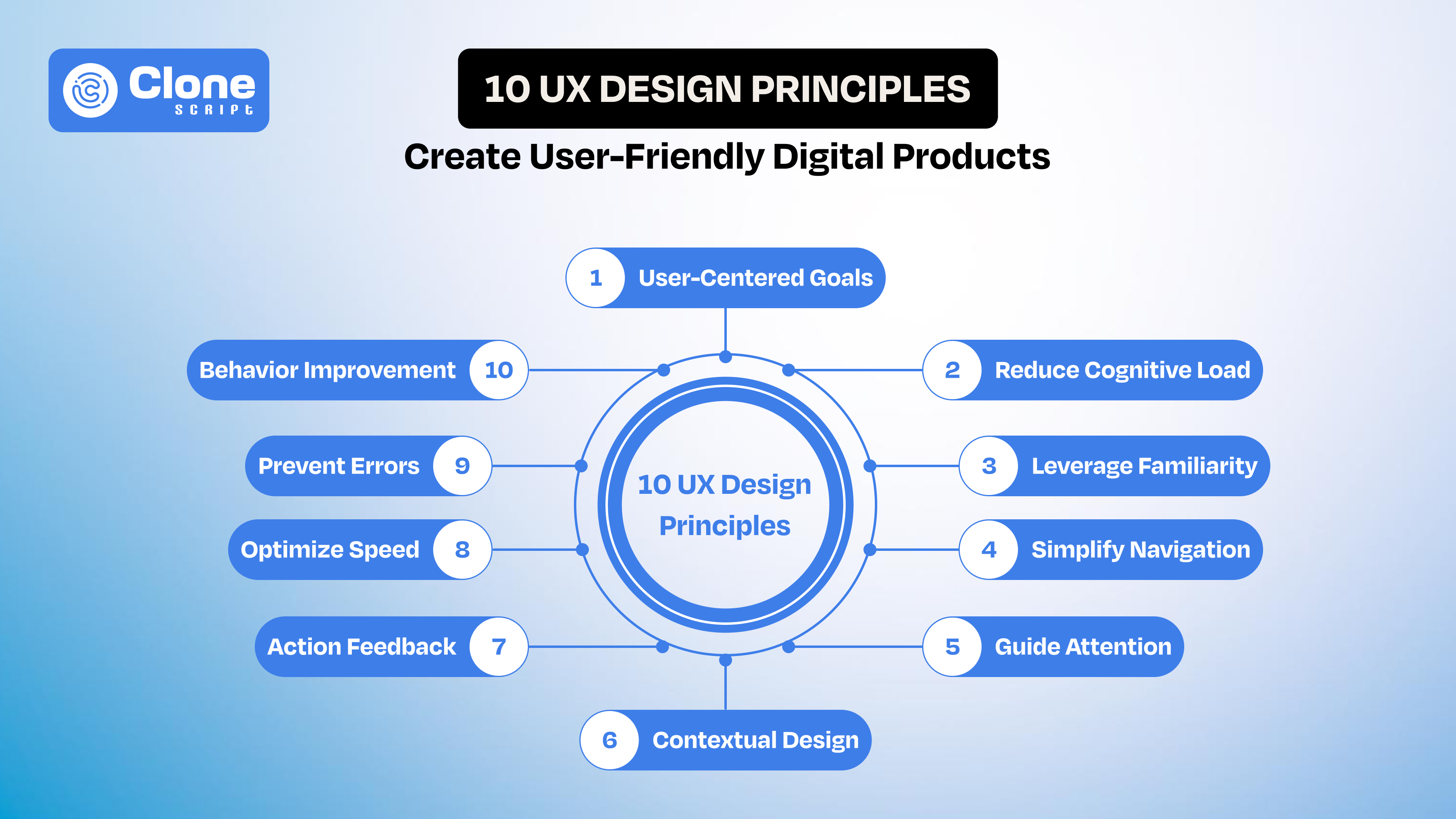
10 UX Design Principles for Creating User-Friendly Digital Products
Every digital product, including a website and app, competes for one thing: attention.
Users don’t read manuals. They don’t explore patiently. They don’t forgive confusion. They open your app or website with a goal in mind, and within seconds, they decide whether to continue or leave.
That decision is driven by user experience (UX).
Your product’s feature may be powerful, the visuals are modern, and the back-end is strong, but when the moment users struggle to navigate it, hesitation is created. Then, the drop off can be shown in the analytics.
This is why companies that invest in professional UX design consistently outperform others. Better UX leads to:
-
Higher user retention
-
Increased conversion rates
-
Stronger customer satisfaction
-
Reduced churn
UX is how your product works, feels, and responds to human behavior.
In this guide, you’ll learn the core UX process, basics, and principles that help designers build digital products that are not only functional but genuinely useful.
What is UX Design? Understanding the Core of User Experience
User experience design refers to the process of creating products that are easy to use, efficient, and enjoyable for users.

It focuses on:
-
Usability
-
Accessibility
-
Interaction design
-
Information architecture
-
User behavior
Many beginners confuse UX with UI design. While both are connected, they serve different purposes.
-
UI (User Interface) is related to visual elements like buttons, colors, and typography.
-
UX (User Experience) is based on overall interaction and usability.
For example, a visually appealing interface may attract users, but if they cannot complete a task smoothly, the experience fails.
Good UX design ensures:
-
Users understand what to do instantly.
-
Tasks can be completed with minimal effort.
-
The product feels intuitive and predictable.
In simple terms: UI makes things look good. UX makes them work well.
Why UX Design is Critical for Digital Products, Including Websites and Apps
UX becomes visible the moment users hesitate. This is the fact.
In most website apps, drop-offs don’t happen randomly. They happen at specific friction points. Let’s say the e-commerce website has a confusing onboarding process with 5-steps, then the “Buy Now” CTAs are not placed correctly, and a product page takes 15-20 seconds time for loading. There are strong chances they will leave.
Good UX removes these moments before they happen.
But how?
One fundamental that always works: Keep things simple.
The product has to be designed around clear user flows, so they can move forward without confusing their actions. This results in conversion rates.
Let's say on a fashion e-commerce store, the checkout process becomes simplified from five steps to three. Users find it relevant and happy. On the business side, the cart abandonment has reduced.
UX also affects trust in subtle ways.
-
Users feel secure.
If interactions feel inconsistent or unpredictable, users start doubting the system. On the other hand, when everything behaves as expected, users feel in control. This increases engagement and retention.
-
The load is reduced.
Another critical factor is cognitive load. The more effort users need to understand what’s happening, the faster they disengage. Effective UX reduces this load by guiding attention, simplifying choices, and eliminating unnecessary steps.
Note that if ignoring UX, it impacts metrics like high bounce rates, low task completion, and poor retention.
At its core, UX is not about making things look better. It’s about removing friction so users can achieve their goals without resistance.
The UX Design Process: From Idea to Experience
Good UX doesn’t begin with web product design tools. It begins with understanding people. Before a single screen is created, there’s a process that shapes how the product will actually feel in real use.

1. Start by Understanding Real Users.
Everything begins with user research.
This is where you stop guessing and start listening.
Instead of assuming what users need, you:
-
Talk to them
-
Observe how they behave
-
Look at real data
Often, what users say and what they do are different. This step helps you uncover those gaps, and that’s where real insights come from.
2. Define the Right Problem (Not the Obvious One).
Once you’ve gathered insights, the next step is clarity.
Many products fail not because of poor design, but because they solve the wrong problem.
What looks like a “design issue” is often a deeper usability or flow problem. When a user completes the sign-up process, suddenly the 3 pop-ups appear for product purchase. This is the issue.
Defining the problem correctly gives direction. Without it, everything that follows becomes guesswork.
3. Explore Ideas Before Locking One.
With a clear problem, you move into ideation.
This is where you explore different ways the experience could work. No pressure for perfection, just thinking through possibilities.
The goal is simple: Find a solution that makes the user’s journey easier, faster, and more natural.
4. Turn Ideas Into Something You Can See.
Next comes wireframing and prototyping.
This is where ideas become tangible. You start creating simple layouts and flows that show how the website or app will work.
At this stage, it’s not about setting the visuals. It’s about structure and clarity.
If the flow doesn’t work here, it won’t work later.
5. Watch Real Users Interact.
This is where assumptions get tested.
In usability testing, you observe how real users interact with your product.
And almost always, you’ll notice something unexpected.
-
Users hesitate where you thought it was clear.
-
They miss actions you thought were obvious.
-
They take paths you didn’t plan.
These moments are not failures, they’re insights.
6. Refine, Adjust, Improve, Continuously.
Finally, you move into iteration.
You fix what didn’t work, improve what did, and test again.
This cycle keeps repeating.
Because the truth is: UX is never “done.”
User needs evolve, expectations change, and products grow.
The Real Insight
The UX process isn’t a straight line. It’s a loop. A continuous cycle of learning, testing, and improving.
And the better you follow this process, the less you rely on assumptions, and the more your product simply makes sense to the people using it.
10 UX Basics Every Designer Must Know
These are the patterns you start recognizing when you’ve seen users struggle, hesitate, and drop off inside real products. Good UX is less about adding features and more about removing the friction that stops people from moving forward.

-
Design Around What Users Are Trying to Get Done.
Users don’t explore products. They arrive with intent. We know it.
Someone opening a payment app wants to send money quickly. Someone landing on a signup page wants to get started without effort.
If your design doesn’t align with that intent, users start improvising, and that’s where mistakes and drop-offs happen.
Understanding user goals isn’t about personas on paper. It’s about identifying:
-
What triggers them to open your product?
-
What outcome do they expect within seconds?
-
What would make them abandon midway?
When the flow matches their intent, the experience feels natural. When it doesn’t, even small steps feel heavy. Do not ever play with it.
-
Remove Moments Where Users Have to Think.
Every time a user pauses, something is unclear. That prevents them from using a website or app.
It could be:
-
A vague button label without a clear value
-
Too many choices on screen that confuse them
-
An unfamiliar pattern from the direct product page to the sign-up process.
These small interruptions break momentum. And once momentum breaks, users start questioning whether it’s worth continuing.
Strong UX reduces these moments by making actions self-explanatory.
Note this point: Users shouldn’t decode your interface. They should move through it almost automatically.
-
Don’t Make Users Relearn the Interface.
Once users understand how something works, they expect that logic to stay consistent. It has to be.
If a “Continue” button moves position, changes style, the colors overlap, or behaves differently across screens, users slow down. Not because it’s difficult, but because it’s unpredictable.
Thinking that only a consistent aesthetic can be a single aspect to save your product, then you’re wrong. Try to reduce mental effort. The fewer users who have to relearn, the faster they move.
-
Make Movement Through the Product Effortless.
Navigation problems rarely look obvious in design, but they show clearly in behavior. For example, in Android and iOS app UI design has different guidelines, and if the product is not optimized for either, it can cause issues.
Users do the following tasks:
-
Click back multiple times
-
Open and close menus repeatedly
-
Take longer paths to simple tasks
These are signals that the structure isn’t clear.
Good navigation doesn’t just help users move. It helps them feel oriented.
They should never wonder:
-
“Where am I?”
-
“What do I do next?”
That clarity keeps them moving forward without hesitation.
-
Control What Users Notice First.
Thinking that a user opening an appointment booking app on their Phone, so basically, they don’t read anything. They just scan the content.
If multiple elements compete for attention, users have to decide where to focus. That decision itself becomes friction.
For example, imagine the app shows a “Book Appointment” button on the main screen, but also triggers a calendar-related pop-up near the thumb area. At the same time, similar options exist inside a hamburger menu. Now the user is unsure:
-
Where should I start?
-
Which action is the correct one?
This confusion doesn’t come from a lack of features. It comes from a lack of hierarchy.
Strong visual hierarchy removes that decision by guiding attention:
-
The primary action stands out immediately.
-
Supporting information stays secondary.
-
Nothing unnecessary competes for focus.
When hierarchy is clear, users don’t search. They follow.
-
Design for Real Conditions, Not Ideal Users.
Most products are imagined in ideal conditions. They have to work properly on fast internet, full attention, and plenty of screen space. But that’s not how people actually use them.
In real life, they utilize a website or an app:
-
During the walking
-
Dealing with a weak signal
-
Switching between apps
In those moments, even small delays or unclear actions feel bigger than they are.
Designing for these situations means keeping things simple, responsive, and easy to handle in less-than-perfect conditions. When that happens, users may not notice the design, but they remember that it worked.
-
Always Acknowledge User Actions.
When users take an action, they expect something to happen right away. If the system stays silent, even for a moment, it creates doubt.
They start thinking:
-
Did my action go through?
-
Should I try again?
This uncertainty often leads to repeated clicks, unintended errors, and frustration.
Clear feedback removes this confusion. It shows users that their action has been received and the system is responding.
When users get that response, they feel reassured and stay in control. Without it, even a properly working website or app can feel unresponsive and hard to trust.
-
Speed Directly Affects Decision-Making.
Speed isn’t something users measure, but they feel it almost instantly. If a screen takes more than 2–3 seconds to respond, it starts to feel slow.
They may:
-
Pause and wonder if something went wrong.
-
Get distracted within 5–6 seconds and shift attention.
-
Leave entirely if the wait goes beyond 8–10 seconds.
It’s not a conscious decision. It just happened.
When things move quickly, users stay in the moment. They continue without thinking about the system at all.
But when there’s a delay, even a small one, it interrupts that flow.
And once that flow is broken, users often don’t come back to finish what they started.
-
Design to Prevent Errors, Not Just Fix Them.
Most errors come from an unclear design.
When someone enters the wrong data or skips a step, it’s because something wasn’t obvious enough. Users are usually moving quickly, trying to complete a task, not carefully analyzing every instruction.
These mistakes are predictable.
Users may:
-
Enter incorrect formats because expectations aren’t clear.
-
Misses steps because the flow isn’t obvious.
-
Take the wrong action because the options feel similar.
Good UX reduces these situations before they happen. It guides users in a way that feels natural without forcing them to think too much.
This can be done by:
-
Making input requirements clear upfront.
-
Limiting actions that can lead to errors.
-
Structuring flows so users don’t miss important steps.
When something still goes wrong, recovery should feel simple, not frustrating.
Strong UX doesn’t depend on showing better error messages.
It works by making sure users rarely need them in the first place.
-
Improve Based on How People Actually Use the Product.
No matter how well something is designed, real usage always reveals what was missed.
Once users start interacting, patterns begin to appear. You’ll notice where they slow down, where they hesitate, and where they leave. These moments matter more than initial assumptions.
Users face:
-
Drop off at specific steps in a flow.
-
Ignore features that seemed important.
-
Take unexpected paths to complete simple tasks.
These behaviors show what’s working and what isn’t.
Professional UX comes from paying attention to these signals and making small, meaningful improvements over time. It’s less about redesigning everything and more about fixing the points where users struggle.
The goal isn’t to get it perfect from the start.
It’s to keep refining the experience based on how people actually use it.
Conclusion
Great UX about removing friction. From understanding users and simplifying flows to ensuring speed, feedback, and error prevention, every detail shapes the experience. When products align with real behavior and continuously improve, users move correctly, stay longer, and trust the digital product without even thinking about it.