BTC - Bitcoin
 USDTERC20 - USDT ERC20
 ETH - Ethereum
 BNB - Binance
 BCH - Bitcoin Cash
 DOGE - Dogecoin
 TRX - TRON
 USDTTRC20 - USD TRC20
 LTC - LiteCoin
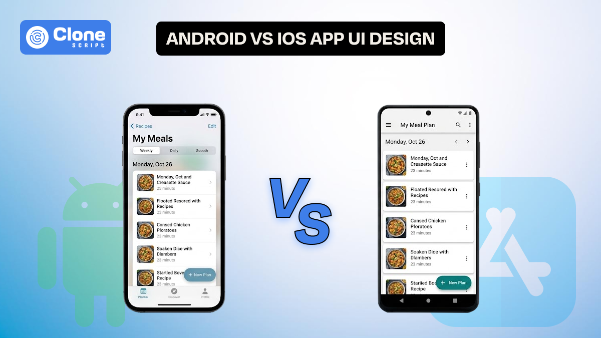
Android vs. iOS App UI Design: A Complete Analysis You Need to Know
Mobile app teams rarely argue about whether design matters. The real debate begins when they have to decide how much the design should change across platforms.
A startup founder wants faster release cycles. A designer wants platform purity. A developer wants reusable components. A product manager wants retention metrics.
And somewhere in between, the question appears:
Should we design one interface for both platforms, or should we follow Android vs iOS UI Design conventions separately?
This article explains practical design behavior, system expectations, performance perception, and scalable design system thinking.
If your team is planning a new mobile product or redesigning an existing one, this guide will help you make informed UI decisions.
Why Platform-Specific UI Thinking Still Shapes Mobile Products
Cross-platform frameworks have simplified front-end mobile app development. Yet users have not changed their expectations. An Android user switching to a banking app expects flexible navigation and visible interaction cues. An iPhone user expects smooth gestures and a predictable layout hierarchy.
These differences are rooted in long-term ecosystem design. That is why the mobile app design differences between Android and iOS still influence product usability.
So what does the development team notice? If they ignore platform conventions, they often notice subtle drops in engagement. Users may not complain directly, but they hesitate, explore less, and abandon flows faster. These behavioral signals highlight the importance of platform-specific UI components and interaction.
Understanding these expectations is the first step toward building scalable mobile interfaces.
Material Design vs Cupertino Design: More Than Visual Style

When designers compare Material Design vs Cupertino design, the conversation starts with shadows, blur effects, and typography. However, the real distinction lies in the philosophy of interaction.
-
Material Design
Material design encourages spatial storytelling. Elements move, expand, collapse, and react. This makes Android interfaces feel dynamic and responsive.
-
Cupertino Design
On the other hand, Cupertino design emphasizes continuity and clarity. Motion exists, but it rarely demands attention.
In line with Android UI design guidelines, designers use cards to separate content clusters. Elevation creates a sense of depth and modular structure. In contrast, apps following iOS Human Interface Guidelines (HIG) rely more on grouped lists, large titles, and subtle separators.
These patterns are not arbitrary. They reflect how users scan content, understand hierarchy, and complete tasks.
For example, a task management app on Android may highlight project sections with floating cards and action buttons. The iOS version may prioritize a clean list with swipe gestures and contextual menus.
Both solutions can be effective, provided they align with user expectations.
Navigation Pattern Differences Between Android and iOS
Navigation is where most Android and iOS UX differences become visible. Teams often underestimate how strongly navigation affects user confidence.
-
Android apps have simple navigation.
Android apps commonly depend on bottom navigation bars combined with system back navigation. This allows users to explore deeply without worrying about getting lost. Navigation drawers or expandable menus further support complex information architecture.
-
iOS apps' navigation is unique.
In contrast, iOS navigation works toward tab bars and hierarchical transitions. Edge swipe gestures help users move backward without visual clutter. Modal sheets handle secondary tasks.
These app navigation patterns in Android and iOS shape how users think about app structure. If an Android app hides critical destinations inside modal flows copied from iOS patterns, users may feel constrained. Similarly, an iOS app overloaded with floating action buttons may appear unfamiliar.
Recognizing these mobile design patterns helps teams reduce abandonment in core journeys such as onboarding, payments, and profile management.
UI Component Behavior and Micro-Interactions
Another area where Android vs iOS UI design diverges is component feedback.
-
Android implements ripple effects.
Buttons on Android use ripple effects to confirm touch interaction. Cards may animate slightly when tapped. Floating action buttons emphasize primary tasks.
-
iOS apps consider interaction feedback.
In iOS interfaces, interaction feedback is more restrained. Highlight states, subtle scale animations, or haptic responses confirm without strong visual noise.
These differences also influence gesture design differences between Android and iOS. Android apps frequently support drag interactions combined with visible handles. iOS apps may depend more on hidden gestures such as swipe actions.
Teams designing shared user interface component libraries must plan conditional behavior. This ensures UI consistency in mobile apps while respecting platform identity.
Typography, Layout Density, and Adaptive Thinking Difference
These decisions can significantly affect usability metrics.
-
Android is designed for content density.
Android interfaces tolerate higher content length. This suits productivity apps, dashboards, and enterprise tools, where every type of content is included.
-
iOS is optimized for readability.
iOS interfaces usually favor readability and breathing space. Large titles, grouped sections, and clear margins improve cognitive flow.
Designers working on responsive and adaptive mobile UI need to handle device fragmentation carefully. Android devices vary widely in screen size, aspect ratio, and hardware capability. iOS devices are more standardized but demand strict safe-area handling.
A scalable design system for mobile apps should define flexible grid tokens and spacing rules. This allows layouts to adapt without losing rhythm.
Motion Design and Performance Perception Difference
Animation is a communication layer. It tells users what changed, why it changed, and what will happen next.
-
Material motion
Material motion feels expressive. Elements transform, morph, and travel across the screen. This aligns with modern mobile UI trends that emphasize immersive feedback.
-
iOS motion
iOS motion, by contrast, aims for invisibility. Transitions are fast and fluid. Users should feel continuity rather than spectacle.
These differences shape Android and iOS UX in perceived performance. A slightly slower Android animation may still feel responsive if the transition explains context. An iOS animation must remain brief to maintain system rhythm.
Designers experimenting with new mobile UI trends must test performance perception alongside visual appeal.
Unified vs Native UI: A Strategic Decision

The debate around native vs hybrid UI design continues across product teams.
-
Unified UI
A unified UI can accelerate development and strengthen brand identity. However, forcing identical interaction patterns may weaken usability. A fully native approach improves familiarity but increases design and testing effort.
-
Hybrid UI
The emerging best practice is a hybrid method. Development teams maintain consistent layout structures and branding. They are adapting navigation, gestures, and key platform-specific UI components.
This approach works particularly well in frameworks supporting Flutter UI for Android and iOS. Adaptive widgets can render differently based on platform context.
Adopting this cross-platform UI design strategy helps teams balance speed and experience quality.
Real UI Comparison in Android and iOS: E-commerce and Ride Booking App
Consider a typical product listing screen in an e-commerce app.
-
Android apps depend on card-based grids.
On Android, designers follow Android UI design guidelines by structuring products in card-based grids. Each card may contain elevation, quick action icons, and dynamic badges like “Sale” or “Trending.” Filters might appear as expandable chips above the list.
-
The iOS app manages only flat grids.
On iOS, the same screen usually adopts a lighter visual approach. Products may appear in flat grids with generous spacing. Filters might open through slide-up sheets or segmented controls.
These are small but meaningful mobile app design differences between Android and iOS. They affect scanning speed, perceived density, and even emotional response.
Design teams working on cross-platform UI design strategy must decide whether to unify the visual style or preserve platform familiarity.
Let’s examine a ride-booking flow.
-
Android control is available on the same screen.
On Android, map controls and booking actions often coexist on the same screen. A floating action button may trigger ride confirmation. Bottom sheets expand progressively as users select options.
-
iOS control is going with full screen.
On iOS, booking flows frequently transition through full-screen panels. Confirmation buttons remain fixed at the bottom, while gesture-based navigation simplifies backtracking.
These contrasting app navigation patterns in Android vs iOS influence how quickly users complete bookings. Teams optimizing conversion funnels must consider such platform behaviors.
Ignoring these mobile design patterns can lead to unexpected drop-offs in required flows.
Development Impact and Design System Scalability
Design decisions influence code architecture. When teams invest early in token-based systems, they can implement UI consistency in apps more effectively.
Spacing tokens, typography scales, and motion presets enable predictable adaptation. This is essential when managing large products across multiple platforms.
Ignoring Android UI design guidelines or iOS Human Interface Guidelines during system planning often leads to fragmented component libraries. Over time, this increases maintenance costs and slows feature releases.
A well-structured design system for mobile apps should document platform variations clearly. Designers and developers must collaborate closely to maintain alignment.
Android and iOS Feature Comparison Table
Here is the comparison between the design for Android and iOS.

This comparison helps teams understand how the mobile app design affects real implementation.
Android and iOS Development Impact: Cost, Speed, and Scalability
When developing a cross-platform development using Flutter or another framework, some factors have to be understood.
-
Development Cost
Design direction significantly affects budget allocation.
-
Creating fully native interfaces for both platforms can increase initial design and development cost by 25%–40%.
-
In contrast, adopting an adaptive approach within a structured cross-platform UI design strategy can reduce early UI effort by nearly 20%.
Investing in a scalable design system for mobile apps further minimizes long-term redesign and maintenance expenses.
-
Development Speed
Platform-specific interaction logic may add 10%–15% extra implementation time per feature, especially when handling navigation or gesture variations.
However, shared UI architecture and reusable components often improve release velocity by up to 30%, helping teams launch MVPs faster.
-
Testing Complexity
Separate UI flows can expand QA and testing scenarios by up to 50%. Using consistent design tokens and conditional rendering reduces regression testing effort by nearly 20%.
-
Scalability Impact
Thoughtful handling of platform-specific UI components ensures predictable scaling, faster feature rollout, and stronger usability performance as products grow.
Best Practices for Designing Apps for Both Android and iOS
Follow these practices to make an app design perfect for both OS.
-
Start with a Flexible Design System.
Before starting screens, build a practical design system for mobile apps. Define spacing rules, typography scales, and reusable components. This helps maintain UI consistency and allows the interface to adapt naturally across devices and platforms.
-
Respect How Users Navigate on Each Platform.
Navigation habits are deeply rooted. Android users expect system back behavior and clear bottom navigation, while iOS users are more comfortable with tab structures and smooth gesture flows.
Following real app navigation patterns and familiarizing makes the product feel intuitive from the first interaction.
-
Adapt Components Instead of Copying UI.
Thinking that every element should look identical is not always right. Cards and Floating Action Buttons work well within Android UI design guidelines, whereas grouped lists and modal sheets align better with iOS Human Interface Guidelines.
Using the right platform-specific UI components improves usability without harming brand identity.
-
Validate Designs in Real Contexts.
Always test motion, gestures, and layout density on real devices. Understanding genuine mobile app design differences between Android and iOS helps teams design experiences that feel natural, scalable, and ready for growth.
AllClone Script: Professional UI and UX Design Service Collaboration
Designing for both Android and iOS is not just about following guidelines. It requires experience in building scalable, production-ready interfaces. This is where AllClone Script’s professional UI and UX design service can support product teams, startups, and agencies. You can collaborate with us.
If you are planning a new product or redesigning an existing one, our team focuses on platform-aware design execution, ensuring that it feels natural in each ecosystem:
-
Navigating patterns
-
Component behavior
-
Visual hierarchy
Whether you need structured website flows or adaptive mobile interfaces, their services are built to reduce design confusion and speed up development handoff.
You can explore our dedicated offerings here:
Working with a specialized design partner helps teams build consistent brand experiences, respecting real mobile app design differences between Android and iOS. It can improve usability, scalability, and long-term product growth.