BTC - Bitcoin
 USDTERC20 - USDT ERC20
 ETH - Ethereum
 BNB - Binance
 BCH - Bitcoin Cash
 DOGE - Dogecoin
 TRX - TRON
 USDTTRC20 - USD TRC20
 LTC - LiteCoin
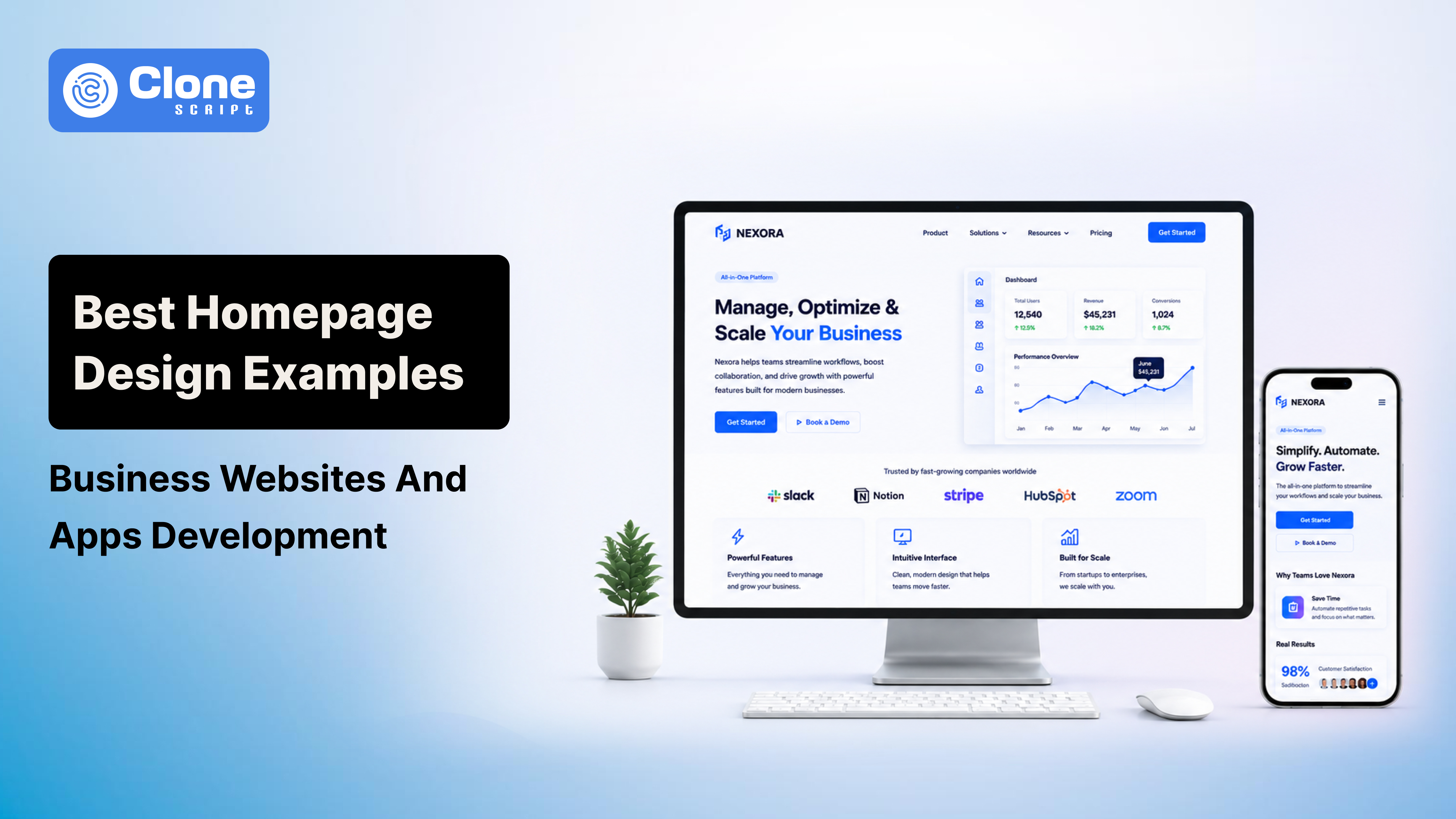
Best Homepage Design Examples for Business Websites and Apps Development
Users do not "explore" websites anymore. They scan them aggressively.
The moment someone lands on a homepage, they subconsciously evaluate:
-
Whether the company looks trustworthy
-
Whether the product feels modern
-
Whether the interface feels easy to use
-
Whether the page loads fast enough to continue scrolling
That entire decision happens before most visitors even reach the second section.
This is why homepage design has evolved far beyond aesthetics. A modern business homepage now behaves like a conversion-focused product experience.
The difficult part is balancing everything at once.
A homepage filled with cinematic animations, oversized videos, and complex interactions may look incredible inside Figma prototypes and designs. But once deployed, it often destroys Core Web Vitals, slows Largest Contentful Paint (LCP), increases bounce rates, and frustrates mobile users.
At the same time, purely performance-focused layouts can feel outdated and visually weak compared to modern SaaS competitors.
The best homepage design examples succeed because they understand one thing clearly: Users want simplicity backed by confidence.
In this guide, we will break down:
-
What makes a homepage structure convert
-
Why certain SaaS and app homepage designs outperform others
-
How modern businesses organize homepage architecture
-
How UI/UX hierarchy influences user behavior
-
How to balance immersive visuals with technical performance
Most importantly, this is not another generic gallery-style inspiration post. The goal here is to analyze the strategic thinking behind homepage design decisions that actually work in production environments.
The Core DNA of High-Converting Homepage Design
Before looking at homepage examples, it is important to understand why some layouts naturally convert better than others.
Most poorly performing business websites fail because they overload users with too much information too early. They try to explain every feature, every service, every company detail, and every marketing message on the first screen.
Users do not process websites that way.
Modern homepage UX depends heavily on controlled visual flow. Strong homepages guide attention intentionally instead of forcing users to search for information manually.
The best business website design structures usually share these characteristics:
Key Elements Found in High-Converting Homepages
-
Clear Above-the-Fold Messaging
The hero section should immediately answer:
-
What the product does
-
Who is it for
-
Why it matters
Weak homepage headlines:
-
"Driving Digital Innovation"
-
"Transforming Business Excellence"
-
"Solutions for Modern Growth"
These phrases sound polished but communicate nothing useful.
Stronger homepage messaging sounds more specific:
-
"Build Internal Apps Without Back-end Development"
-
"AI Accounting Software for Logistics Companies"
-
"Launch Marketplace Platforms in Under 14 Days"
Specificity improves conversion because users instantly recognize relevance.
-
Strong Visual Hierarchy
Homepage hierarchy determines where users look first.
Professional UI/UX design uses controls to control scanning behavior naturally:
-
Typography scaling
-
Spacing systems
-
Contrast balance
-
Directional alignment
-
Negative space
For example:
-
The headline receives the highest font weight
-
The CTA button uses the strongest accent color
-
Secondary elements remain visually quieter
-
Spacing isolates important interactions
This creates a predictable reading path without overwhelming the interface.
One major mistake many designers make is over-emphasizing every component simultaneously. When headlines, animations, buttons, cards, badges, and statistics all compete equally for attention, the page loses hierarchy entirely.
-
Frictionless Navigation Structure
Homepage navigation should reduce thinking effort.
The best homepage design examples rarely use more than:
-
5 to 7 primary navigation items
-
One highlighted CTA button
-
Simple dropdown structures
Users understand familiar labels faster.
Good examples:
-
Pricing
-
Features
-
Solutions
-
Resources
-
Contact
Poor examples:
-
Discover
-
Innovation Hub
-
Ecosystem Experience
Navigation should improve orientation, not branding creativity.
Best Homepage Design Examples by Category
Different industries require different homepage structures. A SaaS platform homepage behaves differently from an enterprise software provider or a consumer-focused app ecosystem.
Understanding these differences helps designers create layouts aligned with actual user expectations.
1. B2B SaaS Homepage Design Examples
Modern SaaS homepage design focuses heavily on reducing complexity.
Most SaaS businesses solve technical or operational problems that can easily become difficult to explain. Instead of overwhelming visitors with documentation-heavy content, successful SaaS websites break information into modular web design sections with visuality.
The best modern SaaS homepage examples usually rely on:
-
Interactive dashboard previews
-
Animated workflow demonstrations
-
Structured feature grids
-
Simplified onboarding visuals
-
Segmented content blocks
This design strategy works because users understand interfaces visually faster than text explanations.
For example, companies inspired by platforms like often demonstrate functionality directly within the hero section itself:
-
Dropbox
-
FlutterFlow
-
Notion-style ecosystems
Instead of saying:
"Advanced collaborative workspace management."
They visually show:
-
Drag-and-drop workflows
-
Dashboard organization
-
Real-time collaboration UI
This reduces web app cognitive load friction.
What Makes SaaS Homepage Design Convert Better
Latest UI/UX design best practices consistently appear in high-performing SaaS homepages:
-
Controlled Micro-Interactions
Subtle animation improves perceived quality.
Effective examples include:
-
Hover transitions
-
Interface previews on scroll
-
Animated graphs
-
Lightweight motion feedback
However, excessive animations usually damage performance metrics.
Many SaaS homepages fail because designers prototype cinematic interactions that increase JavaScript rendering costs significantly.
-
Layered Content Architecture
Strong SaaS homepage structures follow a psychological sequence:
-
Problem introduction
-
Product visualization
-
Benefit explanation
-
Workflow breakdown
-
Trust validation
-
CTA conversion push
This progression gradually lowers skepticism instead of forcing conversion too early.
2. App Development & Product Ecosystem Homepage Examples
Modern app homepage design has shifted heavily toward minimalist interfaces.
This trend is not accidental.
Minimal design improves:
-
Readability
-
Mobile responsiveness
-
Interaction clarity
-
Perceived speed
-
Conversion focus
Platforms inspired by:
-
Raycast
-
Linktree
-
Linear
-
Arc Browser
Use simplicity strategically.
Instead of filling layouts with endless gradients, oversized illustrations, and dense marketing blocks, these platforms prioritize:
-
Typography
-
Whitespace
-
Clean spacing systems
-
Utility-focused UI
The result feels premium because the interface avoids visual exhaustion.
Why Minimal Homepage Design Works So Well
Users associate visual simplicity with product confidence.
When interfaces look overloaded, users subconsciously assume:
-
The product is complicated
-
Onboarding will be difficult
-
The navigation will feel confusing
Minimal app homepage layouts reduce this psychological resistance.
Several modern UI/UX design best practices support this direction:
-
Large Typography Systems
Oversized typography creates immediate hierarchy.
Modern homepage structures increasingly rely on:
-
Bold headlines
-
Concise supporting text
-
Minimal paragraph density
This improves readability across desktop and mobile devices.
-
Aggressive Use of Negative Space
Whitespace is not "space."
It controls attention flow, content separation, readability, and CTA emphasis.
One strong CTA surrounded by sufficient spacing converts better than five competing buttons grouped tightly together.
3. Enterprise & Custom Solution Homepage Examples
Enterprise homepage design works differently because the audience behaves differently.
These websites often target:
-
Operations managers
-
Procurement teams
-
Manufacturing companies
-
Enterprise executives
-
Technical decision-makers
These users prioritize trust and operational reliability over trendy visuals.
That changes the homepage structure completely.
Instead of flashy interactions, enterprise websites focus on:
-
Clarity
-
Authority
-
Implementation confidence
-
Industry specificity
-
Specific Messaging Beats Generic Branding
Enterprise homepage copy should immediately identify the operational problem being solved.
Weak enterprise messaging: "Innovating the Future of Operations."
Strong enterprise messaging:
-
"Real-Time Warehouse Tracking Across Multi-Location Manufacturing Systems"
Specificity increases trust because it signals industry understanding.
-
Better Visual Alternatives to Stock Photography
Generic stock imagery weakens enterprise credibility quickly.
Modern industrial homepage design increasingly uses:
-
Custom platform diagrams
-
Framed UI previews
-
Workflow illustrations
-
Integration architecture graphics
These visuals feel more authentic and product-focused.
They also improve memorability compared to repetitive stock office photography.
The Modern Homepage Blueprint for Business Websites & Apps
Most successful homepage layouts follow a surprisingly similar structure underneath the visual styling.
The visual design may change dramatically, but the conversion architecture remains consistent.
-
The Hero Section
The hero section is the homepage’s conversion anchor.
This section should contain:
-
One strong headline
-
Supporting subtext
-
One primary CTA
-
One visual demonstration element
Best practices include:
-
Headlines under 12 words
-
High contrast typography
-
Simplified backgrounds
-
Responsive two-column layout structure
A common modern pattern is:
-
left side = messaging
-
right side = interface preview
This structure works extremely well within responsive grid systems like:
-
Tailwind CSS
-
Bootstrap
-
CSS Grid
-
Flexbox
Because it collapses efficiently for mobile layouts.
2. Social Proof & Trust Indicators
Trust indicators should appear immediately below the hero section.
This usually includes:
-
Client logo strips
-
Review platform badges
-
User statistics
-
Adoption metrics
-
Industry certifications
One effective design technique is using grayscale logos rather than full-color branding. This prevents visual distraction while still establishing authority.
3. Feature Grid Architecture
Feature grids remain one of the most important sections in business website design.
Strong feature sections:
-
Separate content clearly
-
Avoid long paragraphs
-
Prioritize outcomes over technical jargon
-
Maintain consistent spacing systems
Instead of: “Advanced API infrastructure.”
Use: “Connect your CRM and payment tools in minutes.”
Outcome-focused content converts better because users care about operational benefits first.
4. Interactive Validation Sections
Modern homepage structures increasingly replace traditional testimonials with proof-driven content.
More effective alternatives include:
-
Case studies
-
ROI metrics
-
Before-and-after comparisons
-
Interactive workflow demos
-
Implementations breakdown
Why?
Because users trust demonstrable outcomes more than generic praise quotes.
5. The Final Conversion Push
The last homepage section should remove all distractions.
This section works best when it:
-
Uses strong contrast
-
Simplifies messaging
-
Contains one CTA only
-
Minimizes navigation options
Examples:
-
Start Free Trial
-
Book a Strategy Call
-
Launch Your Platform
-
Schedule a Demo
This section exists purely to capture conversion momentum.
The Biggest Problem in Modern Homepage Design: Performance
This is where many beautiful designs fail.
Designers often create visually immersive layouts filled with:
-
3D graphics
-
Animation frameworks
-
Autoplay videos
-
Massive image assets
-
Advanced JavaScript interactions
The homepage looks impressive during presentations.
Then production performance collapses.
Why Core Web Vitals Matter for Designers
Google now evaluates real user experience metrics heavily.
One of the most important homepage metrics is:
Largest Contentful Paint (LCP)
Target: under 2.5 seconds on mobile devices
Poor LCP performance usually comes from:
-
Oversized hero videos
-
Uncompressed imagery
-
Blocking JavaScript
-
Animation-heavy frameworks
This directly affects:
-
Retention rates
-
Conversion performance
A slow homepage loses users before the product pitch even begins.
How to Balance Visual Depth With Performance
The best homepage design examples balance aesthetics with technical efficiency carefully.
-
Performance Optimization Techniques
Use Modern Asset Formats. Replace PNG and heavy JPEG files with WebP and AVIF. These formats reduce asset weight.
-
Optimize Video Assets
For hero videos:
-
Use WebM format
-
Compress aggressively
-
Avoid long loops
-
Disable autoplay on slower mobile environments
Video should support storytelling, not dominate loading performance.
-
Lazy-Load Non-Critical Components
Below-the-fold assets should load progressively.
This improves perceived speed, responsiveness, and mobile usability.
This is especially important for testimonial sliders, embedded videos, and animation-heavy sections.
-
Reduce JavaScript Dependency
Many modern homepage designs rely excessively on animation libraries.
Native CSS transitions often perform significantly better than third-party animation frameworks.
Efficient examples include:
-
Transform animations
-
Opacity fades
-
Hover scaling
-
Transition timing functions
These maintain smoothness without hurting performance budgets.
Final Thoughts
The best homepage design examples are not successful because they follow trends blindly.
They succeed because every layout decision supports:
-
Clarity
-
Usability
-
Conversion
-
Performance
-
Responsiveness
-
Trust
A homepage is not simply a visual showcase anymore. It is a business performance system.
Strong homepage design requires balancing UI/UX quality with modern visual expectations.
Before launching any business website or app homepage, audit it carefully:
-
Can users understand the product instantly?
-
Does the visual hierarchy guide attention properly?
-
Is the CTA unmistakably clear?
-
Does the mobile version feel native?
-
Are animations improving UX or slowing performance?
-
Is the homepage optimized for Core Web Vitals?
That balance is what separates high-converting business websites from visually attractive pages that never generate meaningful results.