BTC - Bitcoin
 USDTERC20 - USDT ERC20
 ETH - Ethereum
 BNB - Binance
 BCH - Bitcoin Cash
 DOGE - Dogecoin
 TRX - TRON
 USDTTRC20 - USD TRC20
 LTC - LiteCoin
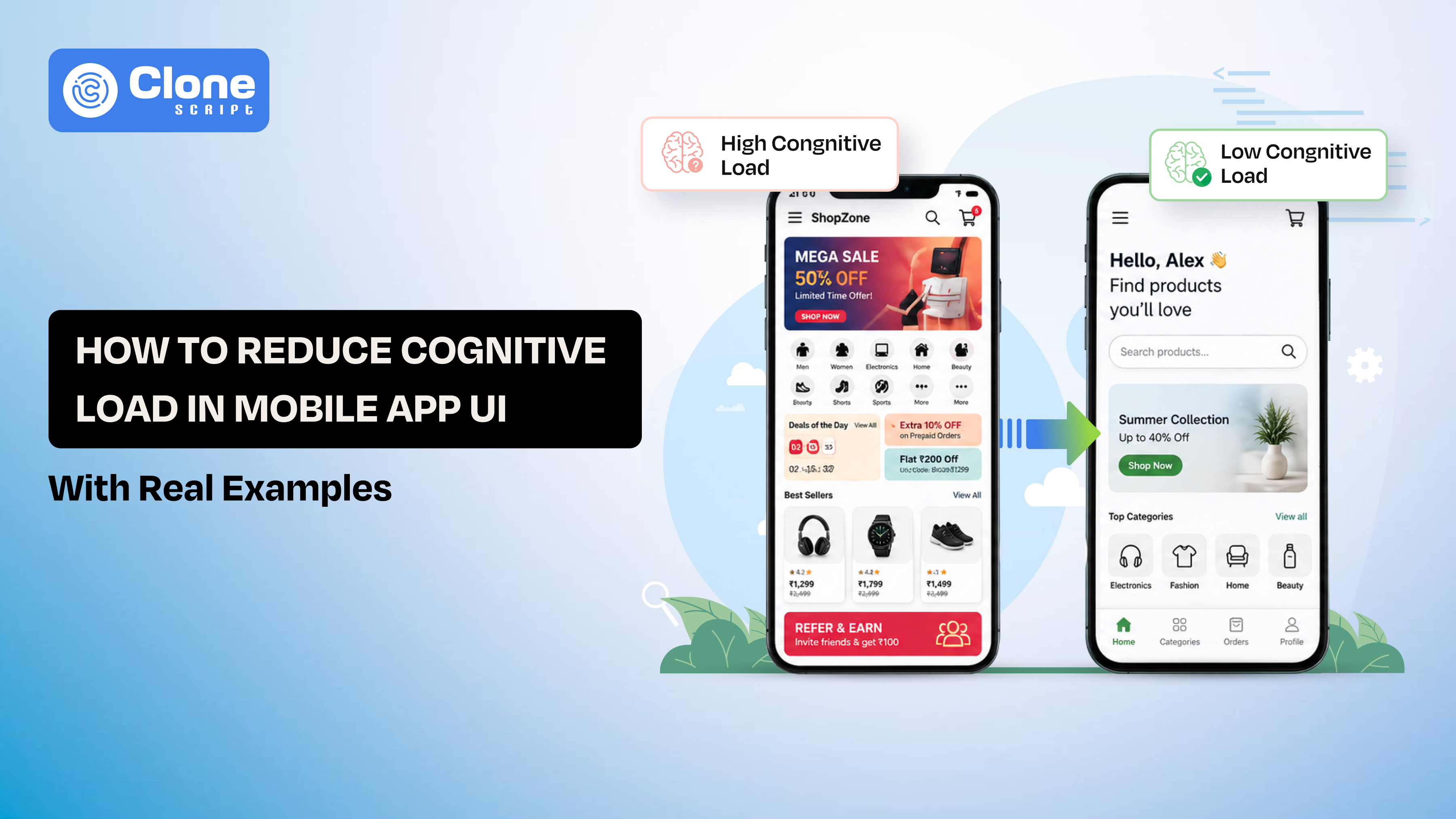
How to Reduce Cognitive Load in Mobile App UI (With Real Examples)
Open any mobile app and notice what happens in the first few seconds. Obviously, you’re trying to get something done. Book a ride, reply to a message, check a balance. If the app interface makes you pause, even briefly, it’s already working against you. That friction is cognitive load.
As an app designer, you have to know how to reduce cognitive load in mobile app UI, which comes down to one thing: removing unnecessary thinking from the path to action. As simple as that.
Note that users are not professional UI designers to interpret layout sizes, colors, and fonts. They only have one intention: to fulfill requirements by using the app.
For product teams, reducing cognitive load in UX design has direct consequences. Onboarding becomes faster, decisions feel easier, and users reach value sooner. The effect compounds across the product, especially in flows that involve multiple steps.
This article breaks down mobile UI cognitive load reduction techniques using real apps and practical patterns.
What Cognitive Load Means in Mobile UI
Cognitive load is simply the amount of thinking a user has to do before taking an action.
In mobile apps, that thinking shows up in small moments:
-
“Where do I tap?”
-
“What does this icon mean?”
-
“What happens if I press this?”
Each of these micro-decisions slows the user down.
On desktop, users tolerate a bit more exploration. On mobile, they don’t.
Why?
First of all, the screen is smaller, attention is shorter, and interactions are faster. People use apps in between tasks, while commuting, waiting, or multitasking. There’s no room for confusion.
This is where most interfaces fail. They look clean, but still force users to figure things out instead of just acting.
Take a simple example.
If a user has to read labels carefully before tapping a button, that’s cognitive load. If they hesitate between two similar options, that’s cognitive load. If they need to remember what they saw on the previous screen, that’s cognitive load.
The goal isn’t to remove information. It’s to remove unnecessary decisions.
A good mobile UI doesn’t make users think, “What should I do?”
It makes the next step feel obvious.
Why Mobile Apps Struggle with Cognitive Overload
Unclear choices play a key role in the cognitive overload of most mobile apps. Thinking that design complexity is the only culprit is wrong thinking.
When someone opens your app, they’re not looking to explore every feature. They’re trying to complete one task. The problem starts when the interface asks them to decide too much, too early.
Here’s how that usually happens:
-
Too many actions on one screen: When everything looks important, nothing stands out. Users pause because they don’t know where to start.
-
No clear visual priority: Buttons, links, and content compete for attention instead of guiding it. The user has to scan and interpret before acting.
-
Hidden or unpredictable navigation: Gestures without hints, menus inside menus, users end up guessing instead of navigating.
-
Heavy onboarding flows: Asking for too much information upfront increases effort before users see any value.
The result isn’t confusion in a sense. It’s a subtle hesitation. A few extra seconds of thinking. A second look at the screen. That’s enough to break momentum.
And once momentum is gone, users drop off.
Cognitive overload doesn’t come from one bad decision. It builds up across screens and interactions. Small frictions stack until the experience feels tiring.
That’s when users stop trying and start leaving.
Real Mobile App Examples that Reduce Cognitive Load (What Actually Works)
Looking at principles is useful. Seeing how real products apply them is better. The difference comes down to how decisions are removed—not just how screens look.

-
WhatsApp Brings Fewer Choices, Faster Actions
Open WhatsApp, and the path is clear. You either open a chat or start a new one.
There’s no moment where you stop and think about what to do next. The interface doesn’t ask for interpretation.
What’s happening under the surface:
-
One dominant action: start or continue a conversation
-
Clear separation between tabs (Chats, Status, Calls)
-
Familiar icons that don’t need explanation
The app avoids stacking features on the same screen. Even though it has multiple functions, they don’t compete with each other.
Takeaway: When users don’t need to compare options, they move faster.
-
Uber Focuses on One Goal Per Screen
Uber removes decisions before the user even notices them.
The first thing you see is a single prompt: Where to? Not a list of features. Not multiple CTAs. Just one clear next step.
What’s happening under the surface:
-
Location is auto-detected (no manual input)
-
Ride options appear only after the destination is set
-
Pricing and time are shown in a simple, comparable format
Instead of asking users to configure everything up front, Uber structures the flow step by step.
Takeaway: When the interface guides the sequence, users don’t feel the complexity behind it.
-
Google Maps Solves Complexity in Layers
Google Maps handles a lot of navigation, discovery, traffic, and saved places. Yet it doesn’t feel overwhelming at first glance.
That’s because it doesn’t show everything at once.
What’s happening under the surface:
-
The default screen focuses on the map and search bar
-
Extra features appear based on context (search, movement, location)
-
Advanced options stay hidden until needed
The app delays complexity instead of removing it. Users only deal with what’s relevant in that moment.
Takeaway: You don’t need to simplify the product. You need to control when complexity appears.
What These Apps Have in Common
Across all three, a pattern is clear:
-
The next action is always obvious
-
Users don’t need to remember previous steps
-
Decisions are limited at each stage
They’re not “simple” apps. They’re structured to reduce thinking at every step.
Practical Ways to Reduce Cognitive Load in Mobile UI
This is where most teams get stuck. The idea sounds clear, reduce thinking, but the execution often drifts into visual tweaks instead of structural fixes.
These patterns focus on how decisions are shaped, not just how screens look.

-
One Screen, One Primary Action
Every screen should answer one question: What is the user supposed to do here?
If there are multiple answers, users slow down.
Secondary actions can exist, but they shouldn’t compete visually. The primary action needs to stand out without effort.
-
Make the Next Step Obvious
Users shouldn’t scan the screen to figure out what comes next. This comes down to:
-
Button placement
-
Clear labels
-
Logical flow from top to bottom
If users hesitate, the interface prompts them to think rather than act.
-
Reduce the Need to Remember
Mobile apps assume users will recall information from previous steps. In reality, they don’t. Bring context forward:
-
Show selected options
-
Keep important data visible
-
Avoid forcing users to go back and check
Recognition is faster than recall.
-
Show Less, Reveal More
Trying to explain everything at once creates friction. Instead, consider the following:
-
Show only what’s needed for the current step
-
Reveal details as users move forward
-
Delay advanced options until they’re relevant
This keeps the interface focused without removing capability.
-
Cut Down Input Wherever Possible
Typing, selecting, and configuring all add effort. Reduce it by:
-
Using defaults
-
Auto-detecting data (location, preferences)
-
Offering quick selections instead of manual entry
Less input means fewer decisions.
-
Keep Interaction Patterns Consistent
When the same action behaves differently across screens, users pause to relearn. Consistency removes that pause:
-
Same gestures for similar actions
-
Predictable button behavior
-
Familiar layouts across flows
Users build patterns quickly. Don’t break them.
-
Use Visual Hierarchy to Guide Attention
Users don’t read screens. They scan them. Hierarchy helps them know where to look:
-
Larger elements draw focus
-
Spacing separates importance
-
Contrast highlights actions
The goal is simple: users should notice the right thing first.
-
Give Immediate Feedback
Every action should confirm that something happened. Without feedback, users question the result:
-
Did the tap register?
-
Is the process complete?
Micro feedback, like loading states, animations, or confirmations, removes that uncertainty.
-
Remove Rarely Used Options
Not every feature needs to be visible all the time. If an option isn’t used often:
-
Move it deeper in the flow
-
Hide it behind a secondary layer
This keeps the main interface focused on common actions.
-
Design for Real Usage Conditions
Mobile users aren’t sitting still and focused. They’re walking, multitasking, and using one hand to use the app.
Place important actions within easy reach. Reduce precision requirements. Lower both physical and mental effort.
What This Really Comes Down To
Reducing cognitive load isn’t about making things look simple.
If a user can move forward without stopping to think, the design is doing its job.
Cognitive Load in User Flows (Where Friction Actually Builds)
Most teams review screens in isolation. Users don’t experience products that way. They move through flows step by step, and that’s where cognitive load accumulates.
A single screen might feel clear. Five connected screens can feel exhausting.
Where Load Starts to Stack
Cognitive load increases when users are forced to:
-
Re-evaluate decisions at each step
-
Re-enter or reconfirm the same information
-
Adjust to changing layouts or patterns
-
Wait without knowing what’s happening next
Individually, these seem minor. Across a flow, they slow users down.
Example: Onboarding Flow
Consider two approaches to onboarding.

Flow A:
-
Step 1: Sign up
-
Step 2: Fill in a detailed profile
-
Step 3: Choose preferences
-
Step 4: Enable permissions
-
Step 5: Product tour
Users haven’t experienced value yet, but they’ve already invested effort.
Flow B:
-
Step 1: Sign up
-
Step 2: Land directly into the core feature
-
Step 3: Gradual prompts for profile and preferences
The second flow reduces early decisions. Users act first, configure later.
Flow-Level Mistakes That Increase Load
-
Front-loading effort before showing value affects the user experience.
-
Changing interaction patterns between steps sounds doubtful.
-
Breaking continuity for no sense of progress leads to abandoned usage.
-
Unclear transitions between actions hide the value.
Users shouldn’t feel like they’re restarting on every screen.
What Low Cognitive Load Flows Do Differently
-
Maintain a clear sequence from start to finish
-
Carry context forward instead of resetting it
-
Introduce decisions only when necessary
-
Show progress without distracting from the task
Each step should feel like a continuation, not a new problem to solve.
Practical Way to Audit a Flow
Instead of reviewing UI screens, walk through the flow as a user:
-
At which step do you pause to think?
-
Where do you repeat an action or input?
-
When does the next step feel unclear?
Those points are where cognitive load is building.
Users drop off because the effort keeps increasing as they move forward.
Reduce that accumulation, and the entire experience starts to feel lighter, even if the product itself remains complex.
Developer + Design Collaboration (Where Cognitive Load Is Quietly Added)
Cognitive load only shaped in design files? Not maybe. It often gets introduced during implementation.
A flow may look clear in Figma, but small decisions in development, states, timing, and feedback can change how users experience it.

Where Cognitive Load Creeps In
These issues don’t look critical individually, but they affect how users interpret the interface:
-
Unclear loading states: Users tap an action, and nothing seems to happen. They tap again. Now they’re unsure what state the app is in.
-
Inconsistent state behavior: A button works one way on one screen and differently on another. Users hesitate because they can’t predict outcomes.
-
Generic or missing error messages: “Something went wrong” forces users to guess what to fix.
-
Delayed or laggy responses: Even a slight delay creates doubt. Users question whether their action was registered.
How Developers Reduce Cognitive Load
When implementation aligns with intent, the experience feels natural.
-
Clear state transitions: Every action leads to a visible result, loading, success, or error.
-
Predictable behavior across screens: Same user interface components behave the same way everywhere.
-
Context-aware error handling: Errors explain what happened and what to do next.
-
Performance optimization: A faster response removes uncertainty and repeated actions.
Example in Practice
Take a simple form submission.
High cognitive load version:
-
User taps submit
-
No immediate feedback
-
An error appears after a delay with a vague message
Low cognitive load version:
-
Tap triggers an instant loading indicator
-
Button state changes (disabled/loading)
-
Error message highlights the exact field with a clear instruction
Same flow. Different mental effort.
Why This Matters for Teams
Design defines intention. Development defines experience.
If both sides don’t align:
-
Users face inconsistent behavior
-
Flows feel unpredictable
-
Decision-making slows down
Reducing cognitive load requires coordination at the component and state level, not just layout.
Users experience the result as one system design from development.
If that system behaves clearly and consistently, users move without thinking.
Conclusion
Reducing cognitive load comes down to clarity in action, not visual simplicity. When users move without hesitation, your UI is working. Focus on decision points, not just screens. Tighten flows, remove friction, and guide attention. That’s how complex apps start feeling effortless in real usage.
Where in your app do users pause, hesitate, or repeat actions, and what specific decision can you simplify right now to make their next step feel obvious?