BTC - Bitcoin
 USDTERC20 - USDT ERC20
 ETH - Ethereum
 BNB - Binance
 BCH - Bitcoin Cash
 DOGE - Dogecoin
 TRX - TRON
 USDTTRC20 - USD TRC20
 LTC - LiteCoin
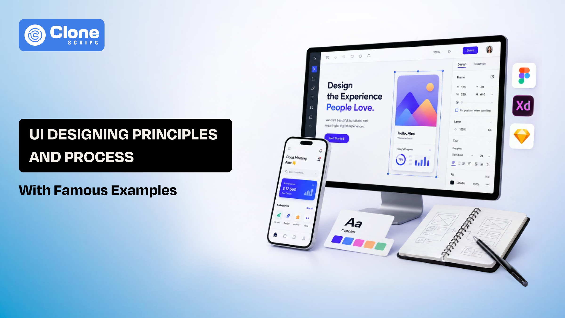
UI Designing: Principles, Process & Famous Examples Complete Guide
We all experience one thing while using the website or app. On opening the app, you know how to use it even without there’s a no instruction. You feel happy. But hold on, those moments where you pause, tap the wrong thing, go back, and wonder, “Why is this so hard?”
That difference isn’t luck. It’s UI design.
At its core, UI design is about understanding people, their habits, their impatience, and their expectations. Users react to interfaces. They scan, guess, and move fast. If something slows them down, even slightly, they lose interest just as quickly.
Good UI quietly supports actions. It reduces effort, builds comfort, and makes digital experiences feel almost invisible. In a space where users have endless choices, the interfaces that feel easy, natural, and human are the ones that people actually stick with.
What is UI Designing?
So what actually creates that feeling of “this is easy” versus “this is frustrating”
UI design is the layer where users interact with a product. It’s everything they see and touch, like buttons, text, colors, spacing, icons, and forms. But more importantly, it’s how all of these elements work together to guide someone without forcing them to think.
This means it only decides about how things look?
A clean design means nothing if users don’t know where to click next. At the same time, a functional layout without clarity still feels confusing. Good UI sits in between because it looks simple, but it’s carefully structured to lead users step by step.
When a button feels obvious, when navigation feels predictable, when actions feel instant. That’s intentional design. This reduces technical and design debt in terms of web development.
Basically, UI design turns complexity into clarity. It removes unnecessary decisions and helps users move forward without hesitation. And when done right, users don’t notice the design at all; they just notice how easy everything feels.
Core Principles of UI Design That Make Interfaces Feel Effortless
If an interface feels smooth and natural, it’s rarely by chance. We can say that it’s usually the result of a few core UI design principles working quietly in the background. These principles shape how users see, think, and act without them even noticing.

1. Clarity: Remove the Need to Think
This is the first principle called ”clarity.”
But, how does it work?
When users land on a screen, they’re trying to complete a task. They don’t have 0% interest in understanding your design.
Good UI makes that path obvious. By labeling the buttons and text clearly, adding familiar patterns, and integrating simple layouts help users move without hesitation.
The moment someone has to stop and ask, “What should I do next?”, the design has already created friction. Clarity is about reducing that pause.
2. Consistency: Build Familiarity Without Effort
The design of a website is good and offers clarity, let’s say. But it’s not enough.
Why?
Users learn fast, but only if your interface behaves predictably. When buttons, colors, and interactions stay consistent across screens, users don’t need to relearn anything. They build confidence and move faster.
But even small inconsistencies, like a button changing position from top to bottom or style, can break that flow and make the experience feel unreliable.
These kinds of errors are very risky for getting trust in finance and health app development.
3. Visual Hierarchy: Guide Attention Naturally
If you’re making the digital product design more attentive, this principle is very important: “Maintain visual hierarchy.”
Every screen has multiple elements competing. Here, good UI design decides what matters most and makes that stand out first. Through size, spacing, and contrast, users are guided without instructions. They follow visual cues. Don’t read everything.
Strong hierarchy ensures they see what they need, when they need it.
4. Feedback: Acknowledge Every Action
This design principle is more than just a formality.
Users expect a response to everything they do. A tap, a click, a submission, each action needs confirmation. It can be subtle, like a button changing state or a small animation, but it reassures users that the system is responding.
Without feedback, even a working interface can feel broken or confusing. From here, confusing transform into an issue for the development team involved in front-end and back-end. If the same appears, the final product is flawed and leads to cause prevent using the app or website.
These principles are not just a checklist, but provide guidelines for how successful products are made on them.
UI Design Process: How Interfaces Actually Come Together
From e-commerce website design to fintech app development, the following user interface design has been followed.

First, Understanding the User Before the Screen.
Before any design starts, there’s one simple question: what is the user trying to do?
Do not ever try to explain what the business wants. Additionally, there’s no matter what looks good.
The matter is: what the user actually needs in that moment.
Good web UI begins with clarity about user goals. If this step is skipped, everything that follows feels disconnected, no matter how polished it looks.
Then, Structuring the Experience Wireframing.
The second step is to wireframe the core idea about the website or app.
This is where ideas turn into structure. No colors, no styling, just a foundational layout.
The following has been decided in the wireframe:
-
Where does the button go?
-
What comes first?
-
What should users see immediately?
Wireframes focus on flow, not visuals. It’s about making sure the journey makes sense before making it look good.
Now, Building the Visual System.
The user goals are clear, the wireframe is optimized, and now it’s time to go towards design system preparation.
Colors, typography, spacing, and components are defined at this step.
If you think it's just a random activity to perform? But in reality, the design system in UI development lays the foundation of a successful app and website.
When done right, every screen feels connected, and users don’t feel like they’re entering a different experience every time they navigate.
Focus on Designing the Actual Screens.
After getting the UI design system, the time has come to create the actual screens.
Each screen is designed with full visuals, interactions, and states. But this is also where many go wrong: focusing too much on aesthetics and forgetting usability.
An error-free UI design at this stage still prioritizes ease over decoration.
Consider Testing Real Usage, Not Assumptions.
This fact is right: What looks clear to a designer isn’t always clear to a user.
Testing the UI design looks simple at some level, but most of the issues appear here. If a single has been overlooked, the product will no longer be useful. Every single team member of development has to rework their tasks.
Performing a QA and Testing reveals where people hesitate, get confused, or make mistakes. These insights refine the design and remove friction that would otherwise go unnoticed.
Handoff and real-world execution have to be completed.
Finally, the design moves to development, including front-end and then back-end. But UI doesn’t end here.
Small details, spacing, timing, and responsiveness need to be preserved. Because even a well-designed interface can lose its quality if it’s not implemented with the same precision.
Essential UI Design Elements Users Interact With Every Day
UI design elements are one kind of assets that make the mobile app or website more interactive, lively, and useful. These elements are required to be in the product:

-
Typography: How Text Feels, Not Just Reads
Users scan the words, and they don’t have enough time to read every word. That’s why typography is not limited to font choice; it’s about readability. The right size, spacing, and hierarchy make content easy to follow without effort.
Poor typography forces users to slow down, re-read, or skip information entirely.
-
Color: More Than Just Visual Appeal
Color does more than make a UI look attractive. It communicates meaning. A primary color highlights actions, while subtle tones support the background. When used correctly, users instinctively know where to click.
Too many colors or poor contrast quickly creates confusion and fatigue.
-
Buttons & CTAs: Where Decisions Happen
Every interface has moments where users need to act like, sign up, continue, buy, or submit. These actions are driven by buttons and calls to action. If they’re not clearly visible or placed logically, users hesitate. A good CTA naturally gets attention.
-
Layout & Spacing: The Invisible Structure
The website will open on a mobile phone, and the web app starts on a desktop. Here, the layout and spacing matter. Users may not notice spacing, but they feel it.
Proper layout creates balance and direction. It separates sections, groups related content, and makes everything easier to process.
At the same time, crowded screens overwhelm users, while well-spaced layouts feel calm and organized.
-
Icons & Visual Cues: Quick Understanding Without Words
The intention of adding icons in UI design is to help users understand actions instantly without reading. But they only work when they’re familiar and clear.
Do not try to overcomplicate or unclear icons slow users down instead of helping them. Premium UI products use visuals to reduce effort, not add to it.
These elements may seem basic on their own, but together they define how an interface feels in real use. When they work well, users move naturally. When they don’t, even simple tasks start to feel difficult.
How Successful Websites and Apps Look Towards UI Design
The theoretical knowledge is limited until you see how it is implemented in the product design. Here, we analyze the three most acknowledged business websites and apps that perfectly use the principles:

-
Airbnb
Airbnb’s UI removes hesitation at every step. Users always know what to do next, and small cues like pricing, availability, and instant booking make decisions feel quick and confident.
What are they doing best?
-
Clarity: Users immediately know the first step in booking is to check dates first.
-
Consistency: Every property follows a familiar pattern related to the same listing cards.
-
Visual Hierarchy: Cost is seen before details because price stands out.
-
Feedback: A clear response after action will be available through instant booking confirmation.
-
Google
Google follows simplicity at scale. It eliminates unnecessary elements so users can act instantly, making the interface feel obvious and predictable.
-
Clarity: There is a Single search bar for one clear purpose, no confusion.
-
Consistency: The same UI everywhere, Gmail, Search, and Drive feel connected.
-
Visual Hierarchy: The search dominates the screen because focus is always on action.
-
Feedback: Instant results load and immediate response build trust.
-
IBM
IBM focuses on managing complexity. Applying strong structure and consistency, it makes data-heavy interfaces usable without overwhelming users.
-
Clarity: Complex data is easy to understand with clear data labels.
-
Consistency: Same components across products, and carbon system rules availability is a differentiator.
-
Visual Hierarchy: Dashboard grid layout is helpful to logically structure the information.
-
Feedback: System status indicators always guide users to know what’s happening.
These UI design examples are helping you to know what to prioritize and what’s not. Regardless of the website or app category (like business or service), the principles remain the same.
FAQs
-
What UI design tool can I use for web product designing?
There are a lot of choices, especially AI tools. But on top of that, Figma is the best and still the choice. For prototyping, InVision works, and for collaboration, Zepling could be the option.
-
Do app and website UI design remain the same?
No. The screen resolution design matters, and here’s why responsive layouts are becoming useful. By making only a single device, the UI will work for every screen.
-
My team asks me to use the UI kit for a client project. Does it follow the principles?
Yes. Premium UI design kits are made with the principles of compliance, and for the analysis, you can see a demo of the layout.
-
Using Artificial Intelligence is useful for getting the expected UI design?
Probably not. But if the base requirement is clear, there’s a chance to get a professional UI design through advanced technology. It needs a designer verification before being handed to the development team.
-
How UI design can evolve from now?
Since the AI is taking charge of making design work smarter, the UI psychology matters along with cognitive load reduction in the app. The personalized UI and adaptive layouts are important.