BTC - Bitcoin
 USDTERC20 - USDT ERC20
 ETH - Ethereum
 BNB - Binance
 BCH - Bitcoin Cash
 DOGE - Dogecoin
 TRX - TRON
 USDTTRC20 - USD TRC20
 LTC - LiteCoin

What Makes a Good Website Template (Check these 10 Signs Always)
Choosing a website template sounds like a quick task. You browse a few demos, pick the one that “looks nice,” change the colors, upload content, and go live.
But months later, problems start appearing. Pages load slowly. Visitors don’t convert. Editing becomes difficult. SEO rankings don’t improve. Suddenly, you realize the template you chose is limiting your growth.
This is why understanding what makes a good website template is not a design-only discussion. It is a business decision, a usability decision, and a long-term scalability decision.
A good template becomes your silent growth partner. A bad one becomes a constant technical burden.
In this guide, we will understand how to choose a website template, what real web developers check before finalizing one, and the signs that clearly separate average templates from powerful ones.
How to Evaluate a Website Template in 5 Minutes
Before analyzing features, you need a quick way to filter weak templates.
Open any demo and run this 5-minute audit:
-
Do you understand the website’s purpose within 5 seconds?
-
Is there a clear call-to-action visible immediately?
-
Does the page feel fast when loaded on mobile data?
-
Can you scan content without effort or confusion?
-
Do sections feel reusable or rigid?
If multiple answers are “no,” the template likely lacks structural quality.
This initial test helps eliminate visually attractive but functionally weak templates before you invest time in deeper evaluation.
Good Website Templates Sign to Check Before Buying
These signs are available in a useful template for front-end website development and can be integrated with the system to operate successfully.
1. Mobile Experience Is Designed — Not Compressed
A good template does not simply convert desktop layouts to fit smaller screens. Instead, it restructures the experience for mobile users.
Mobile-first design focuses on clarity, simplicity, and interaction efficiency. Since a large portion of users browse on smartphones, a poor mobile experience directly impacts engagement and conversions.
How to Evaluate
Open the template on your phone and:
-
Scroll through the entire page without zooming
-
Tap buttons and navigation elements.
-
Try completing a form.
What to Look For
-
Content follows a clear vertical flow.
-
Navigation simplifies into accessible patterns.
-
CTAs are easy to find and interact with
-
Text remains readable without adjustment.
-
No horizontal scrolling or layout breaks
If the mobile version feels like a compressed desktop design, the template is not optimized for real-world usage.
2. Above-the-Fold Section Drives Immediate Clarity
The first screen a user lands on plays a decisive role in engagement. Within seconds, visitors form an impression and decide whether to explore further or exit. A well-structured template uses this space to deliver immediate clarity and direction, not just visual appeal. Weak templates often rely on sliders, excessive animations, or vague messaging that looks attractive but fails to communicate purpose.
How to Evaluate
Look at the top section and ask:
-
What does this website offer?
-
Who is it for?
-
What should I do next?
You should be able to answer all three within seconds.
What to Look For
-
A clear and specific headline
-
Supporting subtext that adds context
-
A prominent call-to-action
-
Optional trust elements (reviews, logos, stats)
If the top section focuses more on aesthetics than clarity, it will reduce engagement from the start.
3. Section Flow Supports User Decision-Making
A well-designed template leads users through a structured decision journey, rather than displaying disconnected sections. High-performing templates are built around a conversion-focused flow that gradually builds clarity, trust, and intent. Instead of forcing users to interpret information, the layout naturally guides them toward action.
How to Evaluate
Scroll through the page and observe:
-
Does each section build on the previous one?
-
Is there a natural progression toward action?
What to Look For
-
Problem introduction or context
-
Clear presentation of solutions
-
Highlighted benefits or outcomes
-
Social proof or credibility signals
-
Strong closing CTA
Templates without structured flow force you to reorganize content later, increasing effort and reducing efficiency.
4. Content Flexibility Without Layout Breakage
Many templates appear well-designed only because they use perfectly structured demo content with ideal text lengths and balanced visuals. In real-world scenarios, your content will vary in size, tone, and complexity.
A high-quality template must be content-resilient, meaning it can handle these variations without breaking layout, alignment, or readability. This ensures your website remains consistent even as content evolves.
How to Evaluate
Imagine replacing demo content with:
-
Longer headings
-
Detailed descriptions
-
Real testimonials
Then assess whether the layout still feels balanced, readable, and visually stable across sections.
What to Look For
-
Flexible text containers
-
Consistent spacing regardless of content length
-
No overlap or alignment issues
-
Sections that expand naturally
Templates that depend on perfect content length are difficult to maintain in real scenarios.
5. Performance Is Consistent Under Real Conditions
Template demos are often optimized for presentation, which means they may not reflect real-world performance. Once deployed with actual content, third-party tools, and regular traffic, performance can drop noticeably. A high-quality template is built to maintain consistent speed and responsiveness even outside controlled environments, ensuring users experience smooth interaction across devices and networks.
How to Evaluate
-
Open the demo in incognito mode.
-
Use average mobile data instead of Wi-Fi.
-
Interact with the page immediately.
Pay attention to how quickly content appears and how smoothly elements respond during interaction.
What to Look For
-
Fast initial load time
-
Smooth scrolling experience
-
Instant interaction feedback
-
No lag in animations or transitions
Performance directly impacts user trust, search rankings, and engagement, making it a critical factor in template selection.
6. Navigation Simplifies User Movement
Navigation is one of the most critical usability factors in any website template. Even a visually strong design fails if users cannot quickly find what they are looking for. A well-structured template reduces cognitive load by guiding users through clear paths, helping them move between pages without confusion or hesitation. Poor navigation, on the other hand, increases friction and leads to higher drop-offs.
How to Evaluate
Try accessing key pages:
-
Pricing for services
-
Contact page
-
Core product information
Observe how easily you can locate these sections and how many steps it takes to reach them.
What to Look For
-
Clear menu hierarchy
-
Logical grouping of pages
-
Visible primary actions
-
Minimal clicks to reach important sections
Efficient navigation ensures users can explore content effortlessly, improving both engagement and conversions.
7. Design System Ensures Consistency
Most templates look consistent in demos because they showcase limited pages. The real issue appears when you start expanding the website. Without a defined design system, every new page introduces slight variations in spacing, typography, and component styling.
Over time, this creates a fragmented experience that feels unprofessional and harder to manage. A strong template avoids this by using repeatable design rules, ensuring every section follows a predictable structure.
How to Evaluate
Open multiple pages, such as the homepage, service page, and blog, then check:
-
Do sections follow a consistent spacing pattern?
-
Are buttons styled the same across all pages?
-
Do headings scale logically (H1 to H2 to H3)?
If different pages feel visually inconsistent, the template lacks a system.
What to Look For
-
Uniform typography scale
-
Consistent color usage
-
Reusable layout patterns
-
Predictable spacing
A well-defined design system reduces design effort, improves usability, and ensures your website scales without visual inconsistencies.
8. Inner Pages Are Fully Designed
Many templates invest heavily in the homepage to create a strong first impression, but overlook inner pages where real engagement happens. In practice, users spend more time on service pages, blog content, and contact flows. These pages directly influence SEO performance, lead generation, and user decision-making. A strong template treats inner pages as equally important, not as afterthoughts.
How to Evaluate
Check the following:
-
Blog page layout
-
Service or product pages
-
Contact forms
Go beyond visuals, read content, scroll deeply, and interact with forms to assess usability and structure.
What to Look For
-
Readable long-form content structure (proper spacing, line length)
-
Consistent layout across all page types
-
Integrated CTAs within inner pages (not just homepage)
-
Clear content hierarchy for scanning and navigation
Templates with weak inner pages require redesign later, increasing both development time and cost.
9. Integration-Ready Structure
Most templates are judged on design, but real websites depend on tools and integrations to function, analytics, marketing automation, forms, CRM, chat widgets, and more. A strong template is built to accommodate these without breaking layout, slowing performance, or creating technical conflicts. If integrations feel forced, the template will become a limitation as your stack grows.
How to Evaluate
Consider your future needs:
-
Analytics tools
-
Marketing platforms
-
Forms and CRM integrations
Then check where and how these tools would fit within the layout without disrupting the structure.
What to Look For
-
Flexible sections for embedding scripts or widgets
-
Proper spacing that adapts to external tools
-
No layout shifts when integrations are added
-
Compatibility with commonly used platforms
Templates that restrict integrations limit your ability to scale marketing efforts.
10. Structure Works Without Visual Enhancements
Many templates appear impressive because they rely heavily on animations, stock images, gradients, and visual effects. While these elements enhance presentation, they often hide weak structural design. A strong template should remain effective even when these enhancements are removed. The real quality lies in how well the layout communicates and guides users without relying on decoration.
How to Evaluate
Remove these elements if not required:
-
Animations
-
Images
-
Icons
Then assess whether the layout still feels clear, structured, and easy to follow.
What to Look For
-
Clear layout even without visuals
-
Strong content hierarchy
-
Logical section arrangement
-
Usable interface without effects
If the template loses clarity without visuals, it indicates poor structural design and weak usability foundations.
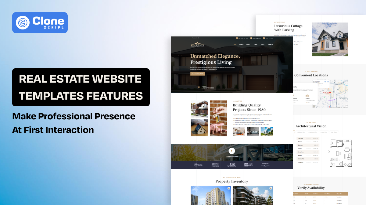
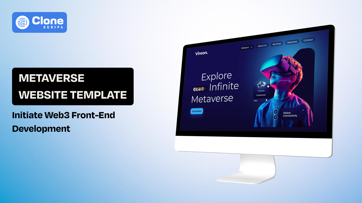
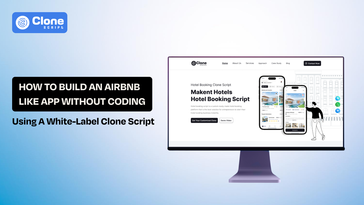
AllClone Script: A Complete Solution for Responsive Website Templates
AllClone Script offers a proper ecosystem for businesses that want to launch websites quickly without starting from scratch. Instead of building everything manually, we provide ready-to-use templates, UI kits, and full clone scripts that reduce both development time and cost.
-
Wide Template Variety Across Industries
Access templates for crypto platforms, e-commerce stores, healthcare services, booking systems, and more, covering multiple real-world business use cases.
-
Multiple Technology Options
Templates are available in HTML, React, WordPress, and modern frameworks like Tailwind CSS and Bootstrap, giving flexibility based on your tech stack.
-
Responsive and Customizable Layouts
Templates are designed to work across devices and allow customization of branding, structure, and features without heavy development effort.
-
Pre-Built Functional Solutions (Clone Scripts)
Beyond templates, it offers complete clone scripts (like Uber, ecommerce, or booking platforms) with both frontend and backend integration.
-
Faster Time-to-Launch
Businesses can deploy websites or apps quickly using pre-built systems instead of building from scratch.
-
Scalable and Integration-Ready
Solutions are built to support customization, integrations, and long-term scalability as business needs grow.
In short, it works as a ready-made foundation for front-end and full-stack development, especially useful for startups and teams that prioritize speed, cost-efficiency, and flexibility.