BTC - Bitcoin
 USDTERC20 - USDT ERC20
 ETH - Ethereum
 BNB - Binance
 BCH - Bitcoin Cash
 DOGE - Dogecoin
 TRX - TRON
 USDTTRC20 - USD TRC20
 LTC - LiteCoin
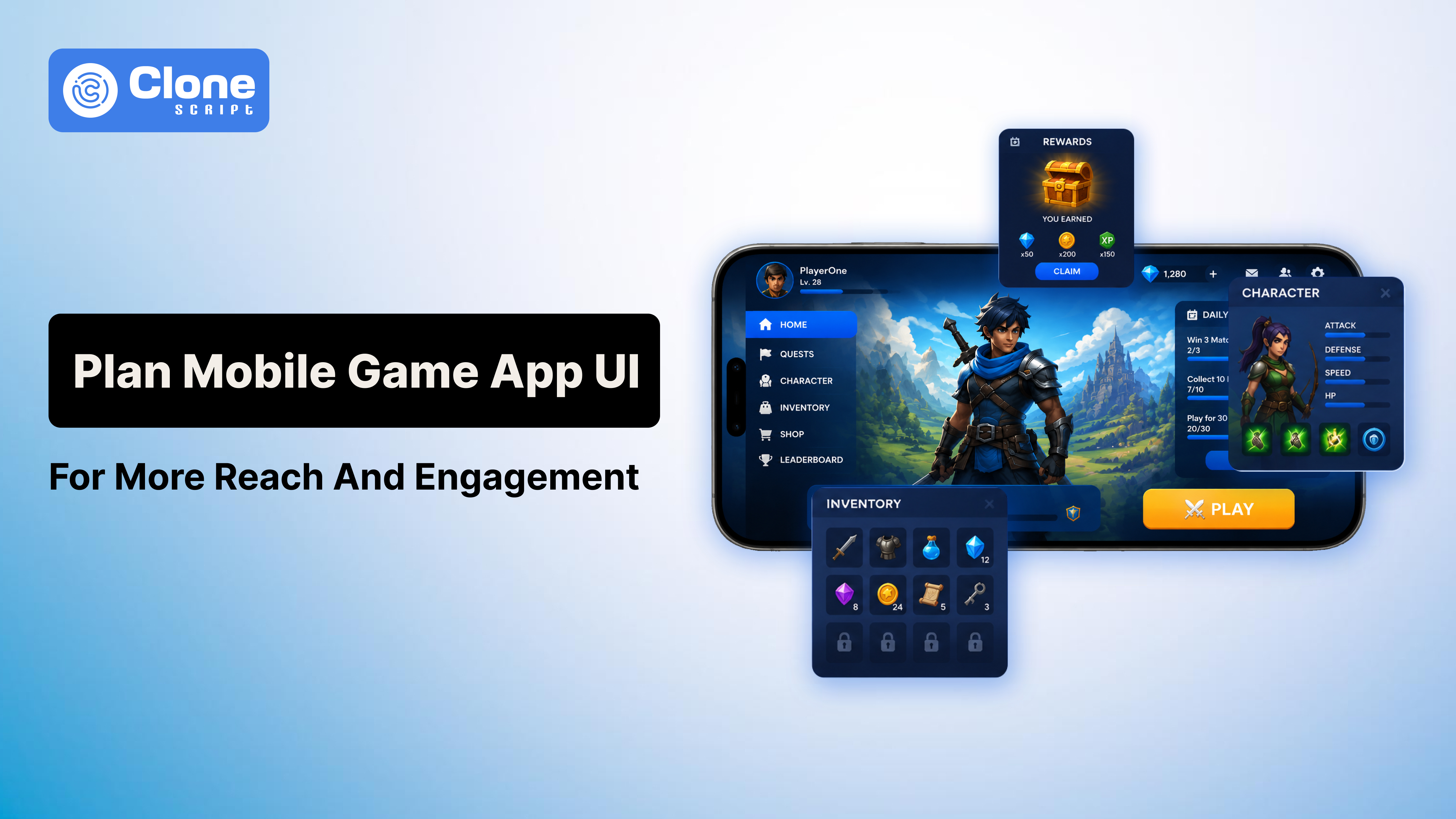
How to Plan Game UI for More Reach and Engagement from Players
Most players never say, “I quit because the UI was bad.”
Instead, they say things like:
-
“The game feels annoying.”
-
“Menus are confusing.”
-
“Too much stuff on screen.”
-
“I couldn’t understand what to do.”
That is usually a UI problem.
A lot of developers think game UI design is mainly about visuals. In reality, the interface controls how comfortable the game feels moment to moment. If basic interactions feel frustrating, even strong gameplay starts feeling frustrating after a while.
This becomes even more important in mobile gaming. Players open a game while traveling, waiting somewhere, or multitasking. Nobody wants to fight through messy menus or tiny buttons during a short session.
Good UI and UX in gaming remove friction quietly. Players move naturally from one action to another without thinking much about the interface itself.
That is the goal.
In this guide, we will go through practical game UI planning strategies, real usability mistakes, and game UX best practices that actually improve mobile gaming engagement and player retention in games.
Most Developers Start UI Planning Too Late.
This is probably the biggest mistake small studios make.
App User Interface usually gets treated like the “final polish phase” after gameplay systems are already built. Then the team realizes the menus feel awkward, onboarding is messy, or players cannot navigate features properly.
Fixing those issues late becomes expensive.
A better approach is planning UI alongside gameplay systems from the beginning.
Before designing anything, ask:
-
What will players do most often?
-
What actions need instant access?
-
Which information matters during gameplay?
-
What can stay hidden until needed?
Those answers shape your entire game user interface design.
For example, competitive shooters prioritize speed. RPGs prioritize information depth. Casual puzzle games prioritize simplicity.
Trying to force the same interface logic into every genre usually creates friction.
Good Game UI Design Feels Effortless.
One thing we notice in many indie games is overdesign.
Developers try too hard to make the interface look futuristic, cinematic, or “AAA style.” The result becomes harder to use.
-
Too many animations.
-
Too many glowing elements.
-
Too many overlapping menus.
Visually, it may look impressive for screenshots.
But during actual gameplay, it becomes tiring.
Some of the best game interface examples are surprisingly simple.
Minecraft is a perfect example. The interface is extremely basic compared to modern AAA games, but players understand it instantly. Nothing fights for attention unnecessarily.
That simplicity is one reason the game remains accessible even after years.
Good UI design for games is less about decoration and more about reducing mental effort.
Players should not waste energy figuring out navigation.
Why Players Leave Games Faster Than Developers Expect
A lot of developers underestimate how impatient players are now.
Especially on mobile.
Research from gaming analytics companies consistently shows major player drop-offs during the first session. Sometimes users leave before even understanding the core gameplay loop.
Usually, the problem is not graphics.
It is frustration.
Common friction points include:
-
Confusing onboarding
-
Overloaded HUD systems
-
Slow menu transitions
-
Unreadable text
-
Hidden rewards
-
Inconsistent controls
-
Aggressive monetization popups
Individually, these issues feel small.
Together, they damage the entire experience.
This is why player engagement strategies today focus heavily on usability improvements instead of just adding content constantly.
Sometimes, improving navigation increases retention more than adding new gameplay features.
Start With Player Behavior, Not Visual Trends.
A common problem in game UI planning is blindly copying successful games.
Developers see a trending interface style and immediately try to recreate it without understanding why it works.
But player expectations change depending on genre.
For example:
-
Strategy players tolerate more visible information
-
Casual players prefer cleaner layouts
-
Competitive players need faster interactions
-
RPG players expect layered systems
Your player-centric UI should support player habits, not design trends from social media.
I have seen beautifully designed interfaces completely fail because developers prioritized aesthetics over usability.
Meanwhile, some visually simple games perform extremely well because interactions feel smooth.
Players forgive average visuals much faster than frustrating interactions.
HUD Design in Games Is Usually Overloaded.
This is one of the most common UI mistakes.
Many developers keep adding more and more information to the screen because they are afraid players might miss something.
Eventually, the HUD becomes exhausting.
Good HUD design in games focuses on priority, not quantity.
Ask yourself:
-
What information matters right now?
-
What can appear contextually?
-
What information rarely gets used?
Modern games increasingly use dynamic HUD systems where elements appear only when necessary.
That approach improves immersion significantly.
Players should focus on gameplay, not spend half their attention decoding interface clutter.
Mobile Game UI Requires Completely Different Thinking.
Desktop-first design usually fails on phones.
A lot of developers still make this mistake.
They design everything for large screens, then shrink it for mobile later. The result is usually terrible:
-
Buttons become too small
-
Text becomes unreadable
-
Menus feel cramped
-
Touch interactions feel awkward
Strong UI for mobile games requires designing around thumbs, limited space, and shorter attention spans from the beginning.
PUBG Mobile handles this surprisingly well despite having many controls. The game allows heavy layout customization, which improves comfort for different users.
That flexibility matters more than flashy design.
Comfort directly affects mobile gaming engagement.
If interacting with the game feels annoying physically, retention drops quickly.
The Best Onboarding Systems Barely Feel Like Tutorials.
Nobody enjoys sitting through ten minutes of instructions before playing.
Yet many games still overload new users with explanations immediately.
Long tutorials usually create boredom, not learning.
The best onboarding systems teach gradually through interaction.
Among Us became accessible partly because players learned while playing instead of reading giant text blocks first.
Good onboarding should:
-
Introduce mechanics step by step
-
Reward users quickly
-
Reduce reading
-
Encourage experimentation
-
Avoid overwhelming menus early
Strong game UX best practices focus on momentum.
The faster players feel comfortable, the higher the chance they will continue playing.
Game Menu Design Quietly Shapes Player Experience
Most developers pay attention to gameplay screens but ignore menus.
That is a mistake because players constantly interact with menus:
-
Before matches
-
After rewards
-
During upgrades
-
During purchases
-
While checking the progression.
Bad game menu design slowly creates fatigue over time.
Players may not consciously complain about menus, but frustrating navigation affects how they emotionally perceive the game overall.
Fortnite handles large-scale menu systems surprisingly well, considering the amount of content inside the game. Navigation remains relatively fast despite events, cosmetics, modes, progression systems, and stores constantly updating.
Menus should support momentum instead of interrupting it.
Reward Systems Need Emotional Feedback.
This is something many technically strong developers overlook.
Players do not just enjoy progression mechanically. They enjoy it emotionally.
That is why gaming experience design relies heavily on:
-
Reward animations
-
Sound effects
-
Progress bars
-
Unlock sequences
-
Achievement feedback
Even small interaction details matter.
A smooth XP animation feels satisfying.
A sluggish reward pop-up feels cheap.
But there is also a limit.
Too many popups, notifications, or monetization prompts create exhaustion quickly. Some mobile games interrupt gameplay every few minutes with offers, bundles, or limited-time promotions.
Short-term monetization often damages long-term engagement.
Good gaming UI and UX balance rewards without constantly demanding attention.
Accessibility Is Now Part of Good Design.
Accessibility used to feel optional.
Not anymore.
Modern players expect features like:
-
Scalable text
-
Subtitle controls
-
Colorblind support
-
Customizable controls
-
Readable contrast
-
Larger touch targets
And honestly, these improvements help everyone, not only players with disabilities.
Better readability improves usability universally.
Ignoring accessibility limits your audience unnecessarily and weakens overall game user interface design quality.
Real Testing Reveals Problems Fast.
Internal teams become blind to usability problems because they already understand the game deeply.
New players do not.
That is why usability testing matters so much during game UI planning.
Watching real players interact with your game reveals issues instantly.
You notice things like:
-
Players skipping buttons
-
Confusion during onboarding
-
Slow inventory navigation
-
Ignored features
-
Unnecessary clicks
Even basic testing sessions can improve UI design for games before launch.
Professional studios constantly iterate based on player behavior data instead of assuming the first version is correct.
Simple Interfaces Usually Age Better.
A lot of overly designed interfaces look impressive initially, but become exhausting long-term.
Simple interfaces usually survive longer because they prioritize usability first.
That is why many successful game interface examples remain relatively clean despite evolving for years.
The interface should support gameplay quietly instead of constantly trying to impress visually.
Players remember how the game felt far more than how the menus looked.
Conclusion
At the end of the day, players care about comfort more than complexity.
A good interactive game UI helps users stay immersed without creating frustration. Navigation feels natural, rewards feel satisfying, and gameplay remains the main focus instead of the interface itself.
That is what strong game UI design actually does.
It reduces friction.
The best interfaces are usually the ones players barely notice because everything simply works the way they expect.
If you focus on player behavior, usability, clarity, and comfort during game UI planning, engagement improves naturally over time.
And honestly, that matters far more than making the UI look overly futuristic for screenshots.