BTC - Bitcoin
 USDTERC20 - USDT ERC20
 ETH - Ethereum
 BNB - Binance
 BCH - Bitcoin Cash
 DOGE - Dogecoin
 TRX - TRON
 USDTTRC20 - USD TRC20
 LTC - LiteCoin
What Makes a Figma UI Kit Truly ‘Ready-to-Use’
Figma has become the key element of modern interface design. Whether you’re working on a SaaS dashboard, game UI, or mobile app interface, chances are Figma plays a role in your workflow. But here’s the reality most developers already know: a lot of so-called “ready-to-use” Figma UI kits aren’t ready for anything.
You download the file expecting a clean, usable system. But instead, find disconnected layers, no component structure, poor naming conventions, and zero responsiveness. If you’re building actual products, not design portfolios, that’s a dealbreaker.
So let’s set the record straight: what exactly makes a Figma UI kit truly ready-to-use in 2025? And how do you spot the kits that are built to support real development work, not just look impressive?
What Does ‘Ready-to-Use’ Really Mean in 2025?
In 2025, “ready-to-use” should mean more than a good-looking collection of screens. For developers and designers shipping products, it means:
-
Structured layouts for fast iteration
-
Built on components, not static layers
-
Responsive by default using Auto Layout
-
Includes key user interface states (hover, error, success, loading)
-
Designed with developer handoff in mind
-
Adaptable across screen types like mobile, tablet, and desktop
This isn’t optional anymore.
Whether you're designing a web app, building out a mobile interface, or prototyping a game overlay, the Figma kit must function like a lightweight design system. It can scale with your product.
Now you have a question when going to buy a Figma web UI design: what features to be prioritized? Let’s find an answer.
4 Core Features of a High-Quality Figma UI Kit
When evaluating a user interface (UI) kit, you need to think beyond how it looks. What matters is how it works within a dev pipeline.
1. Modular Components with Variants
You need a UI that has atomic design principles built in:
-
Buttons, cards, form inputs, and navs as reusable components.
-
Variants for every expected state (hover, focus, active, disabled, loading).
-
Shared foundations like base Button or Card components that extend into use-specific versions.
This allows you to build with speed and consistency. For example, if you work on a FinTech app dashboard UI design, then it offers scalability.
2. Auto Layout and Smart Constraints
Designing a screen in Figma comes with the auto layout, helping developers not to be involved in coding too much for testing the responsiveness of a web page.
Check the following things when considering the relevant kit:
-
Components flex when content changes.
-
Pages adapt to screen sizes (vital for mobile app and site UI design).
-
You don’t have to manually adjust spacing every time you duplicate a frame.
Test this: stretch a layout or update text. If it breaks, it's not ready to use.
3. Design Tokens and Global Styles
Tokens make your design consistent and code-friendly. A proper kit should include:
-
Color palettes mapped to semantic names (Primary 500, Neutral 100)
-
Font styles using proper hierarchies (Heading, Subheading, Body, Caption)
-
Padding/margin scales are consistent across components
To translate a Figma UI design into HTML code, tokens are helpful. From it, you can convert the layout into CSS, SCSS, and Tailwind utility classes through tools.
4. Clear File & Layer Organization
A clean file matters when handing off to a developer. It becomes important when on a single web development project, more than 10 developers are involved. Make sure the file you download from purchasing a UI kit has:
-
Pages for documentation, components, flows, and screens
-
Logical naming (Button/Primary/Large/Icon Left)
-
Layer names that reflect purpose, not just Group 45
Your Figma web design file should be just as easy to navigate as your IDE.
Still, you have a thought on why front-end developers are moving towards the pre-built user interface designs despite the custom designing? Let’s find an answer.
Why Speed and Usability Matter for Developers?
If a Figma UI kit doesn’t make development faster, it’s not worth your time. Here’s how:
-
Faster Prototyping, Testing, and Validation
Need to pitch a stakeholder or test a user flow before writing code? A ready-to-use UI kit lets you do it in hours, not days. It enables early feedback on product direction without engineering overhead.
-
Developer Handoff Without Guesswork
When a Figma kit includes specs, states, naming, and responsiveness, devs can start building a product immediately. There is no need to measure margins or decode random color codes. Everything is already structured to align with your front-end tools.
-
Consistency Across Builds
If you’re maintaining multiple products (web app + mobile app + landing site), a universal UI kit avoids divergence in your user interface design logic. Whether it’s a Figma website template or a mobile app UI design file, consistency saves time and avoids tech debt.
Ultimately, using a Figma website design not only saves repetitive work but also makes the web development workflow streamlined and managed.
Want to know how the UI kit is used in a real-time development project? Let’s explore.
Use Cases of a Ready-to-Use UI Kit
Here’s where a real, production-ready UI kit can shine:
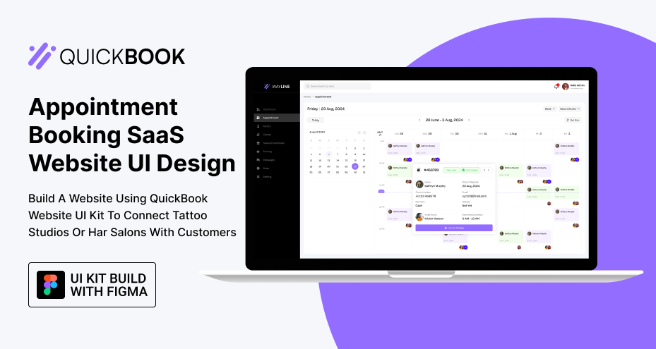
1. SaaS Dashboards (Dashboard UI Kits)
If you’ve ever built a SaaS dashboard, you know it’s not just about placing some tables and charts on a page. Dashboards are complex, data-heavy interfaces with multiple user flows, states, and responsiveness requirements. A high-quality Figma dashboard UI kit allows you to skip repetitive layout work and focus on functionality and logic.
Most importantly, you have to follow the modern UI/UX principles for dashboard design. If your product is not optimized, you might have built it incorrectly for the purpose it’s designed for.
Ready-to-use dashboard kit offer:
-
Functional Tables with sortable headers, pagination, and filter dropdowns.
-
Charts and Graphs for analytics dashboards, including bar, line, pie, and area charts using auto-layout and structured components.
-
Metrics Cards that showcase KPIs like user growth, revenue, or engagement rates, with visual elements like trend arrows or percentage changes.
-
Navigation Elements, including sidebars with active state logic, collapsible menus, breadcrumbs, and top bars with user profile and notifications.
-
Modals and Drawers for actions like "Add New User" or "Update Plan" are designed with form elements and responsiveness.
-
Empty States, Loading Screens, and Error UIs, not just for visuals, but to improve UX during edge-case interactions.
For developers, this means every piece of the dashboard, from layout structure to spacing, responsiveness, and interaction, is prebuilt and ready to hand off to code. You can go from wireframe to functioning front-end in days, not weeks.
Here is the appointment booking SaaS UI Kit example.
2. Mobile Applications (App UI & Mobile UI Design)
Designing for mobile involves more constraints than the web. Here you have to tackle limited screen space, touch interactions, OS-specific conventions, and accessibility standards. A well-built Figma mobile UI design kit does more than give you pretty screens. It delivers app-ready components that work across platforms and screen sizes.
What features should be included?
-
Tab Bar Navigation, complete with active/inactive icon variants, proper padding for touch areas, and platform-appropriate styles (iOS vs Android).
-
Bottom Sheets and Action Modals, with drag indicators, backdrop overlays, and scrollable content areas for long forms or options.
-
Forms and Input Fields with prebuilt states such as focus, filled, error, and disabled as components. These can plug directly into React Native or Flutter code logic.
-
Safe Area Awareness layouts that account for notches, status bars, and device-specific spacing (especially on iPhones and Android edge-to-edge screens).
-
Multi-Screen Flows for onboarding, sign-in/sign-up, settings, and profile management. These should include both screen designs and transition logic (like slide-in or modal-style animations).
-
Push Notification Previews, in-app messages, and loading indicators. It is small, but a preferable component for a complete app flow.
As a developer, having these patterns built with Auto Layout and tokenized styles means you don’t have to manually create base screens or manage mobile responsiveness from scratch.
You’re free to plug these screens into a prototype quickly, iterate faster, and launch sooner.
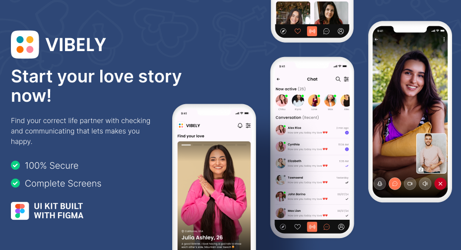
Here is a good example of a dating mobile app UI design.
3. Landing Pages and Marketing Sites (Figma Website Templates)
Building marketing sites feels repetitive: hero > features > CTA > testimonials > footer.
But doing it well with optimized layout, mobile responsiveness, and brand flexibility is where most templates fall short.
A ready-to-use Figma website template should be modular, responsive, and structured to match real front-end implementation.
What should it contain?
-
Responsive Hero Sections. It should have layered background images, bold headings, and call-to-action buttons, designed to collapse gracefully on mobile.
-
Feature Blocks and Comparison Grids. It is used to showcase product benefits, with icon support, section titles, and variant cards (dark/light, 2-column/3-column).
-
Pricing Tables. With segmented plans, feature checklists, highlight states (for most popular plans), and toggle switches for monthly/yearly pricing in a responsive screen, enhance user experience.
-
Testimonials and Social Proof. By using avatar components, quote formatting, star ratings, and carousel structures, the overall website sounds professional.
-
Lead Capture Forms. Email opt-ins, contact forms, or demo request UIs with clean form validation states reduce the manual work.
-
Footer Variations. Check if it includes legal links, social icons, language selectors, and newsletter subscription.
The goal is to provide a component system that helps you build landing pages as quickly as building pages in a CMS. Developers should be able to drop these designs into a site builder, Next.js app, or headless CMS like Sanity or Strapi without manually slicing images or rebuilding layouts.
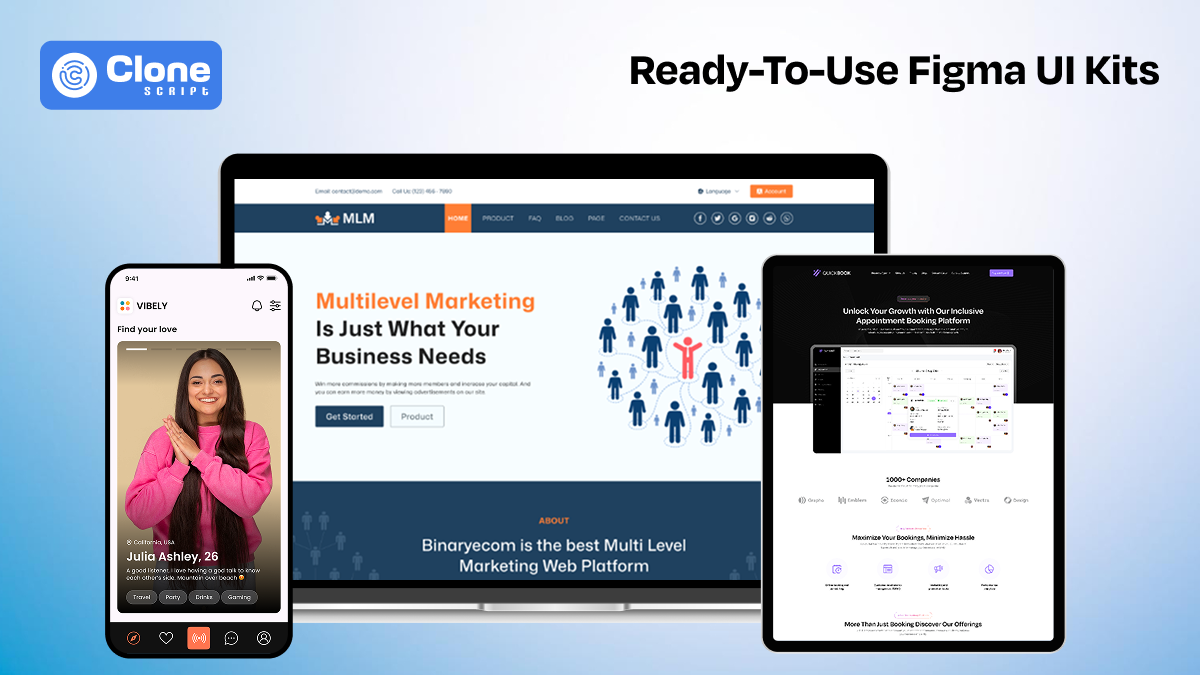
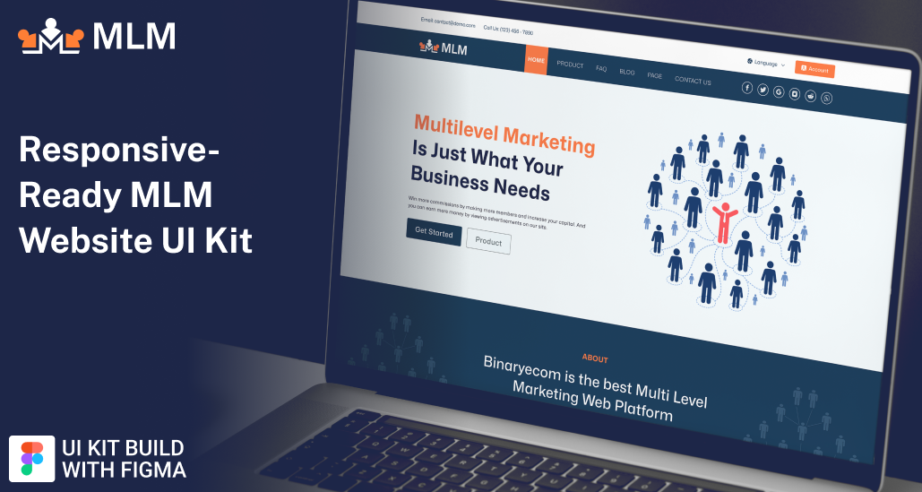
Here is an example of a multi-level marketing website UI kit designed in Figma.
4. Mobile App Game UI Design
Unlike apps and websites, game interfaces require fast, immersive, and stylized UI experiences that reflect the gameplay itself. A Figma UI kit designed for games isn’t just about visuals. It must support real-time interaction models, in-game overlays, and HUD logic. The design system must be flexible and customizable to support both mobile and desktop game builds.
A pre-designed game UI kit should offer:
-
Inventory and Equipment Screens. This includes drag-and-drop item slots, status popovers, and pagination systems.
-
Dialog Windows. Check if it comes with stylized backgrounds, choice buttons, and typing animation hints ready to be ported into visual scripting tools like Unity UI or Godot.
-
Player Stats Overlays. See health bars, XP meters, and mana bars with dynamic sizing and color-coded feedback.
-
On-Screen HUD Elements. It has minimaps, timers, and ammo counters designed to scale across screen resolutions and aspect ratios.
-
Radial Menus, Tooltips, and Action Buttons. To simulate real in-game logic, like cooldown timers or tooltip popups on hover/press, it is necessary.
Game UI is where Figma stretches, and if the kit is built well, it can be exported to Unity, Unreal, or even WebGL projects with little refactoring. These kits help game dev teams test UX concepts before jumping into engine logic, reducing both design debt and coding overhead.
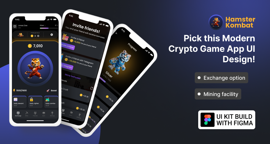
Here is a Figma game design app UI kit for Hamster Kombat, a crypto game.
It’s a time to know the checklist for getting a ready-made premium UI kit.
How to Identify a UI Kit Ready for Making Development Easy?
Follow these tips to justify that the UI kit is ideal for development:
-
Modular Components with Variants: Check if components are built with nesting and variants. A good kit includes button states, input fields, and UI logic variations.
-
Consistent Use of Auto Layout: Resize any element or frame. If text and spacing adjust properly, Auto Layout is implemented. It saves hours of manual resizing work.
-
Responsive Across Breakpoints: A high-quality kit includes layouts for desktop, tablet, and mobile. These should shift naturally with proper constraints and alignment settings in place.
-
Style Tokens with Semantic Naming: Look for named styles like Primary 500, Heading XL, or Spacing 16px. This makes code integration seamless with CSS frameworks.
-
Well-Named Layers and Groups: Layers should be labeled clearly (e.g., Button/Primary/Default) rather than vague ones like Group 57 or Rectangle 22, aiding smooth handoff.
-
Includes All Common UI States: Good UI kits cover default, hover, focus, error, and loading states for inputs, buttons, and alerts. It is important for prototyping real UX flows.
-
Passes the Quick Edit Test: Try duplicating and editing a page. If layouts break, spacing collapses, or variants fail, the kit isn’t reliable for real-world use.
Top Mistakes to Avoid When Choosing a Figma UI Kit
Here is a list of mistakes when selecting a Figma design:
-
Judging by Aesthetics Alone: A beautiful landing page doesn’t mean the kit is functional. Many look great visually but break when put into real workflows.
-
Ignoring Auto Layout Support: If components don’t scale properly with content changes, you’ll spend hours fixing layouts that should have worked from the start.
-
Overlooking Variant Support: Free UI kits that lack hover, error, or loading states force you to recreate the same elements repeatedly, which affects productivity.
-
Skipping a Quick Usability Test: Always test by editing a screen or duplicating a component. If it breaks easily, it won’t scale during a real project.
-
Assuming Mobile Responsiveness Is Included: Not all web design kits adapt to different screen sizes. Check for true mobile-ready frames, not just resized desktop versions.
-
Forgetting About Developer Handoff Quality: UI kits with messy layers, random naming, or no documentation will waste your dev time. It doesn’t matter how nice the UI looks.
-
Using Overly Complex or Bloated Kits: Some UI designs try to include everything and end up cluttered. Choose lean, purposeful kits with reusable logic, not noise.
-
Relying on Outdated Kits: A kit built in 2018 may not follow Figma’s modern features like variables, component properties, or new Auto Layout behavior.
Conclusion: Choose Smarter, Build Faster
In 2025, a truly ready-to-use Figma UI kit isn’t defined by trendy visuals. It’s defined by structure, logic, and speed. For developers, that means clean layers, reusable components, variant logic, and layouts that just work. Whether you’re designing a dashboard UI, building a mobile app interface, or prototyping a game UI, the right kit should reduce manual work, not add more.
Before downloading or buying, test the kit like you’d test any tool in your stack: for speed, stability, and scalability. A premium UI kit should feel like a jumpstart, not a refactor.