BTC - Bitcoin
 USDTERC20 - USDT ERC20
 ETH - Ethereum
 BNB - Binance
 BCH - Bitcoin Cash
 DOGE - Dogecoin
 TRX - TRON
 USDTTRC20 - USD TRC20
 LTC - LiteCoin
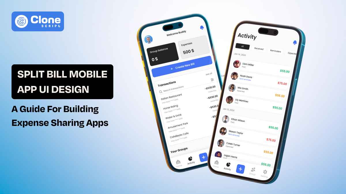
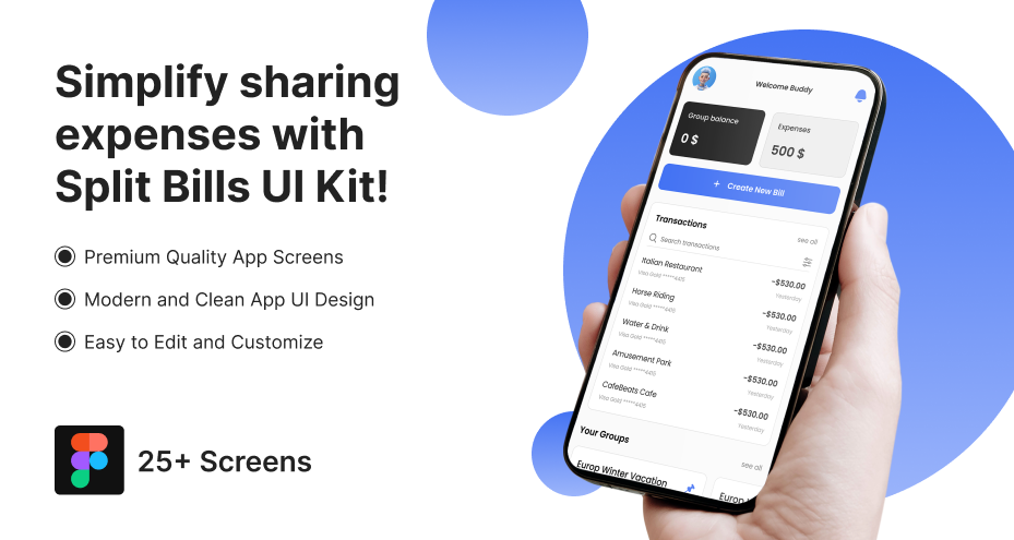
Split Bill Mobile App UI Design: A Complete Guide for Building Expense Sharing Apps
Splitting a bill is rarely just about numbers. It happens at the end of dinners with friends, during weekend trips, inside shared apartments, or after team events. In those moments, people don’t want to calculate who paid for what; they want clarity, fairness, and speed. That’s where a well-crafted split bill app design makes a difference.
Designing a split bill mobile app UI starts with understanding people, not screens. Users feel awkward asking for money. They worry about miscalculations. They double-check totals before confirming payments. Your interface must remove that tension. Every balance, every split option, and every confirmation screen should communicate transparency and trust.
This guide explores how to design expense-sharing experiences that prioritize human behavior first, then structure the UI around precision and simplicity.
Why Split Bill Apps Need Thoughtful UI Design
When money is involved, tolerance for confusion drops to zero. Users might forgive a social app for clutter or a shopping app for minor friction. But they will not forgive a financial app for unclear totals or miscalculated splits.
Split bill apps operate in socially sensitive situations:
-
Friends settling dinner expenses.
-
Roommates dividing rent and utilities.
-
Colleagues tracking travel reimbursements.
-
Couples managing shared subscriptions.
In every scenario, the app becomes the neutral mediator. If the interface feels biased, confusing, or opaque, trust is not available.
Thoughtful UI design is essential because:
-
Clarity reduces tension. Users should instantly see who owes what.
-
Transparency builds confidence. Clear tax, tip, and subtotal breakdowns prevent doubt.
-
Structure prevents disputes. Real-time recalculations eliminate manual math errors.
-
Neutral tone maintains relationships. Payment reminders must feel factual, not aggressive.
From typography to color usage, every decision influences emotional response. Red for owed amounts must be subtle, not alarming. Confirmation states must feel reassuring, not transactional.
Ultimately, a split bill app is not just a calculator. It is a trust interface. App UX and UI designers must treat it as a financial product first and a utility second.
Optimized User Flows in a Split Bill Mobile App (2026 Standards)
In 2026, user flows in split bill apps are expected to be intelligent, adaptive, and fast. Users find multi-step processes for simple actions like adding an expense or settling a balance. The goal is to reduce taps while maintaining financial clarity.
A modern, optimized flow typically follows this structure:
-
Secure authentication (OTP + biometric)
-
Dashboard overview (net balance visibility)
-
Group selection
-
Smart expense entry
-
Dynamic split configuration
-
Review and confirm
-
Instant settlement
Key Flow Enhancements in 2026
In Fintech app features, the standards for 2026 set the benchmark.
-
Real-time recalculation: Totals update immediately when split values change.
-
Context-aware suggestions: The app suggests equal split or last-used split logic.
-
Inline editing: No separate screens for minor adjustments.
-
Auto-saved drafts: Prevent loss of partially entered expenses.
Reducing Cognitive Load
Modern split bill UX removes unnecessary decision points. For example:
-
Default to an equal split but allow quick customization.
-
Highlight net settlement instead of showing multiple bilateral payments.
-
Surface the most used payment method automatically.
Optimized flows remove confusion. Every transition must feel predictable, every confirmation definitive. In financial interactions, speed matters, but clarity matters.
UI Components of Every Split Bill App That Must Include
A split bill app is structurally simple. But functionally sensitive. The UI must support financial accuracy, social transparency, and payment execution without overwhelming the user. That requires a disciplined component system.

Below are the core UI components every production-ready billing sharing app must include.
1. Dashboard Balance Summary
The dashboard is the financial snapshot. It should clearly display:
-
Total you owe
-
Total owed to you
-
Net balance
-
Active groups
Visual hierarchy matters here. Net balance must be the dominant element. Microcopy should clarify whether the number represents receivable or payable funds. It's advisable to follow UI design and UX principles for dashboards.
2. Group Management Module
Users often manage multiple contexts, such as roommates, trips, and office teams. It should include essential features:
-
Group avatar or identifier
-
Member list with profile indicators
-
Per-group balance summary
-
Add or remove members functionality.
Smart tagging improves scannability when users participate in several groups simultaneously.
3. Expense Entry Interface
This is the most interaction-heavy screen when the user enters the expenses in the app. It must include:
-
Amount input with numeric keypad optimization
-
Category selection (food, rent, travel, etc.)
-
Optional receipt upload
-
Date and notes field
Input latency must be near-zero. Financial apps cannot afford UI delay.
4. Split Configuration Controls
This component differentiates basic apps from advanced ones. It must support:
-
Equal split
-
Unequal split (manual amounts)
-
Percentage-based split
-
Share-based split
-
Exclude member toggle
Dynamic recalculation is mandatory. Changes must update totals instantly to avoid user doubt.
5. Settlement Interface
Settlement must be frictionless in the app. Make sure to include key elements:
-
Clear “Settle Up” CTA
-
Integrated payment method selector
-
Confirmation state with timestamp
-
Status indicator (pending, completed)
The system should collapse multiple debts into one net payment whenever possible.
6. Transaction History Feed
Users need auditability. The history component should display:
-
Expense title
-
Group name
-
Date
-
Paid by and split details
-
Settlement status
Filters (by group, date, and unpaid status) improve utility significantly.
7. Notification & Reminder System
Reminders must feel neutral, not promotional. Design considerations:
-
Soft language (“Reminder to settle”)
-
Clear amount visibility
-
One-tap payment action
Push notifications should sync with in-app alerts to maintain consistency.
8. Profile & Payment Settings
Financial apps require personalization and security. It must include:
-
Linked payment methods
-
Currency settings
-
Biometric toggle
-
Data export option
Trust increases when users feel in control of their financial data.
Component Consistency Is Important
Each component should follow a unified design system:
-
Consistent spacing grid
-
Standardized iconography
-
Predictable CTA placement
-
Accessible contrast ratios
A split bill app is not visually complex. But it is structurally precise. Missing even one of these components compromises trust, usability, or scalability.
In fintech UX, completeness is credibility.
Design Patterns Used by Leading Expense Sharing Apps
Expense sharing apps may appear lightweight. But their interaction models are carefully engineered. The goal is to reduce friction, eliminate confusion, and implement financial trust through predictable design behavior.

Below are the core design patterns widely used in mature split bill applications.
1. Net Balance Simplification Pattern
Instead of showing multiple individual debts, leading apps calculate a single consolidated balance between users. This pattern ensures:
-
Reduced payment clutter
-
Clear payable or receivable outcome
-
Simplified settlement flow
Users see one actionable number rather than fragmented transactions. This lowers cognitive strain and accelerates resolution.
2. Progressive Disclosure Model
Advanced options remain hidden until explicitly requested. This pattern applies to:
-
Custom split configurations
-
Advanced filters
-
Detailed transaction breakdowns
The default interface remains clean and minimal. Complexity appears only when needed, preventing user overwhelm.
3. Real-Time Recalculation Feedback
Every input change instantly updates totals. This pattern supports:
-
Immediate split adjustments
-
Dynamic tax or tip updates
-
Transparent share modification
Delayed recalculation creates doubt. Instant feedback reinforces numerical trust.
4. Chronological Activity Feed
All actions are recorded in a timeline structure. It typically includes:
-
Expense additions
-
Split edits
-
Settlement confirmations
-
Member changes
The timeline acts as a financial audit layer without requiring separate navigation.
5. Inline Editing Pattern
Users can modify amounts, categories, or splits directly within the current screen. Benefits include:
-
Reduced navigation loops
-
Faster corrections
-
Improved task completion rate
This pattern respects user momentum during financial entry.
6. Soft Behavioral Nudging
Subtle visual cues encourage settlement without confrontation. Examples include:
-
Highlighting overdue balances
-
Surfacing “Settle All” suggestions
-
Displaying gentle reminder badges
The interface guides action without creating social pressure.
7. Confirmation Reinforcement States
After settlement, apps show clear confirmation screens. These include:
-
Transaction timestamp
-
Payment method used
-
Updated balance snapshot
This applies closure and prevents uncertainty.
Pattern Discipline Drives Retention
Leading split bill apps do not innovate again and again. They refine proven behavioral structures that users already understand.
In financial UX, familiarity reduces friction. Reduced friction increases trust. Trust directly impacts long-term retention.
UX Challenges in Split Bill App Design (How to Solve Them)
Even well-built split bill apps encounter friction points once real users begin interacting with shared expenses. Unlike generic productivity tools, these products work at the intersection of money and relationships. That combination creates unique usability pressures.
Here are the most persistent UX obstacles and how structured design decisions resolve them.
1. Misinterpretation of Balances
Users frequently misread financial summaries, especially when multiple groups are involved. Here is the solution:
-
Explicit directional indicators (arrow icons or labels).
-
Separate sections for payable vs. receivable amounts.
-
Persistent net summary at the top of the screen.
Interpretation should require zero mental calculation.
2. Complex Split Adjustments
Unequal splits can quickly become cognitively heavy. Follow this solution:
-
Preset split options (equal, percentage, shares).
-
Live recalculation during edits.
-
Inline validation for incorrect totals.
The system should prevent mathematical errors before submission.
3. Social Friction Around Reminders
Aggressive reminders can strain relationships. Consider implementing this solution:
-
Neutral, system-generated language.
-
Optional reminder customization.
-
Visible payment history to reduce disputes.
Tone design is as critical as layout design.
4. Payment Flow Drop-Off
Users abandon flows if settlement feels complicated. The solution is:
-
One-tap settlement where possible.
-
Saved payment methods.
-
Clear post-payment confirmation.
Settlement must feel immediate and definitive.
Precision in UX eliminates disputes. In expense-sharing apps, prevention is better than correction.
Visual Design Considerations for Fintech Expense Apps
Visual design in a split bill application is functional. Every color, font weight, spacing decision, and icon communicates financial meaning. In fintech interfaces, aesthetics must reinforce clarity, not compete with it.

Below are the critical visual considerations for expense-sharing products.
1. Color Semantics
Color must signal financial direction without triggering stress. Best practices include:
-
Muted red or orange for payable amounts.
-
Calm green or blue for receivables.
-
Neutral tones for settled balances.
Over-saturated colors create emotional intensity. Subtle contrast communicates status without alarm.
2. Typography Hierarchy
Numerical data must dominate the visual structure. Consider this design approach:
-
Large, bold font for net balance.
-
Medium weight for individual expenses.
-
Lightweight for metadata (dates, notes).
Hierarchy ensures users identify key figures instantly.
3. Spacing and Layout Precision
Dense layouts increase cognitive load. Recommended structure:
-
Clear section separation
-
Generous padding around financial figures
-
Consistent grid alignment
Whitespace enhances trust perception in financial products.
4. Iconography Discipline
Icons should clarify, not decorate. Use icons for:
-
Payment status
-
Group identifiers
-
Expense categories
Avoid abstract or ambiguous visuals. Recognizability improves speed.
5. Accessible Contrast Standards
Fintech apps must meet accessibility guidelines. Key requirements:
-
WCAG-compliant contrast ratios
-
Scalable typography
-
Support for dark mode
Financial data must remain readable in all lighting conditions.
Wireframe Structure of an Ideal Split Bill App
Before visual styling begins, structural clarity must be established at the wireframe level. A split bill app wireframe should prioritize task efficiency, financial transparency, and predictable navigation. The goal is to define interaction logic before introducing aesthetic elements.

Below is the structural layout of an effective split bill app.
1. Authentication Layer
The entry structure should include:
-
Biometric login option
-
OTP fallback
-
Minimal onboarding steps
Security should feel integrated, not obstructive.
2. Home Dashboard (Primary Screen)
This screen acts as the financial control center. Wireframe layout:
-
Top: Net balance summary
-
Middle: Group cards with mini balance indicators
-
Bottom: Quick action button (“Add Expense”)
Primary actions must be reachable with one thumb in mobile layouts.
3. Group Detail Screen
Selecting a group opens a focused financial view. Layout elements:
-
Sticky group balance header
-
Scrollable transaction timeline
-
Floating settlement CTA
The balance summary should remain visible during scrolling.
4. Add Expense Flow
This is typically modal or full-screen. Structure:
-
Amount field at the top
-
Split configuration below
-
Optional details section (collapsed by default)
-
Confirmation button fixed at the bottom
Vertical progression supports intuitive input flow.
5. Settlement Confirmation Screen
After payment, users should see:
-
Updated balance snapshot
-
Transaction confirmation details
-
Return-to-dashboard action
Closure must be visually explicit.
Why Designers Prefer a Split Bill App Figma UI Kit
Design efficiency becomes critical when building fintech products under tight timelines. Creating every component from scratch introduces inconsistency, delays iteration, and increases design debt. This is why many product teams rely on a dedicated Split Bill App Figma UI Kit.
Below are the primary reasons designers favor structured UI kits.
1. Pre-Built Financial Components
A specialized UI kit includes ready-made elements such as:
-
Balance summary cards
-
Expense list items
-
Split configuration modules
-
Payment confirmation states
These components follow established fintech interaction standards, reducing the need for reinvention.
2. Consistent Design System Foundation
UI kits typically include:
-
Typography scales
-
Color tokens
-
Spacing grids
-
Icon libraries
This ensures visual coherence across screens and accelerates cross-team collaboration.
3. Faster Iteration Cycles
With reusable components:
-
Designers can prototype flows quickly.
-
Stakeholder feedback can be implemented rapidly.
-
Multiple layout variations can be tested efficiently.
Speed improves without sacrificing structural quality.
4. Developer Handoff Clarity
Production-ready UI kits include:
-
Auto-layout structures
-
Component variants
-
Defined states (default, active, error, success)
This reduces confusion during development and shortens implementation cycles.
In fintech product design, time-to-market matters. A structured Figma UI kit enables precision, consistency, and scalability from the first sprint.
What to Look for in a Production-Ready Split Bill App UI Kit
Many are visually appealing but do not have structural depth, responsive logic, or state variations required for fintech applications. A production-ready split bill app UI kit must go beyond surface design.
Below are the essential evaluation criteria.
1. Complete Screen Coverage
The kit should include:
-
Authentication screens
-
Dashboard views
-
Group detail pages
-
Expense entry flows
-
Settlement confirmations
-
Error and empty states
Missing states create downstream design inconsistencies.
2. Component Variants and States
Financial interfaces require clear feedback. Look for:
-
Default, active, hover, and disabled states
-
Error validation patterns
-
Success confirmations
-
Loading indicators
State completeness prevents UX ambiguity during development.
3. Auto-Layout and Responsive Structure
A production-grade kit should use:
-
Auto-layout constraints
-
Scalable spacing systems
-
Responsive breakpoints
This ensures adaptability across screen sizes without manual redesign.
4. Design Token Integration
Professional UI kits define:
-
Color variables
-
Typography scales
-
Spacing tokens
-
Elevation styles
Tokens enable easier updates and long-term scalability.
5. Accessibility Considerations
The kit must account for:
-
WCAG-compliant contrast ratios
-
Readable typography sizing
-
Touch-friendly tap targets
Accessibility is not optional in fintech products.
How the Split Bill App Figma UI Kit Accelerates Your Fintech MVP
Speed is decisive in fintech product launches. The longer an MVP takes to move from prototype to production, the higher the development cost and competitive risk. A structured split bill app Figma UI kit directly compresses this timeline.
Below is how it accelerates delivery without compromising quality.
1. Rapid Prototyping
Pre-built components allow teams to:
-
Assemble full user flows within hours.
-
Test multiple layout variations quickly.
-
Validate interaction logic before development begins.
This reduces speculative design work.
2. Reduced Design Iteration Loops
Because components are systematized:
-
Visual inconsistencies are minimized early.
-
Stakeholder feedback focuses on functionality.
-
Revisions require component-level updates rather than full redesigns.
Efficiency increases across sprint cycles.
3. Cleaner Developer Handoff
Well-structured UI kits include:
-
Defined spacing rules
-
Component naming conventions
-
Interactive states documentation
Front-end developers receive precise design intent, reducing clarification cycles and rework.
4. Scalable Foundation for Post-MVP Growth
An MVP built on a consistent UI system can expand smoothly. Adding features like:
-
Recurring expenses
-
Multi-currency support
-
Advanced analytics
It becomes structurally manageable.
In fintech environments, acceleration must not introduce instability. A robust Figma UI kit ensures faster execution while preserving architectural discipline.
Conclusion
Split bill apps demand more than functional interfaces. They require precision, transparency, and structural discipline. Every balance summary, split adjustment, and settlement confirmation must eliminate ambiguity. In financial interactions, even minor confusion can weaken user trust.
Optimized flows, complete UI components, and clear visual hierarchy form the foundation of a reliable expense-sharing experience. A production-ready Figma UI kit further strengthens execution by accelerating MVP development while maintaining consistency and scalability.