BTC - Bitcoin
 USDTERC20 - USDT ERC20
 ETH - Ethereum
 BNB - Binance
 BCH - Bitcoin Cash
 DOGE - Dogecoin
 TRX - TRON
 USDTTRC20 - USD TRC20
 LTC - LiteCoin
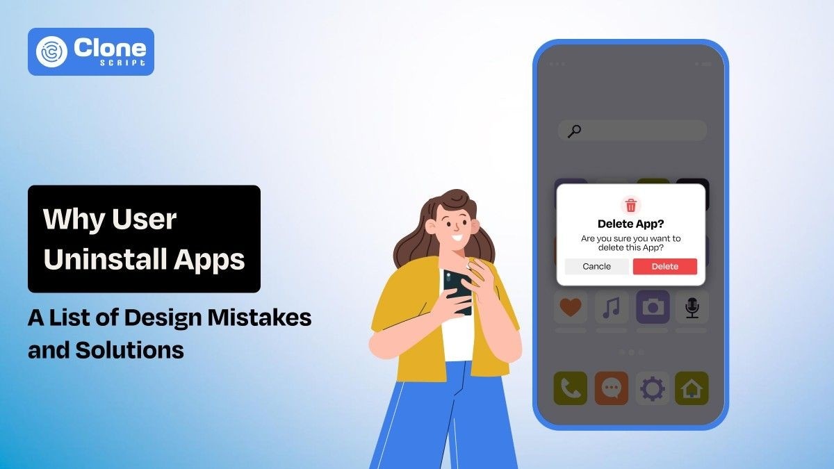
Early App Design Mistakes That Make Users Uninstall Apps (With Fix)
You don’t uninstall because your app is “bad.” You uninstall because, in those first 90 seconds, your app silently communicates: this is not going to be work.
Picture a user downloading your app while waiting in a coffee line. They tap the icon. The splash screen was introduced. A permission screen appears. Then a signup screen. In this time frame, they haven’t seen one benefit yet. But, they’re already considering the cost vs. benefit. The issue calls their name. The phone locks. Your app is never opened again.
That’s how most uninstalls occur, not in anger. But in apathy.
This article explores the more hidden early app design pitfalls that lead to immediate uninstallation, based on real user behavior, not theory.
Why Users Decide to Uninstall an App Within the First Few Minutes
Users don’t assess apps like teams do by features or plans. They assess in split seconds, in moments of feeling: the first screen, the first touch, the first pause in response. Each moment answers one lean question: Is this worth my time now?
The Google UX Playbook observes that users make a value judgment in less than 10 seconds from the first interaction. After that, every additional step has to justify itself. If it seems unnecessary, the app will begin to seem costly to them.
In the first interaction, three assessments go off like rapid-fire.
-
First, they estimate the effort for how much work am I getting myself into?
-
Second, they assess risk by looking for signs of poor quality, spam, and poor security.
-
Third, they look for immediate payoff of hard evidence that the app actually solves my problem.
When design conceals value behind effort, users don’t complain about it. They just quit and go elsewhere.
Poor First Impression Design Mistakes That Instantly Affect Retention
These mistakes are very common during MVP development. Once it is not solved, the entire product may be proven to be worthless.
-
Cluttered Home Screens That Force Cognitive Decisions
Thinking that 10+ introductory pages make users frustrated? No. If the layouts are easy to understand, users prefer them. But when you’re forcing them to make initial decisions, they refuse.
For example, when they open the app find:
-
6 calls to action that create confusion in funnel conversion.
-
4 navigation tabs makes tough to explore the app.
-
A promotional banner appears without proving the value.
-
The onboarding tooltip is still not optimized.
-
A floating action button does not work properly.
Here, users feel mentally taxed. Instead of progress, they experience hesitation.
NNGroup points out that each additional choice increases cognitive load and decreases task success by as much as 20% for first-time tasks (Nielsen Norman Group, Cognitive Load in UX, 2023).
Do you know what a successful app does to retain users?
They delay the majority of their features by 60-70%. After the user has experienced their first success, it has been released. It’s not about how complicated it is; it’s about when it happens.
-
Inconsistent UI Patterns That Break Muscle Memory
Users don’t look for change at first. They search for familiarity.
When button placement changes from screen to screen, gestures make their way in with unexpected behavior, or icons just plain miss the point of the platform, users quietly label the app “unreliable.”
Apple’s Human Interface Guidelines provide guidelines that demonstrate apps that follow native, platform-consistent patterns have better task completion and lower churn, especially in users over 30 years old.
Understand that inconsistency in the early stages is equal to trust destruction.
-
Outdated Visual Design That Signals Product Neglect
Users interpret visual freshness as a sign of continued maintenance. This improves the usability and drive preferred actions you want to let users make.
A 2024 GoodFirms survey found that 38% of users will uninstall apps they feel are “outdated,” even if functionality remains intact.
Here are the subtle warning signs that can appear in the outdated app design:
-
Low contrast typography
-
Legacy gradients
-
Stock photos from the early 2010s
-
Pixel misalignment
These signs give users the impression that: “If the UI design looks outdated, the back-end development must be outdated too.” So, why do they use the app?
Onboarding Design Mistakes That Push Users Away
While users want to register for the app to start using it, the following issues in design stop them from doing so.
-
Mandatory Sign-Up Before Showing Any Value
This is how you lose intent-driven users at instant speed. Your app design prioritizes getting maximum data at first interaction, but does not optimize for representing the value for users.
Users think: “Why am I giving my data to this app where I can’t see anything worthy?”
At the second moment, they will uninstall the app.
UXCam statistics have proven that having an account creation process with a "value moment" lifts the typical week-one retention rate by 45%.
So what is the best approach?
Let users accomplish one useful task anonymously, then encourage users to save their progress.
-
Long Onboarding Flows With No Skip Option
Onboarding screens do not teach the users what to do. They relate to what they will experience.
Localytics points out that “if the app feels intuitive, those who don’t go through the onboarding process tend to stick around just as much as those who do.”
When users perceive that they are being boxed in by the app’s onboarding process, it leads the user to believe that:
-
The app is complex
-
Learning cost is high.
-
Exit is easier
If you keep wait the user to just access the app through a 2-3 minute onboarding, never expect to find your app in their favorite list.
-
Feature Explanations That Don’t Match User Intent
If the features don’t align with what the user actually wants, the onboarding ends up teaching you about the product instead of getting you to your task at hand.
Consider the following example:
“Track your tasks, manage your workflows, collaborate in real time.”
But the user’s immediate goal is much more limited: “I just need to remember three things today.”
That gap establishes a quick and uncomfortable tone.
UX and Usability Errors That Trigger Immediate Frustration
The design feels accurate, but the app user experience still struggles due to the following reasons:
-
Unclear Navigation and Hidden Core Actions
So if you don’t know what to say, “What do I do next?” causes users to bail out.
Research done by the Baymard Institute reveals that unclear navigation has the power to increase first-time abandonment by up to 34%.
There are too many early-stage apps that keep the most basic actions hidden in menus to remain "clean."
This kind of bare-bones approach affects progress and is not real usability, but rather vanity.
-
Small Touch Targets and Precision Errors
Reaching the screen with your thumb matters.
According to Material Design research, mistakes in apps are really frustrating for people using larger screens and often lead to them abandoning sessions altogether.
When a user makes two failed attempts, they immediately assume the app is broken, not that they're the problem.
-
Confusing Icons Without Labels
Icons are learned conventions, not a language.
Icons that don't have labels in the first interactions slow down understanding and raise the likelihood that users might leave, especially users who have no design know-how.
That no matter how useful your app proves to be for them.
Performance-Related Design Issues Users Perceive as “Broken Apps”
Users need to use those apps that reflect the actions most easily and instantly. But these problemes prevents it and have to be optimized.
-
Slow Initial Load Time
First impressions occur before you actually see an interface. Google Firebase writes, "Applications that take longer than 3 seconds to load have lost over half of their potential users before a first touch occurs."
You don't have to be a developer or a designer to understand what's causing the hiccup. The screen freezes, and users will think, "Who cares if it's front-end, back-end, or infrastructure issues?
Something's broken when the page goes blank or doesn't load fast enough." Is the load speed slow? Users instantly think it's not stable, not solid, and not useful over time.
-
UI Freezes That Feel Like Issues
Freezes, even micro-freezes, or 300 to 500 milliseconds, label the app as unsteady during the first use experience. These are seen as failures rather than normal loading issues that the end user experiences.
Tolerance in these first minutes is thin. A single hitch can convince an individual that the application was not complete enough to succeed safely.
-
Poor Error and Empty State Design
A blank screen undermines trust even quicker than an application’s errors do.
Why?
Because when something goes wrong in an app, and the app doesn’t inform the user what happened, or why it happened, or what to do next, users don’t know what to do.
They get confused, frustrated, and leave, permanently uninstalling an application when they don’t understand it.
Trust-Destroying Design Choices That Make Users Exit Instantly
These mistakes are making the app doubtful to use.
-
Aggressive Permission Requests on First Launch
Requesting permissions before a user understands the application’s benefits is really invasive.
The Pew Research study reveals that before users are fully aware of an app's usefulness, they fear that their data will be. The fear stems from a lack of understanding of why they should grant permissions to their data.
Users should first understand why they need to allow permissions before they do so.
Best practice is to ask permission only where it's needed and to clearly communicate the benefits to the user, not the app.
-
Missing Credibility Signals
At times, even early-stage applications lack information that points towards trust.
For example, if there is no information about it on its about page, if there are no clear ways to contact it, if there is no clear understanding of its brand, such things spark doubt in people’s minds.
But when there is no clear understanding, hesitation occurs, and hesitation leads to its uninstallation.
-
Dark Patterns That Feel Manipulative
Tricks such as forced subscriptions, invisible close buttons, or creating false urgencies can destroy consumer trust in an instant.
They may generate quick conversion rates for an app, but in many cases, they also lead to instant uninstalls and poor app store ratings in no time whatsoever.
Once consumer trust is breached in any way, retaining users becomes a near-impossible task.
Monetization Design Mistakes That Lead to Instant Uninstalls
Optimizing the mobile app with monetization is important, but never make these mistakes:
-
Paywalls Before Value Demonstration
Pricing before users feel the value of the app is no less than unnecessary friction. If users don't understand why the app is important to them, then the paid wall is perceived as a barrier to the app.
RevenueCat studies have consistently shown that apps make better numbers when monetization is delayed until after a win, until after they have successfully finished a simple task. We have to feel it before we can price it.
-
Excessive Ads in the First Session
They appear too soon and carry a blunt message: our product is you. For those who have not attached to something emotional or useful, being interrupted feels exploitative rather than tolerated. Instead of delving further, they leave.
After establishing trust and familiarity, monetizing is perfectly fine. But, in the very first session, it just feels like they’re hastening uninstallations.
How These Early Design Mistakes Impact App Retention Metrics
Those initial missteps in terms of design not only frustrate people; they also end up distorting your retention figures right from the beginning. If the initial impressions do not have the desired results, any comeback will be impossible.
The effects of this can quickly be seen in terms of Day 1 retention. Here, the drop-off naturally tends to be the heaviest. Where new users aren't engaging on their first step or "meaningful first actions" as defined by the model, this shows how badly the install-to-first-action conversion is failing. As time stretches on, this then drives down the lifetime value (LTV) as fewer people have time to monetize.
Increasing the first-session user experience can increase retention by up to 30%, without any additional features or increased marketing spend. The user experience is front-loaded; the first few minutes determine the course of everything that follows.
It's much cheaper to fix the design than it is to go out and get new customers to offset the loss of customers caused by unnecessary friction points.
How to Fix Early App Design Mistakes Before Users Leave
With these tips, you can resolve the app design mistakes:
-
Design for the First 60 Seconds.
The hold on the user will be determined by what happens in that first minute. Design the experience for those first few moments, don’t try to fit all the features we could have. Tell the story of the trajectory of the first touch, the small victory, the first real reward. If something isn’t helping those moments, cut it or defer it. Clarity wins over feature depth every time.
-
Validate Design With Behavior, Not Opinions.
Talking to users helps clarify what they're trying to do, helps make sense of what they're feeling, but what they're doing helps clarify where they're really struggling. Dig into your session recordings, your heat maps, and your points where users are dropping off. Everywhere you see hesitation, backtracking, or dropping off. That’s where your friction's occurring. Don't focus on fixing what they're saying; focus on fixing what they're doing.
-
Iterate Before Scaling Acquisition.
More traffic means more issues. Therefore, if the acquisition and the first session leak into the migration stream, even paid growth will only speed up the damage. Focus on making those early flows solid and stable before focusing on growth. Growth without retention isn’t growth, it’s churn scaling.
Conclusion
In real life, people don't quit an app because it lacks features-they bounce. After all, the design asks for attention, effort, or trust before it proves its value. The first minute of interaction is make or break-is this thing actually helping me, or is it just needy? Feels safe or feels risky? Intuitive or exhausting? When friction comes on before the user knows they can trust the app, uninstall is the line of least resistance.
Retention isn't a marketing or growth issue so much as a first-impression design challenge. Give users a sense of progress, clarity, and control, and their frustration tolerance will rise on its own. Nail the very first minute, and everything that follows-engagement, retention, and monetization becomes noticeably easier.