BTC - Bitcoin
 USDTERC20 - USDT ERC20
 ETH - Ethereum
 BNB - Binance
 BCH - Bitcoin Cash
 DOGE - Dogecoin
 TRX - TRON
 USDTTRC20 - USD TRC20
 LTC - LiteCoin
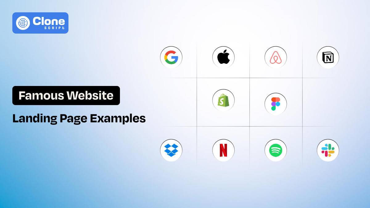
10 Landing Pages Design Examples of Famous Websites (Best Things Do)
Designers don’t look at landing pages the way users do. Users scan, hesitate, scroll, and decide. Designers analyze spacing, hierarchy, interaction flow, and intent.
It’s not enough to collect the screenshots and watch the tutorial for design aspiration. You have to visit the famous website and analyze its landing page structure. From there, you will get an idea of how to make a convincing layout in a live project. Each landing page discussed here supports a measurable goal, like as sign-ups, trials, subscriptions, or product understanding.
5 Key Elements to Observe in High-Performing Landing Pages
Every landing page design template has elements that make it truly acceptable for a certain business goal to be achieved. Across industries, in these pages, predictable design logic works.
You should pay attention to:
-
How quickly the value proposition becomes clear. Check if it takes 5 seconds to know or 1 minute to understand what the product or service is about.
-
Whether the layout supports scanning behavior. Identify every asset that is optimized well for a user experience, with ease of seeing or not.
-
How visual hierarchy directs attention toward the CTA. Is the content or other elements inviting the user to click the button, or is it for decoration?
-
Where trust signals appear relative to decision points. A credibility section keeps users informed that getting service from the business is genuine.
-
How much choice is removed, not added. Having multiple choices confuses the users, but giving them what they want is enough.
Strong landing page UX design is less about creativity and more about editing. The best pages remove friction before users consciously recognize it.
10 Landing Pages Design Examples from Famous Websites
When you see these websites and their landing pages, the noticeable elements help you decide what to prefer during the design process.
-
Apple
-
Airbnb
-
Dropbox
-
Slack
-
Shopify
-
Notion
-
Netflix
-
Spotify
-
Figma
-
Google
Let’s understand these in detail.
-
Apple – Minimalism and Product Focus
Apple’s landing pages are designed to remove visual decision-making. The layout isolates the product, limits copy, and controls attention through spacing and contrast. Instead of persuading users with feature lists, Apple lets the product presentation do the work.
How good is that!
Moving to the page structure. It answers one question at a time, like what it is, what it looks like, and why it matters, then introduces the call to action. This keeps users focused and reduces cognitive load.

Image source: Apple
What Apple Does Best?
-
Controls visual hierarchy with whitespace: Large margins and controlled spacing ensure the product remains the primary focal point at all times.
-
Uses short, declarative messaging: Headlines are informative rather than promotional, and they can be found in the hero section. This reduces product or service interpretation effort.
-
Eliminates unnecessary navigation paths: Fewer exit steps on the website keep attention on the product story instead of site exploration. This highlights the company not selling the product but believes in helping customers.
-
Maintains predictable CTA placement: Apple’s website uses calls to action at the places where users like to have. So, it improves interaction confidence.
-
Aligns UI restraint with brand positioning: The minimal interface keeps encouraging interests in Apple’s premium and precision-focused identity.
2. Airbnb – Trust-Driven Landing Page Design
Airbnb is an OTA platform known for its premium services in the world. This website’s landing pages are designed to reduce hesitation before conversion.
Do you know what makes this OTA website the best in design?
The focus on context, like where users want to go, who they will stay with, and what the experience might feel like. The layout feels open and exploratory rather than transactional.
The overall UX encourages browsing while quietly guiding users toward search and booking actions.

Image source: Airbnb
What Airbnb Does Best?
-
Builds trust before asking for commitment: The design prioritizes reassurance over immediate conversion. The credibility elements are present in every section.
-
Uses real-world imagery to support decision-making: There a no stock images on the website, only a real image of the premises and location to help users imagine the experience.
-
Keeps navigation accessible but unobtrusive: Users can explore the website and app without feeling pushed towards booking.
-
Supports location-based personalization: Content adapts to user intent and context. This personalization plays a role in improving conversions.
-
Balances exploration with conversion paths: CTAs are present but not aggressive to take the prioritized action. It lets users think about what they want to do.
3. Dropbox – Clarity Over Feature Density
Dropbox is a SaaS web platform that allows users to store their files securely with encryption. Dropbox’s landing pages focus on explaining value quickly, especially for users unfamiliar with cloud storage concepts. The illustrations highlight the use cases and proficiently present the service.

Image source: Dropbox
What Dropbox Does Best?
-
Explains complex functionality easily: The copy and visual assets let the user understand the technical concepts in clear terms.
-
Uses illustrations to support understanding the product: The presence of visuals explains workflows in real-time that relate to users.
-
Segments users without cluttering the UI: Different audiences are addressed separately, like technology, education, professional services, and construction.
-
Maintains a strong content hierarchy: From the hero section to representing the use cases, users can scan the page without missing key points.
-
Avoids feature overload on the first interaction screen: The depth for the product is revealed progressively, not implemented as a sales pitch.
4. Slack – Conversational and Human-Centered UI
Slack is a communication platform used by millions of professionals for maintaining their workflow. When we see Slack’s landing page, we notice how the product is meant to feel: collaborative, informal, and human. A conversational tone and storytelling layout look like a genuine product made for utilization.

Image source: Slack
What Slack Does Best?
-
Uses conversational copy instead of marketing language: The tone feels relatable and practical without sounding like getting a subscription.
-
Shows real interface usage, not confusing concepts: The screen's representation lets users understand why Slack is important to have and manage work.
-
Design sections around user problems: Each design container answers a specific need, like reminder, instant messaging, meeting setup, file exchange, and collaboration.
-
Keeps CTAs visible: Preferred action is encouraged in the Slack website using UI components. That's why expert web designers praise it, because users are invited to click the page and complete the action.
-
Aligns product personality with UI design: Design and brand voice remain consistent from colors to messaging and functionality to use cases for a premium look.
5. Shopify – Conversion-Optimized Landing Page Structure
To accomplish a conversion from the landing page, take an example of how Shopify does it well.
Shopify is a well-known e-commerce platform that helps startups to established corporate businesses to host and manage their online store.
Shopify’s landing pages are built with a single measurable goal: getting users to start a free trial. Every design decision supports this objective, from CTA placement to content sequencing.

Image source: Shopify
What Shopify Does Best?
-
Centers the entire layout around one primary action: All elements support trial sign-up by showcasing the importance of having a store on this platform.
-
Repeats CTAs without visual fatigue: Placement for CTAs feels natural, not excessive. This becomes important when you want to present the benefits fit rather than revenue generation.
-
Reduces friction in form interactions: Shopify implements fewer input fields means fewer drop-offs they may notice from new users.
-
Balances inspiration with practicality: On their homepage, success stories support credibility and let the website visitors know they can be a part of it.
-
Uses clear benefit-driven messaging: Value is stated plainly. No marketing copy is used to bring unqualified leads on board to the platform.
6. Notion – Content-First Landing Page Design
Notion is a workflow management and tracking tool with AI help. To highlight the content before inviting users the register on the platform, Notion’s landing pages are a good example. This is achieved through strong structure, consistent spacing, and clear typographic hierarchy.

Image source: Notion
What Notion Does Best?
-
Organizes dense content without overwhelming users: The content structure replaces visual simplification that sometimes becomes irritating to see.
-
Uses a modular layout aligned with the product concept: Modular design mirrors consistent functionality while maintaining branding.
-
Relies on typography for hierarchy: Clear headings guide scanning towards other sections, and from there, the conversion can be completed.
-
Targets knowledgeable audiences effectively: Notion’s web design pattern assumes user intent and curiosity. It relates to what users can benefit from using the product.
-
Avoids unnecessary visual decoration: Content remains the focus. The animations are used only when needed, not placed for attention.
7. Netflix – Focused Messaging With Minimal Choice
How can we forget to mention the world’s most famous streaming platform, Netflix? When seeing the Netflix landing page, we noticed that they are focusing on the users to see the platform’s features and moving towards subscription payment. All of these have been done with minimal distraction. The page removes unnecessary navigation and limits choices to keep attention focused.

Image source: Netflix
What Netflix Does Best?
-
Limits user choices to reduce hesitation: With fewer options, users can decide what is the right choice for them and not be confused between multiple choices. This is important to increase clarity.
-
Uses emotionally direct headlines: Netflix’s messaging is immediate and clear that encouraging users to take the cinematic experience anytime, anywhere.
-
Applies strong visual contrast for focus: The big-sized H1 tags with the subheadings and messaging are readable and dominant for mobile and desktop screens.
-
Keeps CTAs consistently visible: Netflix is doing a unique thing to keep the buttons always accessible for sign-up to enjoy the streaming services.
-
Removes unnecessary navigation paths: To onboard users and help them what to watch for their choices is designed for minimal steps. It means users will do whatever they want.
8. Spotify – Brand-Led Visual Design
Spotify is a widely used audio and video streaming platform and the most preferred app for users. Spotify’s landing pages rely heavily on brand identity, using bold colors, typography, and motion. Despite the expressive visuals, usability remains excellent due to strong hierarchy and contrast control.
CTAs are clearly differentiated, and motion is used selectively to guide attention rather than distract from it. The design adapts well across devices, maintaining clarity even in visually dense layouts.

Image source: Spotify
What Spotify Does Best?
-
Integrates strong brand identity without harming UX: Spotify uses visuals that support recognition from users and improve usability.
-
Maintains hierarchy in bold layouts: Whether it’s a search bar, side navigation menu, or listening to the best music, like important elements, remain dominant.
-
Uses motion to guide attention: Animations have a purpose to encourage users to listen to music, podcasts, and explore the platform for their experience.
-
Ensures CTA visibility in colorful interfaces: Spotify web app contrast is carefully managed that keep users engaged to do what's next.
-
Balances expression with usability: The design remains functional in Spotify, where it aligns correctly with the branding.
9. Figma – Product-Led Storytelling
When a product has to be present through storytelling, take the Figma landing page example. The platform doesn’t focus on usability, but clearly represents the importance of this website prototyping tool. The landing pages are structured around the real use cases that instantly highlight the users. Interactive previews and real workflows replace long-form descriptions.

Image source: Figma
What Figma Does Best?
-
Shows the product instead of describing it: Visual interaction builds understanding, and Figma does this with a good approach.
-
Uses storytelling to structure content: Each section builds on the previous one, which keeps users what they can do next with the tool.
-
Targets designers with realistic workflows: Scenarios feel authentic and relate to real-time web design works that every designer finds useful.
-
Reduces learning friction before sign-up: Users know what to expect after using Figma, and the simplicity in use cases keeps every level of skilled designers familiar.
-
Aligns landing page UX with product UX: Consistency builds confidence across the landing pages to the product for optimizing conversion.
10. Google – Functionality-First Landing Page Design
Google is the most used website and application for search, and the best part of it is focusing on the functionality-prioritized landing page. With clarity, accessibility, and predictability holding three pillars of Google’s utilization in daily life. The good part is that the visual design remains minimal, but the interaction pattern is reliable and credible.
Typography, spacing, and layout support readability across devices. Messaging focuses on what the product does rather than why it is exciting. This approach works well for a broad audience with diverse technical comfort levels.

Image source: Google
What Google Does Best?
-
Prioritizes usability over visual expression: Function comes first in Google, and all their products are implementing this philosophy.
-
Uses predictable interaction patterns: Users can easily do what they want to do without watching a lengthy tutorial or content.
-
Applies accessible typography and spacing: Fonts and spacing are accurate on Google, and it maintains consistent readability.
-
Keeps messaging practical and direct: No persuasive exaggeration regarding products and services, they showcase why they’re helpful to users.
-
Maintains strong cross-product consistency: Google’s products are doing a good job of encouraging familiarity builds trust.
These examples of landing pages are setting the benchmarks for how the product and service website or applications are presented to users. Achieving the goal with minimal effort is the prime job of the landing page.
Common Design Patterns Found Across These Landing Pages
When reviewing these landing page design examples side by side, the similarities are structural rather than visual. Apple, Google, and Spotify look nothing alike, yet their landing pages function in remarkably similar ways.
The most consistent pattern is single-goal alignment.
Every page is built around one primary action. This includes starting a trial, exploring content, searching listings, or signing up. Secondary actions are either hidden, delayed, or visually not focused.
Another shared pattern is above-the-fold clarity. Within the first screen, users can understand:
-
What the product or service is
-
Who it is for
-
What is the next step is
From a landing page UX design perspective, these pages also rely heavily on progressive disclosure. What they do best is that information revealed as users scroll, preventing overload while still supporting deeper evaluation. Visual hierarchy, spacing, and contrast are used consistently to guide attention rather than decorate the interface.
What Web Designers Can Learn from These Landing Page Examples?
These real-world landing page examples highlight that effective design decisions rarely involve thinking about trends. They are about intent.
-
Work as decision tools.
First, designers should treat landing pages as decision tools, not brand showcases. Every element should justify its presence by supporting clarity or movement toward action. If it does neither, it becomes friction.
-
Customization is important.
Second, a strong landing page UI design depends on editing. The best pages remove more than they add. This includes navigation items, competing CTAs, decorative visuals, and unnecessary copy are all kept away.
-
Know audience requirements.
Third, audience context matters. Notion and Figma assume knowledgeable users and provide depth. Netflix and Apple reduce choices and explanations. Matching content density and tone to user intent is a core landing page design best practice.
-
Branding consistency in design.
Finally, consistency matters more than creativity. Predictable layouts, familiar interaction patterns, and readable typography reduce effort and increase trust.
These practices are usually followed by expert web product designers to help businesses and users achieve their goals: conversions and product or service usability. Also, they take into consideration the landing page design cost as per the business requirement.
Conclusion
The best landing pages succeed because they make decisions easier. These landing page design examples show that high performance comes from clear hierarchy, focused messaging, and disciplined UX choices. A good landing page does not try to say everything. It says the right thing, at the right moment, in the simplest possible way.