BTC - Bitcoin
 USDTERC20 - USDT ERC20
 ETH - Ethereum
 BNB - Binance
 BCH - Bitcoin Cash
 DOGE - Dogecoin
 TRX - TRON
 USDTTRC20 - USD TRC20
 LTC - LiteCoin
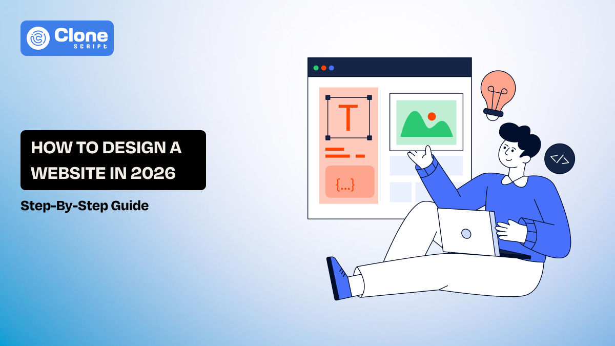
How to Design a Website in 2026: Step-by-Step Guide
The future of website design is determined by user psychology, performance engineering, search visibility, and scalable systems in 2026.
Users make a trust judgment in less than one second, and core web vitals and user engagement signals will continue to shape Search Engine Optimization (SEO) outcomes. Therefore, web design teams must also consider how their website will become intentional, measurable, and adaptable.
This blog explains a modern, professional design process for websites that is based on real-world workflows, team collaboration, and the logical application of tools. It is meant to be used by designers who want to create a high-performing website that is not only visually appealing.
Step 1 – Define the Purpose of Your Website.
Great designers do not begin with layouts; they begin with outcomes!
This is the first step for designing a website in 2026: define why you want to create a website.
The purpose of your website dictates every single design decision down the line. From content hierarchy to interactions, and without a clearly explained purpose, your design will be based on opinions, not performance.
Before creating wireframes or determining color palettes, web design teams will determine the following:
-
Primary Conversion Actions: Is the website made for signing up for products, demo requests for demonstration, purchasing goods, or booking the services?
-
Secondary Engagement Goals: This element describes what users have to do once they visit a website, like how far users scroll on a page, time on site, and pages viewed per visit.
-
KPIs Controlled by Design: The business performance metrics, like bounce rate, task completion rate, and form abandonment, can be handled with the design.
Why are we talking about it?
There was a study conducted by Nielsen Norman Group, which showed that successful goal-aligned UX design provides an increase of 83% in task completion when there is a defined outcome. Therefore, it reduces the amount of subjective feedback, such as “make it pop,” and replaces that feedback with measurable success criteria.
Step 2 – Understand Your Target Audience.
Once the intention is clear, then we have to move forward to the next step: know your audience.
Expert designing teams do not just design the website for “users.” So what do they do?
They design for observable behavior, which means what a user has done in the past and what solution the user is looking for.
Nowadays, only considering user demographics is not enough. You have to know how users think, what method they adopt to scan and process information when making decisions about using your website.
Most web design teams (that perform at the highest level) conduct in-depth analysis of their target audience:
-
User Intent: This explains that a user is searching for information, wants to complete the transaction, or is finding a site.
-
Behavior Patterns: This metric identifies what users are actually doing, such as scrolling, clicking, and drop-offs.
-
Pain Points and Friction Points: This will clear why users are leaving the site due toconfusing navigation and unclear CTAs.
What’s the point of talking about?
According to Forrester, it has been shown that user-centered design can create up to a 400% increase in conversion rates. When designers use real user behavior data versus their assumptions about user behavior, they can identify and create less usable experiences.
Therefore, create intuitive layouts, clearer navigation systems, and provide users with an overall experience that feels more like a natural part of their day as opposed to an inconvenience.
Step 3 – Plan Your Website Structure.
The third step in website design is to plan the structure of how your site will be represented to users.
Experienced web designers do not arrange the pages, but they create pathways for users for every stage, like Top of the funnel to Bottom of the funnel.
This means your website’s structure has to be defined as: how users find content, how search engines crawl through pages, and how simple it is for the site to continue to grow without having to be redesigned.
Before you can start building out navigation or page layouts, design teams must first establish:
-
Hierarchy of Content: This aspect is related to what pages will be main content types and what can be considered as secondary content.
-
Logic For Navigation: This explains what your main global menu will look like, what your secondary navigation will be, and what contextual links will be used.
-
The Depth Of Your Crawl And Internal Links: This is related to how many clicks it takes to your important pages.
Talking to this point, why required?
Nielsen Norman Group found that poor information architecture is one of the leading causes of users failing to complete tasks on websites. Having an organized and logical structure enables users to have a better idea of where to go and take less of a cognitive load doing it.
Step 4 – Wireframe Your Website Layout.
The website's purpose is clear, the audience behavior is analyzed, the site structure is managed, and then comes a low-fidelity wireframe.
The workflow of professional website design starts with the first layout logic validation using wireframes. It doesn’t start with the visual design.
Wireframe design focuses on the arrangement of elements along with hierarchy and user flow without adding the influence of color, font, or branding items.
Creating wireframes before using visual design will assist designers in documenting:
-
Content placement and priority: This helps to know what the user sees first, number one, number two, and number three last.
-
User flow between sections and pages: This identifies how the user enters and exits each section/page and the path a user will use to make a decision.
-
Functionality: This explains what to include in forms, CTAs, navigation, and all user interactive areas.
The question is: why wireframe required?
According to studies done within the User Experience (UX) industry, wireframing in the early stages will reduce the need to make late revisions to designs by 30% to 40%. By validating how the layout and flow are going to work before the coding of the application begins, the design teams will identify usability errors before any development is started.
Step 5 – Choose the Right Design Style.
This is the fifth step, where expert designers don’t just choose a design style based on its popularity. They select a design style to fit the context and the purpose of the website.
The design style establishes perception, credibility, and usability in just a matter of seconds through an initial user experience.
The following aspects of the web design team should be considered before applying visual effects:
-
How the design relates to the brand: They find what brand voice is, what tone to prefer, and the consistency of brand visual identity.
-
How the design meets target user expectations: They identify what industry standards are, have familiarity with the user's requirements, and place trust signals with UI components.
-
The impact of the design on usability: The design provided clarity, legibility, and reduced the amount of distraction.
Think what if you don’t define the design style in a client’s website, what happens?
It will reduce the confidence of users in the site. The research says it.
According to research from Google UX studies, users develop a design-related level of trust in 50 milliseconds or less.
Step 6 – Apply Color, Typography, and Visual Hierarchy.
To make a website interesting and professional in look, the visuals are required, such as colors, typography, and hierarchy.
Web designers are more concerned with creating visual elements to help direct user behaviour rather than just to add visual interest to screens.
This relates to what users will see, read, and take action on as they are presented in a digital environment with a prominent analysis.
Before developers use the various visual styles, design teams need to define:
-
Rules for the usage of colors: This explains what contrast ratios will be, whether semantic colors are used & accessibility compliance.
-
Systems for typography: This is important to describe what type scale would be, what line-height ratios would be used, and readability across devices.
-
Signals of hierarchy: This describes what font sizes will be, what spacing proportions will work, how the alignment will remain, and what to emphasize.
Why is it required?
You can improve readers' user experience by 40% with a well-organized visual hierarchy. This is found in the research on readability and User Experience (UX).
Step 7 – Design for Responsiveness and Accessibility.
If the design supports the responsive behavior, the work for the development team is shortened and flexible.
Google uses design "quality" as a factor in its ranking system, and Google values a website that delivers a seamless, inclusive experience.
By designing the website layout based on user experience through responsive web design and access for everyone, you will enable your website to perform well in both search results and usability.
Before locking down any website layout, a team will prefer modular web design for:
-
Mobile-first breakpoints: They identify target areas for touch along with areas for fingering the display, and design priority of content types.
-
Consideration of accessibility measures: These are based on contrast, keyboard use, and readable text in day and night environments.
-
Variations in devices: It will be important to make it accessible for every size screen, input method/device, and assistive device.
Why is it important?
More than 60% of the global internet traffic originates from a mobile device, and greater accessibility translates into increased usability for all.
Step 8 – Optimize Website Design for SEO.
Professional designers realize that design impacts rankings. This is the eighth step in a website design that is misunderstood.
SEO isn’t just about content and keywords anymore since other factors, including layout stability, performance, and usability, also play a role.
As part of the final design handoff before release by development teams, they optimize for the following:
-
Google Core Web Vitals metrics (LCP, CLS, and INP): These metrics are impacted by design choices like what icons are taking time to load and the section floating effect increase the rendering.
-
Readability of content structure: This is required for spacing and hierarchy of headings & scanability of hero sections along with the page.
-
How efficiently assets are used: This is useful to understand what the image size is, why the font takes so long to load, and the use of animation.
Why is it important?
Google has indicated that a large percentage of its potential conversions are lost due to even one extra second of delay in website page load times. In addition, websites with poor layout stability add frustration for users and increase bounce rates.
Step 9 – Select the Right Tools or Templates.
Professional designers should choose design and development tools carefully, not based on emotion or trendiness. The design team’s goal is to choose tools or ready templates in Figma or Webflow that improve the speed of execution while not negatively impacting the experience of users.
Teams measure their design tools across three dimensions:
-
The fidelity of the design: Can the tool create complex layouts, states, and interactions?
-
How efficiently they can collaborate with their team members: Are they able to provide real-time feedback, maintain version control, and hand off work to developers easily?
-
Can the design be developed in a manner that allows it to scale without needing to rebuild from scratch?
Once they know these dimensions, the tool choices of design teams are:
| Task | Tools |
|---|---|
|
Design & UI |
Figma, Sketch, Adobe XD |
|
Prototyping |
Figma Prototype, Framer, ProtoPie |
|
Handoff & QA |
Figma Dev Mode, Zeplin |
|
Template / Builders |
Webflow, WordPress (block-based themes), Shopify |
Why does it matter?
Based on the results of recent surveys regarding the design industry, design teams that employ collaborative tools such as Figma are approximately 30-40% faster than those that do not.
Selecting website templates properly can also greatly enhance the speed of the design process while still providing professional standards for quality.
Step 10 – Test, Launch, and Iterate.
Professional website designers know that their sites never end when they are initially launched. That’s where this step is introduced. Instead, the end of the launch is the beginning of a controlled release, followed by measurements, learning, and subsequent refinements.
Here, the design hypothesis is helpful to understand what works properly for the website and what needs to be neglected at the moment.
Once the site has been created and is ready for launch, teams that excel (who are typically not part of the design team) will focus on three different methods of analysis.
-
Functional Testing: This covers checking broken links, validating forms, and knowing how it behaves across different browsers.
-
Usability Testing: It includes aspects like completing tasks, ensuring navigation is clear, and reducing friction.
-
Performance Testing: This observes Core Web Vitals, page load speed, and interaction delay.
Why should you care?
According to Google, one second of page load delay equals up to a 20% decrease in conversion. Testing also ensures that real-world conditions, devices, networks, and user behaviours do not affect the designer’s design intentions.
The best way is to use analytics and user feedback. It helps teams to enhance UX, SEO, and conversion outcomes continuously, versus relying on expensive redesigns.
As a result of these iterative adjustments, a static site now becomes an active, living product that continues to provide performance and results that grow exponentially with the passing time.
Conclusion
Experienced web designers and teams view the creation of websites as an ongoing process rather than just creating something and handing it off. Design decisions based on research, confirmed through testing, and built upon scalable systems will make the website an asset of growth rather than a static page. This will result in a website that is user-centric, search-engine-friendly, and ready for the future, and that continually produces results for the client's business.