Esports Website Design Guide: Build Modern Gaming Platforms Faster
Esports websites are built to deliver live information without delay. Users arrive to check match status, schedules, team lineups, results, or streams while an event is already in progress. If this information is not visible immediately or requires multiple clicks, users leave. For this reason, esports website design is primarily a work of structure, speed, and clarity.
Unlike standard content websites, esports gaming platforms deal with constantly changing data and short user sessions. Pages must support live match states, frequent updates, and high traffic during tournaments. On the other side, navigation, layouts, and UI components need to prioritize match-related content first, not branding or decorative elements.
This guide explains how esports website design should be approached today. It focuses on practical UI and UX decisions that help teams build modern gaming platforms faster, with layouts that are easy to scan, quick to load, and reliable during live events.
What Makes a Great Esports Website Design?
When seeing famous esports gaming websites like Toornament, Battlefy, and ESL (Electronic Sports League), we notice the following things:
-
Navigation Should Lead Users Straight to Live Content.
Great esports website design starts with clear navigation and predictable user paths. Users should reach live matches, schedules, team pages, or results within one or two interactions.
High-performing esports platforms surface priority links such as Live, Matches, and Standings directly in the main navigation. It reduces decision time during live events.
-
Strong Visuals Should Support Function, Not Compete With It.
Esports branding is bold, but excessive animations, large video backgrounds, or heavy effects can interfere with usability. Effective designs use visuals to support content, not distract from it.
Match cards, player stats, and brackets remain readable even when strong colors or imagery are used.
-
Layouts Must Adapt Cleanly Across Devices
A large portion of esports traffic comes from mobile users checking scores, schedules, or brackets while watching streams elsewhere. Layouts must adapt without hiding key information or forcing horizontal scrolling.
Tournament brackets and match listings work best when they have simplified mobile views rather than scaled-down desktop layouts.
-
Speed and Live Updates Are Core Design Requirements
Fast loading and real-time content updates define quality in a modern esports website. Users expect match states, timers, and scores to update instantly.
Delayed updates, page reloads, or layout shifts during live events reduce trust and engagement. Successful platforms design around live data first and optimize everything else around that requirement.
Anatomy of a Winning Esports Website (Real Examples)
Top esports websites follow a clear, utility-first structure that prioritizes live content, fast access, and repeat visits during events.
-
Homepages Act as Live Match Dashboards
Leading platforms such as Team Liquid, G2 Esports, Cloud9, and ESL design their homepages to present live and upcoming matches immediately. Live match cards, timers, and event highlights appear above the fold. The homepage functions as a control panel, not a brand story.
-
Navigation Is Built Around Events, Not Pages
Primary navigation of these websites focuses on Matches, Teams, Tournaments, and News. During major events, temporary links for brackets or special competitions are added and removed once the event ends. This keeps navigation short, relevant, and easy to scan.
-
Hero Sections Prioritize Utility Over Decoration
Winning esports websites avoid static hero banners. Instead, hero section areas highlight live matches, countdowns, or featured tournaments. This helps users see time-sensitive information first without scrolling.
-
Team and Player Pages Are Designed for Quick Scanning
Team and player pages place recent results, upcoming matches, and performance stats before background details. The best part is that the content is structured for fast-reading users to find key information within seconds.
-
Clear Visual Hierarchy Drives Engagement
These platforms use consistent spacing, typography, and contrast to guide attention toward live content and key actions. Calls to action, such as event registration or notifications, are placed logically without disrupting the main flow.
Key UI Elements Every Esports Site Should Include
A strong gaming website depends on UI elements that make live events, scores, and player information immediately accessible. These elements must work seamlessly across devices and handle frequent updates without slowing the site.
-
Live Match Widgets and Scoreboards
In any of the esports websites, real-time match information play important role. The widget has to be designed accordingly, where it shows ongoing match status, team scores, and timers without requiring page reloads. This keeps users informed during tournaments, and they stay engaged.
-
Tournament Schedules and Filters
Tournament schedules must be easy to scan, with clear indicators for upcoming, live, and completed matches. Also, filters allow users to sort by team, league, or event type. It reduces the time spent searching for relevant matches.
-
Player and Team Profiles
In esports, players like to track their gaming performance, so design the profile section accordingly. Present the statistics and rankings at a glance in the easiest way. Quick-access stats help fans follow favorites and make gameplay context clear without scrolling through excessive details.
-
Embedded Streams and Media Galleries
In online gaming platforms, videos, live streams, and highlight reels are integral to the user experience. You have to optimize so that embeds load quickly and adjust automatically to different screen sizes. Additionally, galleries have to design with a place for screenshots, videos, and recap content.
-
Call-to-Action Banners for Signups and Events
CTAs guide users toward registrations, subscriptions, or notifications. These should be visible but not intrusive. The placement of call-to-action buttons also matters. Positioned it near live matches or upcoming tournaments to encourage engagement without cluttering the interface.
Best UX Practices for Esports Audiences
Esports users don’t browse; they scan, click, and refresh as their lives depend on it. Your UX needs to keep up with their speed, or they’ll leave faster than a losing team rage-quits a match.
-
Simplify Navigation for Instant Access
Menus should focus on what users actually want: Live Matches, Teams, Tournaments, Results, and News. Deep hierarchies or buried links are a surefire way to frustrate fans. Keep primary actions reachable within one or two taps because nobody has time to hunt through ten pages for a match schedule.
-
Create Engagement Loops That Keep Users Returning
Feeds, event highlights, and community updates should encourage repeat visits. Users should find relevant content immediately, like the next big match or a trending highlight. Don’t influence them to endless scrolling. A good UX makes the site feel like a quick pit stop, not an obstacle course.
-
Dark UI Themes with Readability in Mind
Dark interfaces reduce eye strain during long gaming sessions, but only if the text is readable. Contrast, icon clarity, and interactive elements must remain legible on all devices. Otherwise, users will face issues so hard they’ll miss the next round.
-
Optimize Load Times
During live tournaments, traffic spikes can be brutal. Images, videos, and animations should be optimized, and real-time updates like scores or timers must load instantly without full page refreshes. Slow load times can cost engagement faster than a disconnection mid-final match. For that, website speed performance optimization methods have to be implemented during development.
Mobile-First Esports Website Design Strategies
In 2025, over 56% of the global esports audience prefers consuming content on mobile devices. It reflects a fundamental shift in how fans interact with competitive gaming platforms. Mobile viewership now rivals desktop as the default way to check scores and live events, especially during major tournaments.
-
Responsive Tournament and Bracket Layouts
Tournament brackets are among the most challenging UI elements to display on smaller screens. Instead of shrinking desktop designs, prioritize simplified brackets that clearly show team names, scores, and match progress. Aim for layouts where users instinctively know where to look, even if they’re squeezing one‑handed into a crowded space.
-
Thumb‑Friendly Interaction Zones
Mobile users tap with intent. Not precision. Buttons and links must be large enough to press without accidental mis‑taps, especially for live match actions like “Watch Live,” “View Stats,” or “Add Reminder.” Position key elements where thumbs naturally rest (middle and lower screen) rather than forcing users to stretch for a corner button.
-
Performance Tuning for Mobile
Mobile connectivity and device capabilities vary widely. In 2024, mobile esports watch time for major titles like Mobile Legends reached hundreds of millions of hours, illustrating how mobile traffic spikes during key events. Optimize images, defer non‑critical scripts, and enable lazy loading to reduce load times. Even a delay of a second can mean the difference between users staying to watch a match or clicking away.
-
Cross-Device Design Consistency
Many fans switch between devices, checking scores on mobile and then reviewing stats on desktop later. Visual consistency across layouts, typography, and data presentation builds confidence. Conversely, inconsistent UI cues or different live update behavior across devices leads to confusion and affects user trust.
Common Esports Website Design Mistakes to Avoid
Many esports websites do not work because of missing features, but because small design decisions create friction at the worst possible moments, usually during live events. These mistakes are common, avoidable, and costly in terms of engagement.
-
Cluttered Layouts That Hide What Matters
Trying to show everything at once is one of the biggest mistakes. When live matches, schedules, news, ads, and promotions compete for attention, users struggle to find what they came for. Winning esports sites prioritize live and upcoming content first and push secondary information lower in the hierarchy.
-
Ignoring Mobile Responsiveness
Some gaming streaming websites still treat mobile as a scaled-down desktop version. This results in unreadable brackets, tiny buttons, and horizontal scrolling. Since a large portion of users check scores and updates on mobile, a poor mobile experience directly translates to lost traffic and repeat visits.
-
Overusing Fonts, Colors, and Effects
Multiple fonts, excessive gradients, and heavy animations may look impressive in a demo, but hurt usability. Inconsistent typography and color usage reduce readability and break visual flow. Esports design works best when bold branding is controlled and used with purpose.
-
Slow Performance During Live Events
Nothing damages trust faster than a site slowing down when traffic spikes. Large images, unoptimized videos, and blocking scripts cause delays when users need instant updates. Esports platforms must be designed with performance under peak load in mind, not just average traffic.
-
Hiding Key Actions
CTAs like Watch Live, View Bracket, or Get Match Alerts should never be buried. When users can’t quickly take action, they disengage. Effective design places actions close to live content, not tucked away in secondary sections.
These mistakes are rarely intentional, but they accumulate quickly. Avoiding them keeps esports websites usable, reliable, and ready for high-pressure moments.
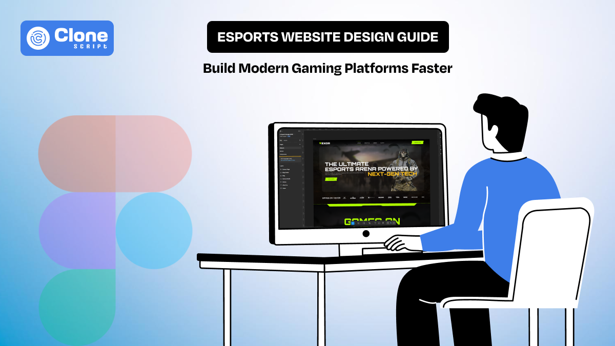
Introducing Vexor: Figma UI Kit & HTML5 Template for Esports Websites
Vexor is built for teams that want to launch an esports website without redesigning common patterns from scratch or fighting front-end inconsistencies later.
-
Built Specifically for Esports Use Cases
Vexor is not a generic dark-theme template repackaged for gaming. Every layout and component is designed around esports-first requirements: live matches, tournaments, teams, rosters, media, and events.
The structure assumes high-content velocity and frequent updates, which is how real esports platforms operate.
-
What’s Included in Vexor
Vexor combines a Figma-based UI system with a production-ready HTML5 template. Using it, developers can move from design to deployment without translation loss.
Here is a core inclusions:
-
Pre-designed pages for teams, tournaments, matches, and news
-
Reusable UI components (cards, tabs, filters, CTAs, navigation)
-
Dark-theme optimized typography and spacing.
-
Responsive layouts across desktop, tablet, and mobile
This reduces both design time and front-end guesswork.
-
Designed for Speed Without Lock-In
Vexor provides structure, not restriction. Modular web design components, making it easy to optimize:
-
Add or remove sections
-
Customize branding
-
Extend features as the platform grows.
Developers are not boxed into rigid layouts, and designers are not forced to reinvent systems.

Get This Figma Design Template
Step-by-Step Workflow: From Design to Deployment
This workflow reflects how esports websites are actually built when speed, coordination, and stability matter, not how they look in slide decks.
Step 1: Establish the Design System in Figma
Start by locking the fundamentals: color tokens, typography scales, spacing rules, and component variants. Esports platforms evolve fast, so consistency at this stage prevents visual debt later.
Using a structured UI kit helps designers focus on layout decisions, not button redesigns for the tenth time.
Prefer the rule of thumb: if a component appears more than twice, it should be reusable.
Step 2: Map Content to Real User Flows
Before exporting anything, align layouts with how users actually behave:
-
Visitors want live matches first
-
Teams look for schedules and results.
-
Fans scan, not deeply.
This step avoids a common mistake: beautiful screens that fail under real traffic pressure.
Step 3: Developer Handoff Without Translation Loss
Clean handoff means fewer Slack messages and fewer “what does this do?” moments.
Best practices include:
-
Name components clearly in Figma
-
Use auto-layouts and constraints properly.
-
Document hover, active, and loading states
If developers guess, inconsistencies follow. If they don’t, velocity improves.
Step 4: HTML Implementation & Component Assembly
Developers translate layouts into structured HTML using reusable sections rather than page-specific hacks. This improves the following:
-
Maintainability
-
Performance
-
SEO readiness
At this stage, focus is on function first, animation second. Esports users forgive fewer micro-interactions than broken pages during live matches.
Step 5: Performance & Responsiveness Checks
Before launch, validate the following:
-
Mobile performance under slow networks
-
Image and video loading behavior
-
Layout stability during dynamic updates
Esports traffic spikes are unforgiving. If the site struggles here, users leave, no second chances.
Step 6: QA, SEO, and Launch Readiness
Final checks ensure:
-
Navigation works under real data
-
Core pages are indexable.
-
Metadata, headings, and structure are intact.
Only after this does the site go live. Not because it’s perfect, but because it’s reliable.
An esports website is not built in one phase. It moves cleanly from system → structure → performance → launch, without issues in between.
 BTC - Bitcoin
 USDTERC20 - USDT ERC20
 ETH - Ethereum
 BNB - Binance
 BCH - Bitcoin Cash
 DOGE - Dogecoin
 TRX - TRON
 USDTTRC20 - USD TRC20
 LTC - LiteCoin

