BTC - Bitcoin
 USDTERC20 - USDT ERC20
 ETH - Ethereum
 BNB - Binance
 BCH - Bitcoin Cash
 DOGE - Dogecoin
 TRX - TRON
 USDTTRC20 - USD TRC20
 LTC - LiteCoin
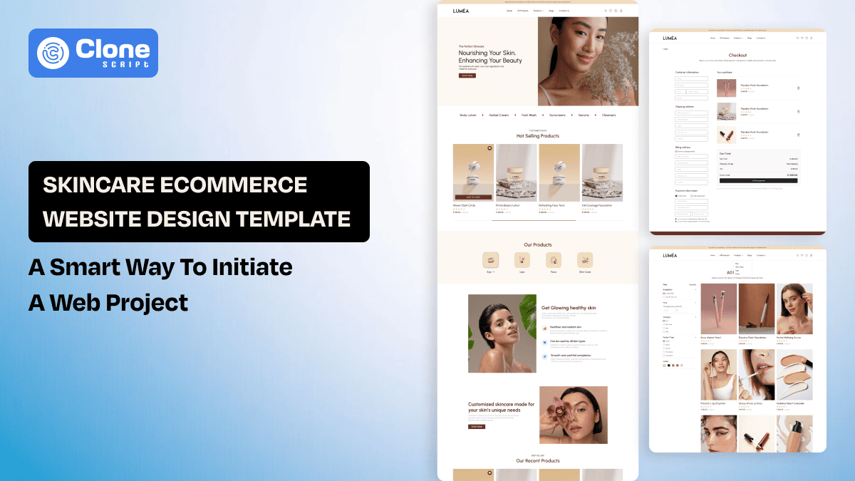
Skincare Ecommerce Website Design Template: A Smart Way to Initiate a Web Project
The skincare market has become intensely competitive, with most discovery, research, and purchasing now happening online. Consumers no longer buy based on branding alone. They evaluate ingredient transparency, clinical validation, peer reviews, and brand credibility before committing. Here, the skincare ecommerce website design must function as both an educational platform and a conversion engine.
Unlike generic ecommerce layouts, a skincare store must reduce uncertainty, clarify product benefits, and guide users toward the right routine with confidence. Poor structure increases hesitation, and at the same time, strategic ecommerce UX builds trust instantly.
This guide breaks down how to design a high-performing skincare ecommerce website and how to accelerate the entire process using a purpose-built Figma template designed specifically for beauty brands.
Why Skincare Ecommerce Website Design Is Fundamentally Different
Skincare is not a casual purchase category. It is outcome-driven, ingredient-sensitive, and risk-aware. Customers are browsing products along with evaluating solutions for acne, pigmentation, sensitivity, dryness, or aging. That shifts the role of skincare website design from aesthetic presentation to structured decision support.
An ecommerce layout optimized for fashion or electronics typically emphasizes visuals and quick purchasing. Skincare, however, requires clarity, reassurance, and guided education before conversion occurs.
1. Buyers Are Problem-Solving, Not Just Shopping
In most ecommerce categories, customers search for a product. In skincare, they search for a solution. This is the difference.
They type the product as follows on websites:
-
“Serum for acne scars”
-
“Moisturizer for sensitive skin”
-
“Retinol for beginners”
This behavior demands a skincare ecommerce UX that prioritizes:
-
Shop-by-concern navigation that helps customers to get what they want.
-
Ingredient-based filtering allows them to save time searching for products.
-
Routine-building pathways speak directly to conscious customers that looks immediate purchase.
If users must decode product names to understand benefits, friction increases, and drop-off follows. Do not ever try this.
2. Ingredient Transparency Is Non-Negotiable
Modern skincare buyers are ingredient literate. They recognize terms like retinol, hyaluronic acid, niacinamide, ceramides, and AHAs. They compare percentages and evaluate compatibility.
Your skincare product website must be designed accordingly as follows:
-
Highlight hero ingredients above the fold. For that, optimize the website hero section for conveying the message.
-
Explain benefits in simple, credible language. Do not have too many marketing professionals to make things complex to understand for a first-time skincare buyer.
-
Clarify skin-type suitability for different categories of products. This will help customers choose the products they actually want.
-
Address common compatibility concerns. Design the product pages where it’s easy to showcase the product and its prominent usage.
Hiding ingredient information behind tabs or collapsible sections reduces trust. Structured transparency increases authority.
3. Trust Barriers Are Higher Than Other Niches
In skincare products, customers are sometimes not aware of the perceived risks, and they pay more attention to them.
-
Fear of breakouts. This is the common pain point of any beauty product buyer, where they wonder if they should purchase the product or if they will experience acne dysmorphia.
-
Allergic reactions. Using the first-time products, customers worry as they feel allergic effects without consulting a dermatologist for the best results.
-
Ineffective results. Every human body needs different types of skincare attention. So, a single product may not be useful for everyone, and if they do usage they have to face unexpected outcomes.
-
Wasted money. When users already want to pay around $30 to $300 for their skincare, they usually think it's just like spending not required things.
Because of this, your online skincare store design must actively reduce anxiety through:
-
Dermatologist-tested badges. Add icons, images, and videos along with the authenticated tests report links to increase the trust in the products.
-
Clear return policies. Mention the criteria where, when, and how the products can be returned, and what procedures have to be followed.
-
Visible customer reviews. The human psychology is that they believe in true examples, not test reports only. Create the testimonial section on the ecommerce website, keeping it in mind.
-
Before-and-after proof. Showcasing the images and videos of how the products are making people’s lives easier it increase the conversion rate.
-
Sensitivity disclaimers. It is important to clarify what potential effects customers can face after using the skincare products.
Trust signals should appear near conversion points, like just after the hero section, CTA buttons, and highlighted sections. Do not isolate in the footer.
4. Education Drives Conversion
Frankly speaking, skincare products often require explanation through real-world personality, images, and videos to answer:
-
When should it be used? Like in the morning, afternoon, evening, or night.
-
How often? Just applying the face cream or jelly once a day is enough, or requires more time.
-
Can it be combined with other activities? Like running, playing, or doing household chores.
-
What results timeline should be expected? It works in 5 minutes, or you have to wait for 15 to 30 minutes.
An effective ecommerce product layout integrates usage instructions, FAQs, layering guides, and routine suggestions directly into the product page.
When education is embedded into the design, hesitation decreases, and purchase confidence rises.
5. Brand Positioning Influences Layout Structure
When you see the famous ecommerce brands in the skincare industry, you usually find three categories:
-
Clinical and science-led. A clinical brand demands structured data presentation. Not a marketing copy.
-
Natural and clean beauty. A natural brand highlights ingredient sourcing and sustainability. Here, sourcing the information on skincare products matters.
-
Luxury and aspirational. A luxury brand emphasizes whitespace and refined visuals apart from the authenticated reports only.
Each positioning requires a different visual hierarchy, typography choices, and content density.
Therefore, skincare ecommerce website design is not templated decoration. But yes, you can say it is strategic alignment between psychology, product education, and visual structure.
Skincare Ecommerce Website Design Best Practices
Now we translate strategy into structure. Below are execution-level principles written from a performance and conversion perspective.
-
Clean, Ingredient-Focused Homepage Design
Your homepage on an online skincare website is not branding decoration; it is a structured decision architecture for immediate clarity. It has to be designed to reduce hesitation and guide users toward confident purchase pathways.
-
Hero Section Strategy
In ecommerce website’s hero section, first use benefit-driven messaging. Clearly articulate the outcome, credibility, and customers. Do not be an ambiguous lifestyle brand.
Then comes a direct, benefit-led headline that communicates measurable results, increasing perceived product effectiveness and user trust immediately.
How can we forget the subheadline? A clarifying subheading should define target skin concern, ingredient strength, or dermatological positioning within your skincare homepage.
Finally, the one primary CTA button is in your ecommerce hero section to avoid cognitive overload and protect conversion clarity.
The clean background with minimal visual noise enhances hierarchy and improves decision-making efficiency in website design.
-
Structured Segmentation Below the Fold
The clear segmentation is helping users in different ways:
-
Shop by Skin Concern improves UX by aligning navigation directly with user intent and problem-solving behavior.
-
Shop by Ingredient strengthens skincare product website design by supporting ingredient-literate consumers seeking specific active formulations.
-
Shop Bestsellers adds social validation, increasing trust in design through implied community endorsement.
-
Start Your Routine introduces guided pathways within the online store, encouraging higher average order value through bundled logic.
In essence, structured segmentation transforms the skincare homepage design from an aesthetic layout into a strategic conversion mapping landing page.
2. Smart Navigation & Filtering System
Navigation in ecommerce website determines whether users explore confidently or abandon due to complexity. So, pay attention to these aspects:
-
Layered filtering: Implement the filters to reduce cognitive strain by allowing progressive narrowing based on user priorities.
-
Category filters: Add the filters like Cleanser, Serum, and Sunscreen, and establish a foundational product taxonomy within the skincare store.
-
Concern-based filters: Applying filters for Acne, Anti-aging, and Pigmentation, reflect problem-driven search behavior in online skincare store design.
-
Ingredient filters: Implementing these filters, such as Retinol, AHA, and Niacinamide support advanced users within skincare product website design ecosystems.
-
Skin type filters: Personalize ecommerce navigation and skincare experiences, increasing relevance and reducing browsing friction.
Having every filter layer on the website improves clarity, strengthening conversion pathways in skincare ecommerce website.
-
Search Behavior Optimization
How can we forget to mention that predictive search optimization enhances the user experience? Yes, it shortens the discovery time and reduces unnecessary navigation clicks.
-
Displaying Acne Control Cleanser during predictive search aligns the skincare ecommerce website with high-intent keyword behavior.
-
Suggesting Acne Scar Serum reinforces the ingredient-focused skincare product page and increases cross-category exploration.
-
Presenting the Acne Treatment Bundle encourages routine-building logic within online skincare store design architecture.
Fast access increases engagement metrics, improving behavioral signals across website design performance indicators.
3. High-Impact Skincare Product Page Design
Your skincare product page design is the primary revenue interface within the skincare ecommerce website design strategy. A high-performing ecommerce product layout eliminates uncertainty, clarifies benefit hierarchy, and reinforces ingredient authority.
-
Immediate Value Clarity (Above the Fold)
Here’s what things that have to be considered:
-
The product benefit statement must immediately define outcome-driven value within skincare ecommerce UX environments.
-
Star ratings enhance trust perception in skincare product websites and take advantage of social proof near the conversion zone.
-
Transparent pricing supports credibility and reduces perceived risk in online skincare store design.
-
Skin concern labeling strengthens personalization within website design frameworks.
-
A visible Add to Cart button anchors conversion logic inside ecommerce product layout strategy.
Avoid scroll dependency for essential information; above-the-fold clarity accelerates decision-making in skincare ecommerce UX.
-
Ingredient Breakdown Section
A structured Hero Ingredient section improves skincare product page design by highlighting scientific differentiation clearly.
-
Displaying ingredient names properly will enhance recognition among informed users.
-
Explaining what the ingredient does builds educational authority.
-
Clarifying who it’s for improves personalization in skincare website.
-
Supporting ingredients should communicate secondary benefits to reinforce formulation credibility.
-
Compatibility notes reduce anxiety, strengthening trust in online skincare store conversion pathways.
Structured ingredient presentation increases perceived expertise in ecommerce website design.
-
Usage & Routine Placement
This aspect has to be more accurate:
-
Clear AM or PM application guidance improves usability in ecommerce user experience systems.
-
Layering order instructions enhances routine-building logic inside product page design.
-
Frequency guidance reduces misuse risk, strengthening trust in online store credibility.
-
Sunscreen reminders demonstrate responsibility and scientific alignment in skincare ecommerce messaging.
Guided usage reduces post-purchase dissatisfaction, improving retention and repeat purchase rates.
-
Reviews That Feel Relevant
Consider the following for review management in the skincare website:
-
Segmenting reviews by skin type improves contextual relatability.
-
Age-group segmentation enhances targeting precision within skincare product website design interfaces.
-
Primary concern tagging strengthens personalization in virtual environments.
Relatable reviews outperform generic testimonials in ecommerce website credibility structures.
4. Mobile-First Skincare Ecommerce Design
Mobile-first execution is foundational in modern skincare ecommerce website design strategy.
-
A sticky Add to Cart button increases conversion continuity within mobile skincare ecommerce design architecture.
-
Collapsible ingredient sections preserve hierarchy while maintaining transparency in skincare ecommerce UX layouts.
-
Swipeable product galleries enhance tactile engagement inside mobile skincare ecommerce design experiences.
-
Large tap areas reduce friction, improving usability metrics within online skincare store design systems.
-
Thumb-optimized layouts increase retention and interaction depth across performance benchmarks.
Make sure the design is adaptable and responsive to every Android, iOS, tablet device, and desktop screen. Modern website user interface designers are implementing the best practices when using the AI-supported UI and UX design tools.
5. Conversion-Focused CTA Strategy
Your ecommerce website CTA strategy must reflect user intent, not generic transactional language. Optimize the website for the following:
-
Replacing “Add to Cart” with “Add to My Routine” strengthens personalization.
-
“Start My Clear Skin Plan” aligns CTA messaging with outcome-focused ecommerce UX psychology.
-
“Subscribe & Save 15%” integrates a retention strategy directly into the skincare product website architecture.
-
Context-driven CTAs increase emotional alignment, improving conversion rates.
Generic CTAs reduce persuasive impact, while strategic messaging elevates skincare ecommerce website performance.
Skincare Ecommerce Website Examples (What Works)
Studying leading brands reveals how strategic skincare ecommerce website design adapts to positioning, audience psychology, and conversion priorities.
-
The Ordinary
A science-driven skincare brand built around ingredient transparency and clinical positioning. Its ecommerce design reflects pharmaceutical minimalism, prioritizing clarity, trust, and frictionless product discovery over aesthetic excess.
What do they do best?
-
Minimal interface that reinforces authority and reduces cognitive load.
-
Strong typographic hierarchy for ingredient-first communication.
-
Clear problem-solution navigation for faster product selection.
-
Data-focused product pages that strengthen purchase confidence.
-
Glossier
A community-first beauty brand combines skincare with lifestyle storytelling. Its ecommerce experience prioritizes emotional engagement, soft branding, and social validation to build loyalty and drive repeat purchases.
What do they do best?
-
Community-driven visuals integrated seamlessly into product journeys.
-
Soft, cohesive color palette enhancing brand recall.
-
Prominent user-generated content to increase trust.
-
Mobile-first layout optimized for modern shoppers.
-
Drunk Elephant
Drun Elephant is a premium skincare brand that has a bold visual identity with ingredient education. Its ecommerce design balances vibrant branding with structured information architecture to guide discovery and increase average order value.
What do they do best?
-
High-contrast visuals that command attention instantly.
-
Clear segmentation by skin concern improves navigation flow.
-
Educational content sections supporting informed purchasing.
-
Strategic bundling and routine suggestions boost conversions.
We find that these famous online skincare websites are optimized for UI components with modular web design practices and the latest UI and UX trends. Ultimately, they’re not just focusing on sales but prioritizing user convenience in online shopping.
The Fastest Way to Design a Skincare Ecommerce Website
We all know the time for skincare website design is not hours of tasks, but it takes months of preparation that involves the following tasks:
-
UX mapping through the client’s goals and audience research
-
Wireframing the layouts as per the brand intent
-
Product page structure using the user interface tools like Figma
-
Mobile layout optimization for iOS, Android, and Tablet screens.
-
A component system building that can be used throughout the e-commerce website development.
If you want structured efficiency, you need a framework.
Introducing the Lumea Skincare Ecommerce Figma Template

The Lumea Skincare Ecommerce Figma Template is built specifically for a skincare brand's website, not adapted from generic ecommerce kits.
This template integrates:
-
Ingredient-focused product sections
-
Skin concern filtering layouts
-
Conversion-optimized homepage
-
Structured mobile frames
-
Reusable UI components
This is not decoration. It is architecture can be helpful in the completion of an entire web development project for a client.
Why It’s Strategically Valuable
Instead of building these designs manually:
-
Product layout systems
-
Filter structures
-
CTA hierarchy
-
Routine builder logic
You start with a pre-designed system that helps you to focus on essential design parts in ecommerce platform.
This reduces design time by 50–70%.
More importantly, it reduces structural mistakes.