BTC - Bitcoin
 USDTERC20 - USDT ERC20
 ETH - Ethereum
 BNB - Binance
 BCH - Bitcoin Cash
 DOGE - Dogecoin
 TRX - TRON
 USDTTRC20 - USD TRC20
 LTC - LiteCoin
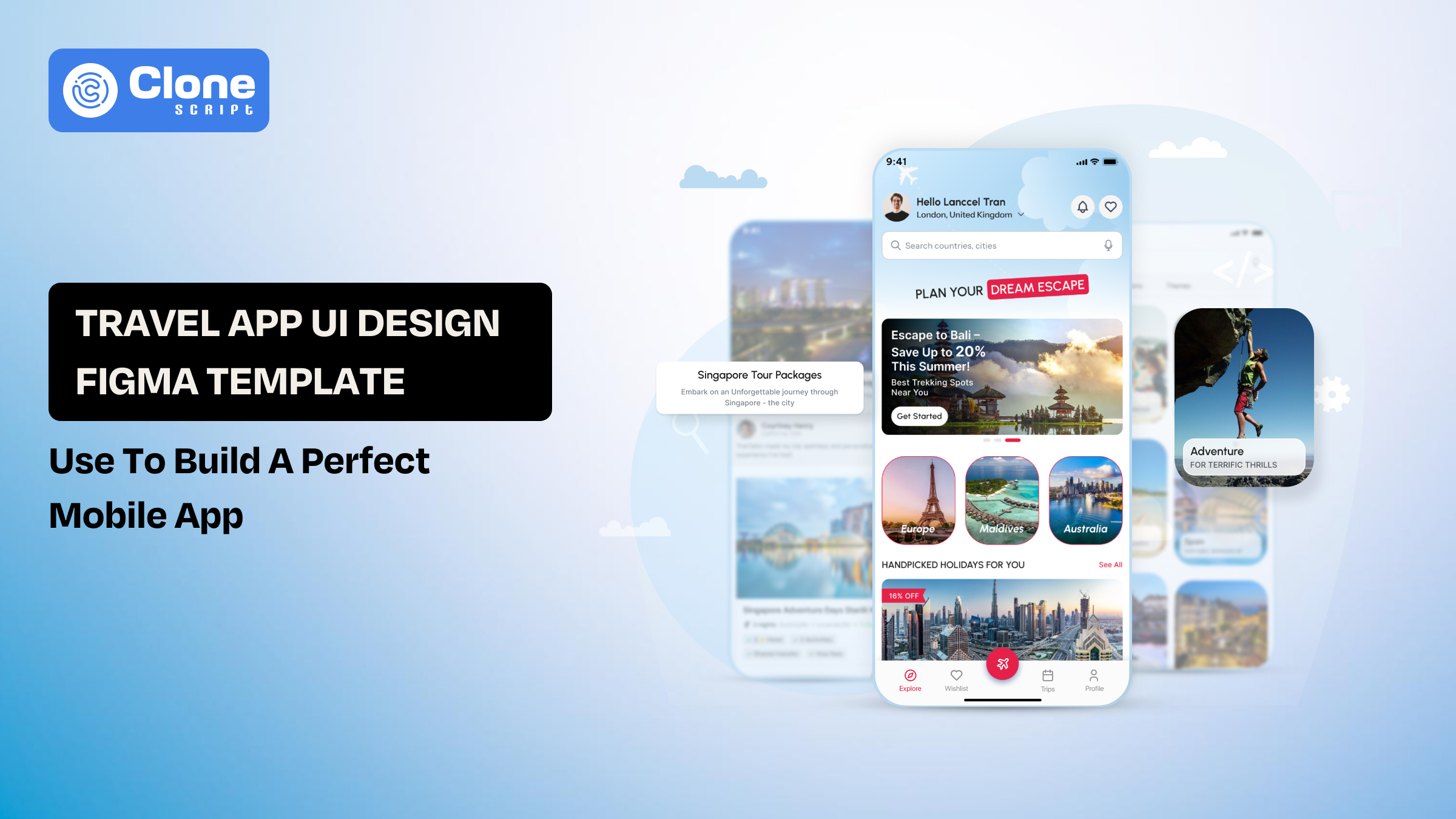
Travel App UI Design Figma Template: Use to Build a Perfect Mobile App
You open the Figma, and the travel app UI looks complete. But still causes problems during implementation. As you know, only having premium visual screens doesn’t justify the product. For that, flow, structure, and usability matter. Nowadays, many travel app development teams overlook how users will actually search, compare options, and complete a booking without friction.
This is where a well-structured Figma travel app template becomes a practical choice. It provides more than layouts. Everything has been defined on how each part of the app connects, from discovery to checkout.
For designers, it reduces repetitive work and enforces consistency. For product managers, it makes the product idea easier to evaluate before development begins.
This guide focuses on using a travel app UI template not just to design screens, but to build a usable, scalable mobile app.
What is a Travel App UI Design Figma Template?
A travel app UI design template is a collection of screens that includes a pre-structured product layout built to handle real user behavior. The role of this template is to save time on repetitive work and to design every page from the start. The design system already defines how users move from exploring destinations to completing a booking.

A complete template typically includes:
-
Connected user flows (search → select → book → pay)
-
Reusable components like cards, filters, and navigation to use in development.
-
Consistent design system availability for typography, spacing, and color logic.
-
Multiple screen states (empty, loading, error, success)
One fact to remember: You may find these elements in a free or basic template, but they fall short. They usually focus on visuals but ignore how the interface behaves when users interact with it.
In practical terms, a well-built Figma template acts as a blueprint for the product, not just a visual draft.
Core Screens Required in a Travel Booking App Design
15+ screens available in the travel booking app do not make it a professional app. The important thing is how clearly every screen moves the users to take action: booking the tour package.
Here are the screens that actually carry product value:

-
Discovery (Home Screen)
The first page, called the home screen, and it’s lays the foundation of conversion rates. Here, users explore destinations, deals, or recommendations. It should guide attention, not overwhelm with options.
-
Search & Filtering
In this screen, users rarely book what they see first. Adding strong filters for price, date, location, and ratings is critical for decision-making.
-
Listing / Results Screen
Displays available hotels, tours, or packages in a more prominent way. The layout must support quick comparison for price, ratings, and key details, and should be scannable.
-
Detail Screen
This is the decision point. It should answer all questions related to the images, amenities, policies, and reviews. Make sure users are not forced to leave the screen.
-
Booking Flow
In the booking flow, a step-by-step process like selecting the dates, then adding guests, and making a confirmation plays a key role. Any confusion here directly impacts conversion.
-
Payment Interface
Travel mobile apps accept online payments to confirm the bookings. So, the design must offer clarity and trust. If any hidden charges or unclear breakdowns appear, the drop-offs will be higher.
-
User Profile / Dashboard
The intention of creating this screen is to permit the management of bookings, preferences, and history. Important for retention, not just functionality.
Each of these screens must connect logically. When structured well, they reduce user effort and make the entire booking experience predictable and smooth.
Essential UI Components in a Travel App Template
Screens define the flow, but UI components define how the interface behaves at scale.
Think that if components are not structured properly, even a well-designed screen becomes difficult to maintain or extend.
A reliable travel app template focuses on reusable, flexible components:

-
Destination Cards
These components are used across home, listings, and recommendations screens. They should support variations, including image, price, rating, and tags, without redesigning each time.
-
Search Bar & Filters
Now, customers are required to find relevant tour packages, hotels, and accommodations. Integrating dropdowns, sliders, date pickers, and multi-select options that adapt to different use cases. These are more than input fields.
-
Calendar / Date Picker
Syncing the calendar into a travel app is very important for booking logic. The date selector is making the effort easier for users who book the accommodation based on availability, pricing changes, and range.
-
Pricing Modules
The pricing displaying components are useful and have to be clearly breakdown of cost base price, taxes, and discounts. Poor structure here leads to user distrust.
-
Navigation System
Bottom tabs, headers, and back navigation must stay consistent across screens to avoid disorientation. This is why famous travel booking apps are paying more attention here.
-
Action Buttons (CTAs)
“Book Now,” “Reserve,” or “Check Availability” should follow consistent styles and hierarchy. If users see a difference on a single stage, they start doubting, resulting in lower conversion rates and cause the uninstall the app.
-
State Variants
Components should include: empty states, loading states, and error states. Most templates ignore these states, which creates gaps during development. Choose a premium Figma design that includes these states.
When components are built correctly:
-
Designers can scale the interface without breaking consistency.
-
Product teams can adapt features without redesigning from scratch.
How Designers Should Actually Work With a Travel App Figma Template
Most app UI designers open a template and start “customizing.” That approach breaks the structure within minutes. A travel app template is not meant to be edited screen-by-screen. It’s meant to be reconfigured at the system level.

-
Read the Flow Before You Touch the UI
Don’t start with colors or images. Trace how the template handles:
-
Multi-step booking
-
Date selection logic
-
Result filtering behavior
If the flow doesn’t match your product (e.g., tours vs hotels), fix that first, not the visuals.
-
Audit Component Dependency
In many templates, one card or filter appears in 6–8 places.
If you detach or manually edit it once, you create inconsistencies everywhere.
Instead, try the following:
-
Identify global components
-
Modify them at the source level
-
Check where they propagate
This is where most templates silently fail during scaling.
-
Stress-Test Real Scenarios
Figma design templates are often designed with ideal data. Your product won’t be.
Test these things:
-
Long destination names
-
Price fluctuations
-
Empty search results
If the UI breaks under these conditions, the template isn’t production-ready.
-
Adjust Structure, Not Just Content
Switching from “hotel booking” to “experience booking” isn’t a text change, but it affects:
-
Filters
-
Detail sections
-
Pricing logic
Treat the UI design templates as a framework, not a ready-made app.
Used this way, a Figma template becomes a controlled system you can reshape, instead of a design you constantly patch.
How Product Managers Can Use This Template for Faster MVP Planning
A Figma template can act as a decision-making tool for product managers. Instead of relying on abstract feature lists, you get a visual structure that exposes how the product will actually behave.
-
Map the Real User Journey
Most product plans look clean on paper but fall apart in execution.
With a template, you can trace:
-
How users discover options
-
What influences their decision
-
Where drop-offs can happen
This helps validate whether the flow is too long, confusing, or incomplete.
-
Define the MVP Scope Clearly
Usually, in Figma designs, there are more screens than the requirement. That’s useful in some conditions, but not always.
You can do:
-
Remove non-essential features
-
Prioritize booking-critical screens
-
Separate MVP vs future releases
This prevents overbuilding in the early stages.
-
Identify Missing Logic Early
Visual screens expose gaps that documents don’t. That’s where the real game begins.
For example:
-
What happens if no results are found?
-
How are price changes handled?
-
Is the booking confirmation clear enough?
Catching this early avoids rework of the app UI design and UX during development.
-
Align Design and Development, Teams
Instead of explaining features in meetings, you can point to:
-
Actual screens
-
Interaction points
-
Component behavior
This reduces misinterpretation between teams working in design, development, QA & testing.
-
Estimate Time and Complexity Better
A structured design template makes it easier to:
-
Break features into modules
-
Estimate development effort
-
Identify dependencies
This leads to more realistic timelines for mobile app development for a travel booking business.
For product managers, the template shifts planning from assumptions to visible product logic, making decisions faster and more grounded.
Developer Handoff: Turning Figma Design into a Functional App
A clean Figma file doesn’t guarantee a smooth build. Most issues start when designs lack a structure that developers can actually work with.

-
Break UI Into Buildable Units
The first thing is not to treat screens as a whole. Identify repeatable parts, including cards, buttons, lists, and filters. These become reusable components in code, not one-off elements.
-
Check Naming and Layer Structure
Messy layers slow down development. Ensure the following:
-
Clear naming (e.g., card/destination/default)
-
Grouped elements by function, not visuals
-
Consistent hierarchy across screens
If developers can’t read the file, they’ll rebuild it their own way.
-
Handle Assets Properly
To export the assets of the Figma template, consider exporting when needed, which contains SVG for icons. For performance optimization, compressed images are required. Avoid exporting entire screens or unnecessary assets.
-
Define States Clearly
Most templates skip this step. Developers need to know:
-
What happens when data is loading
-
What shows when results are empty
-
How errors appear
Without this, behavior is guessed during travel app development for iOS, Android, and Web.
-
Align on Spacing and Layout Rules
Hard-coded pixel values create inconsistency. Instead, you can:
-
Follow spacing patterns
-
Use grid logic
-
to keep margins predictable
A template becomes useful for development only when it’s structured for interpretation, not just presentation.
Free vs Premium Travel App Templates: What Actually Changes
There’s always a thought to use free design templates for a travel app because it looks usable at first glance. But the reality happens in the workflow when extending those templates into a booking system.
The difference isn’t design quality. Its depth of structure.
Where Free Templates Fall Short
Free templates are often built for showcase, not usage. Its common limitations are:
-
Incomplete booking flow
-
Missing edge-case screens (empty, error, loading)
-
Weak component structure
-
Inconsistent spacing and typography
They work for inspiration, but require heavy rework for real products.
What Premium Templates Do Better
Paid templates are usually built with systems thinking. You’ll notice:
-
Connected user flows across screens
-
Reusable, well-defined components
-
Proper use of auto layout and constraints
-
Consistent design tokens (colors, spacing, text styles)
This reduces redesign effort during scaling.
Where the Real Difference Shows
The gap becomes obvious when you add new features, modify booking logic, and handle real data scenarios.
Free templates start to fragment. Premium ones adapt.
When to Choose What
-
Use free templates for idea validation and quick prototypes.
-
Use premium templates for MVP development and production-ready apps.
A template’s value is how long it holds up once the product starts evolving.
Design Trends in Travel App UI (2026)
Trends in travel apps are shifting away from heavy visuals toward decision-focused interfaces. The goal is to help them choose faster. Impressing them becomes secondary.

-
Reduced Visual Noise
Earlier designs pushed large banners and multiple offers at once. Now, interfaces prioritize: fewer elements per screen, clearer hierarchy, and focused CTAs. This improves scan speed, especially on mobile.
-
Context-Based Personalization
Users expect relevant suggestions without searching too much. Implementing Artificial Intelligence through modern UI patterns includes:
-
Location-based recommendations
-
Recently viewed destinations
-
Dynamic pricing highlights
This reduces effort during discovery, and users can fulfill their goals.
-
Stronger Comparison Layouts
Users rarely book the first option. Designs now emphasize:
-
Side-by-side clarity
-
Quick price visibility
-
Rating prominence
The goal is to simplify decision-making, not just browsing.
-
Subtle Interaction Feedback
Microinteractions in user experience are used with purpose, not decoration. Examples are:
-
Filter selection feedback
-
Smoth transitions between steps
-
Confirmation cues during booking
These reduce uncertainty during critical actions.
-
Modular Interface Design
Instead of fixed layouts, screens are built using flexible sections: cards, horizontal scroll blocks, and collapsible details.
This makes it easier to scale features without redesigning entire screens.
The direction is clear: travel app UI is moving toward clarity, speed, and adaptability, rather than visual complexity.
TrekTailor Travel Booking App UI Figma Design Template
A template like TrekTailor is built to reduce friction in the design workflow. Instead of assembling screens from scratch, it gives app designers a structured base to work faster and maintain consistency across the app.

Why designers find it practical:
-
Pre-defined booking flow
This template covers key steps from discovery to checkout, so designers don’t have to map flows manually. This is a big win when the product has multiple features.
-
Reusable component system
Cards, filters, buttons, and navigation elements are already structured for repeated use. That means time can be saved for designing and achieving the timeline.
-
Consistent design language
With a less visual inconsistency related to typography, spacing, and color styles make a professional and trustworthy impression.
-
Well-organized Figma file
Clear layer naming and grouping make it easier to navigate and edit without confusion. If any features can be changed it can be modified accordingly.
-
Multiple ready screens
This Figma app design includes essential pages like home, search results, detail view, and booking interface. It is optimized for conversions.
-
Faster customization
Designers can quickly adapt layouts for different travel use cases without rebuilding UI. Whether it’s a vacation rental, accommodation, or travel-specific segment, any of the mentioned can be created.
-
Supports team collaboration
There is support if you need any assistance to make it easier for product managers and developers to understand the interface logic.
Using a structured template like this helps designers focus less on setup and more on refining the actual user experience.