BTC - Bitcoin
 USDTERC20 - USDT ERC20
 ETH - Ethereum
 BNB - Binance
 BCH - Bitcoin Cash
 DOGE - Dogecoin
 TRX - TRON
 USDTTRC20 - USD TRC20
 LTC - LiteCoin
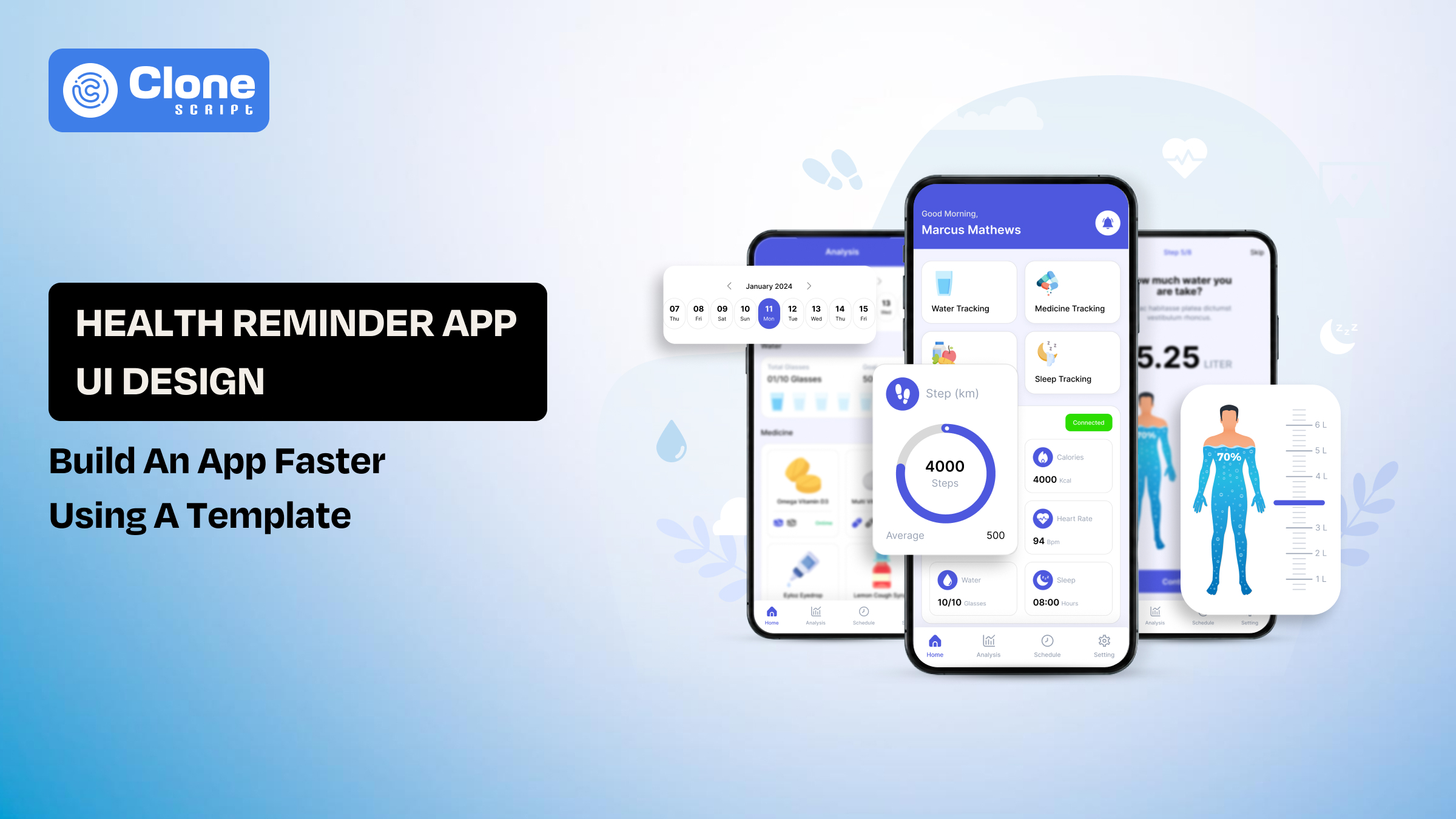
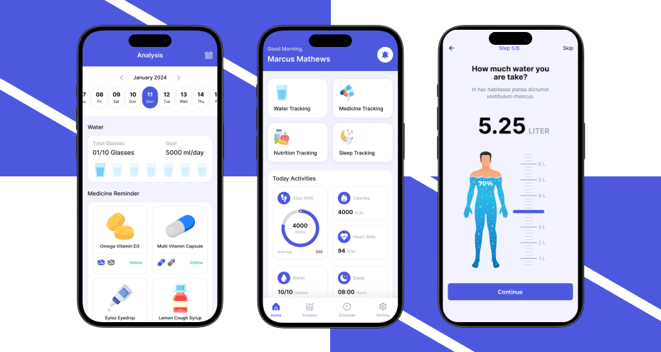
Health Reminder App UI Design: Build an App Faster Using a Figma Template
Most health apps fail at the same point, execution, not idea. The concept is simple: remind users to take medication, track habits, or follow routines. But turning that into a clean, usable mobile app interface takes time, iteration, and precision.
For designers and developers, the real challenge is to create a system that users can trust daily without friction. In health-related apps, even small UX mistakes, such as confusing notifications, poor readability, or cluttered dashboards, can lead to missed actions.
This is where UI design templates change the workflow. Instead of starting from a blank canvas, you begin with structured screens, proven layouts, and reusable components. That reduces design time significantly and allows you to focus on customization and functionality rather than rebuilding common patterns.
If your goal is to launch faster without compromising usability, using a UI template is not a shortcut; it’s a smarter starting point.
Why Health Reminder Apps Are Growing Fast
Health reminder apps are no longer niche tools. They’re becoming part of everyday digital behavior, especially in urban and aging populations.
-
Medication adherence is a global issue: Studies show that a large percentage of patients miss doses regularly, which directly impacts treatment outcomes.
-
Preventive healthcare is increasing: Users are tracking hydration, sleep, vitamins, and fitness routines, not just illnesses.
-
Mobile-first behavior: Smartphones have become the primary interface for daily habits, making reminder apps highly relevant.
-
Demand for simple, repeatable actions: Users don’t want complex dashboards. They want quick reminders and easy confirmation flows.
For designers, this shift creates a clear requirement:
Build interfaces that are fast to understand, easy to act on, and reliable over time.
What Is a Health Reminder App UI Design?
A health reminder app UI design is guiding users through time-sensitive actions with minimal friction.
At its core, the design must support three things:
-
Reminder setup: Users should be able to create reminders quickly.
-
Notification clarity: Alerts must be visible, readable, and actionable.
-
Action confirmation: Users should confirm tasks without confusion.
Unlike other apps, health reminder interfaces must prioritize clarity over creativity. Visual appeal matters, but usability matters more.
Core UX Characteristics
-
Simple layouts: Avoid unnecessary elements that distract from the main action.
-
Readable typography: Especially important for elderly users.
-
Clear call-to-actions: “Take Now,” “Snooze,” or “Mark as Done” should be instantly visible.
-
Low cognitive load: Users should not think twice before completing an action.
What Makes It Different from Other App Designs?
-
Actions are time-sensitive, not exploratory.
-
Users interact in short bursts, not long sessions
-
Errors have real consequences (missed medication, skipped routines)
This is why starting from scratch often leads to avoidable mistakes. A structured UI template already accounts for these patterns, allowing you to focus on refinement instead of rebuilding the fundamentals.
Key Features Every Health Reminder App Must Include
The focus should remain on clarity, speed, and reliability, not feature overload. Each feature must directly support user behavior without adding friction.

-
Medication & Task Reminders
This is the core functionality. If users struggle to set reminders, the app fails immediately.
The interface should allow users to create a reminder within seconds. That means:
-
Time-based alerts must be easy to select without navigating multiple screens.
-
Repeat scheduling should be flexible (daily, weekly, custom intervals).
-
Multiple reminders per day must be manageable without confusion.
The design should minimize input effort. Predefined options, smart defaults, and quick selection patterns reduce user hesitation.
UX focus: Reduce interaction steps and eliminate unnecessary decisions during setup.
-
Smart Notifications
Notifications are where user action actually happens. Poorly designed alerts lead to missed tasks.
Each notification should be:
-
Clear and direct (e.g., “Take your 8 AM dose”)
-
Equipped with action buttons like “Done” or “Snooze.”
-
Persistent in case the user ignores or misses the alert
The key is to avoid passive notifications. Users should be able to act instantly without opening the app.
UX focus: Turn notifications into action points, not reminders that can be ignored.
-
Daily Health Tracking
Tracking builds accountability. Users need a simple way to confirm whether they completed a task.
The interface should include:
-
A one-tap check-in system for marking tasks as done.
-
Visual indicators like checkmarks or progress bars.
-
A history log to review past activity.
Avoid complex input forms. The goal is to make tracking feel effortless, not like a chore.
UX focus: Keep interactions quick and intuitive to encourage consistent usage.
-
Calendar Integration
A calendar view helps users understand their routine beyond individual reminders.
This feature should provide:
-
A weekly or monthly overview of scheduled tasks
-
Clear indicators for completed, missed, or upcoming actions
The challenge is balancing visibility with simplicity. Overloading the calendar with details reduces usability.
UX focus: Present structured information without clutter, so users can scan their schedule quickly.
-
Progress Dashboard
Users need feedback to stay engaged. A dashboard provides a summary of their behavior over time. Key elements include:
-
Completion rates to show consistency
-
Streak tracking to encourage habit formation
-
Basic analytics for insight without complexity
The dashboard should not feel analytical or heavy. It should reinforce positive behavior with simple visuals.
UX focus: Highlight progress in a way that motivates users without overwhelming them.
Each feature in a health reminder app should serve a single purpose: help users take action without delay or confusion. When features are designed around speed and clarity, the app becomes reliable, and that’s what drives long-term usage.
Challenges in a Health Reminder App Design from Scratch
It introduces multiple inefficiencies that slow down both design and development. Most teams underestimate the effort required to build a clean, functional system for time-based user interactions.

-
Time-Intensive UI Creation
Creating every screen from the ground up consumes significant time.
-
Designing flows for reminders, tracking, and dashboards requires multiple iterations.
-
Each screen must be tested for usability and clarity.
-
Small UI decisions (buttons, layouts, spacing) take longer than expected.
This slows down the overall product timeline, especially when working under deadlines.
Impact: Delayed MVP launch and increased design workload.
-
Inconsistent Design System
Without a predefined structure, maintaining consistency becomes difficult.
-
Different screens may use inconsistent spacing, typography, or components.
-
UI elements evolve separately, leading to a visual mismatch.
-
Scaling the app later requires redesigning existing components.
Consistency is critical in health apps where clarity directly affects usability.
Impact: Poor user experience and higher redesign effort.
-
UX Mistakes in Critical Flows
Health reminder apps rely on precise user actions. Poor UX decisions can break the experience.
-
Complicated reminder setup flows increase drop-offs
-
Unclear notifications lead to missed actions
-
Overloaded screens confuse users
These issues are not always visible during initial design but appear after real usage.
Impact: Lower retention and reduced trust in the app.
-
Accessibility Oversights
Health apps often serve a wide user base, including elderly users. The app has to be optimized for:
-
Small fonts reduce readability
-
Low contrast affects visibility
-
Complex navigation makes usage difficult
Accessibility is not optional. It directly affects usability for a large segment of users.
Impact: Limited adoption and poor user satisfaction.
-
Developer Handoff Gaps
Designing without considering development leads to friction during implementation.
-
Lack of proper component structure slows development
-
Missing states (error, loading, success) create confusion
-
Incomplete design systems lead to inconsistent coding
App developers spend extra time interpreting designs instead of building efficiently.
Impact: Increased development time and communication gaps.
Building a health reminder app from scratch gives control, but it also introduces avoidable complexity. Most challenges arise from an absence of structure, repeated iteration, and execution gaps.
This is why many teams shift toward UI templates, not to limit creativity, but to eliminate foundational problems and focus on refinement instead of rebuilding.
Why Use a UI Design Template Instead of Starting from Scratch
A Figma-designed template solves both by providing a structured starting point that already aligns with common user behaviors and app flows.
-
Faster Design Execution
A template removes the need to design every screen manually.
-
Pre-built layouts for reminders, dashboards, and tracking
-
Ready-to-use components like buttons, cards, and input fields
-
Defined user flows that don’t need to be rethought
Instead of spending days on wireframes and iterations, you move directly to customization.
Impact: What usually takes weeks can be reduced to a few days.
-
Built-In UX Patterns
App templates are created based on tested design patterns:
-
Standard reminder flows are already structured
-
Notification layouts follow familiar interaction models
-
Navigation is optimized for quick actions
This reduces the risk of UX mistakes that often happen in first-time builds.
Impact: Better usability from the start without repeated trial and error.
-
Consistent Design System
In the Figma UI templates, a unified visual system is available:
-
Typography, spacing, and colors are predefined
-
Components are reusable across screens
-
Design consistency is maintained automatically
This becomes critical when scaling the app or adding new features later.
Impact: You can get a clean, professional UI without fragmentation.
-
Developer-Ready Structure
A well-built Figma UI kit is not just for designers. It also supports developers:
-
Organized layers and components in tools like Figma
-
Clear naming conventions for faster handoff
-
Predefined states (active, disabled, error)
Health reminder app developers can translate designs into code with fewer assumptions.
Impact: This can reduce development time and the number of revisions.
-
Faster Prototyping and Testing
Templates allow you to build functional prototypes quickly:
-
Connect screens to simulate real user flows
-
Test reminder interactions and navigation
-
Validate ideas before full cross-platform development
This helps identify usability issues early without investing heavily in development.
Impact: You can make better decisions with lower risk.
Using a UI design template removes repetitive work. It allows you to focus on customization, functionality, and user experience, instead of rebuilding standard components.
For teams aiming to launch faster and reduce design errors, a template is a practical starting point, not a compromise.
How to Build a Health Reminder App Using a UI Template
The template changes the workflow from creation to execution. You focus on adapting an existing structure to your product requirements.

Step 1: Choose the Right UI Kit
Start with a template that already includes essential health app screens:
-
Reminder setup screens
-
Notification flows
-
Tracking dashboards
-
Profile and settings
Make sure the design is structured in web design tools like Figma with organized components. A poorly structured template creates more work instead of saving time.
Focus: Select a UI kit that matches your use case, not just visual style.
Step 2: Customize Visual Design
Once the base structure is ready, adapt it to your brand:
-
Update color palette to match your identity
-
Adjust typography for readability
-
Refine icons and illustrations
Avoid over-customizing at this stage. The goal is to align branding without breaking usability.
Focus: Maintain clarity while applying branding elements.
Step 3: Define and Connect User Flows
Templates provide screens, but you need to define how users move between them.
-
Reminder creation → confirmation → notification
-
Notification → action (Done/Snooze) → tracking update
-
Dashboard → detailed history view
Link these flows in your design tool to simulate real usage.
Focus: Ensure every action leads to a clear next step.
Step 4: Prepare for Developer Handoff
Before app development begins, clean up the design files:
-
Use consistent naming for layers and components
-
Define spacing, font sizes, and color styles
-
Include all UI states (active, error, loading)
This reduces confusion during implementation and speeds up development.
Focus: Make the design file self-explanatory for developers.
Step 5: Integrate Back-end Logic
Design alone is not enough; the app must function correctly with the back-end.
-
Implement reminder scheduling logic
-
Handle push notifications
-
Store user data securely
The UI template acts as the front-end structure, while back-end integration makes it operational.
Focus: Align UI behavior with real functionality.
Step 6: Test and Refine
Once the app is functional, test real user interactions:
-
Check reminder accuracy and timing
-
Validate notification behavior
-
Identify friction in task completion
Small usability issues often appear only during real usage, not during design.
Focus: Improve interaction flow based on actual behavior, not assumptions.
The goal is not just to launch faster, but to launch a product that works smoothly from the first interaction.
Health Reminder App UI Kit (Smart Way to Skip Weeks of Design Work)
At this stage, the goal is clear: build a functional, user-friendly app without spending weeks on basic UI structure. This is where a ready-made UI kit becomes a practical solution.
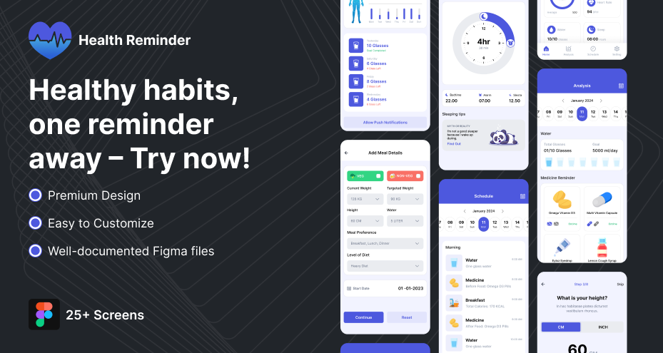
What This UI Kit Typically Includes
-
Pre-designed screens for:
-
Reminder setup
-
Notifications
-
Daily tracking
-
Progress dashboard
-
-
Reusable UI components:
-
Buttons, cards, input fields
-
Navigation elements
-
Status indicators
-
-
Organized design system:
-
Typography and color styles
-
Consistent spacing and layout
-
Component-based structure
-
Benefit: You don’t build from zero. You refine what already works.
When This Becomes Most Useful
-
You need to launch an MVP quickly
-
You’re working with limited design resources
-
You want to focus on functionality instead of UI basics
-
You’re building multiple apps and need a repeatable system
A UI kit is not about reducing effort. It’s about removing unnecessary work.
Instead of spending time on repetitive design tasks, you can focus on improving user experience and building a product that works efficiently from the first release.