BTC - Bitcoin
 USDTERC20 - USDT ERC20
 ETH - Ethereum
 BNB - Binance
 BCH - Bitcoin Cash
 DOGE - Dogecoin
 TRX - TRON
 USDTTRC20 - USD TRC20
 LTC - LiteCoin
Best UI Designs for Websites in 2026: Layouts, Trends, and Conversion-Focused Examples
User interface (UI) design shapes how people interact with websites. Every button, navigation element, form field, and content block influences how users move through a page. Strong UI designs for websites help users understand information quickly, complete actions without confusion, and engage with the product longer.
For UI designers, the challenge is balancing visual creativity with usability. A visually attractive interface means little if users struggle to navigate it. Effective website UI design focuses on clarity, structure, and interaction patterns that guide behavior naturally.
Modern websites now rely on structured layouts, responsive components, and consistent design systems. Whether building a SaaS platform, e-commerce store, portfolio site, or marketplace, UI designers must think beyond aesthetics. Interface decisions affect user engagement, conversion rates, and brand perception.
This guide explains the principles behind website UI design, the most common layout patterns, practical design trends, and real-world product examples from modern websites.
What UI Design Means in Website Development
UI design refers to the visual and interactive elements users see and interact with on a website. These elements include navigation menus, buttons, cards, icons, forms, typography, and layout structures.
While UI focuses on appearance and interaction, it works closely with user experience design. UX defines the overall journey, while the interface determines how that journey appears visually.
Key components of website interface design include:
-
Layout structure
-
Color systems
-
Typography hierarchy
-
Navigation patterns
-
Interactive elements
-
Responsive behavior
When designers build UI designs, the objective is to reduce friction. The whole intention is to help users scan content, understand page structure immediately, and perform actions without hesitation.
For example, a dashboard interface should prioritize data readability, while an e-commerce website should emphasize product visibility and checkout flow.
Core Principles of Effective Website UI Design
Web user interface design principles act as the foundation of every successful interface. These principles help maintain usability while ensuring visual consistency across pages.

-
Visual Hierarchy
Visual hierarchy determines how users process information on a page. Designers guide attention using:
-
Font sizes
-
Contrast
-
Spacing
-
Positioning
Important content such as headlines, call-to-action buttons, or product details should always appear prominently.
-
Consistency
Consistent UI patterns improve usability, as we know. Buttons, icons, and navigation structures should behave the same throughout the website. Do you know? Consistency also strengthens brand identity. Take the example of Amazon.com.
-
Simplicity
Clean interfaces improve website readability. Designers should avoid unnecessary decorative elements that distract from core tasks. Whitespace plays a major role in maintaining simplicity.
-
Accessibility
Modern UI designs for websites must support accessibility. Designers should ensure:
-
Adequate color contrast
-
Readable typography
-
Keyboard navigation support
-
Clear focus states
There are many examples of famous websites that demonstrate how accessibility improves usability for all users.
-
Responsive Design
Users access websites on desktops, tablets, and smartphones. Interfaces must adapt fluidly across screen sizes while maintaining layout integrity.
Responsive UI systems ensure that navigation, content sections, and interactive elements remain functional across devices.
Essential UI Elements Every Website Needs
Regardless of industry or product type, most websites rely on a core set of UI components.
-
Navigation System
Navigation is the structural backbone of a website, from e-commerce to fintech platforms. Clear navigation helps users locate information quickly.
Common navigation styles include:
-
Top navigation bars
-
Sticky menus
-
Sidebar navigation
-
Mega menus for large websites
The navigation your website needs depends on the actions you want users to take.
-
Hero Sections
The hero section on the website appears at the top of a webpage and communicates the main value proposition. Designers often combine:
-
Headline
-
Supporting text
-
Primary call-to-action
-
Visual element or illustration
This section not only optimizes for marketing or other resources. But it should reflect why the user will use the product or service.
-
Buttons and CTAs
Call-to-action buttons guide users toward actions such as signing up, purchasing, or exploring features.
Effective CTA buttons use:
-
Strong contrast
-
Clear labels
-
Adequate spacing
To encourage users to take action, buttons play a key role in website conversion.
-
Forms and Input Fields
Forms are critical for user interactions like registration, subscriptions, and contact inquiries.
Web UI designers should minimize friction by:
-
Limiting required fields
-
Providing validation feedback
-
Maintaining simple layouts
Making the website’s form easy to understand and use, based on experience, can be managed.
-
Cards and Content Sections
Card-based layouts help organize content clearly. Cards often include images, titles, descriptions, and actions.
They are commonly used in dashboards, product listings, and blog layouts. So, a website presenting content in the form of text, video, and images has to be optimized accordingly.
-
Search Interfaces
Search functionality improves usability on content-heavy websites such as marketplaces and documentation platforms.
Search UI should include filtering and sorting capabilities when working with large datasets. Users can easily find the information they are looking for.
Popular UI Layout Patterns for Websites
Layout patterns define how information is arranged on a page. Designers use proven structures to improve readability and navigation.

-
Grid-Based Layout
Grid systems create structured layouts where content aligns neatly across columns and rows. This layout improves visual consistency and scalability.
Grid layouts are widely used in:
-
Blogs
-
E-commerce stores
-
SaaS dashboards
This kind of layout is designed for improving the presentation of a web product.
-
Bento Layout
Bento layouts divide the interface into multiple rectangular sections, each containing a different content type. Each block may display features, metrics, or media elements.
This layout is gaining popularity in modern product websites.
-
Split Screen Layout
Split layouts divide the screen into two sections. Designers often use this structure to highlight two complementary messages or visuals.
It works well for landing pages and portfolio site development.
-
Single Page Scrolling Layout
This layout organizes content vertically on a single page. Users scroll through sections rather than navigating between pages.
It is common in product landing page designs where a clean presentation is important.
-
Dashboard Layout
Dashboard layouts are designed for data-heavy interfaces. These layouts combine charts, tables, filters, and navigation panels.
They are widely used in SaaS products and admin systems.
Modern UI Design Trends for Websites
UI design evolves constantly as user expectations change and new technologies emerge. Take a look at 2015, when the websites were only becoming static platforms. By 2026, AI and modern technology had changed everything. Here are some of the trends to focus on in website design.
-
Minimalist Interfaces
Minimalist design focuses on removing unnecessary visual clutter. Now, UI teams emphasize typography, whitespace, and clear content blocks. They know implementing minimalism improves readability and reduces cognitive load.
-
Bold Typography
Typography is becoming a central design element in modern websites. Large headlines and expressive fonts create a strong visual hierarchy. It relates to quick attention. Many product landing pages depend heavily on typography-driven layouts.
-
Micro-Interactions
Micro-interactions provide subtle feedback when users interact with elements.
Examples include:
-
Button hover effects
-
Loading animations
-
Toggle switches
-
Notification transitions
These small interactions make interfaces feel more responsive and engaging.
-
Dark Mode
Dark mode options have become common in modern UI systems. Dark themes reduce eye strain and create visually striking interfaces. Web designers should ensure proper contrast to maintain readability.
-
Personalized Interfaces
AI-powered systems increasingly personalize website interfaces based on user behavior. While personalization primarily occurs at the back-end development level, UI designers must create flexible layouts that accommodate dynamic content.
UI Design Best Practices for High-Converting Websites
Converting visitors to a website depends on how beautiful the UI design is and how well it is optimized for users’ pain points. Here are some of the practices to follow:
-
Reduce Cognitive Load
Interfaces should avoid overwhelming users with too many options. Prioritize key actions and simplify navigation paths. Adding a single CTA button on the landing page is enough, except when there are more than 5 CTAs.
-
Use Whitespace Strategically
Whitespace improves readability and helps users focus on important content areas. Designers should treat whitespace as an intentional design element rather than space. This reduces users' eye strain while browsing the website's content, making it easier to visualize.
-
Optimize Page Speed
Heavy graphics and excessive animations can slow down websites. Website speed performance optimization is essential for maintaining user engagement. We know it’s a code-related task, but it originates from the UI design, which must be managed.
-
Maintain Clear Call-to-Action Paths
Users should always know what action to take next. CTAs should appear at logical points throughout the interface. Optimize for mobile devices where the thumb-reach principle works and requires attention.
-
Build Scalable Design Systems
Large websites benefit from reusable components and modular design systems. These systems ensure consistency across multiple pages and teams. That’s why expert web UI designers prefer scalable designs to make a website optimized to meet the needs of the future.
Common UI Design Mistakes to Avoid
Even experienced designers can introduce usability issues when designing websites. Small interface mistakes often create friction that reduces engagement and makes navigation harder for users.
-
Overcrowded Interfaces
When too many elements compete for attention, users struggle to focus on important actions. Effective website UI design relies on spacing, hierarchy, and clear grouping to keep the interface readable.
-
Poor Contrast
Low contrast between text and background affects readability, particularly on smaller screens. Strong color contrast ensures that content remains accessible across devices.
-
Hidden Navigation
Navigation should always be easy to locate. If menus are buried or unclear, users may abandon the site rather than search for pages.
-
Excessive Animation
Animations should support user feedback, such as hover states or loading indicators. Overusing motion elements can slow performance and distract from core tasks.
-
Inconsistent Components
Buttons, forms, and icons should behave consistently. Predictable interactions improve trust and usability in website UI designs.
The List of Tools Designers Use to Create Website UI
Modern designers rely on specialized platforms to create scalable UI designs for websites. These tools help structure layouts, build design systems, and prototype interactions efficiently.
-
Figma
Figma has become a primary tool for website UI design because of its real-time collaboration and component-based workflow. Teams can build shared design libraries, maintain consistent UI elements, and prototype interfaces directly within the platform.
-
Sketch
Sketch remains popular among macOS designers. Its lightweight interface and plugin ecosystem support efficient UI workflows, especially when creating structured layouts and reusable components.
-
Webflow
Webflow allows designers to convert UI designs for websites into fully responsive pages without extensive coding. It bridges the gap between visual design and front-end website development.
-
UI Kits and Templates
Prebuilt web UI kits accelerate website projects by providing reusable elements such as navigation bars, cards, and dashboards. Investing time in designing can be saved using this option.
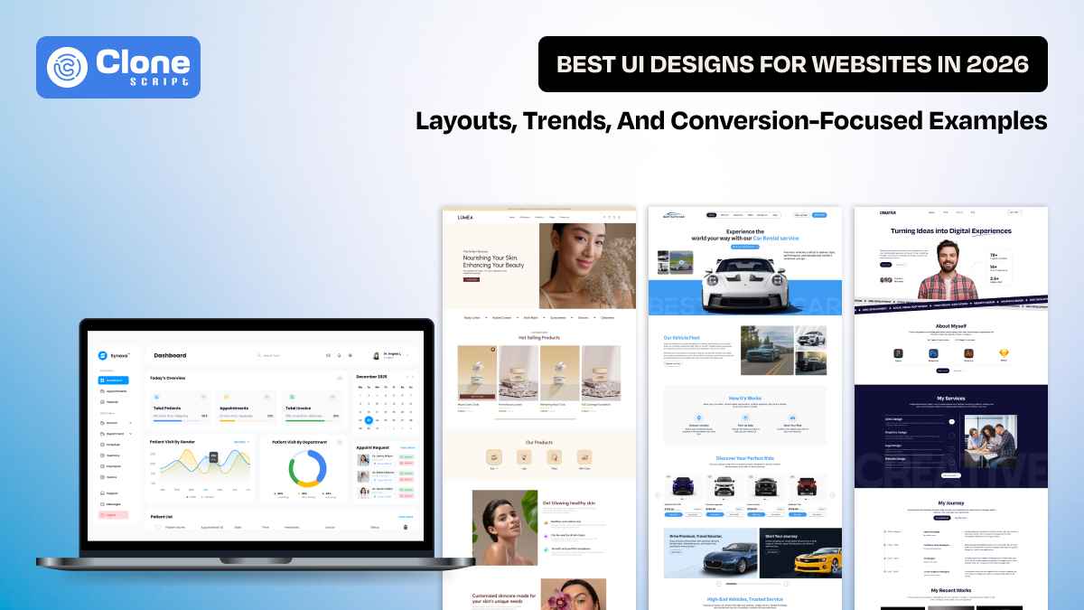
Real-World Figma UI Design Examples for Websites
Understanding UI patterns becomes easier when analyzing real product interfaces. The following examples highlight how different website categories implement effective UI structures.
-
SaaS Dashboards
A SaaS dashboard organizes complex data into readable and interactive layouts. These interfaces must balance functionality with clarity.

A strong example is the Synexa hospital dashboard website design, which presents healthcare data through structured panels and a clear visual hierarchy.
Key UI elements in dashboard interfaces include:
-
Sidebar navigation for modules
-
Data cards and widgets
-
Charts and analytics panels
-
Notification indicators
-
User management sections
Designers working on dashboards must prioritize usability. Data should be easily scannable, and interactive elements should remain consistent across modules.
The dashboard layout in the Synexa design demonstrates how structured grids and consistent color systems can efficiently organize large datasets.
-
E-commerce Stores
E-commerce interfaces focus heavily on product discovery and purchase flow.

The Lumea skincare e-commerce Figma template shows how modern online stores structure product pages and collections.
Important UI components in e-commerce websites include:
-
Product cards with clear imagery
-
Category filters
-
Quick view interactions
-
Shopping cart indicators
-
Checkout flow interfaces
Successful UI designs for websites in the e-commerce category emphasize simplicity. Product visuals should remain the primary focus, while navigation and filtering tools help users easily explore inventory.
The Lumea template uses clean layouts, strong product imagery, and clear typography to support product browsing and purchasing decisions.
-
Portfolio Websites
Portfolio websites allow designers, developers, and creative professionals to showcase their work.

The creative personal portfolio website Figma design demonstrates a modern approach to presenting projects and personal branding.
Portfolio UI typically includes:
-
Project showcase sections
-
About pages
-
Skill highlights
-
Case study layouts
-
Contact forms
Designers often use unique layouts in portfolios to reflect personal style while maintaining usability.
The referenced portfolio design uses bold typography, image-driven sections, and structured grids to present creative work effectively.
-
Marketplace Platforms
Marketplace apps and websites involve complex user interactions because they support multiple vendors, listings, and transactions.

The online car rental app and website Figma template illustrates how marketplace interfaces manage listings and booking workflows.
Marketplace UI systems often include:
-
Search and filtering tools
-
Listing cards with detailed information
-
Booking or checkout interfaces
-
Vendor profiles
-
Review systems
Designers must ensure that users can easily compare options and complete transactions without confusion.
The car rental marketplace template uses structured cards, search functionality, and booking flows to streamline the rental process.
Conclusion
UI design plays an important role in users' experience of websites. For designers, creating effective UI designs for websites requires understanding layout systems, interaction patterns, and usability principles. From SaaS dashboards and e-commerce stores to portfolio websites and marketplace platforms, every website category demands a slightly different interface strategy.